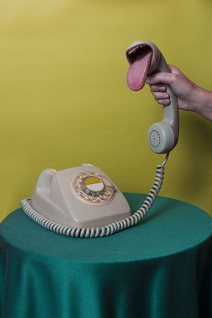
What is surrealism?
Surrealism is a piece of art or a photograph that looks realistic but can't be reality. This is a 20th century piece of work and is very effective in its work. It's a piece of work that is mostly edited using an editing app but it combines a lot of images together.
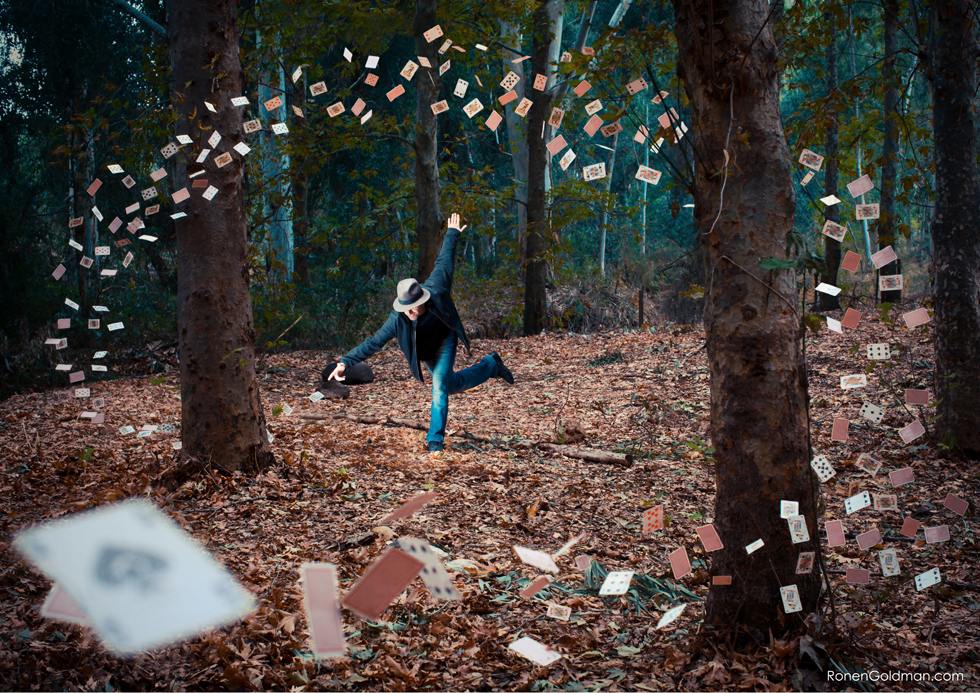
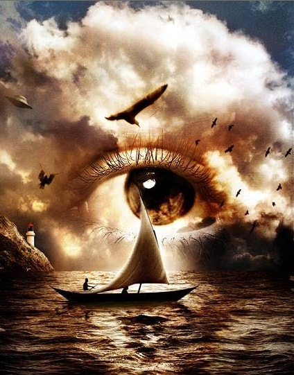
Examples of surrealism
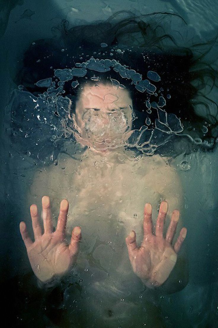

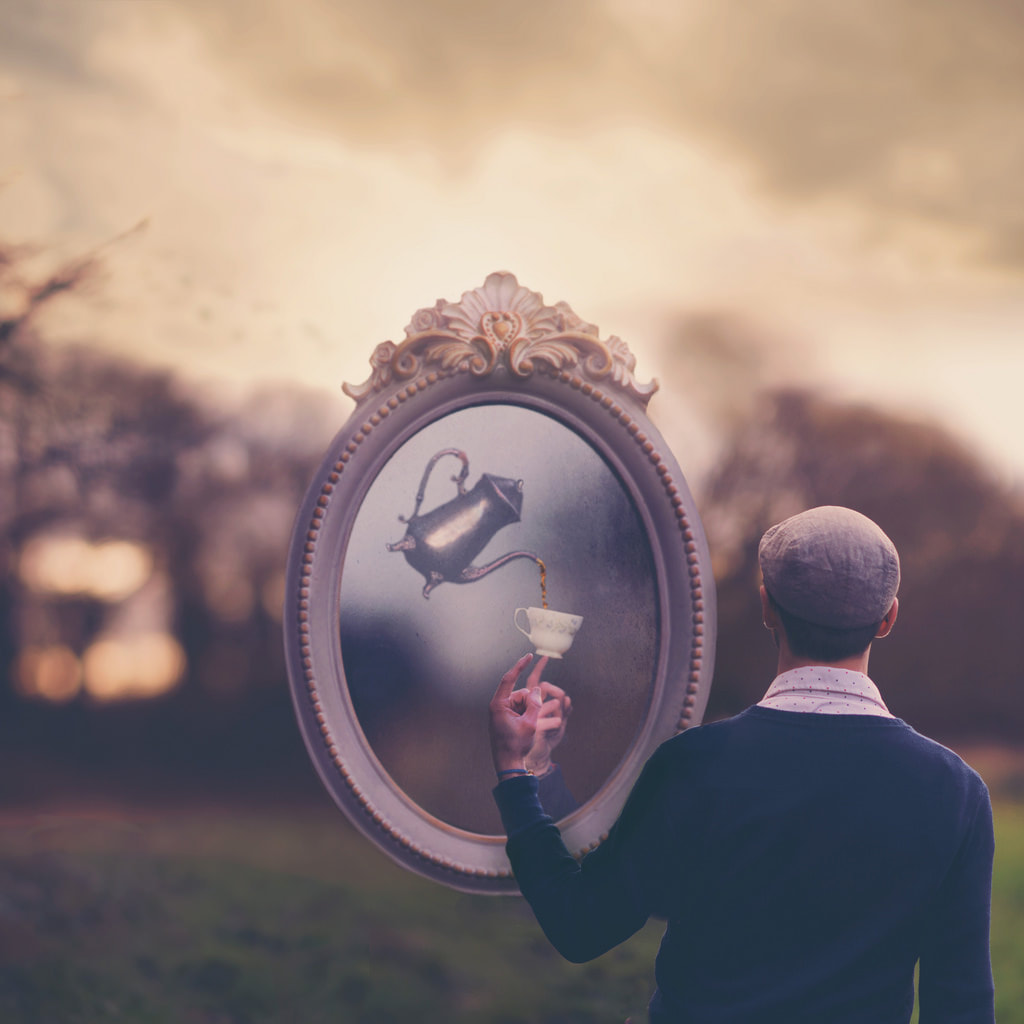
Laura Zalenga
|
Laura Zalenga's work is things such as: human bodies in a unique landscape, human faces, the revelation of unexpected moment or anything that expresses mood she is interested. In all of her photography work the theme of feeling is expressed. Zalenga is also interested in fairy tales.
Born: 1990 in Germany Occupation: photographer |
Examples of her work
Analysis of her work
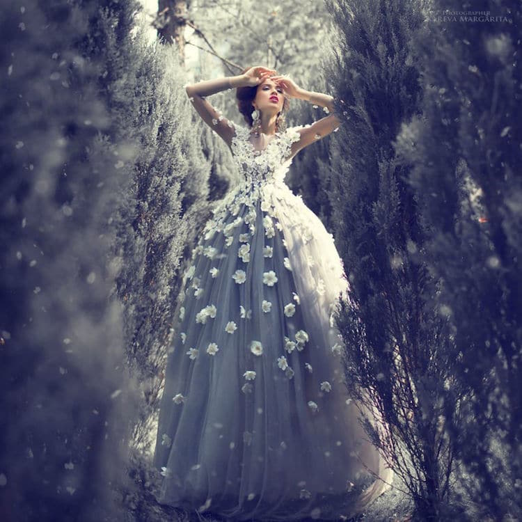
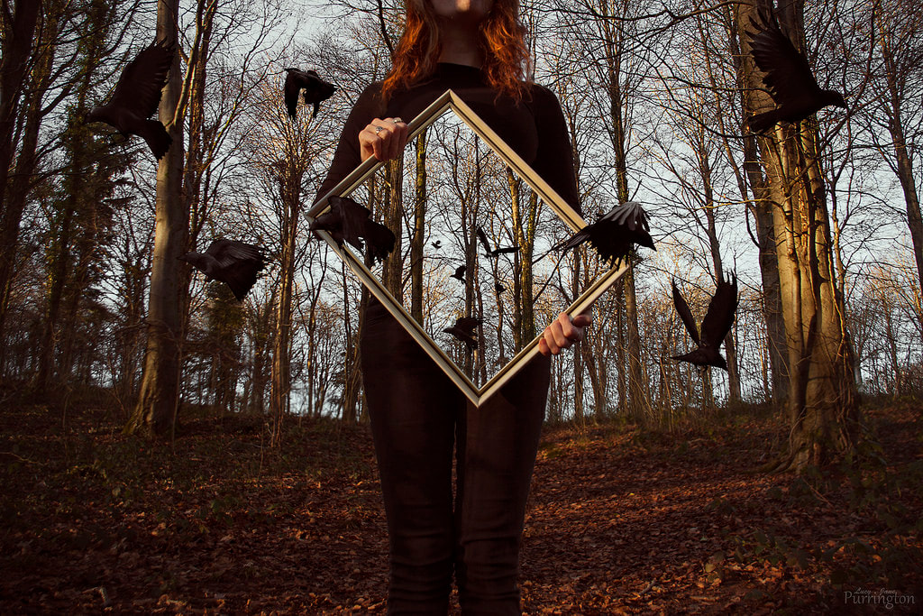
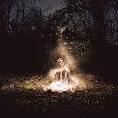
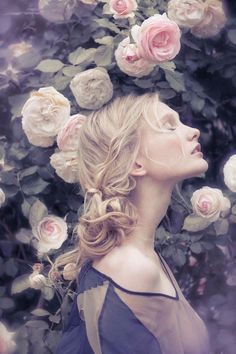
This image shows a theme of fairy tale and feeling is expressed through the model. The feeling portrayed is a feeling of distress and the landscape helps to show this. The image has used a a medium depth of field to get thew environment in as well as the model. Also on the front trees it looks like the blur tool has been used to make the image a little more magical. I like this image because it shows the theme of fairy tale very well and it is a good example of her work.
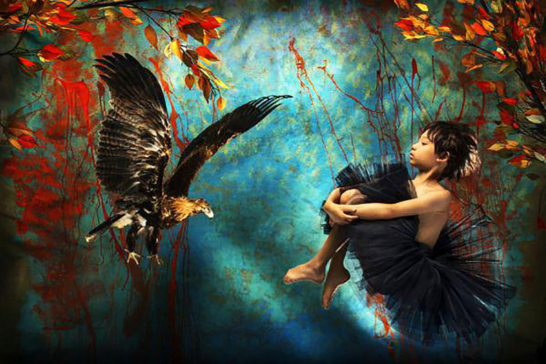
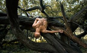
This image also shows a theme of fairy tale and feeling. In addition I like how the little boy is hanging from the tree like a scene from the jungle book. I like how the bird is pasted into the image also i think the choice of background goes with the emotion of the image. I like how some of the background is coloured like autumn colours as it goes with what the photographer is trying to convey.
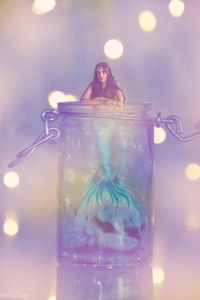
Joel Robinson
|
Robinson's work is motivated by story telling and self expression. He tends to mix reality and fantasy to get thoght thrilling images to show to the world.
Born: 1985 Contry: Canada Lives: England Occupation: photographer |
Examples of his work
Analysing his images
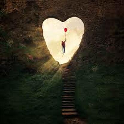
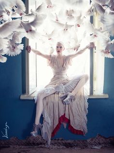
This image portrays the theme of fairy tales and magic. I like how the heart is cut through ther hedge i feel this gives the image more detail and helps with the theme of fairy tales. I like the idea behind this image and I think the heart gives the image a sense of love. Also I like the sense of flying on a balloon as it makes the image like a dream.
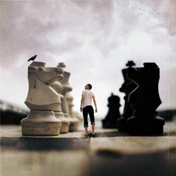
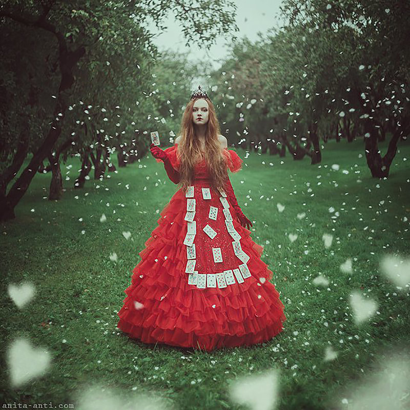
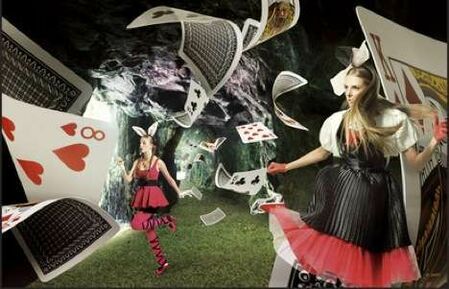
This image is like its from a scene of Alice and Wonderland which makes the theme fairy tale. I like the use of the chess board and making the chess pieces look bigger than the model as it creates the theme of weird but wonderful. In addition I like how some of the chess bored has been blurred which gives the image a better affect and makes it look realistic.
Practice Edits
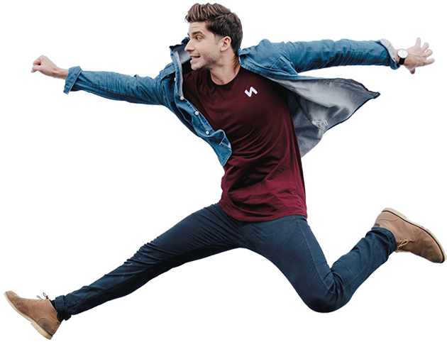
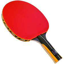
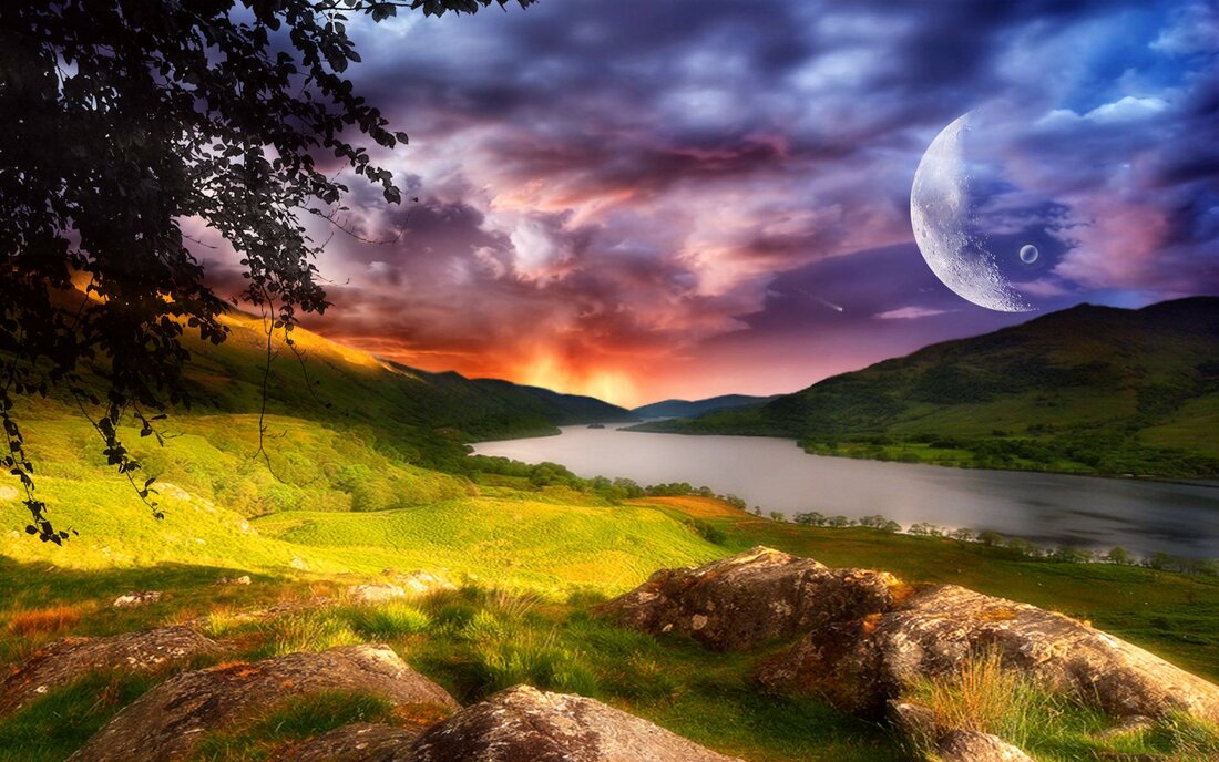
To complete my practice edits I started by choosing three images off the internet. One of a background, one of a person jumping and one of a ping pong bat. I chose these three images because I think it will look natural but obviously it would never happen. Then I opened my images on photo plus and started with the edit. First I used the magic wand tool to select my person then I copied and pasted the person on to the background. Next I used the magic wand tool to select the ping pong bat and pasted that on the background. Then I had a play around with moving both of my selected images and came up with my final image.
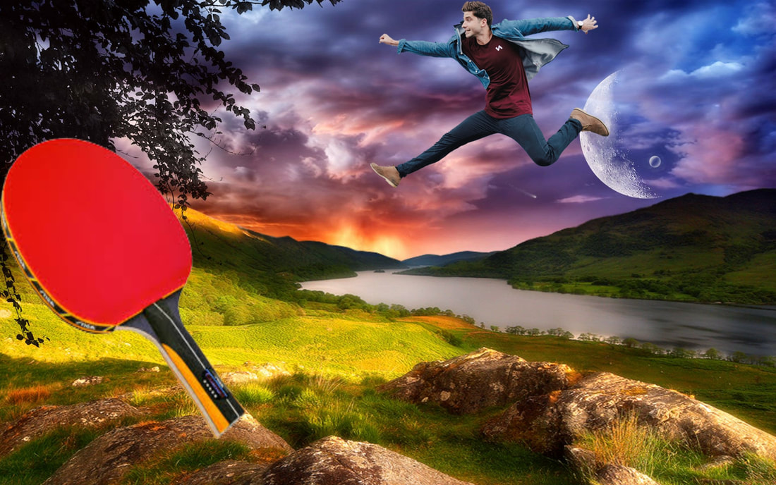
I like how I have had the moon on the background because it has made my image look like the moon is playing ping pond with a person. The opponent of this game is the rock hence the ping pong bat on the rocks I also like the colours of the background as the blend with the person but not as much as the ping pong bat.
Practice Edit 2
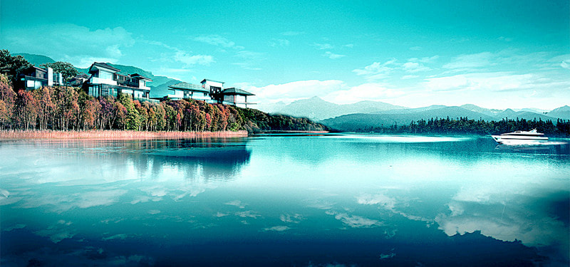
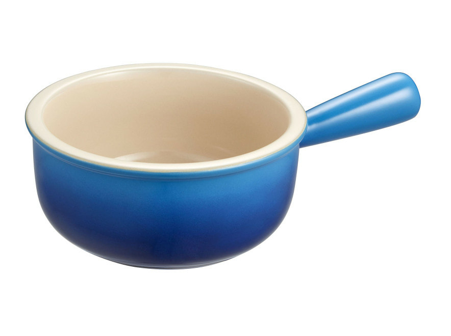
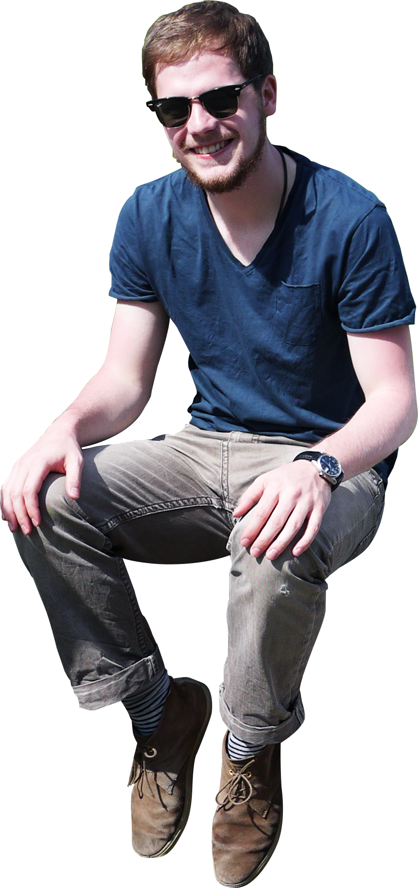
For this edit I decided to experiment with a different theme of holiday. The images I chose was of a pan, a person sitting and a tropical background to show my theme. In this edit I did the same as I did for my first shoot but I had to deform some of my images because they were to big for my idea.
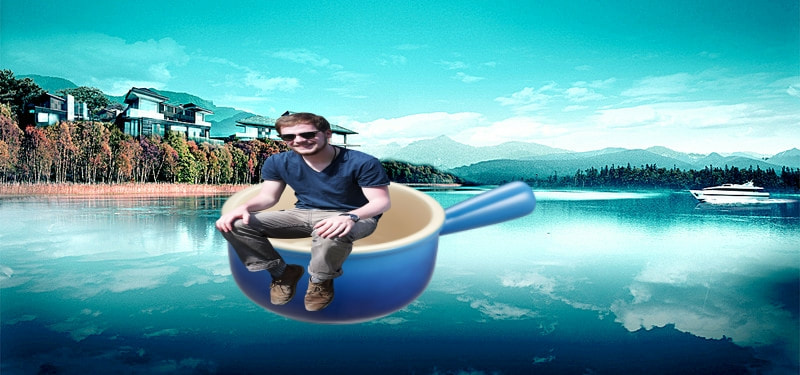
I like how the colour of the pan is the same colour as the sea as it blends and looks natural. Also I like how the person has sunglasses on as if he is on holiday which brings the theme out very well. However I don't think this is as good as my first edit because the pan is lifted off the water if this was my actual shoot I would need to place the pan on the water.
Practice edit 3

Choosing my theme
I have been given 5 themes to choose out of for this project which are:
- Magic
- Fairy Tale
- Dreams and Nightmares
- Superhero Powers
- Surreal
First Shoot
Plan
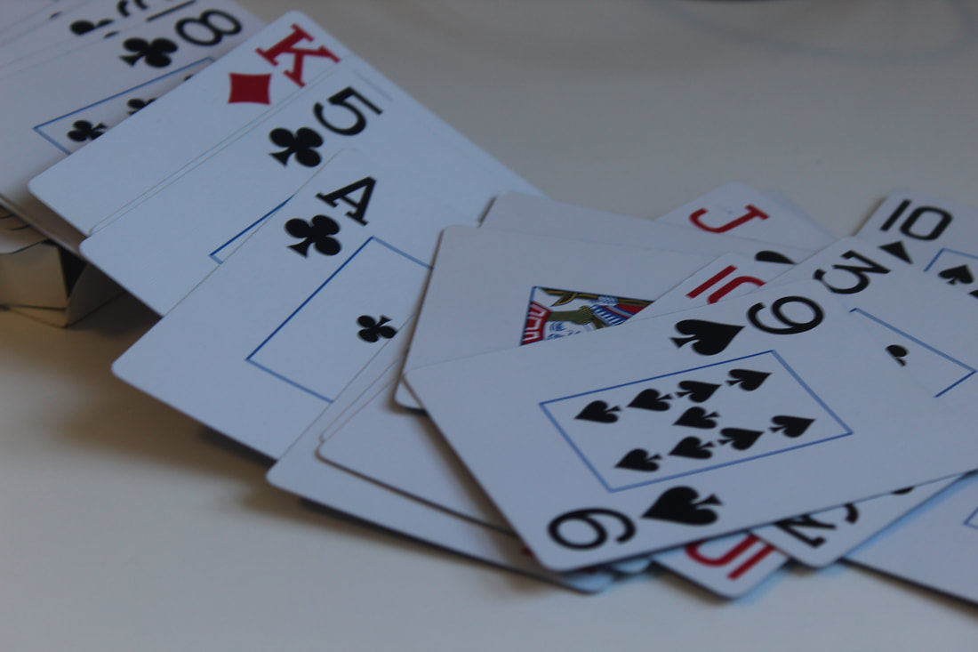
For this shoot I am thinking of getting a pack of playing cards and using a model to act as if they are trapped in the card. Then I am going to place the card on a checkered floor so it looks like a seen from Alice and wonderland. I will start by taking a picture of my model with their hands up and a close up to their face as if they are stuck in the actual card. Next I will take a close up of a card so you can get the face in the card. Then I am going to take a image of something that is checkered on the floor. I might decide for my model to throw the playing cards around them so it looks all upside down like Alice and wonderland is meant to be. This shoot will be mostly done at home the only think I will do in school is the images of my model and the facial expressions I need. Also I will do all the editing in school so I can take my time with it and create the image I want for my first shoot on this topic.
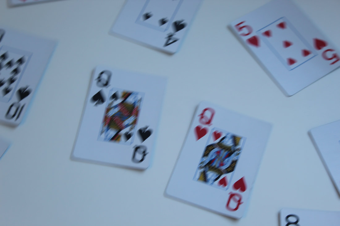
I got my ideas from a lot of different images and combined them with my own plans so that they match my theme the images are:
I got my ideas from a lot of different images and combined them with my own plans so that they match my theme the images are:
|
|
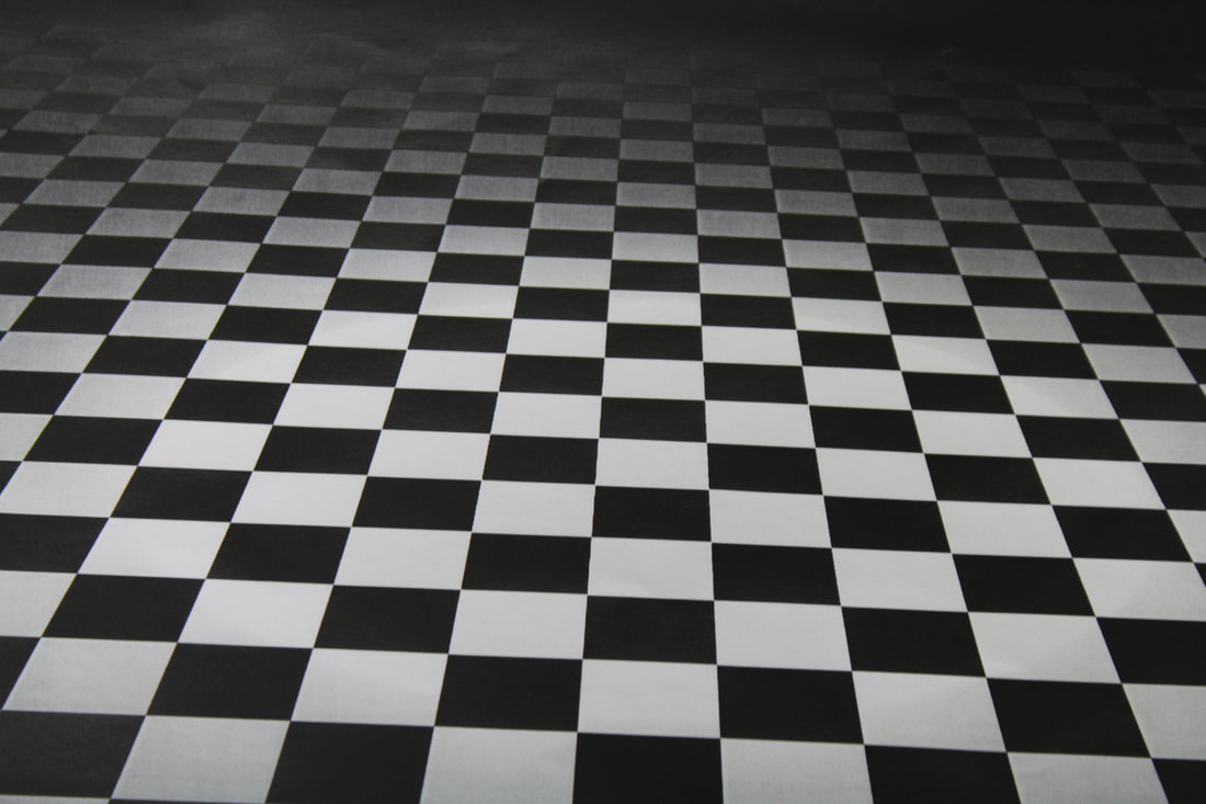
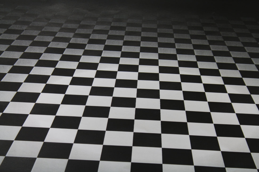
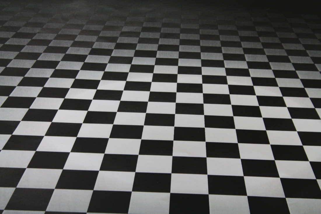
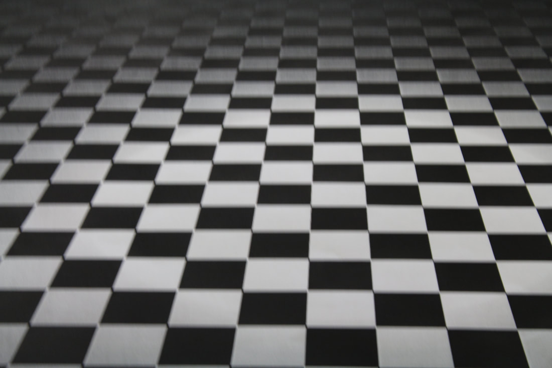
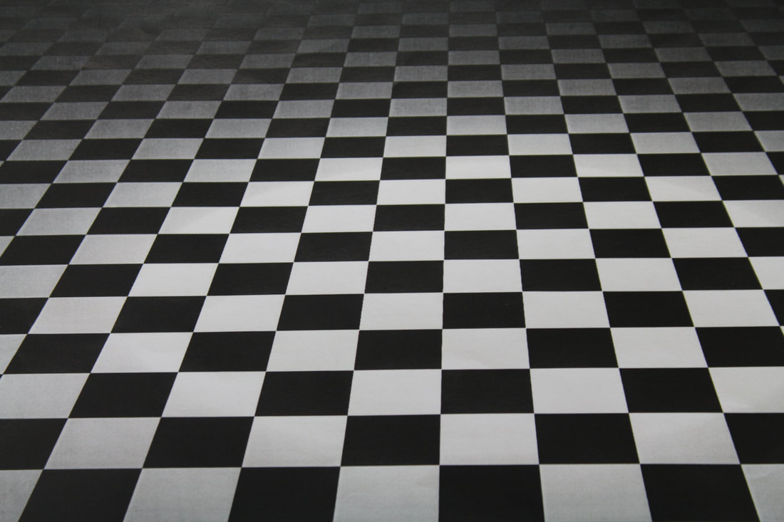
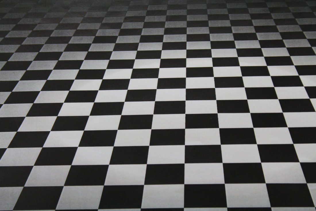
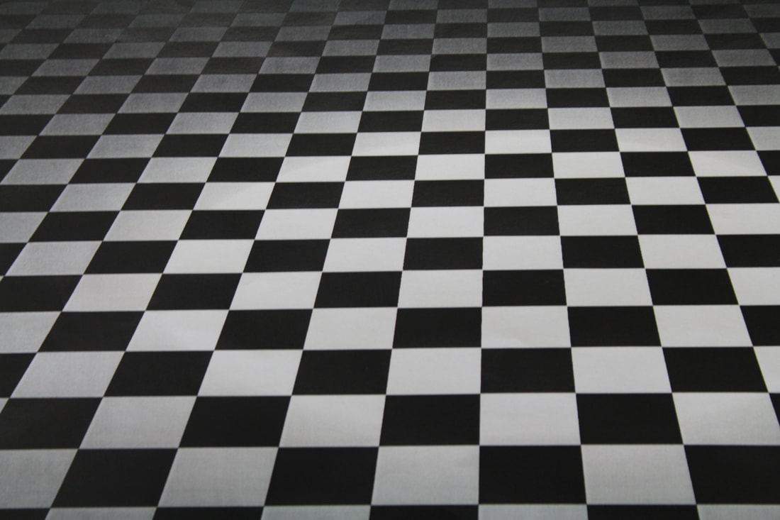
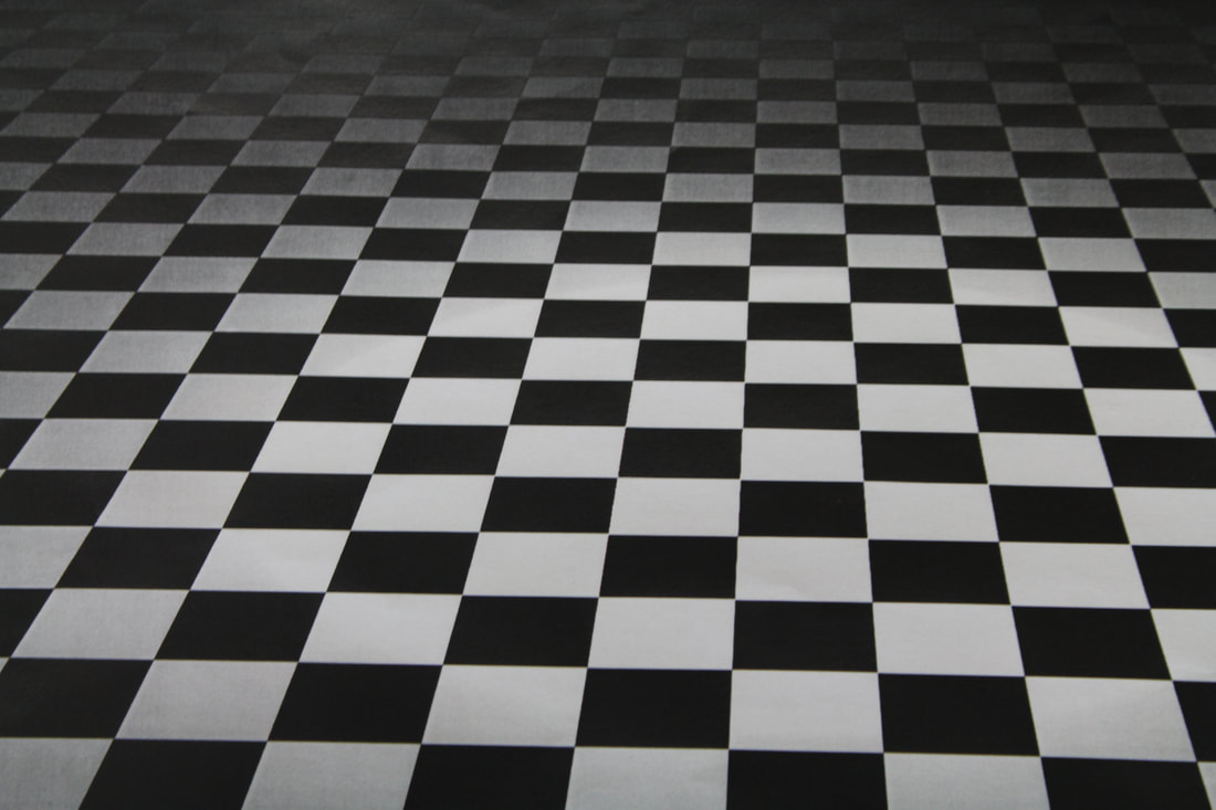
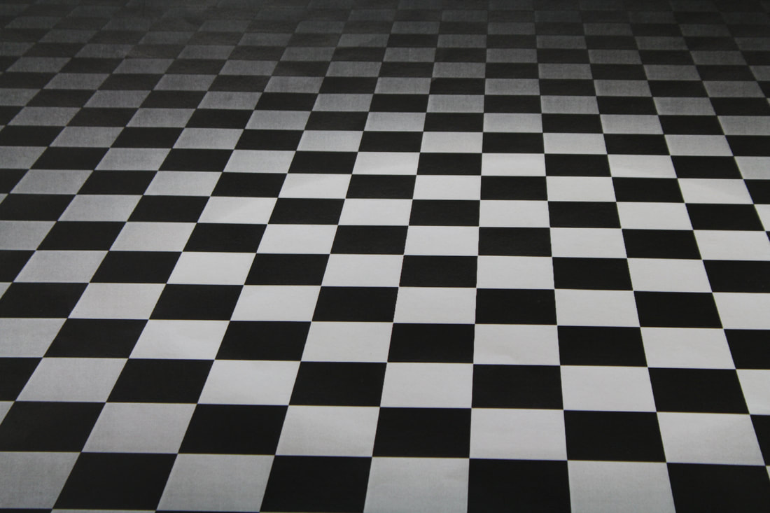
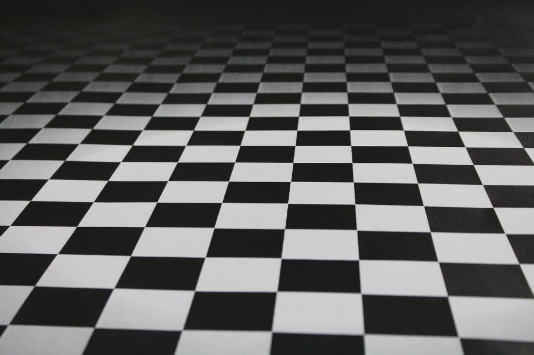
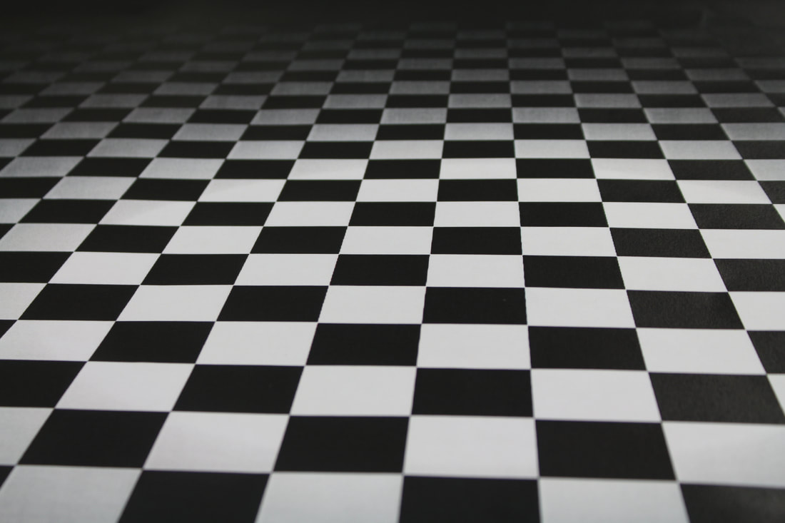
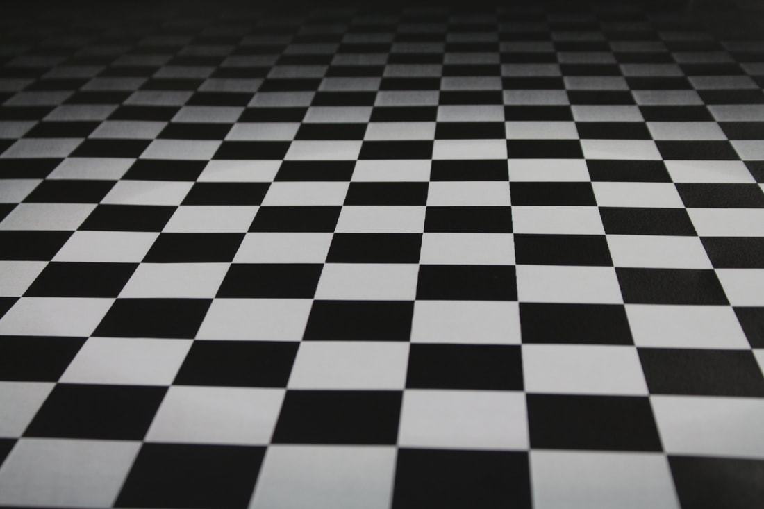
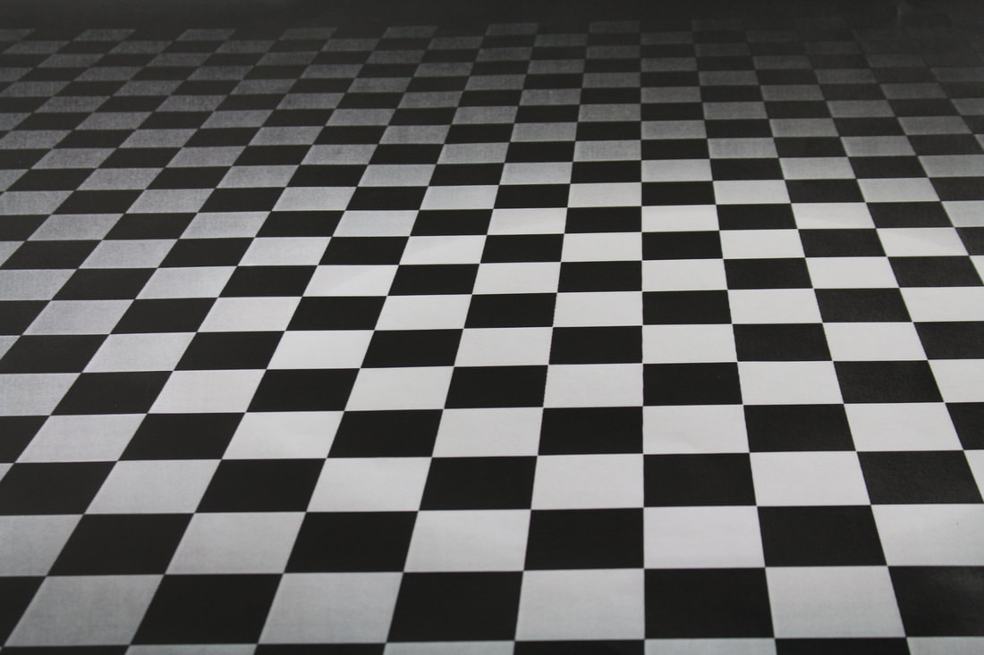
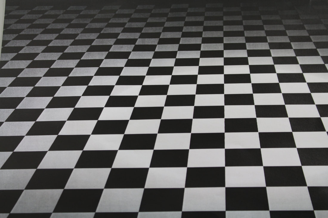
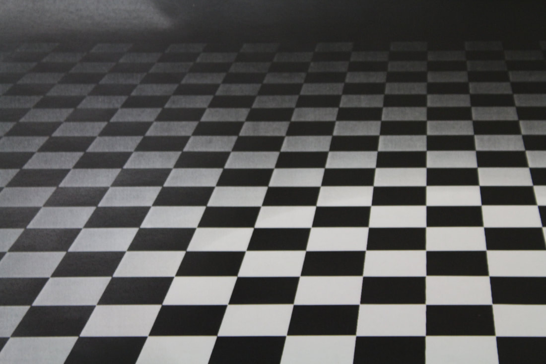
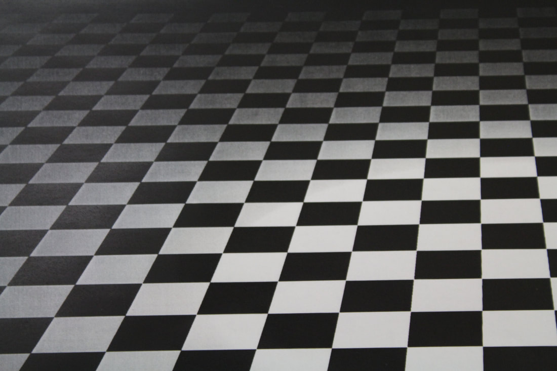
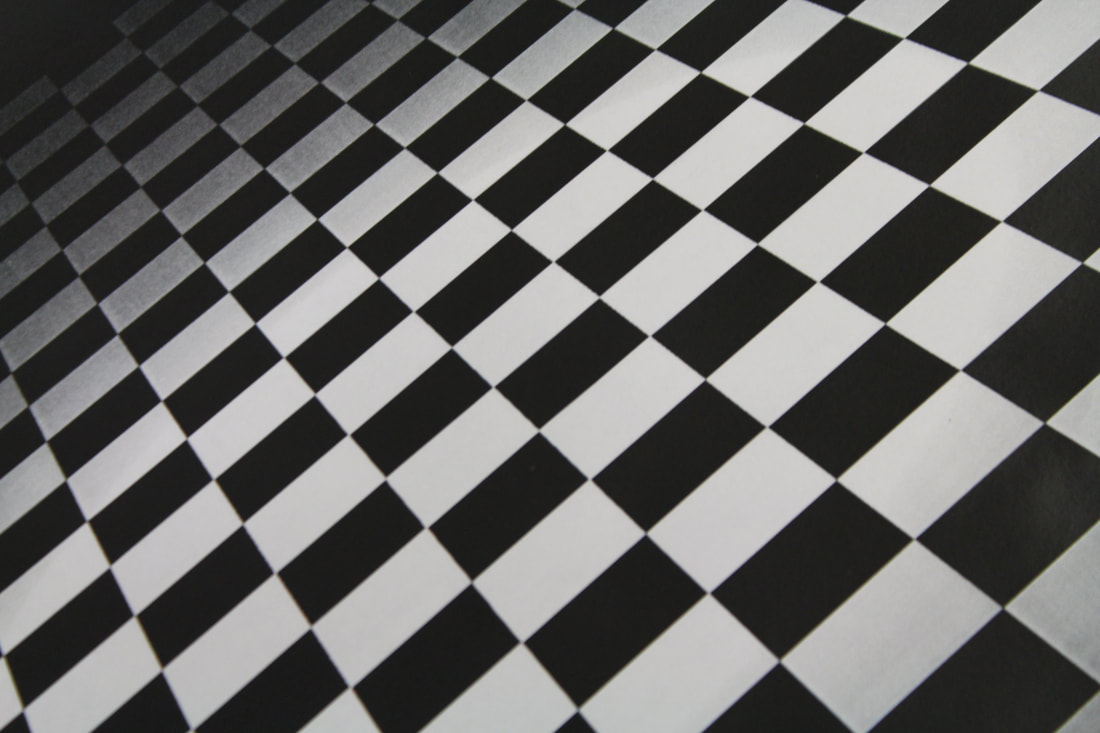
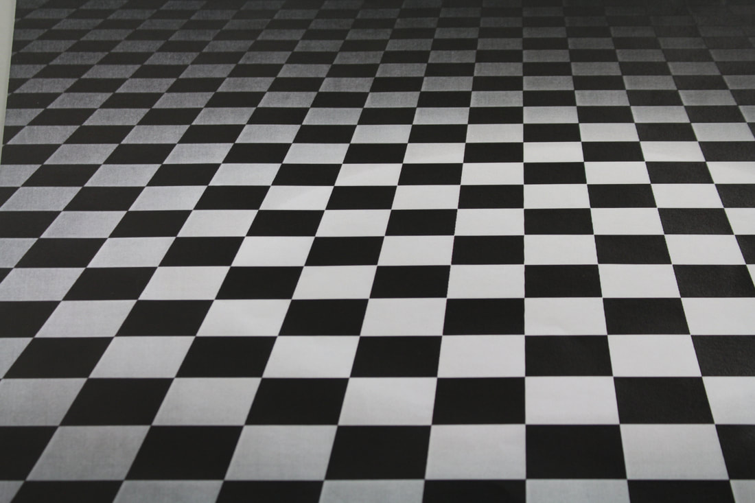
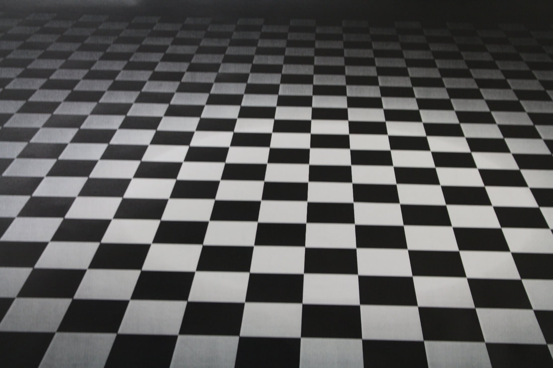
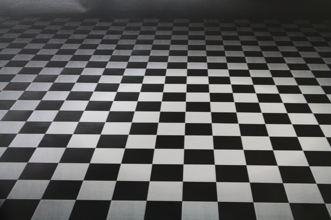
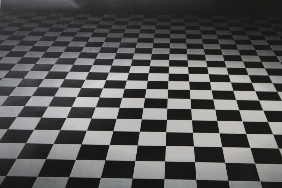
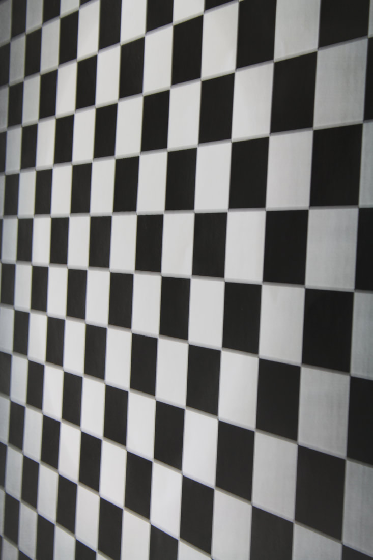
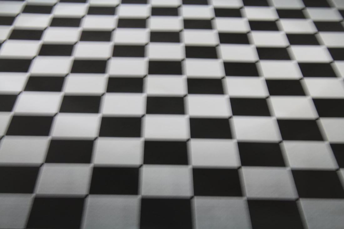
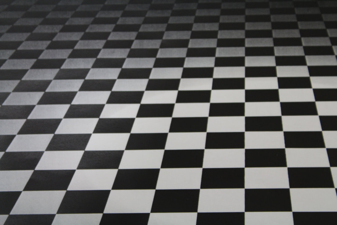
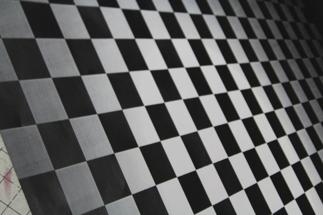
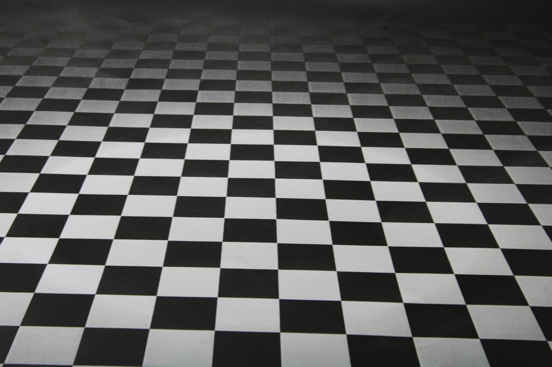
Checkered Images


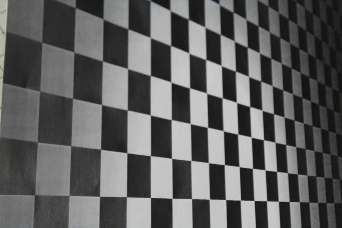


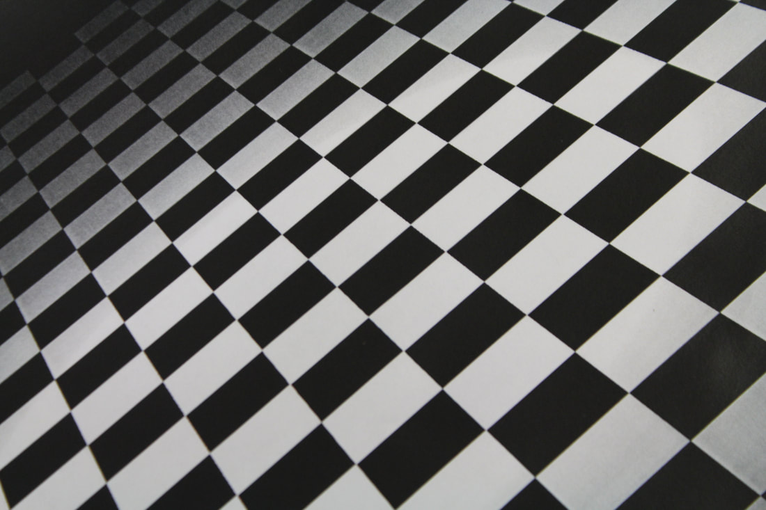


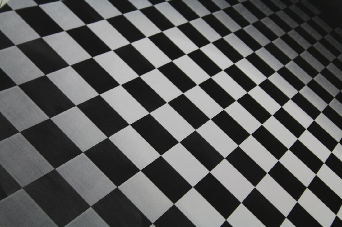
Worst Image

|
This is my worst image because it is on the side and it won't go with my final image. Another problem is you can see bits that aren't meant to be in the image. Also i don't think the card will look good on it as the angle i had the camera wasn't very good. However I like the exposure and focus of this image but I think the depth of field is a little to small for this shoot.
|
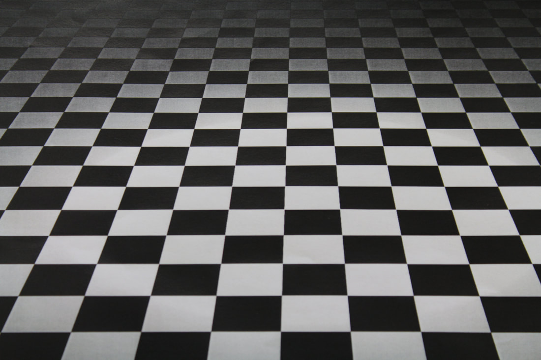
Best Image
|
This is the best image for my shoot as the angle looks good and will be easy to place the card onto. In addition the exposure and depth of field are how I want them to be. I also think the focus is in the right place so it looks realistic and not like an image. I like the size of the squares as I didn't want them to be too big or too small.
|
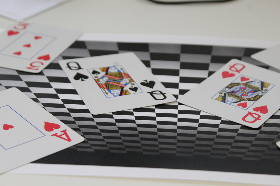
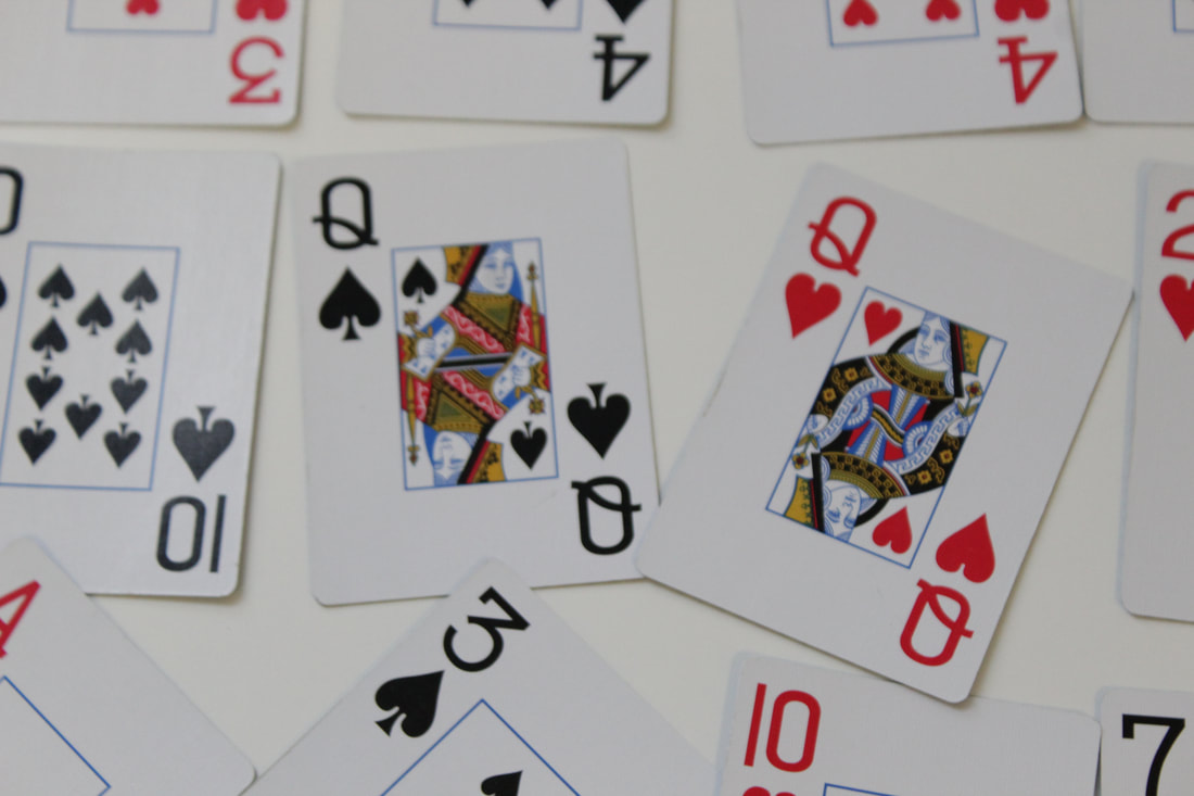
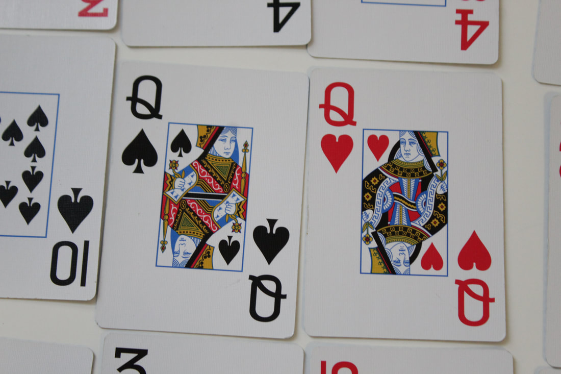
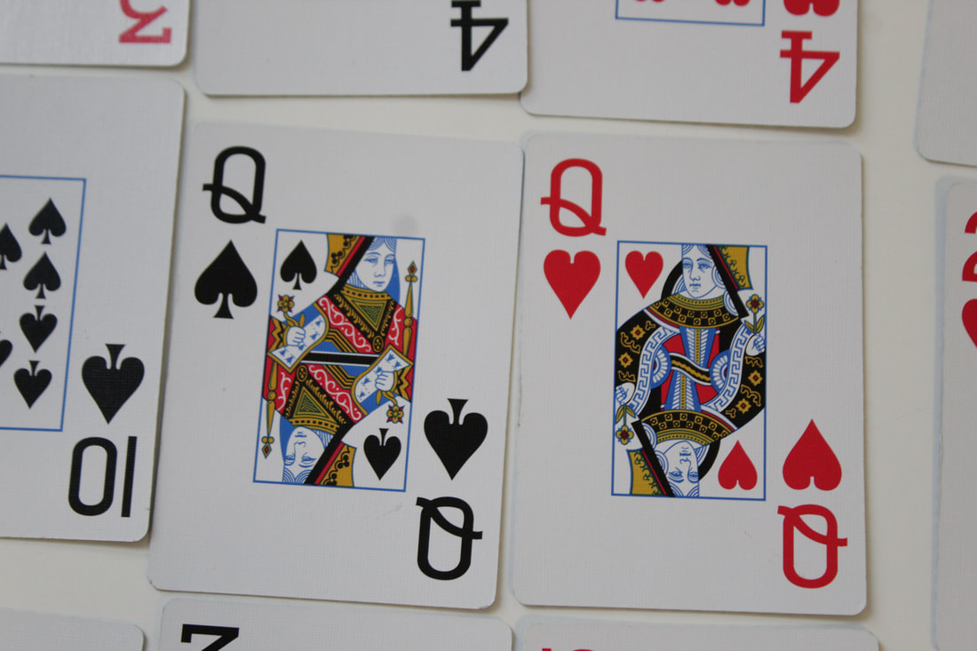
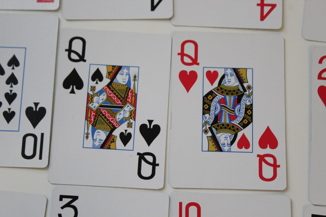
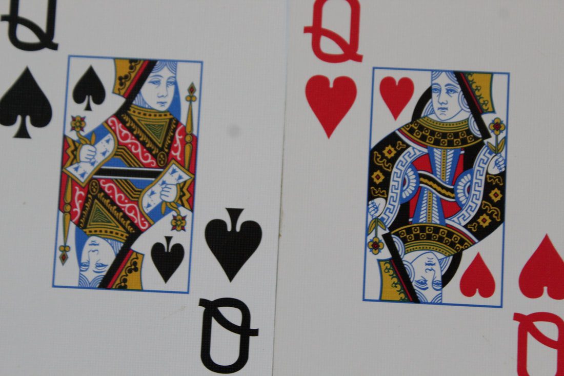
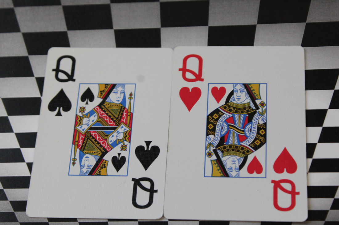
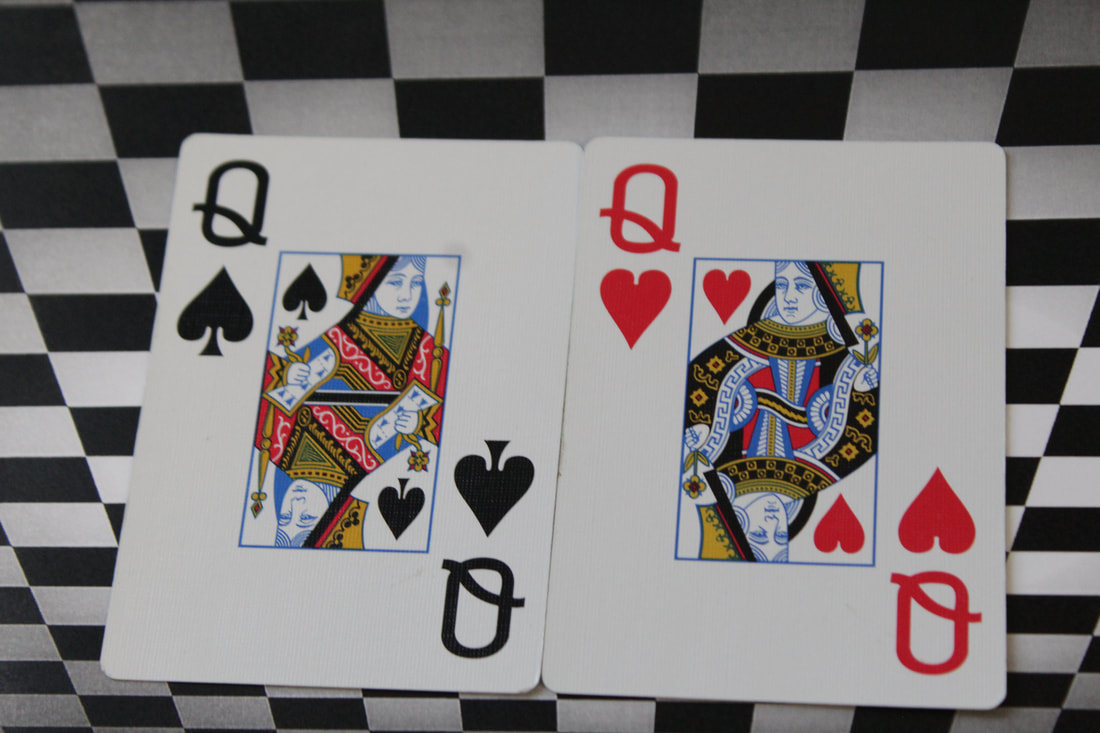
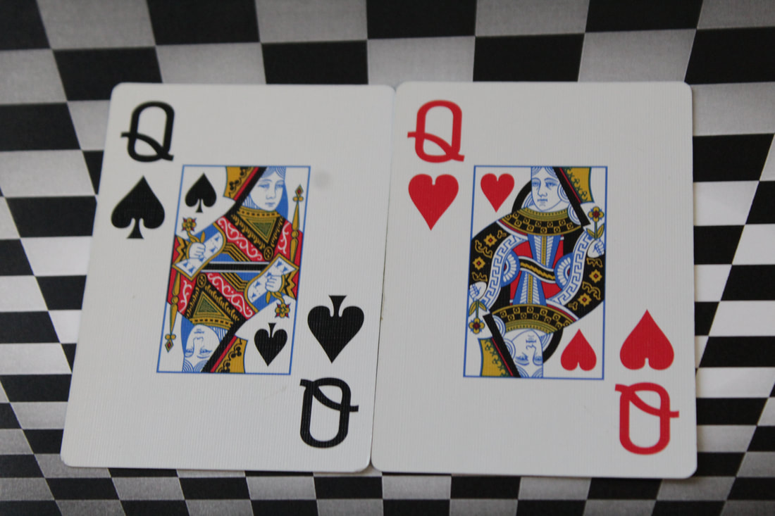
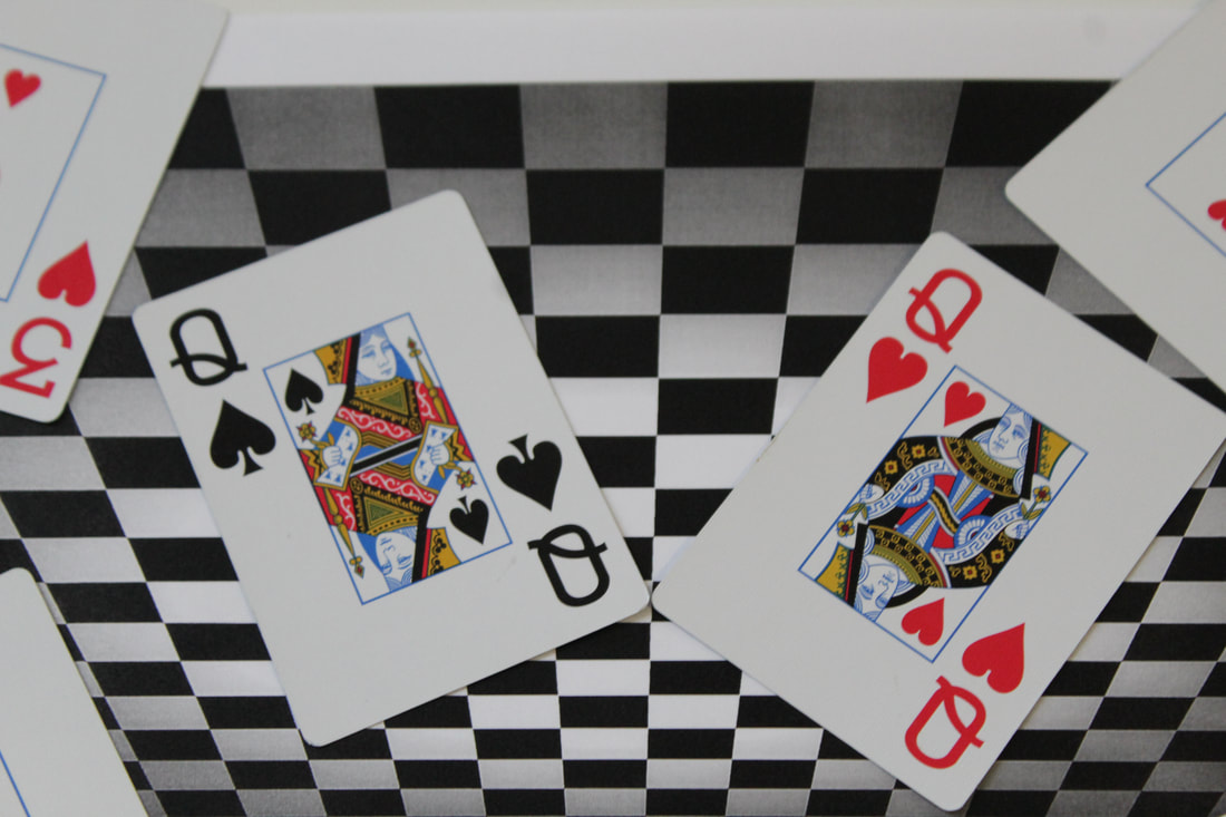
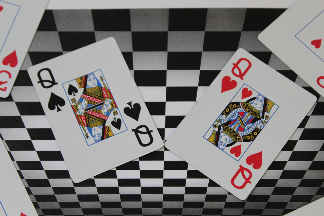
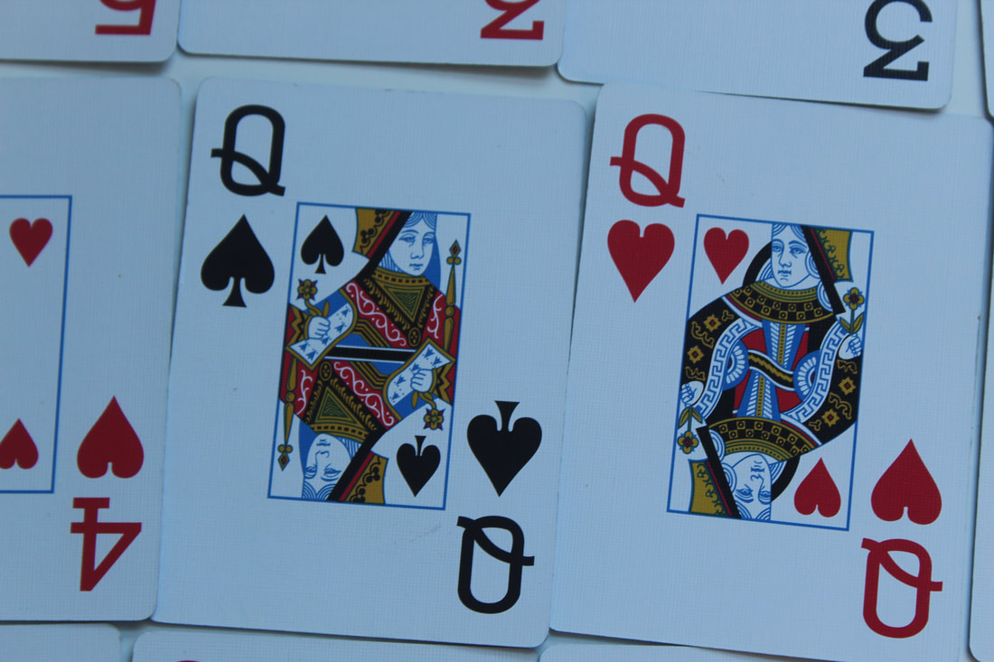
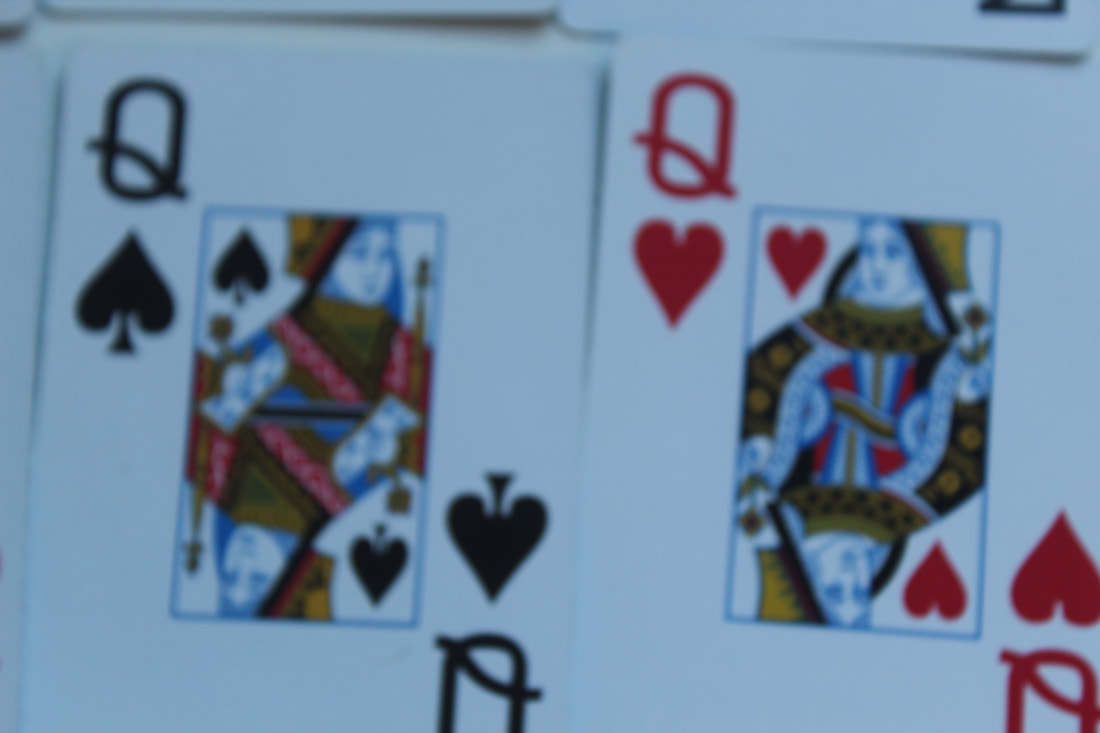
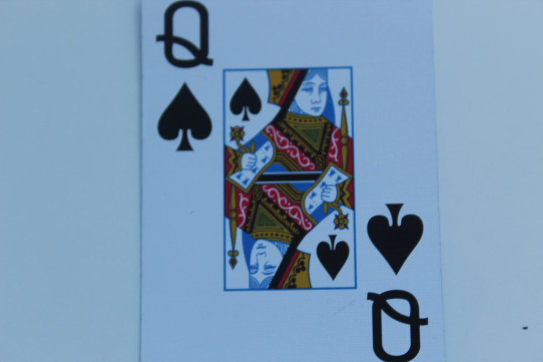
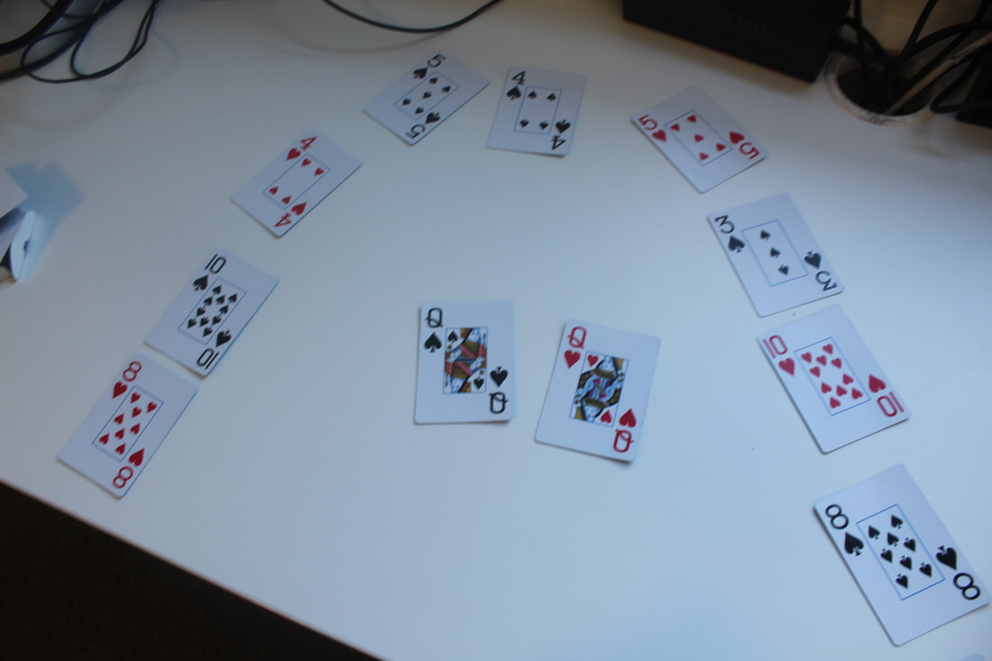
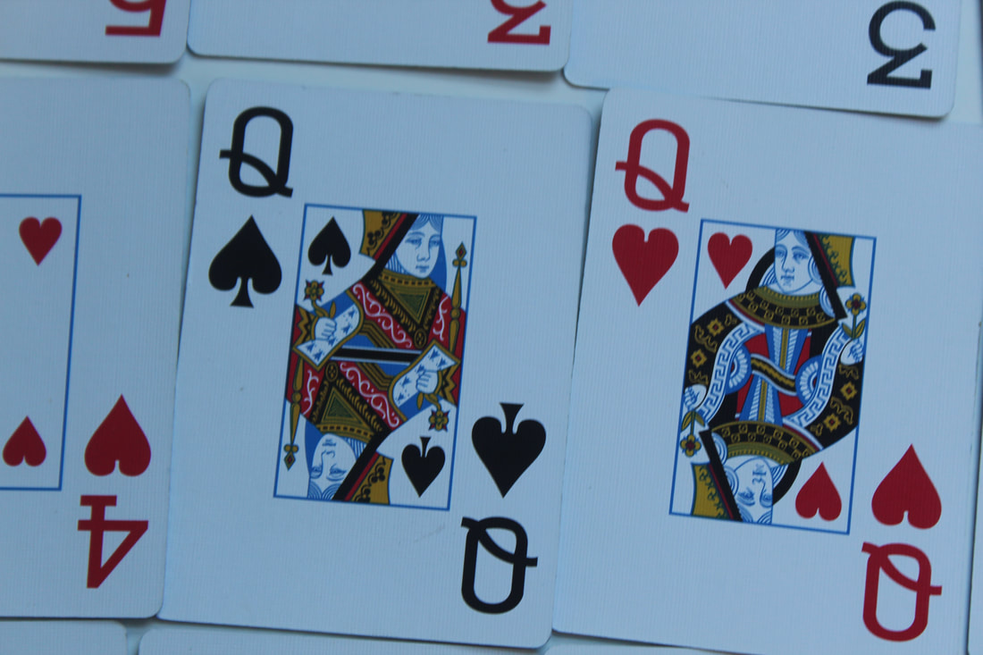
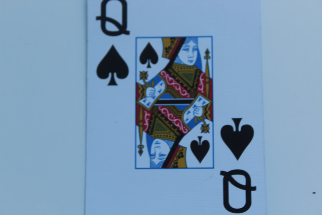
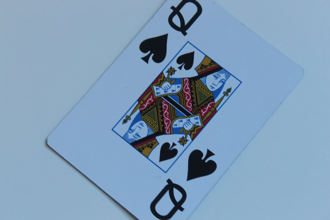
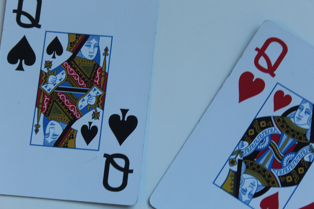
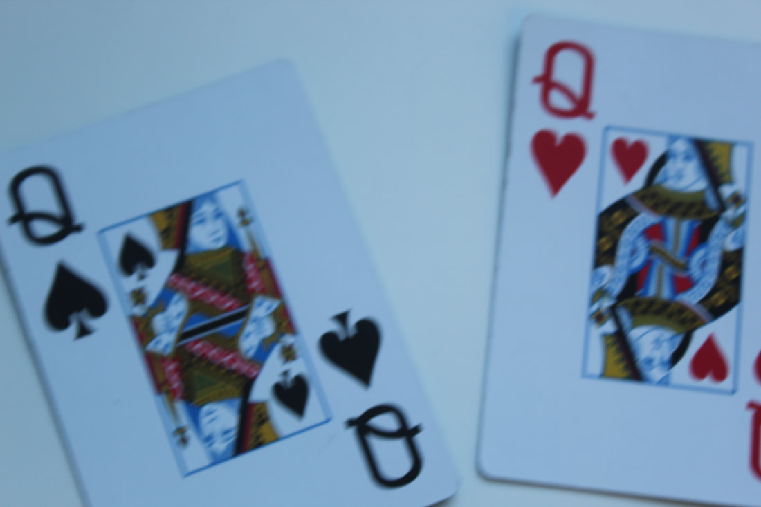
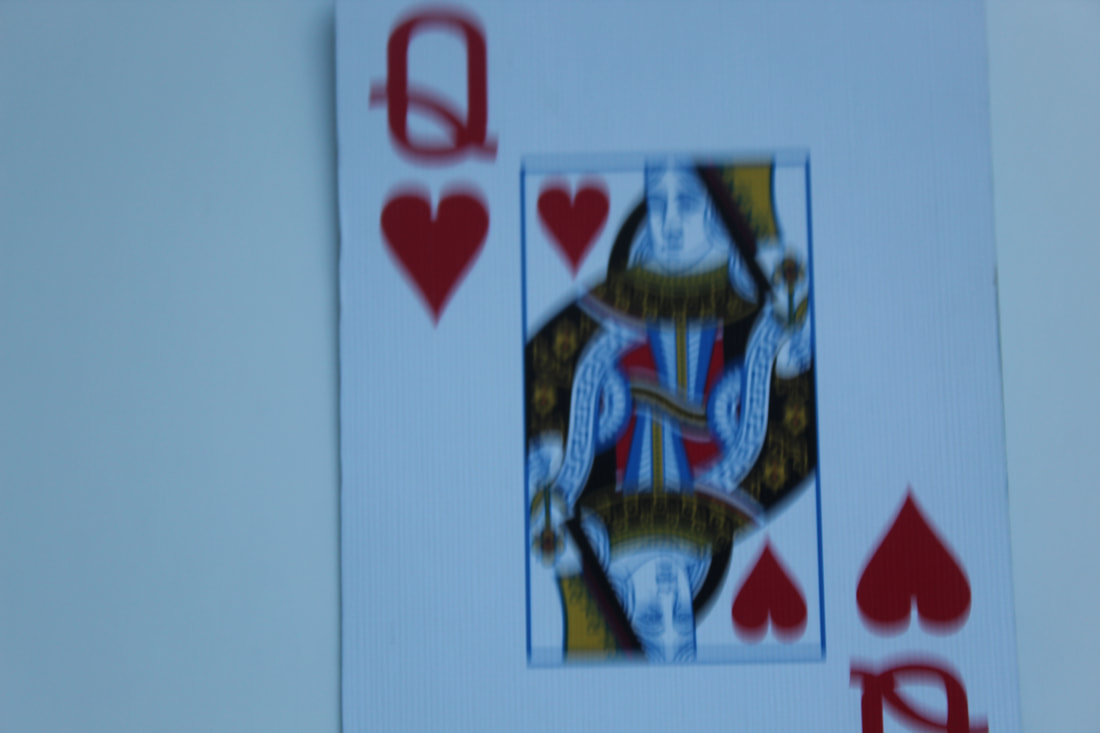
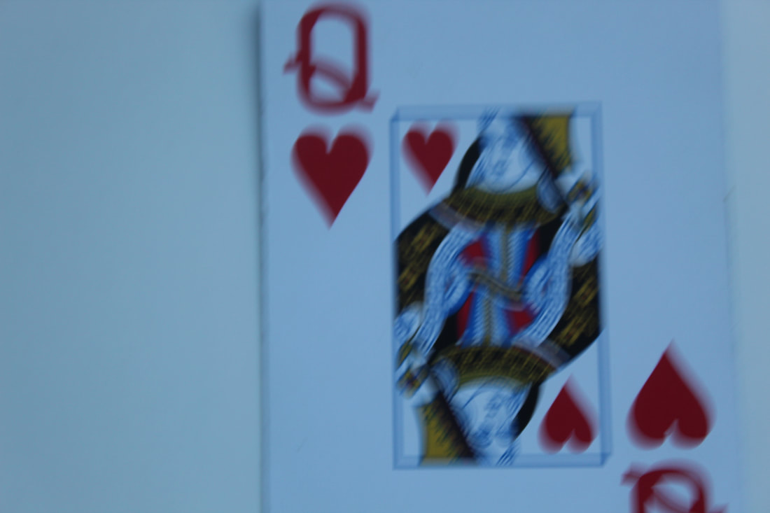
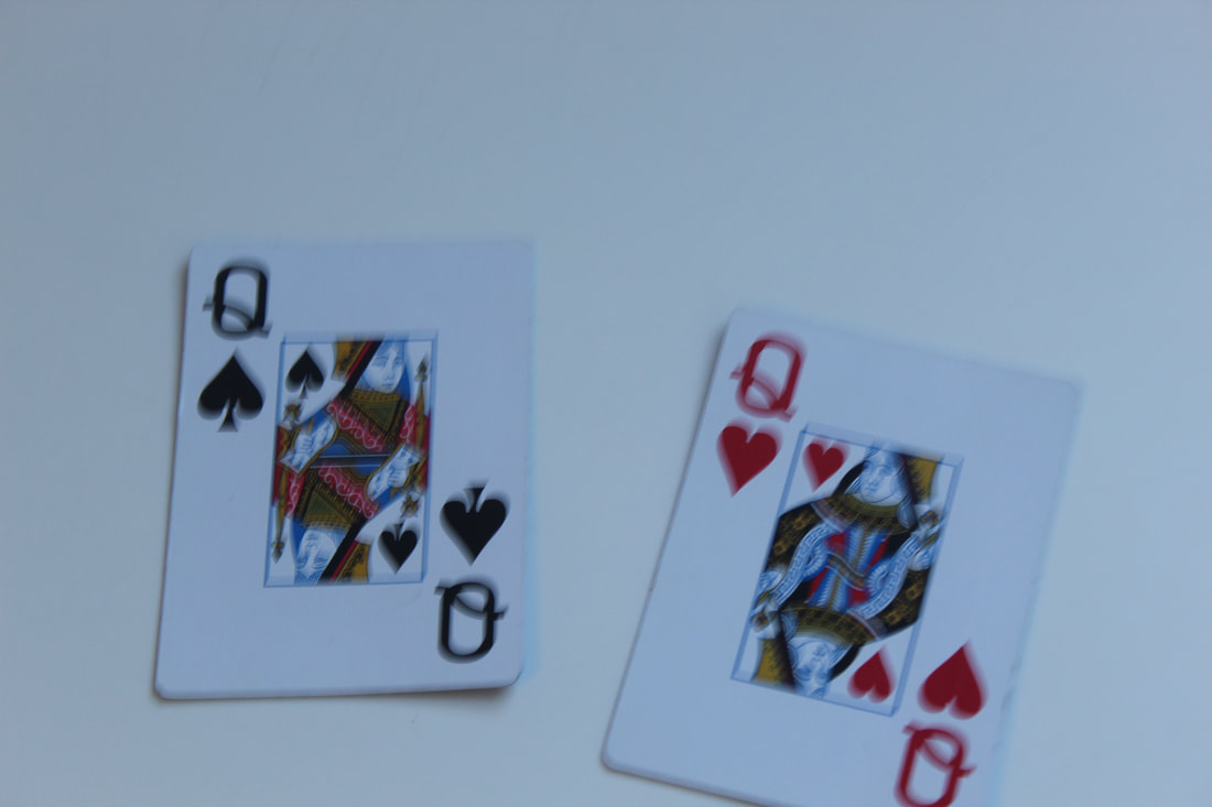
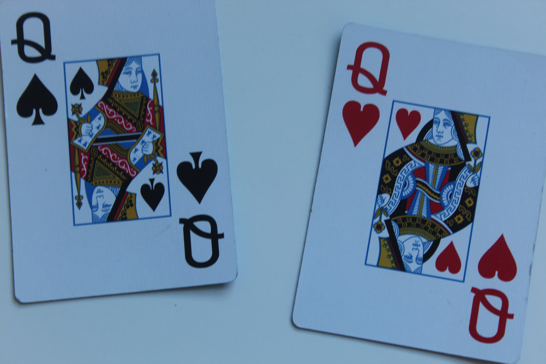
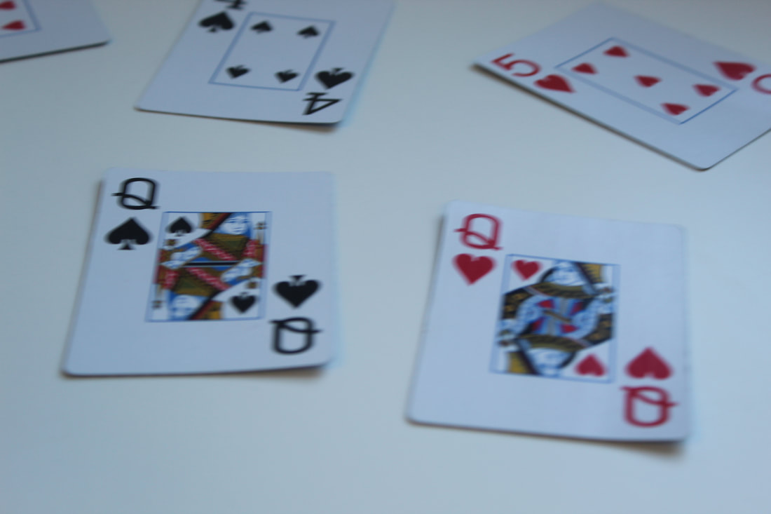
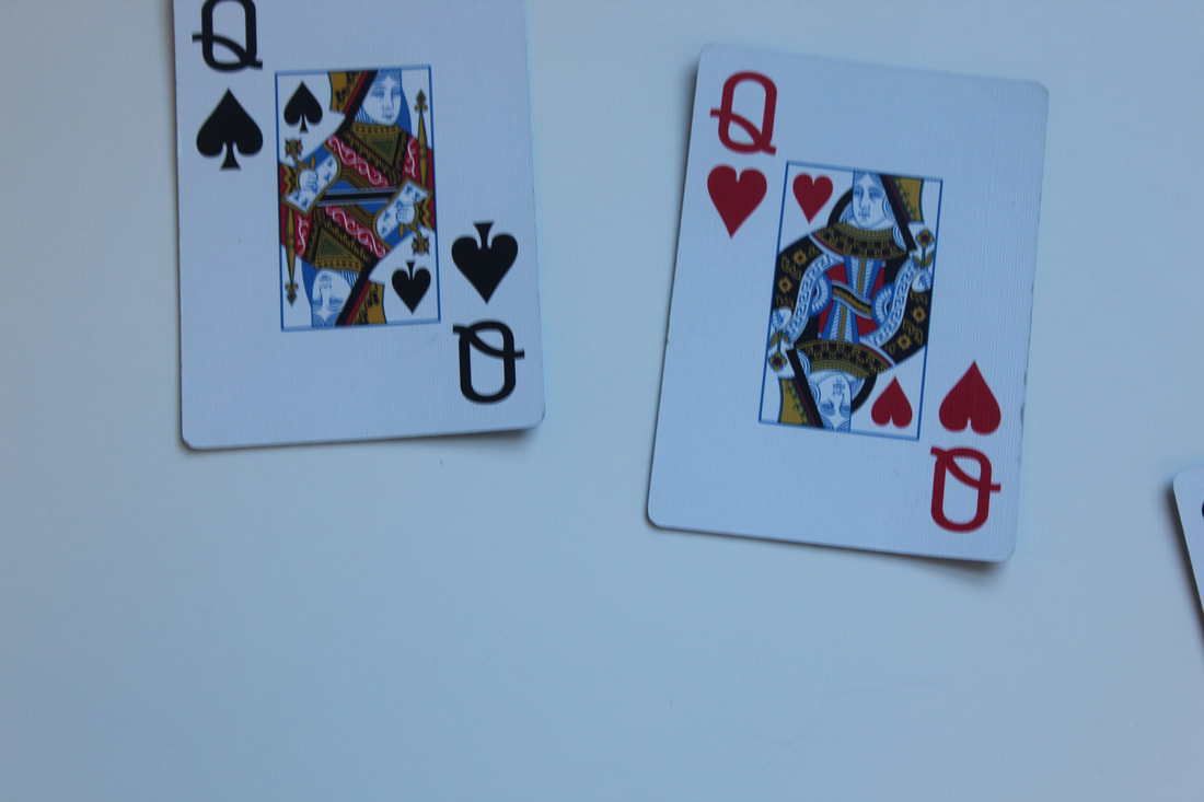
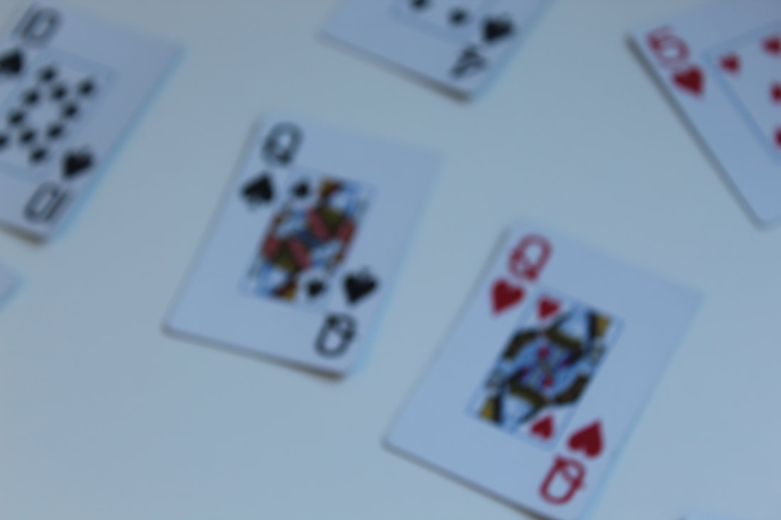
Card Images

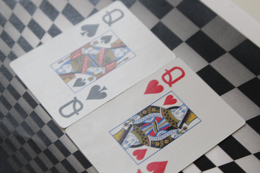


Worst Image

|
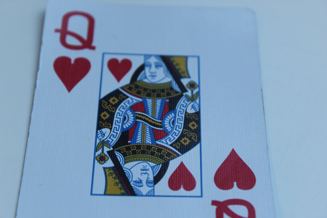
This is my worst image for the cards set because you can tell that the checkered board is a printed out image and the layout of the cards aren't how I want them. For this I used a large depth of field but I think it will look better with a medium depth of field. In addition the focus point isn't on the cards which is not how I want it as it won't look the way I imagined on the edit.
|
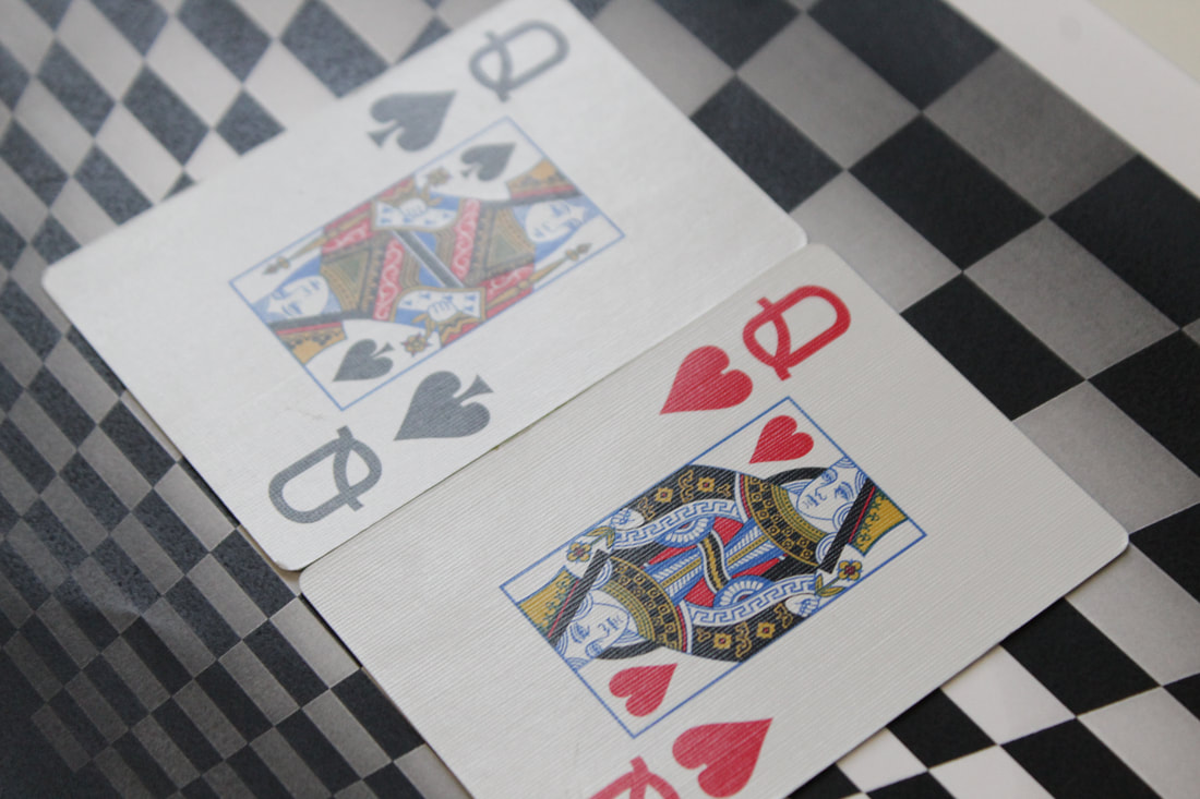
Best Image

|
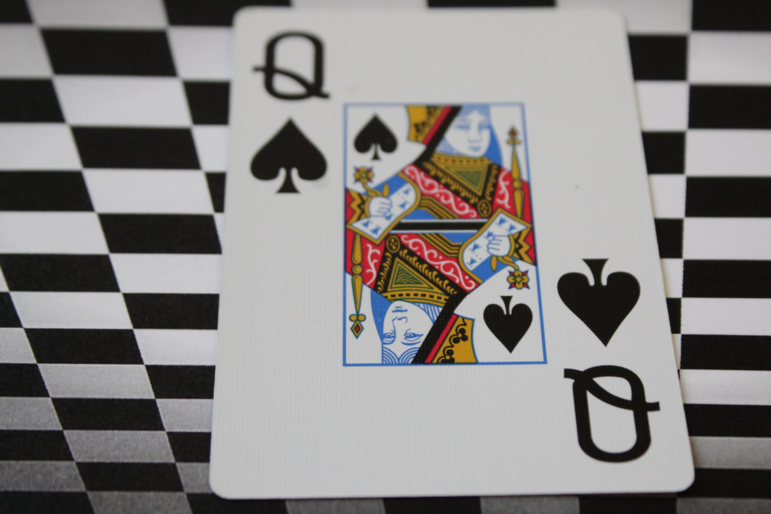
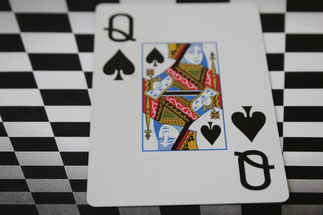
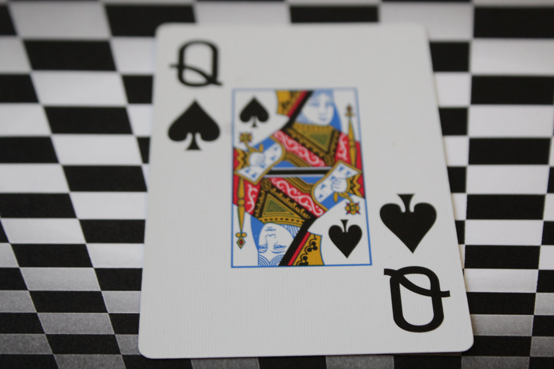
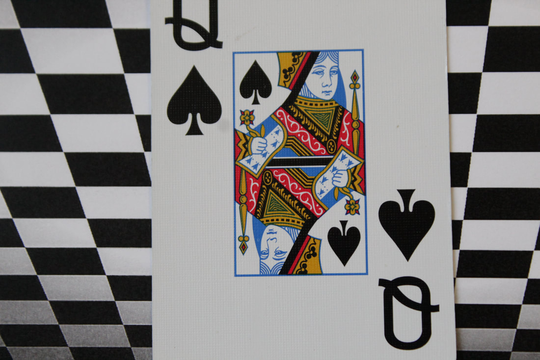
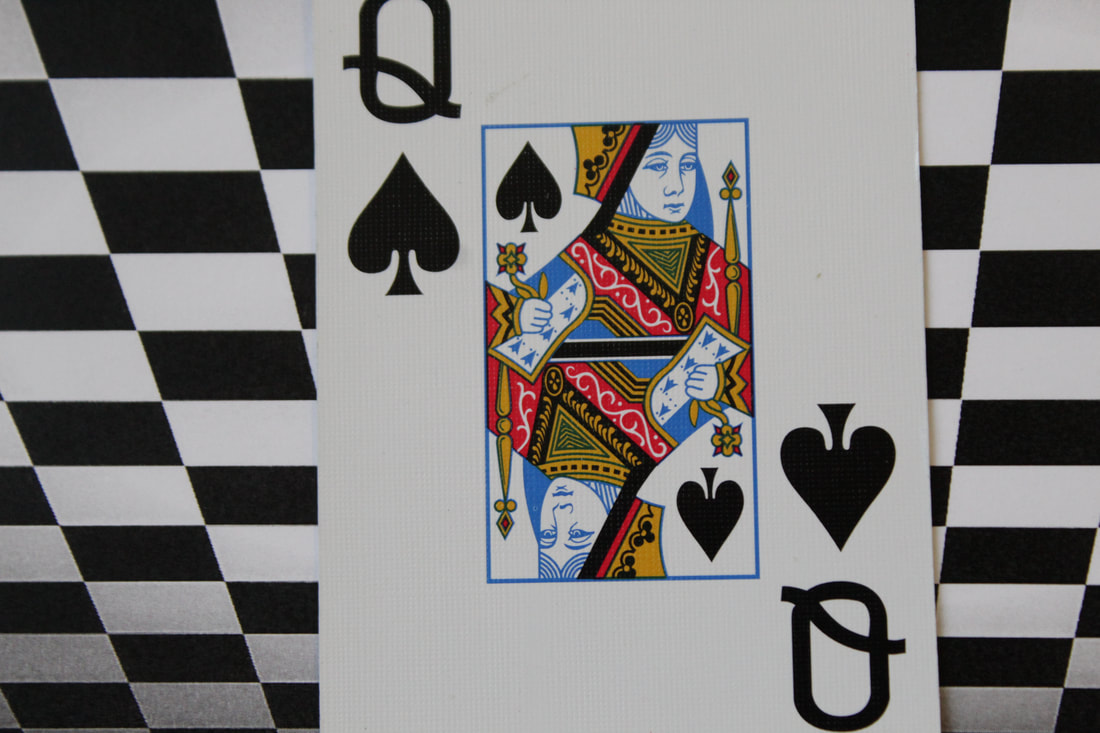
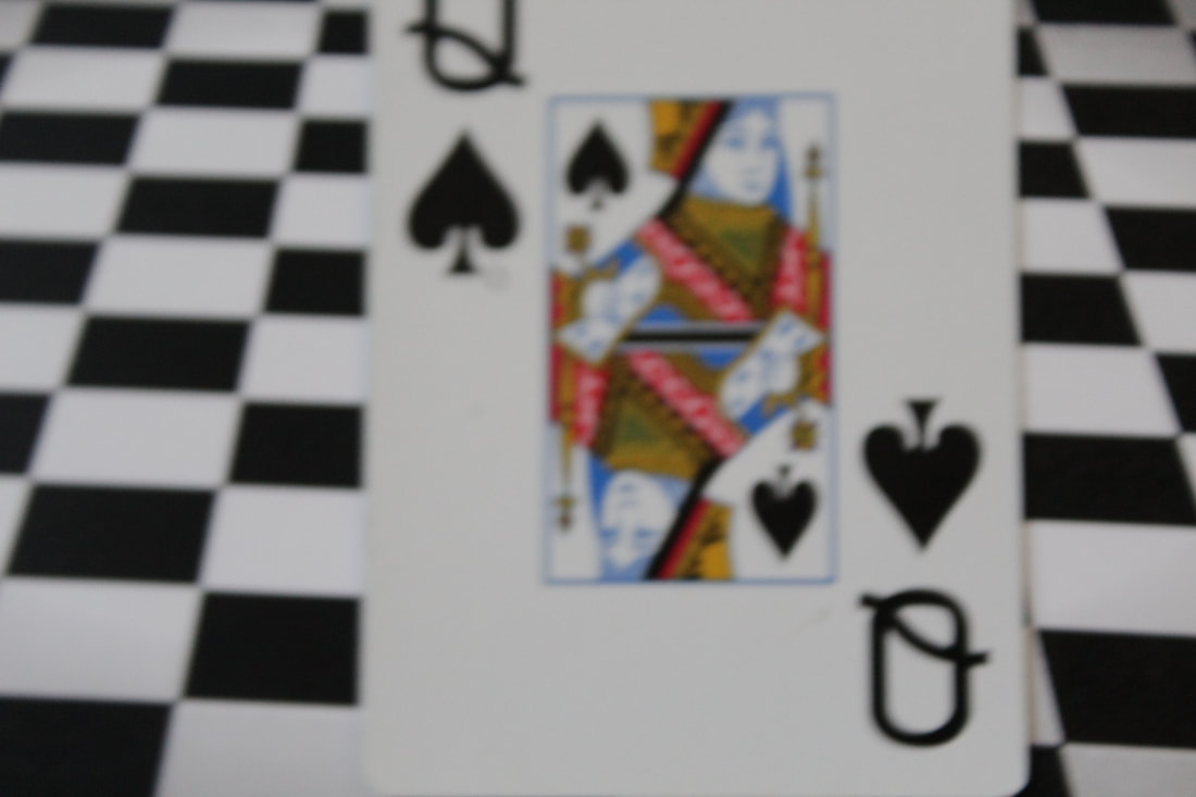
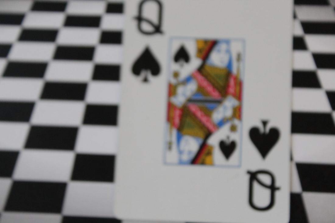
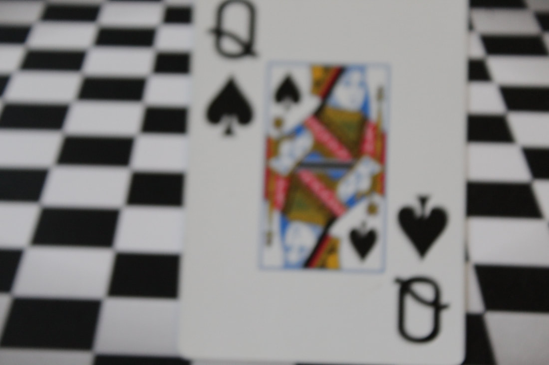
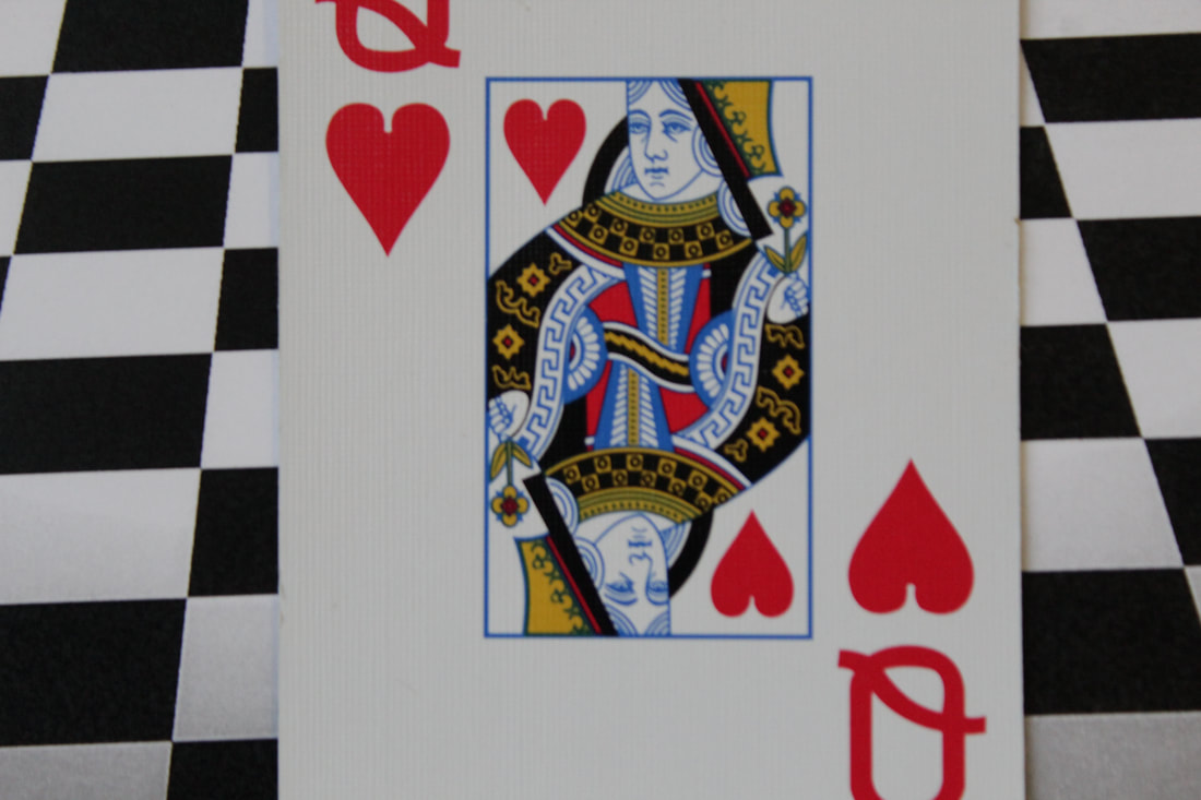
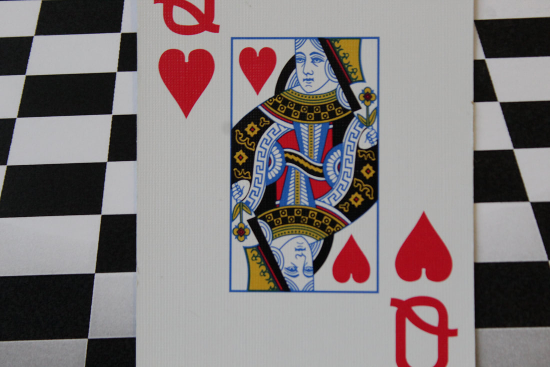
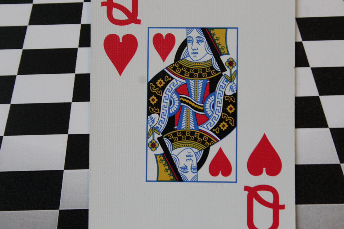
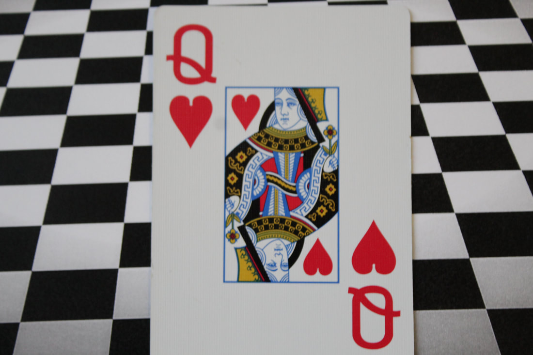
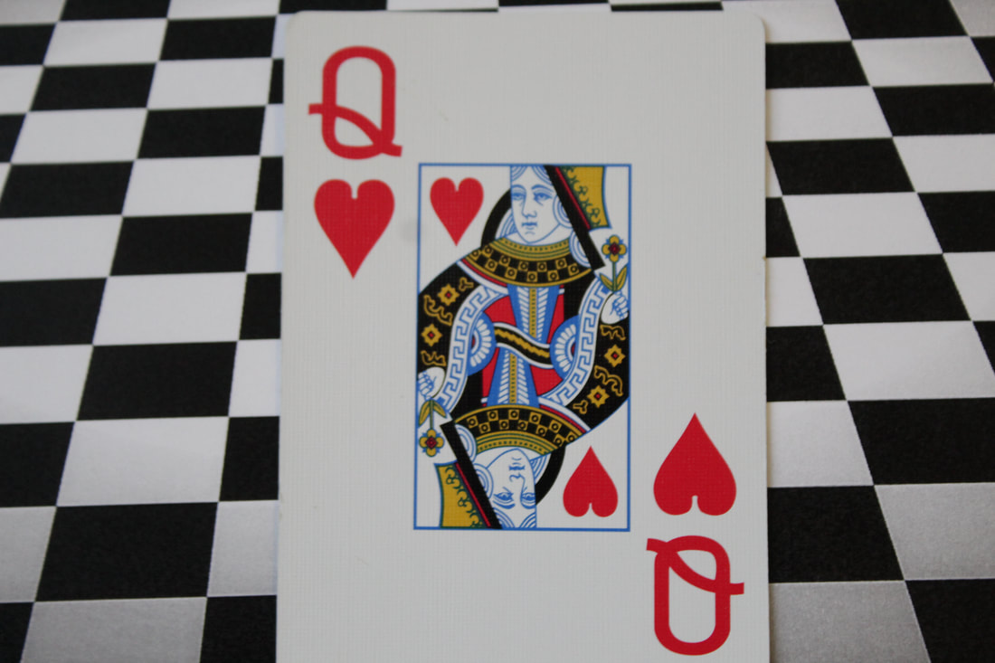
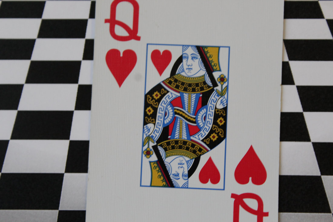
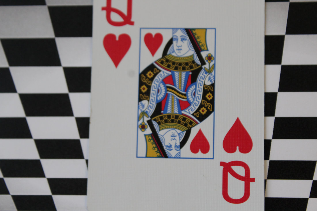
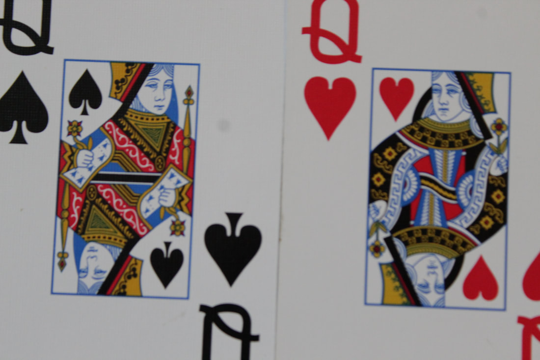
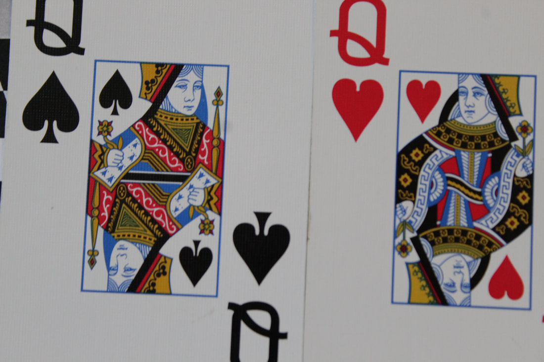
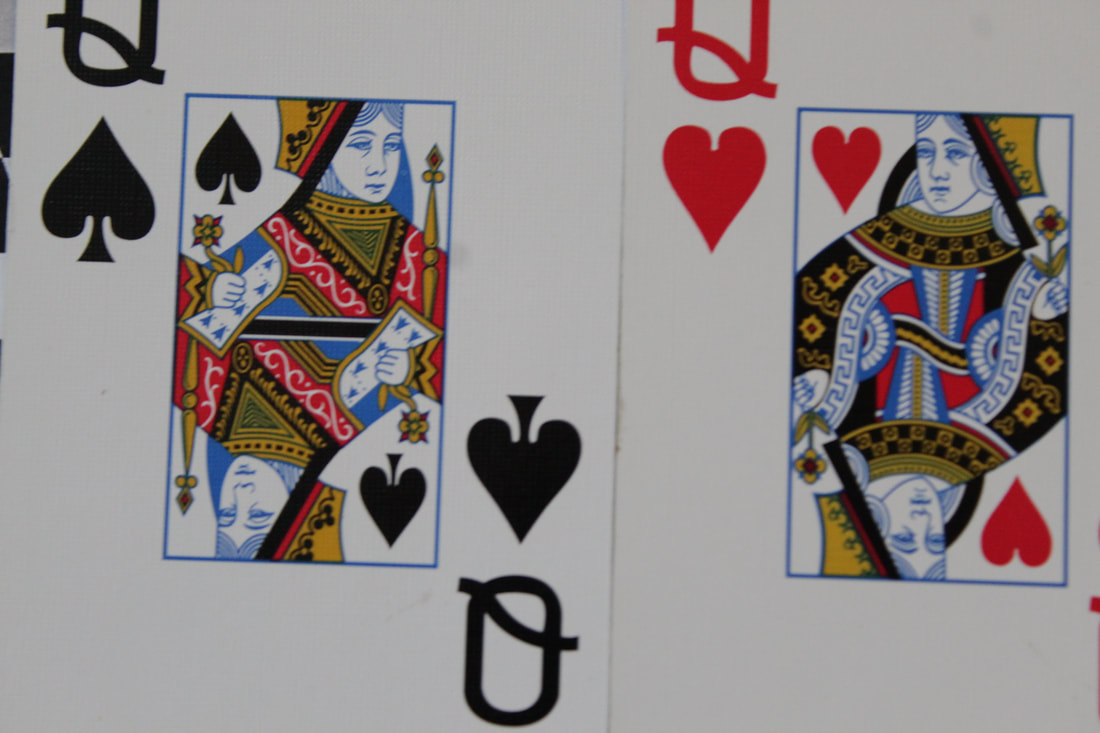
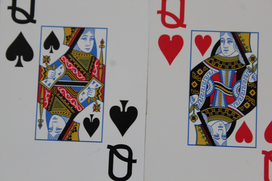
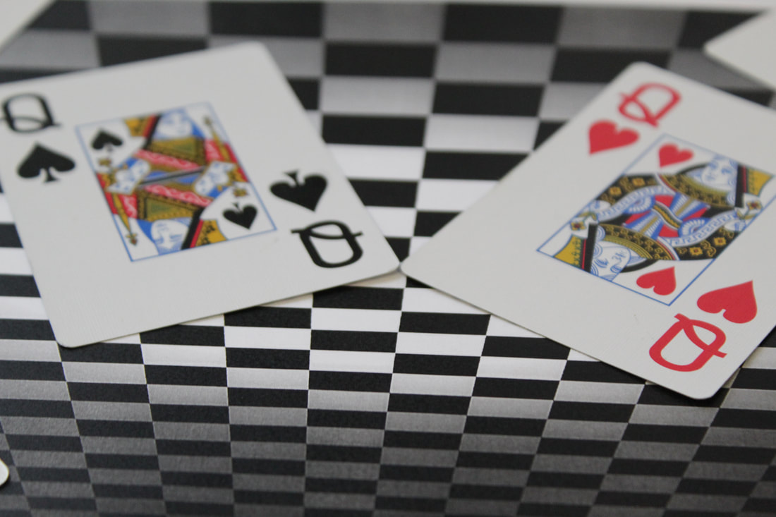
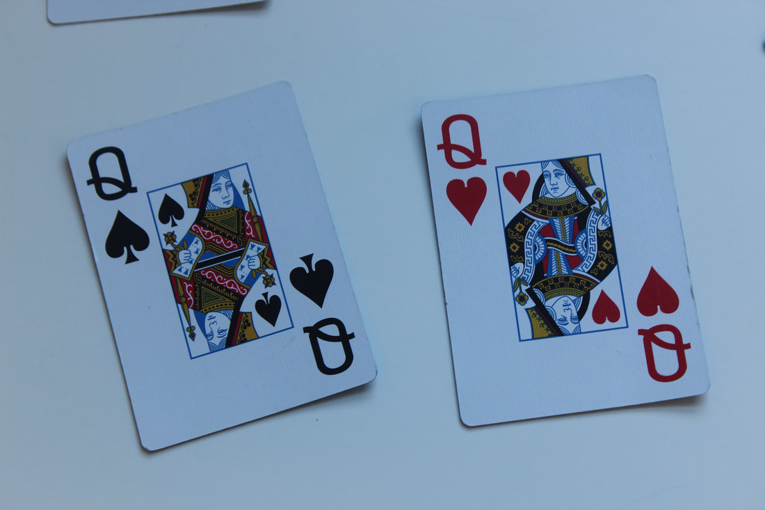
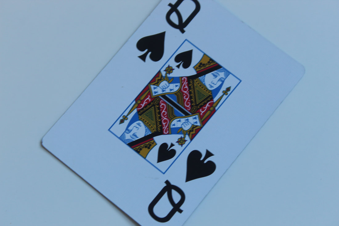
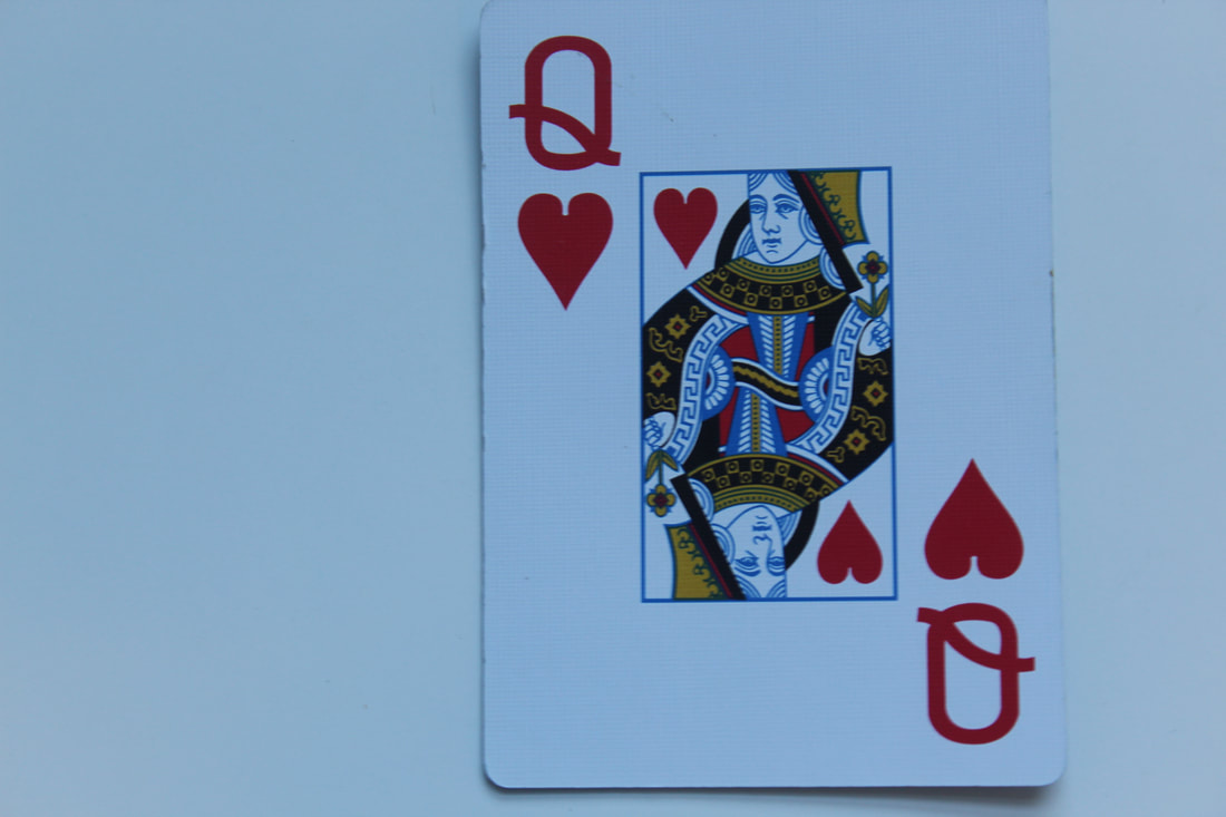
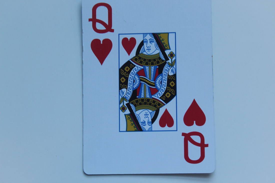
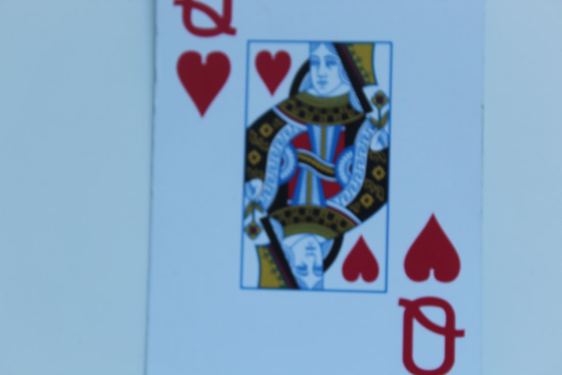
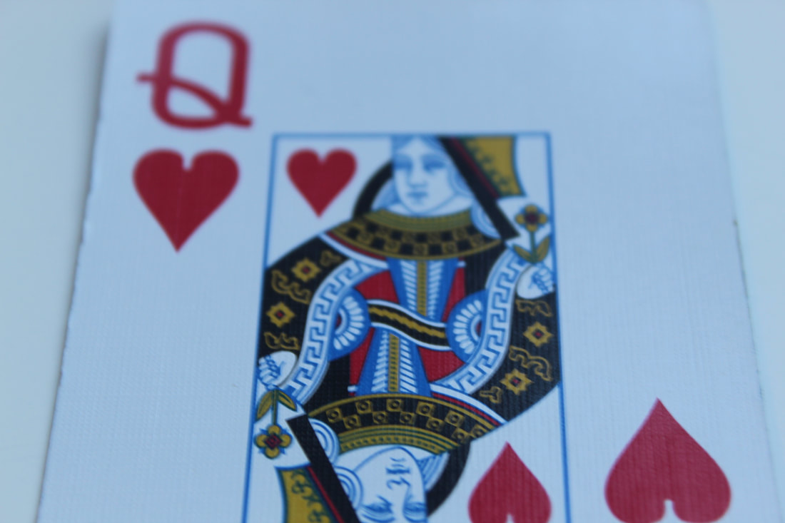
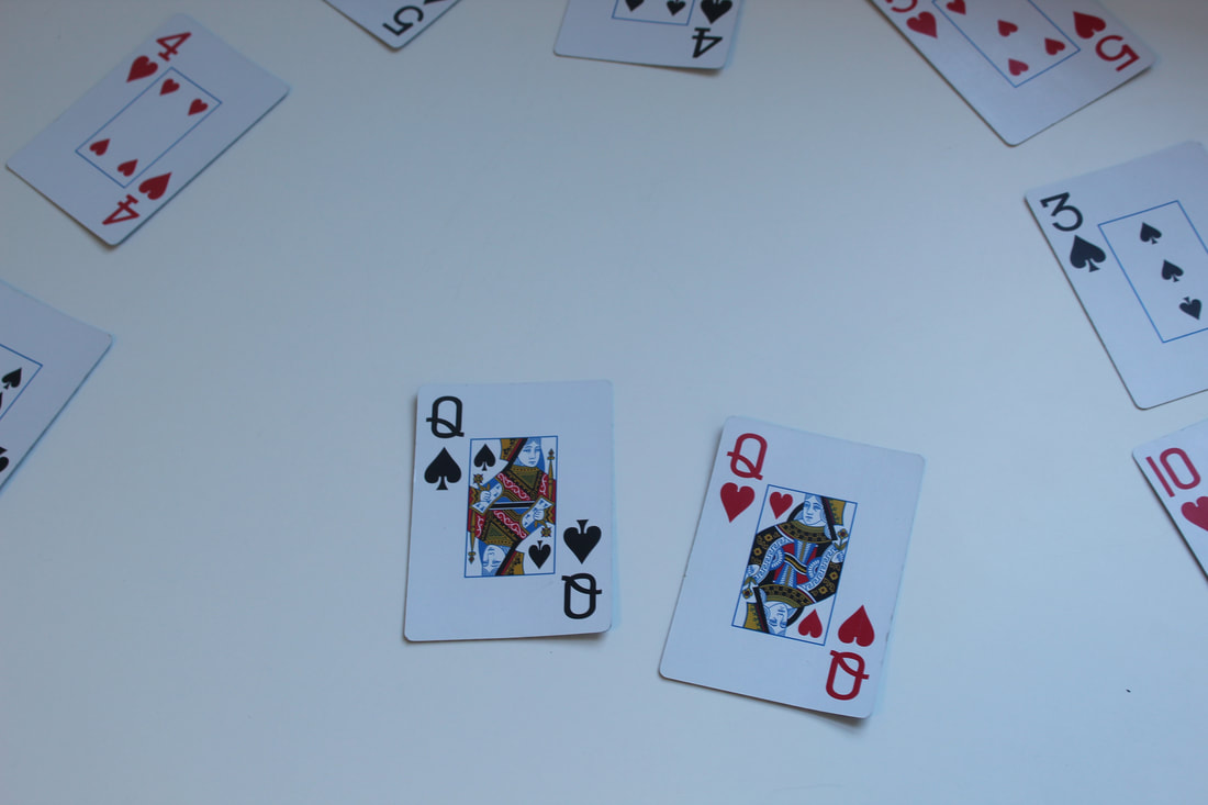
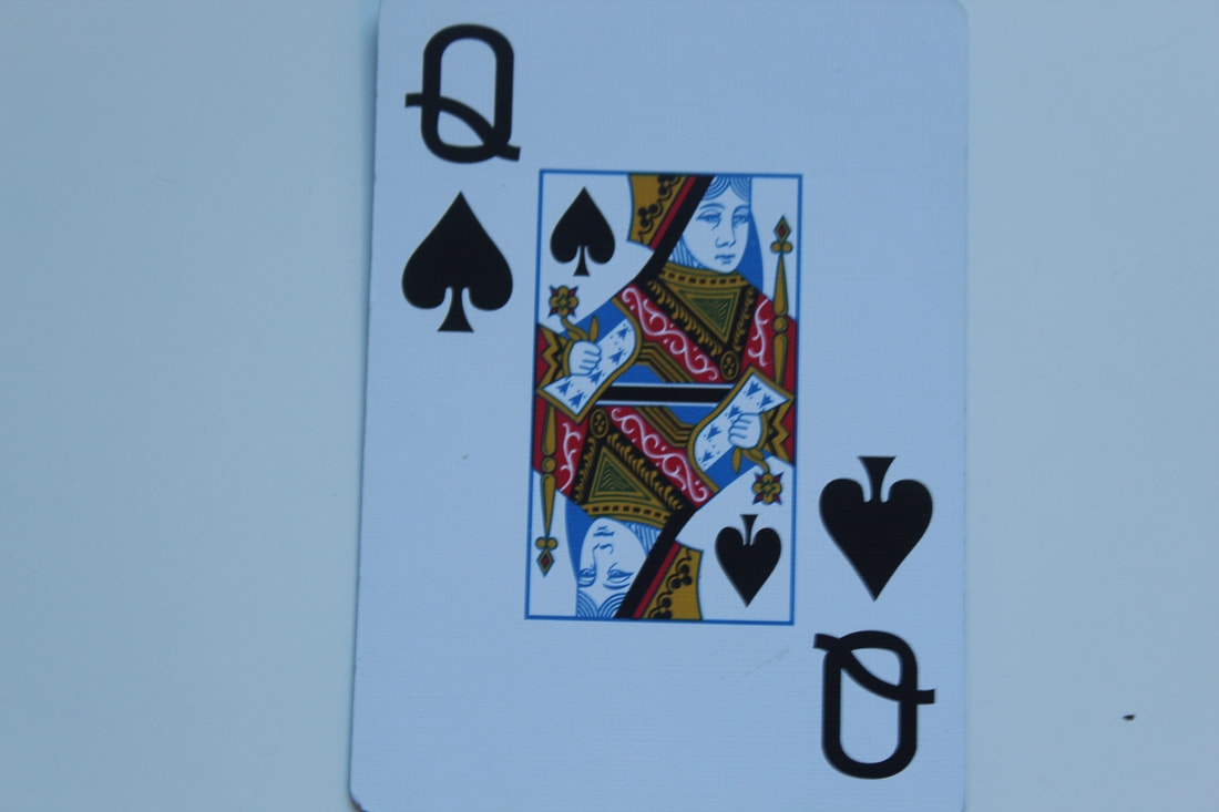
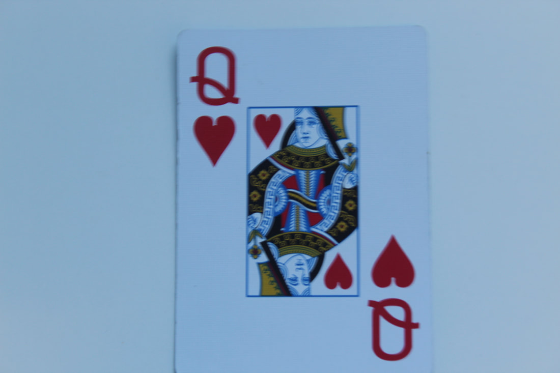
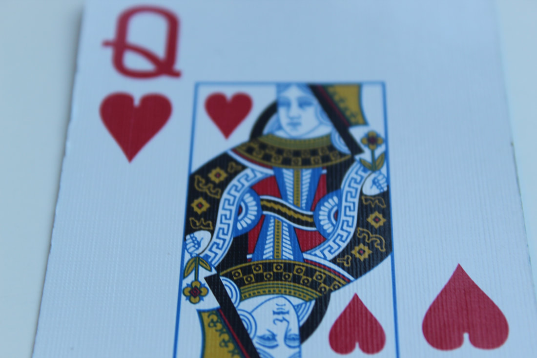
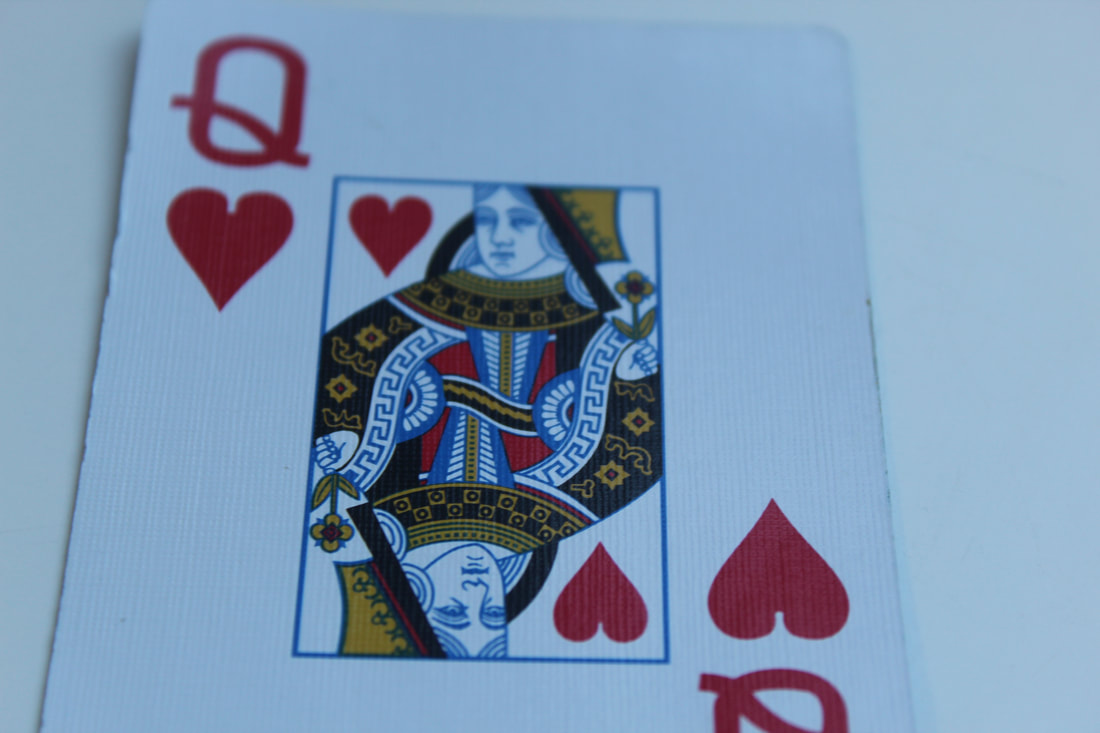
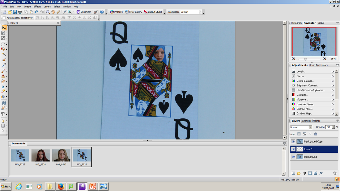
This is my best card image because its a single card also the focus is on the middle which is were i needed it. This card also links to the theme as it is the queen of hearts who is the villain in Alice and Wonderland. The only problem with this image is the white balance is florescent so it gives the image a blue colour which I'll have to change during editing.
|
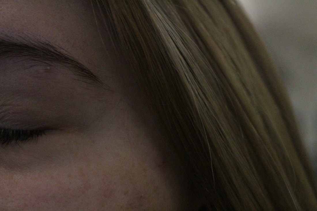
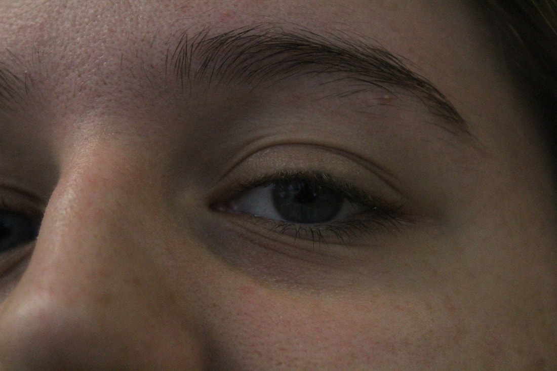
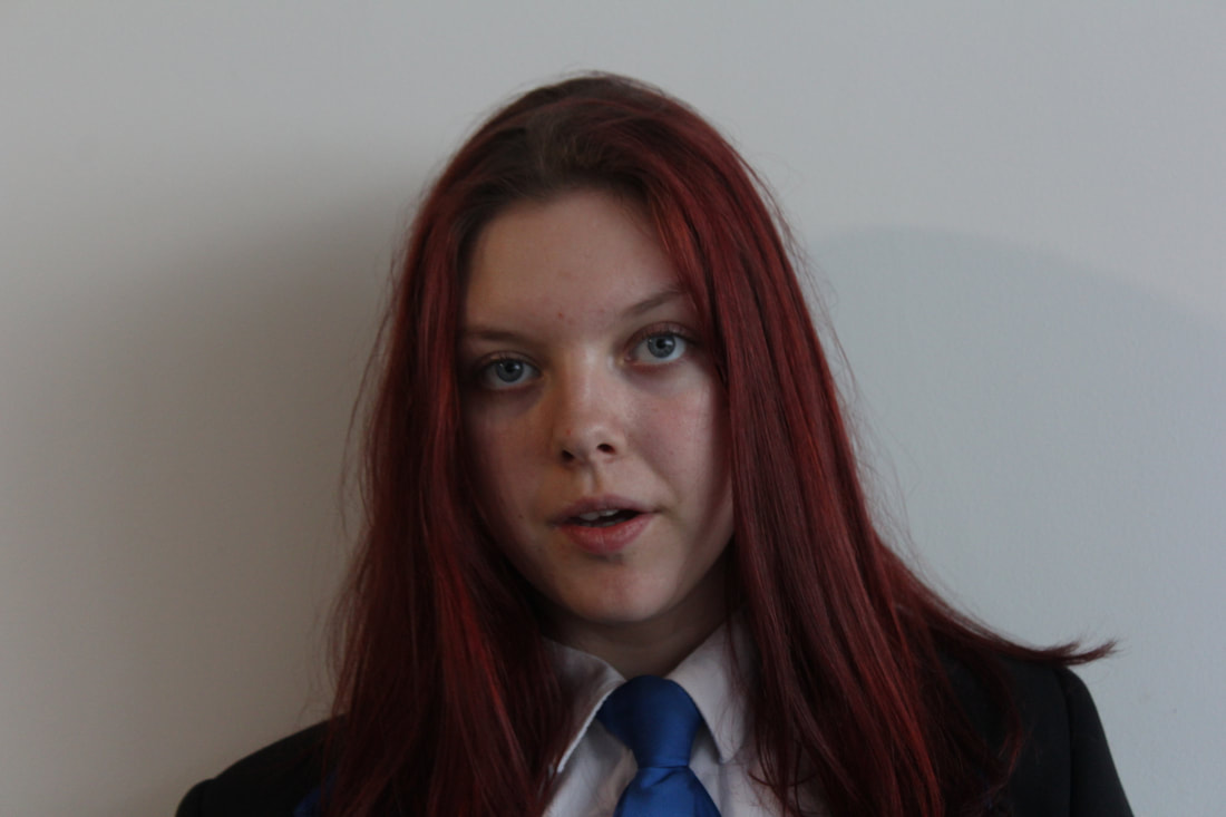
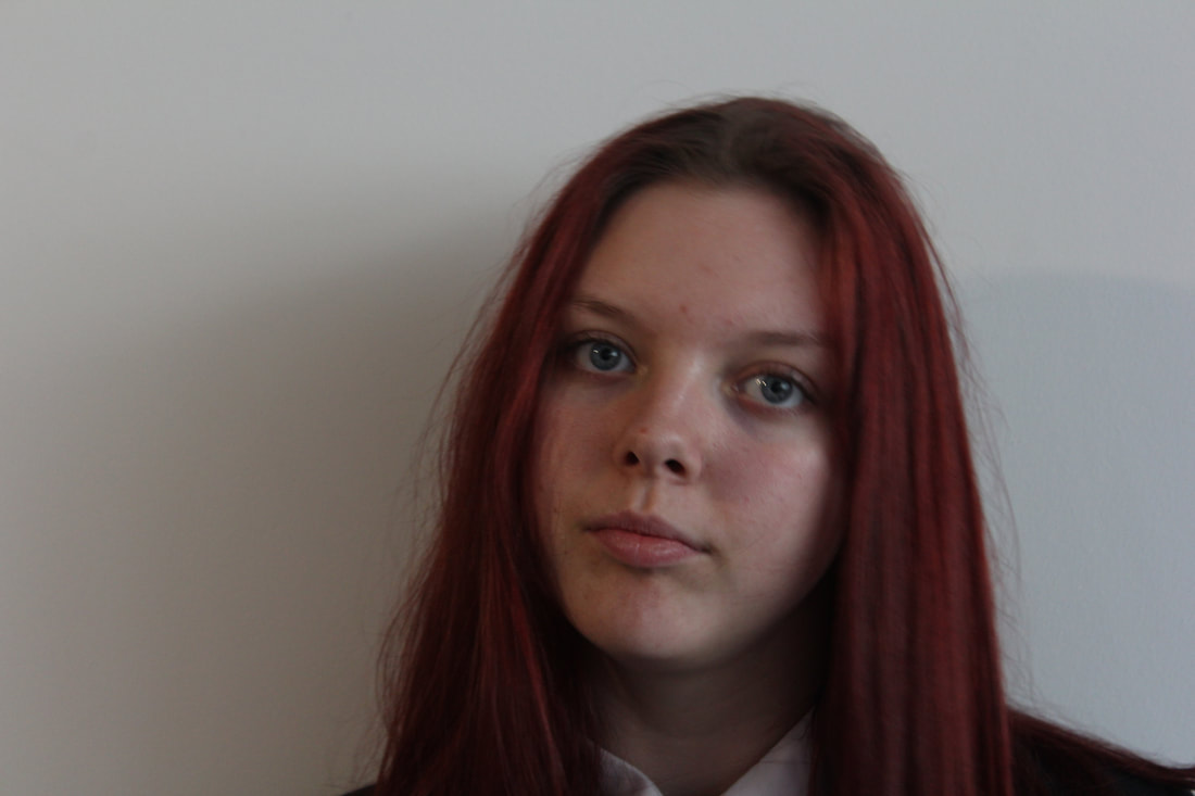
Model Images


Worst Image

|
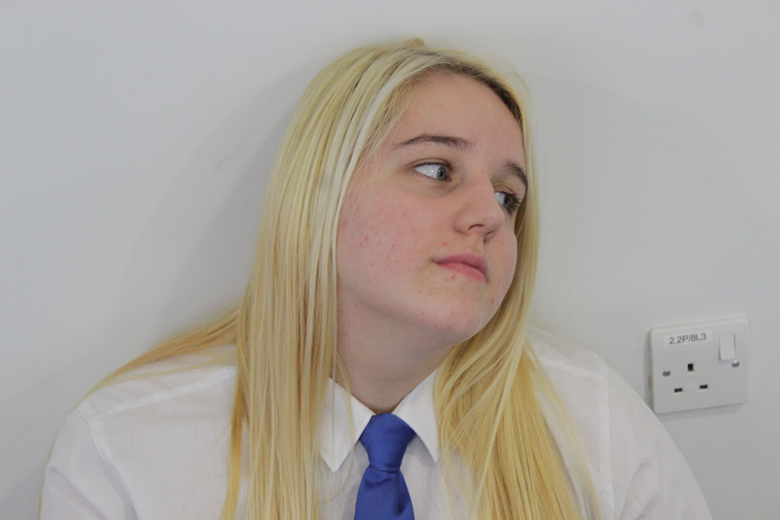
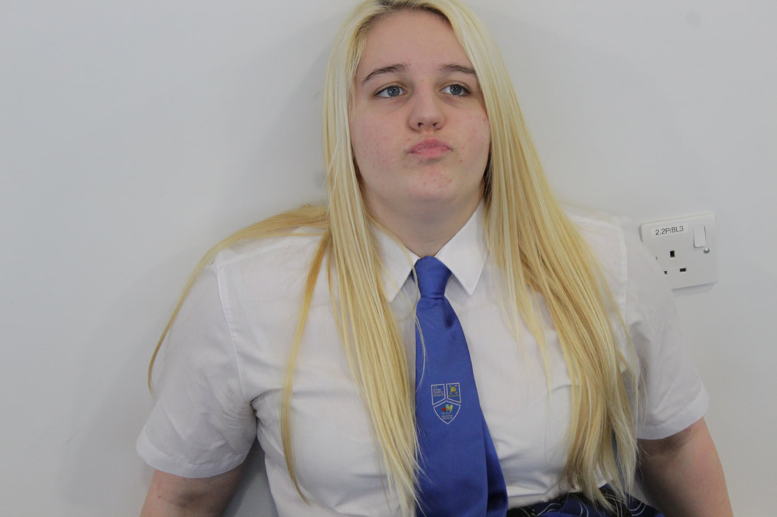
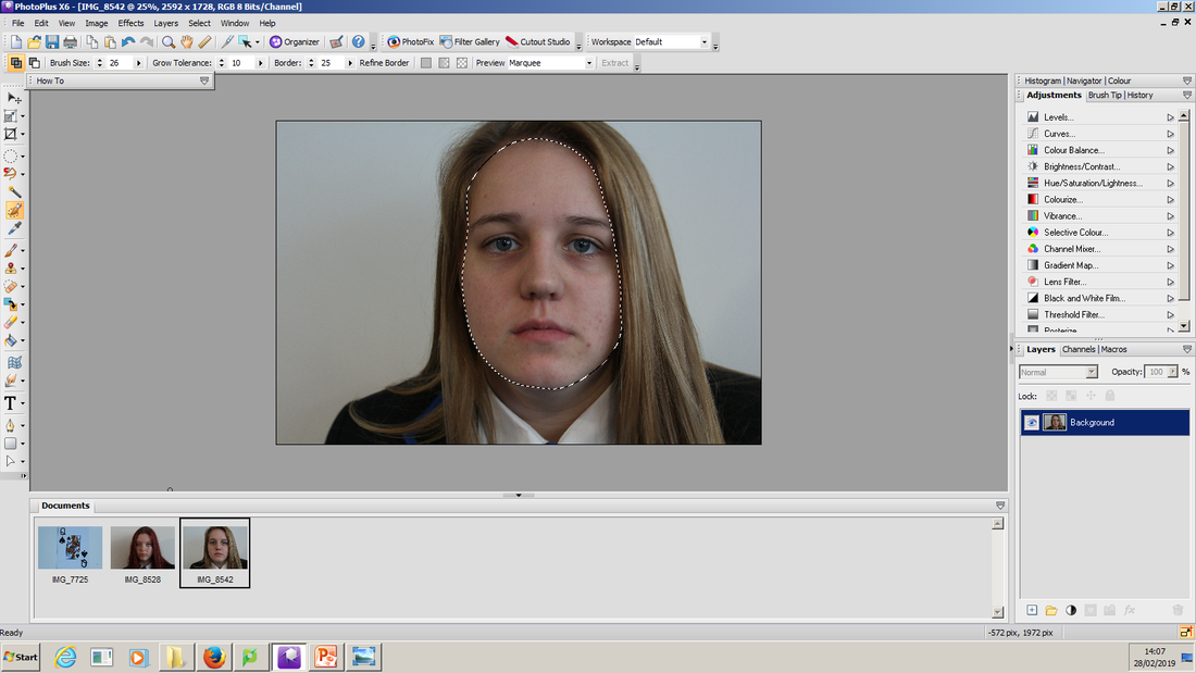
This is my worst model image because she doesn't have a scared look on her face it's more of an evil which i don't think will work well with this shoot but it might come in handy in other shoots. However I like the focus point being on the face and the idea of a small depth of field and the exposure is just right. If it wasn't for the emotion I might of considered using this image.
|
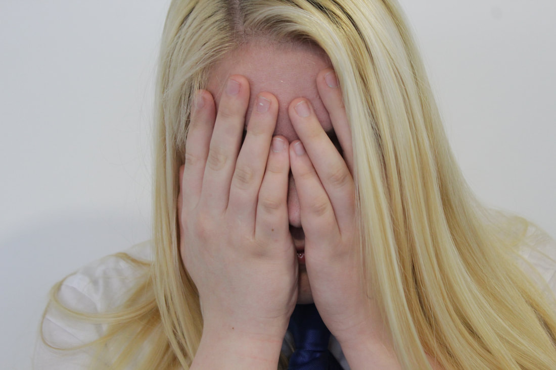
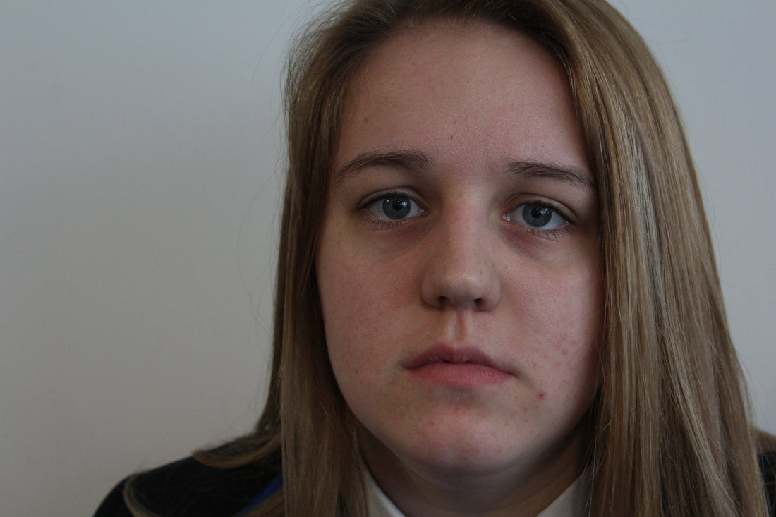
Best Image

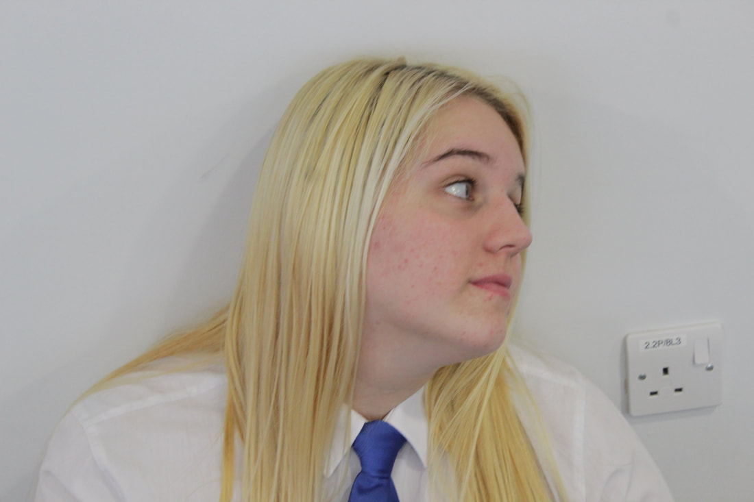
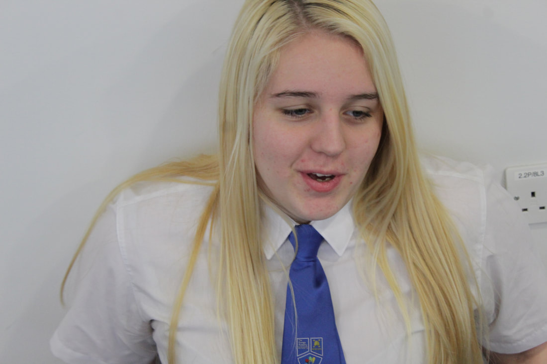
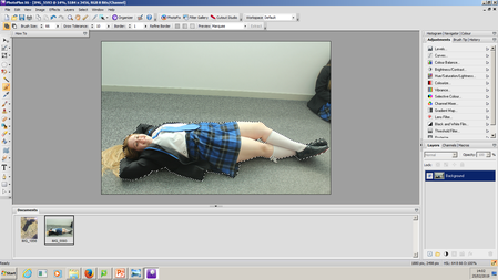
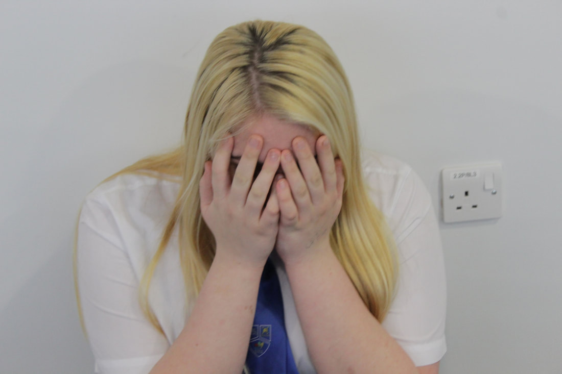
I had two favorite images but then I decided I only wanted top focus on the face not the full body so I chose this image. Also this mage shows the emotions of scared and vulnerable which is what I needed for this shoot to create the idea of being trapped. In addition I like how the focus is on my models hand as it creates the emotion more. The only problem with the image is it is a medium depth of field but i can crop and remove the background on photo plus to give my edit a better effect.
Editing Process

These are the three images that I have chose to use for my edit for this shoot. I have chose these three because I think they have the great potential to complete my first shoot.
Steps
|
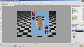
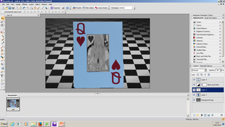
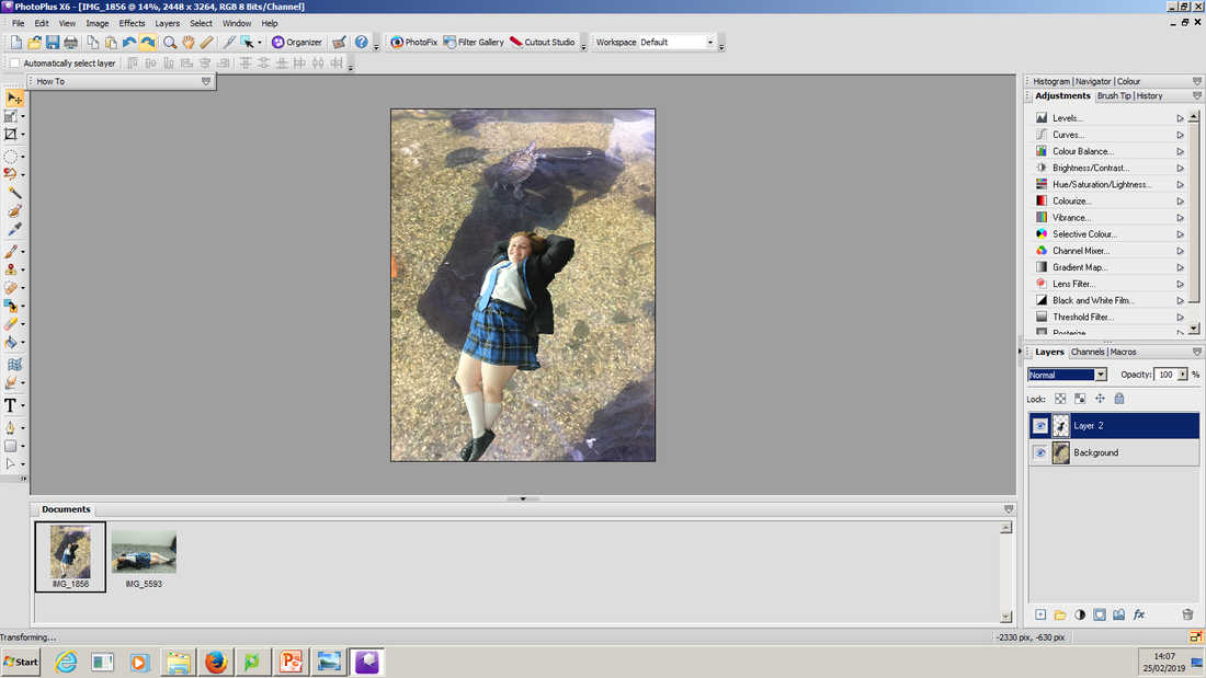
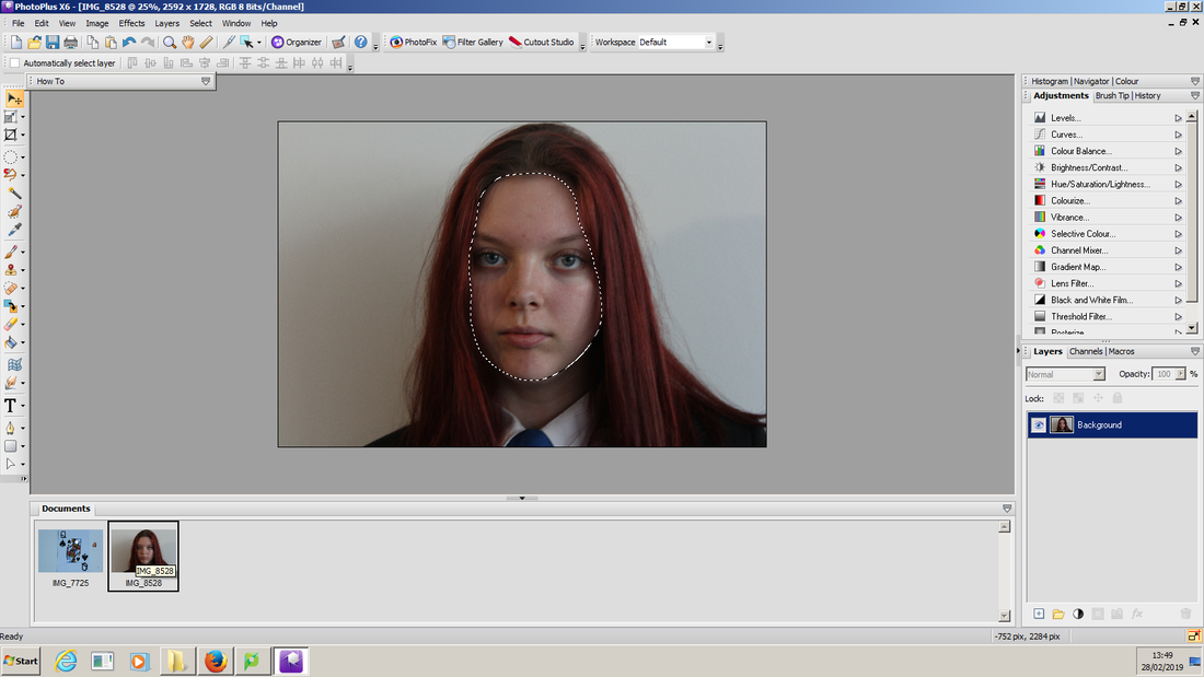
First I selected my image of my model and I went round her with the smart selection tool. I refined the boarder so it would give me a fine boarder. Then I used the feather tool so it didn't look like I copied and pasted it onto the image.
Next I copied my image (Ctrl + C) and pasted my image (Ctrl + L) on to my checkered background. Then I used the deform tool to narrow my image down so it would fit into the card. I did the same thing for my card image.
Then I selected the middle of my card image using the rectangle selection tool and deleted the middle so that my model can be put in the card so I can make m,y edit look like I want it to.
Finally I Added a black and white filter to my model and the 2nd card layer I also turned black and white filter. Then on my model I changed the normal blend mode to exclusion.
|
My Finished Edit
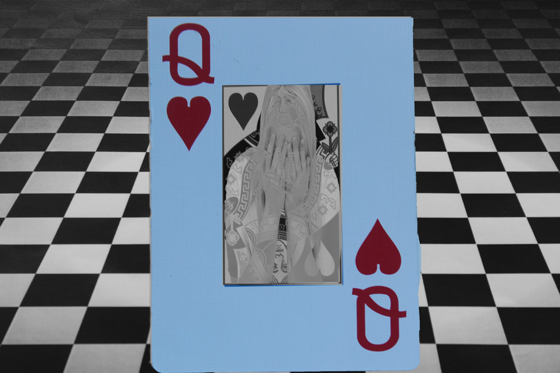
I like the way this turned out but it would be even better if the 2nd layer and the 1st layer were in line with each other so it looks more realistic. I especially like my idea of turning my model and 2nd layer black and white as it helps blend in with the image.
Shoot Analysis
Shoot 2
For this shoot I am planning on using a clock face and using a eye from my model to make it look like my model's eye is looking through it. Then I am going to take pictures of a rainy day background so it looks like my model is spinning in thoughts which links to my first shoot with the Alice in Wonderland theme. I might need to just darken the exposure on the camera to make the light look dark so it looks like a dark fantasy. Also I might add a little version of my model so it looks like the eye is looking down on a little person. This is so it adds my own ideas to the image.
These two images are my inspiration for this shoot and I have decided to merge them together much like the last shoot I did. I think it will create an effective and realistic edit.
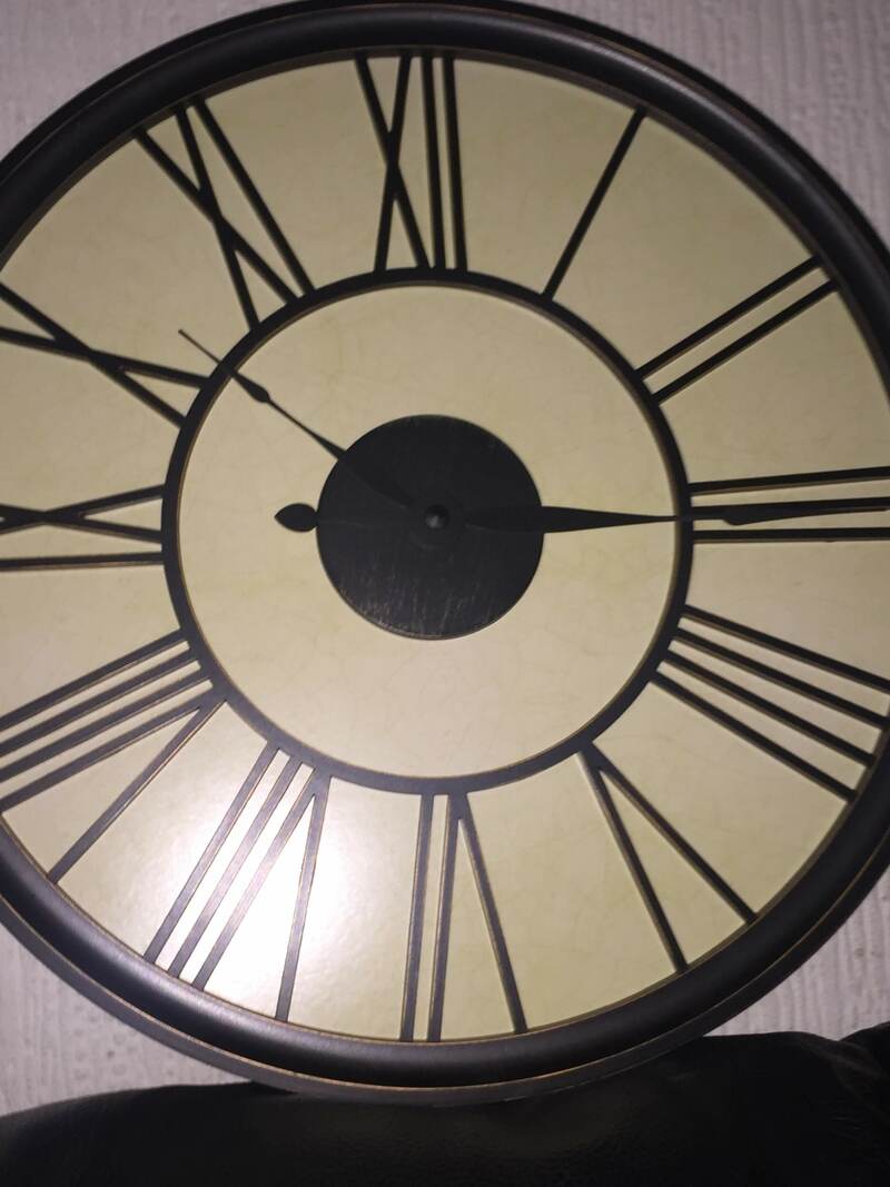
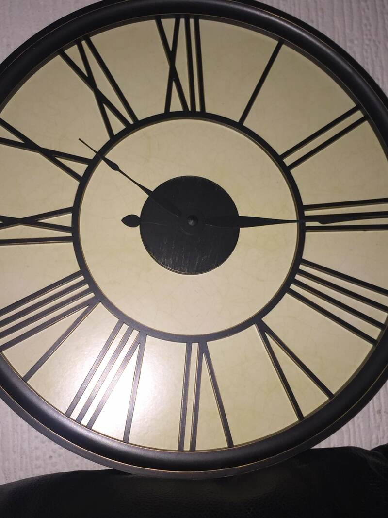
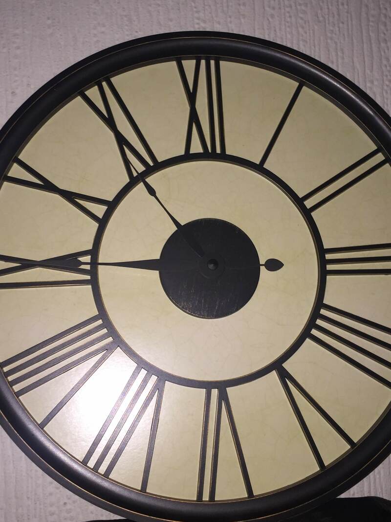
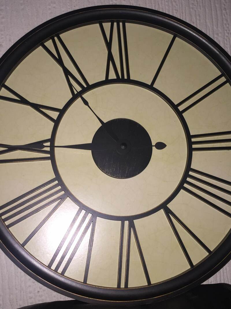
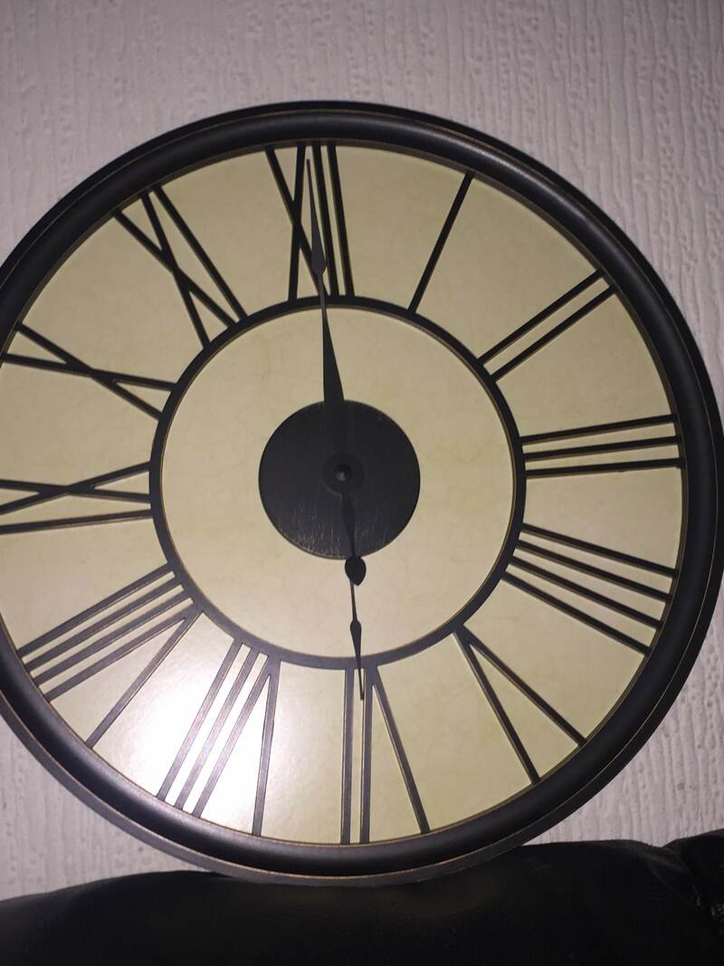
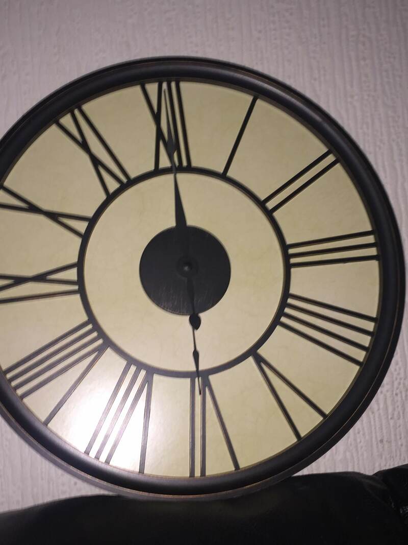
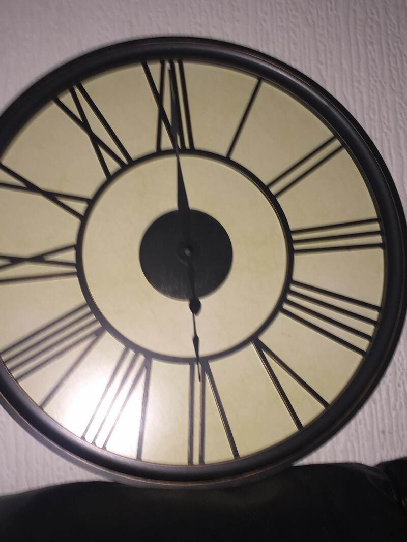
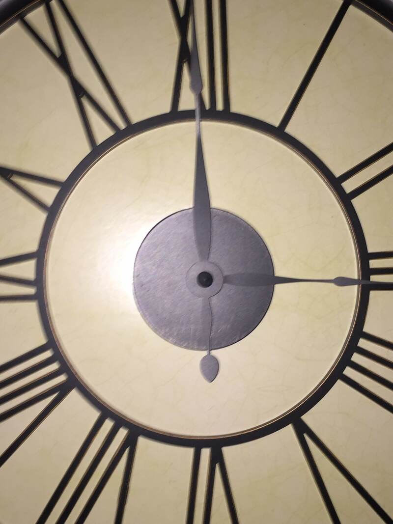
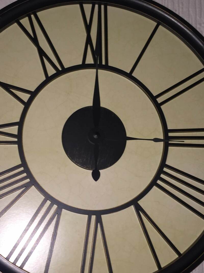
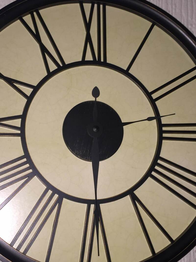
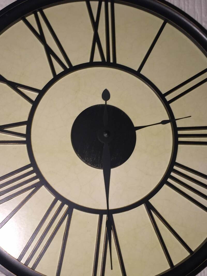
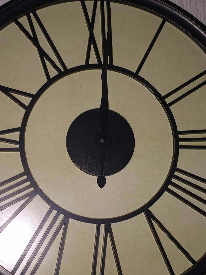
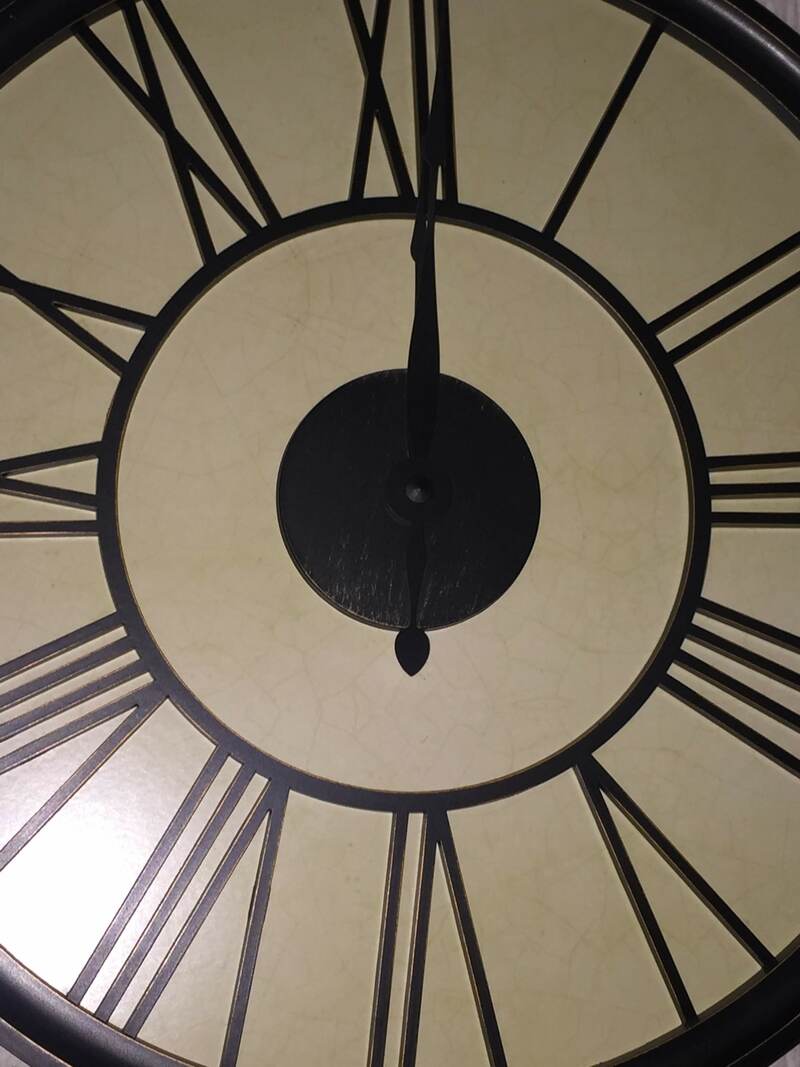
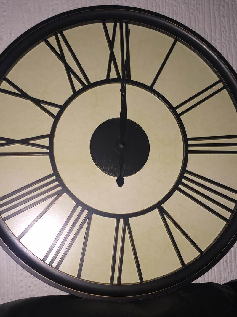
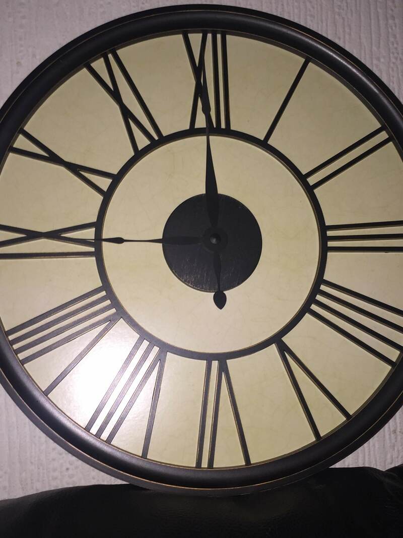
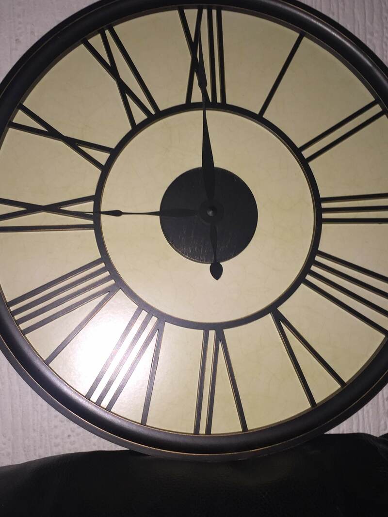
Clock Images
Eye Images
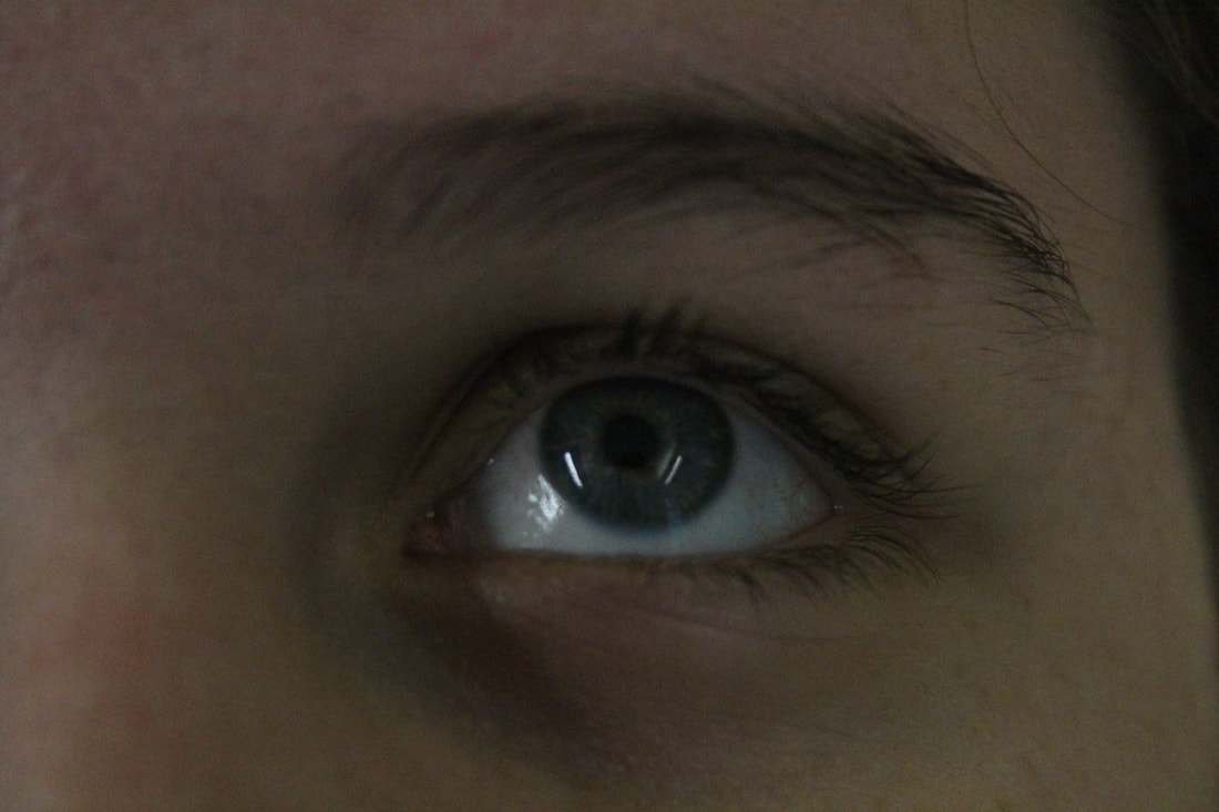
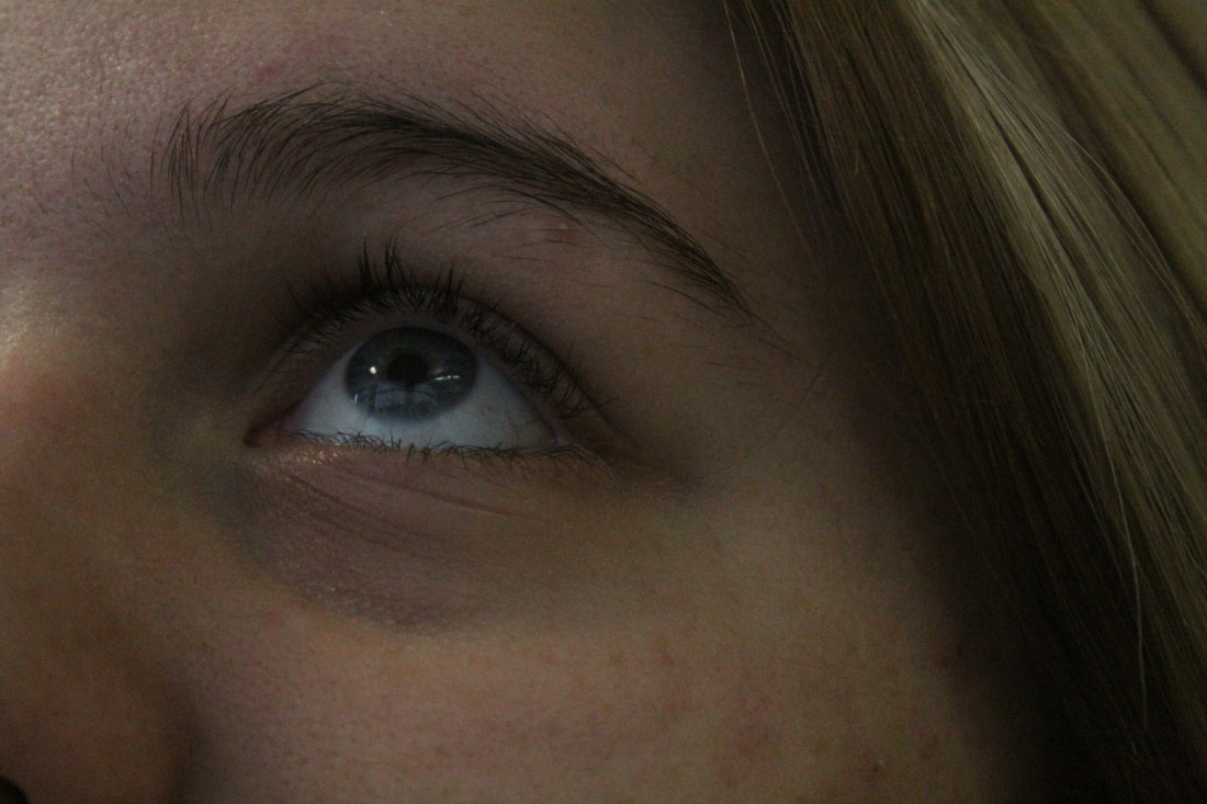
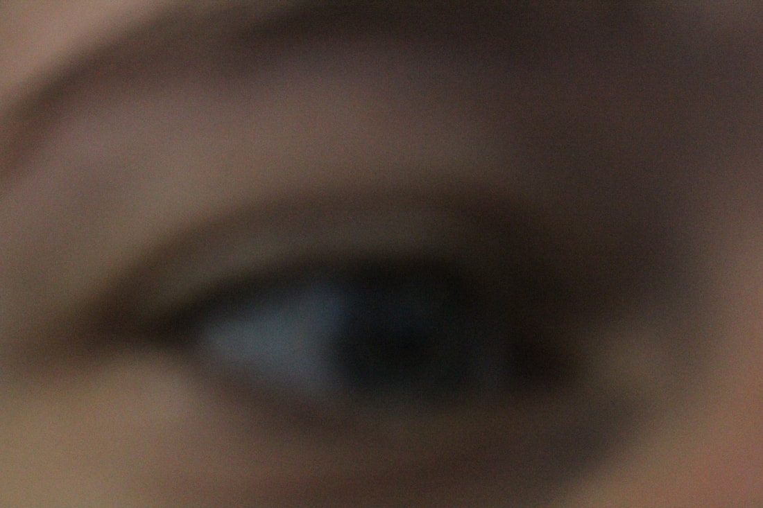
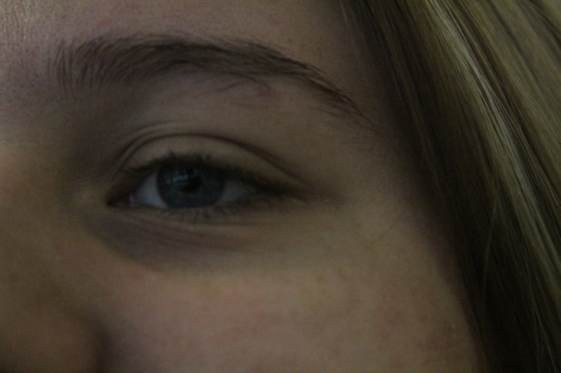
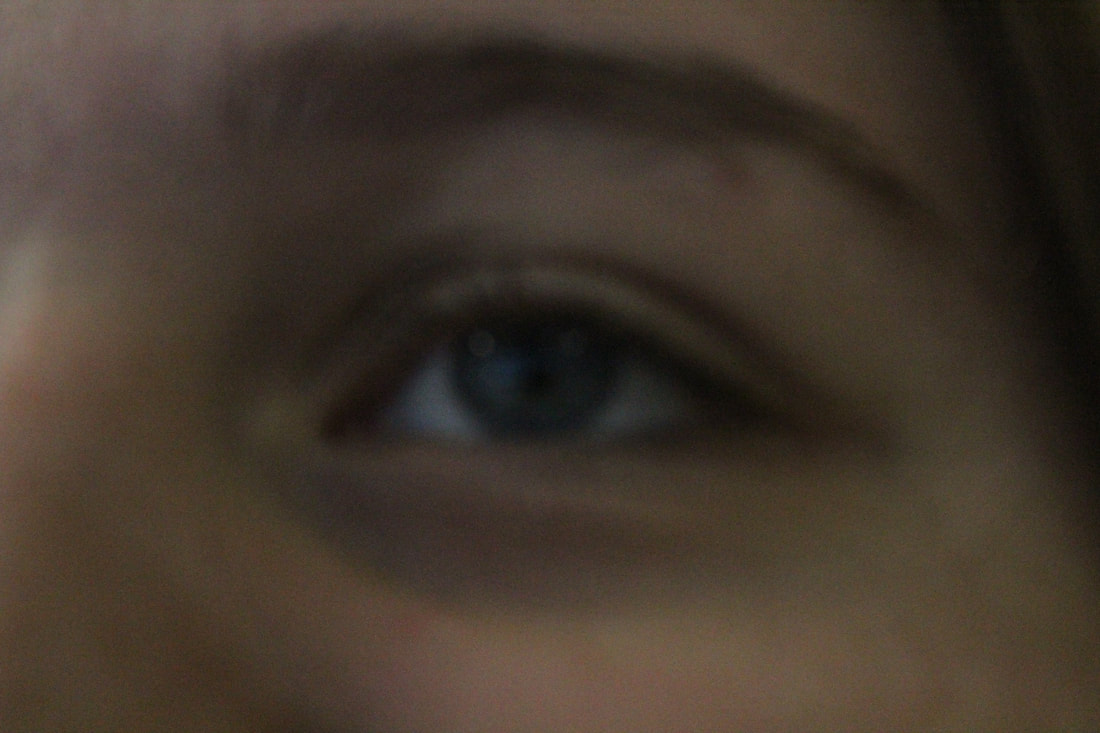
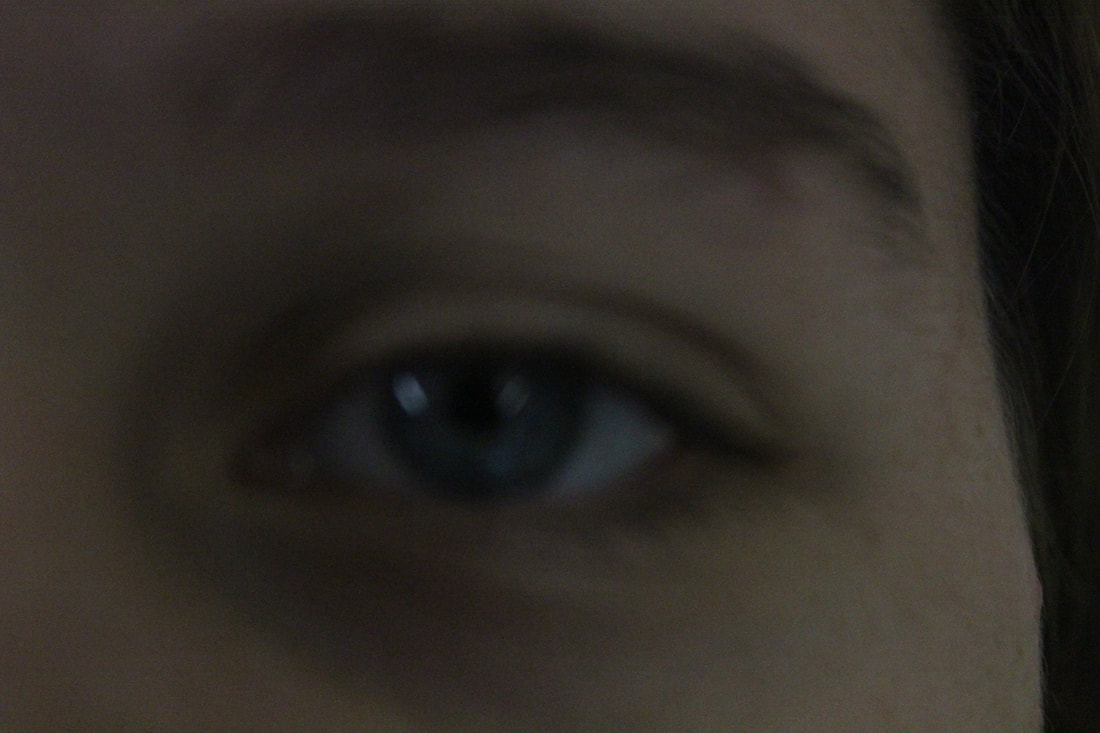
Worst Image
|
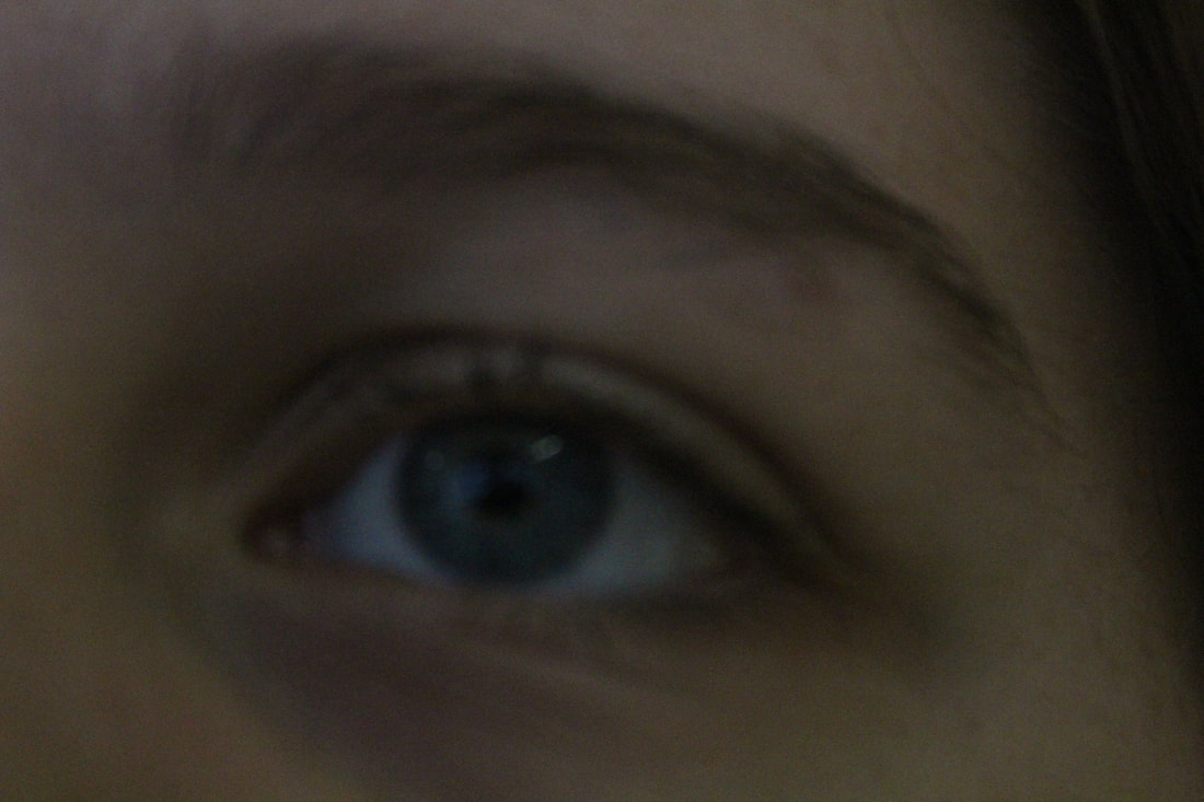
This is my worst image because it is out of focus which makes it blurry. In addition the depth of field in this image is not really correct for what I am going to do with the editing. Also I feel the exposure of the image is a little to low.
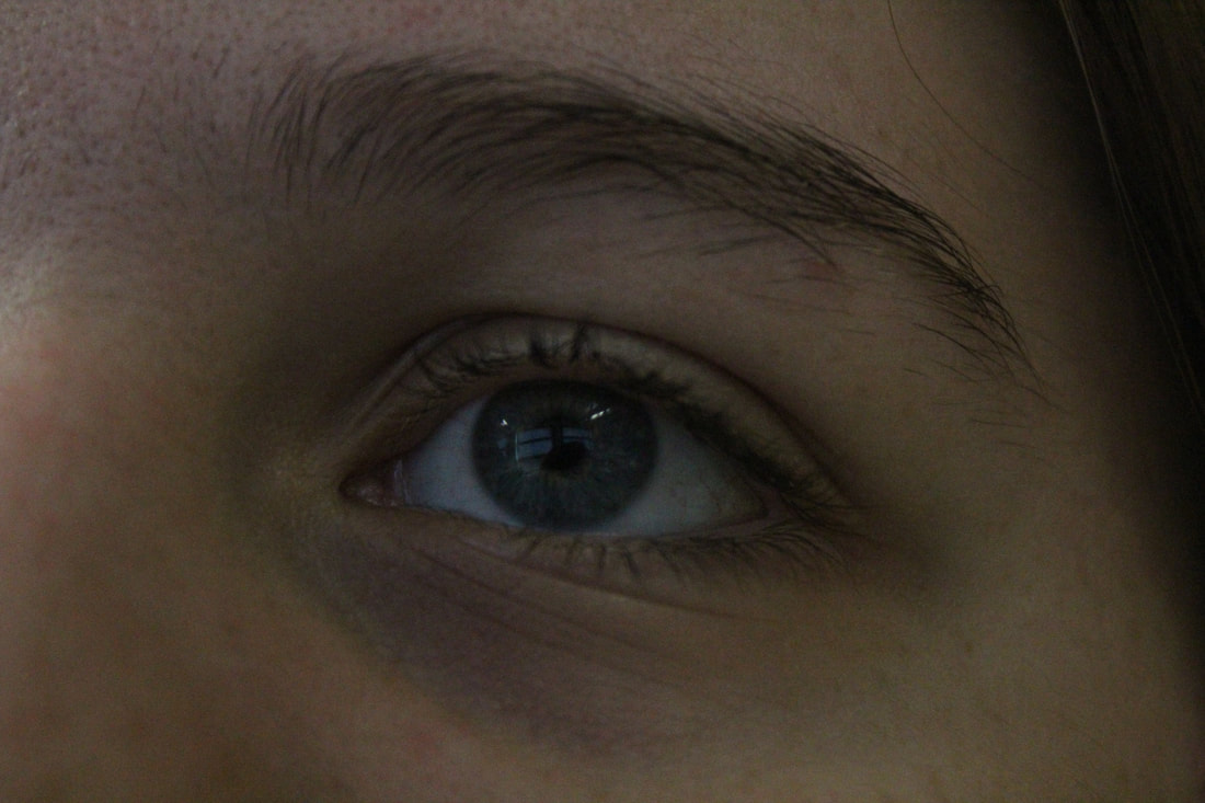
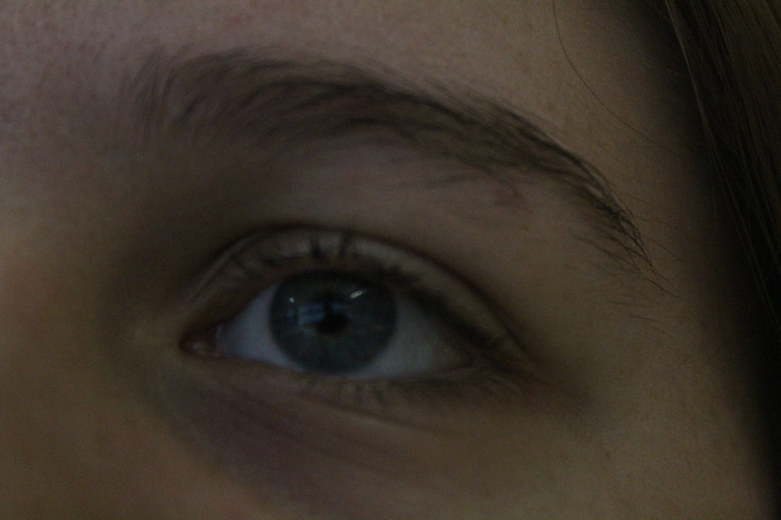
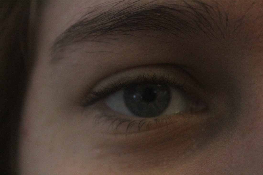
|
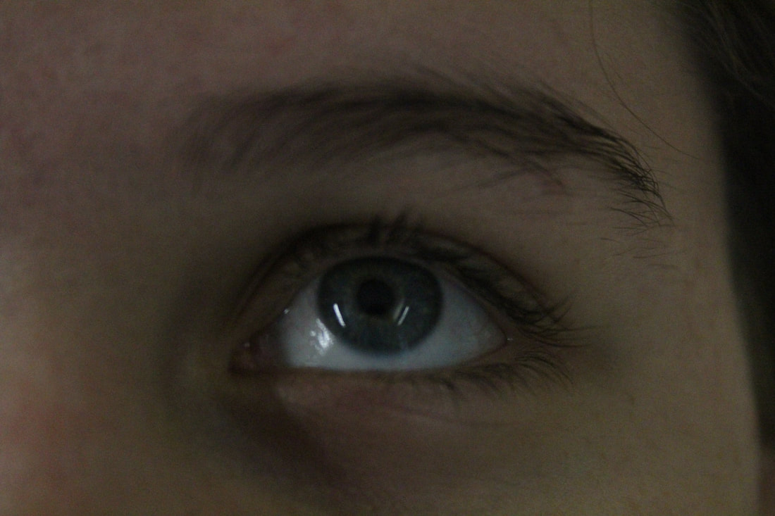
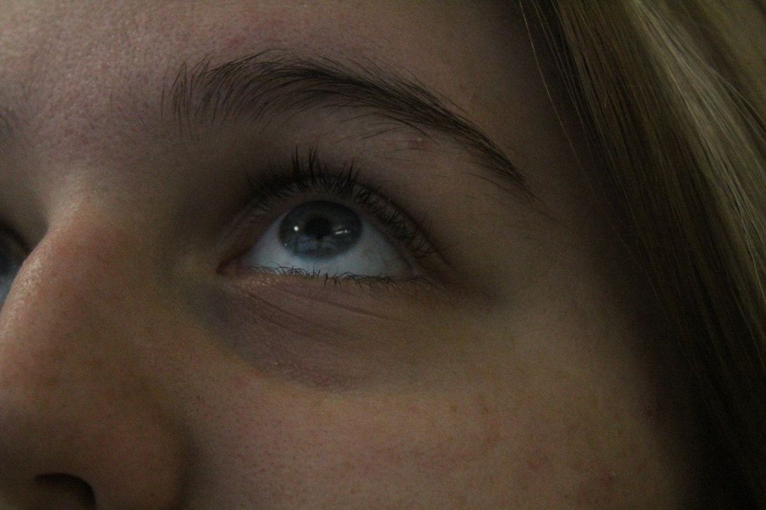
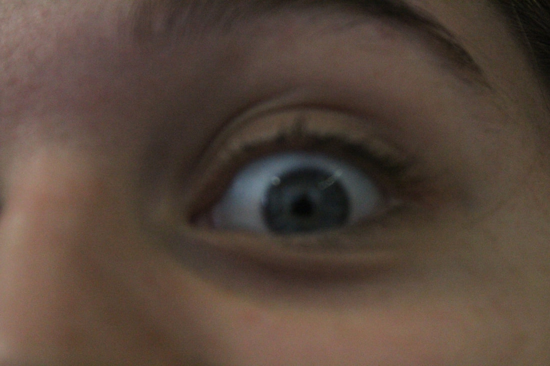
Best Image
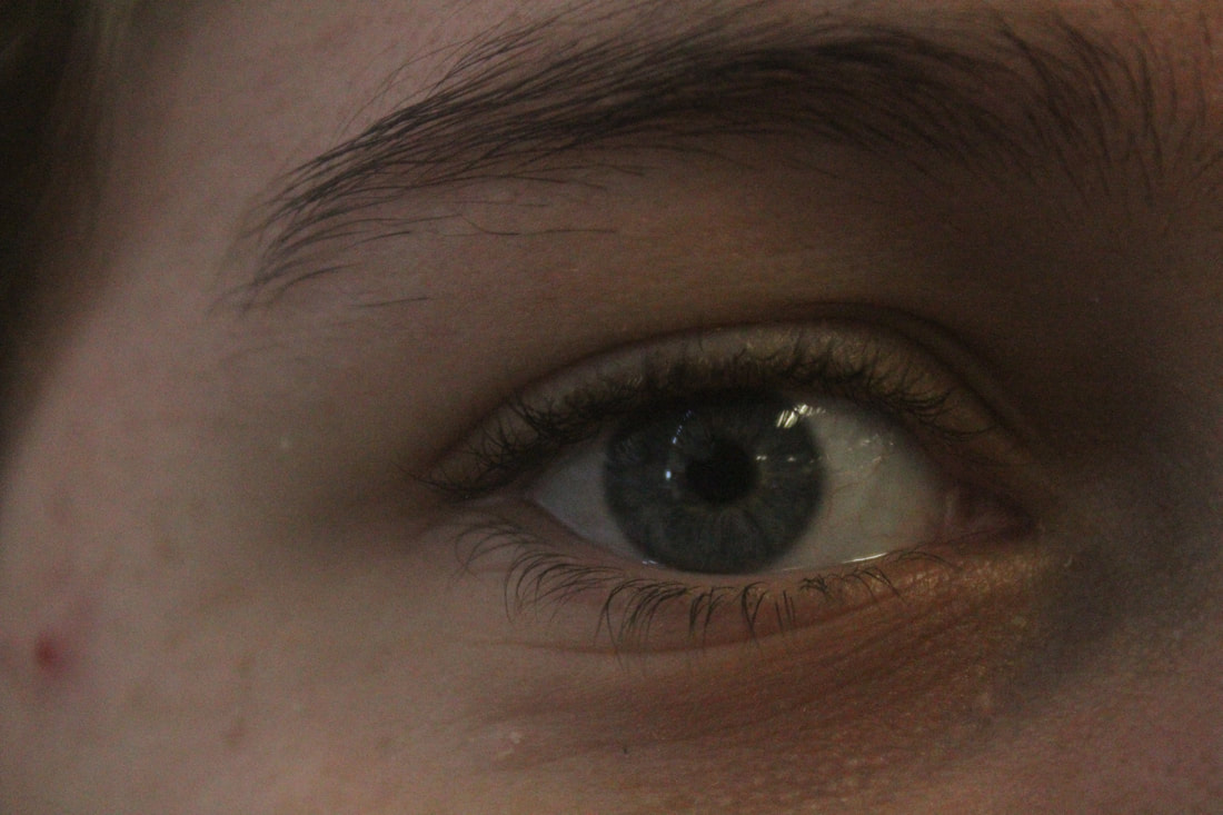
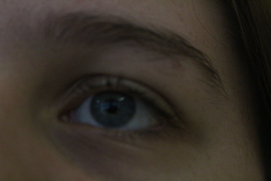
This image is my best image because it really shows the eye out and the focus is on the eye so it isn't blurry. In addition the depth of field is small which shows the eye out and the eyebrow really well for my editing. Also the exposure is right and it isn't dark like the other one.
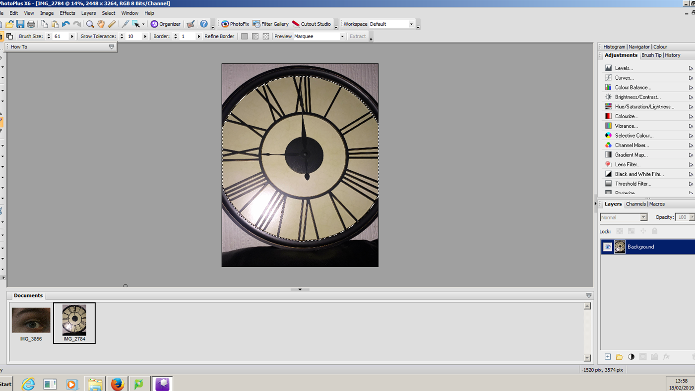
Editing Process
|
First I selected my two images and used the smart selection tool to cut out the middle of the clock. Then I refined and feathered my border so the edges wouldn't be as rough.
|
|
Next I copied (Ctrl + C) the cut out of the clock and pasted (Ctrl + L) it onto the image of the eye. Then I used the deform tool to resize my image to the size I needed for the eye.
|
|
After I pasted the clock image onto the face I used the deform tool to get the clock to the same shape as the eye. This is so it would fit for the next step I took to create my edit.
|
|
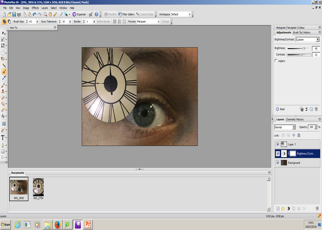
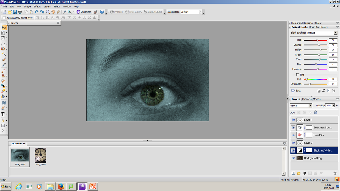
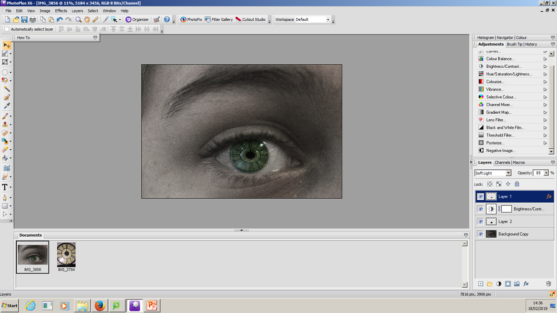
Next I used the darken blend mode to put the clock inside my model's eye. I also started to add a blue filter to my eye at first the filter covered my whole image so i merged it with the second eye layer I created.
|
|
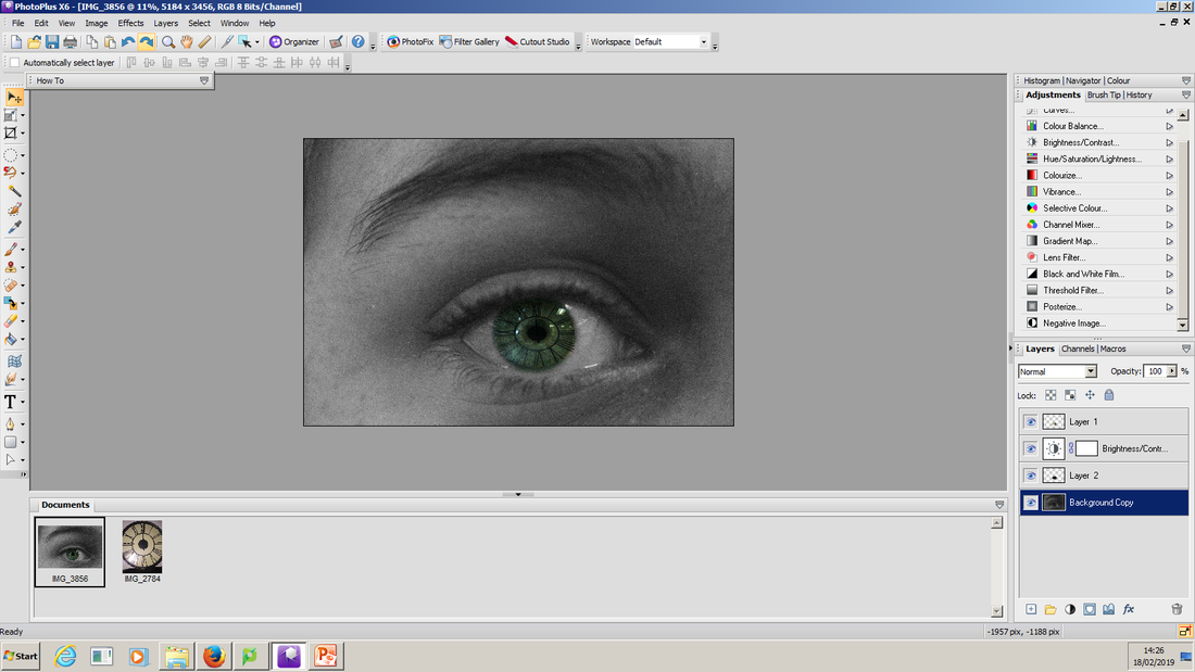
Then I had to merge my black and white filter with the main image so that the eye and the clock stood out. This makes my intentions in my edit clearer.
|
|
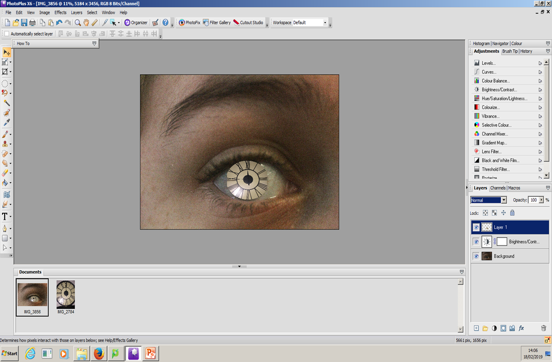
Finally I changed the opacity of the black and white filter. In addition I added a glow to the eye so it would stand out more and put the opacity as 85%.
|
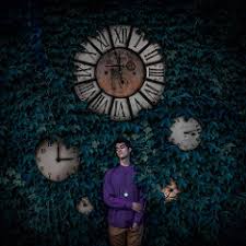
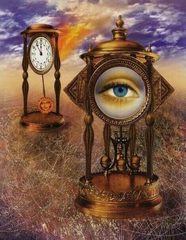
Final Edit
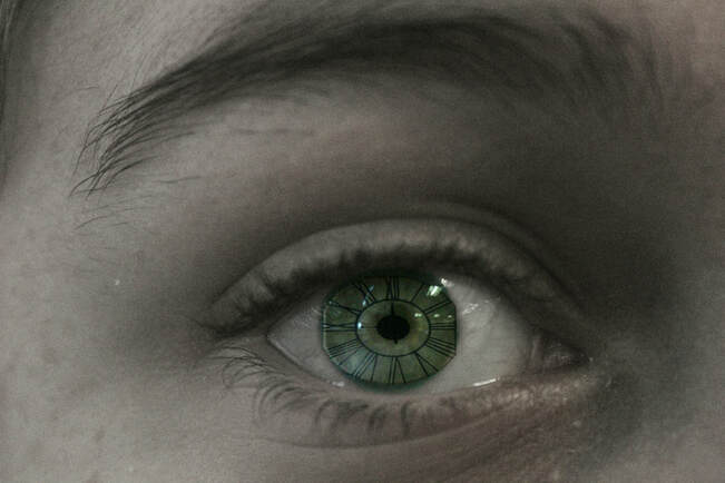
I like this edit because the clock and the eye colour goes very well together and makes the clock stand out a little more than it was. This links to the theme of fairy tales as the idea of the clock is like an Alice in wonderland scene when she falls down the rabit hole. In addition it gives the idea of illusion. This edit would be even better if it looked a little more realistic and maybe had some more clocks surrounding it.
Shoot Analysis
Shoot 3
Plan
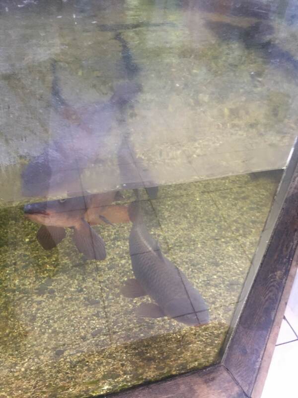
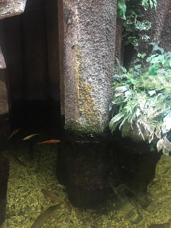
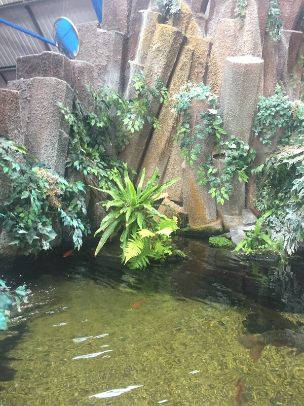
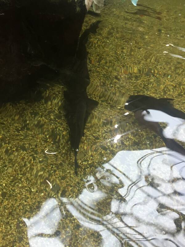
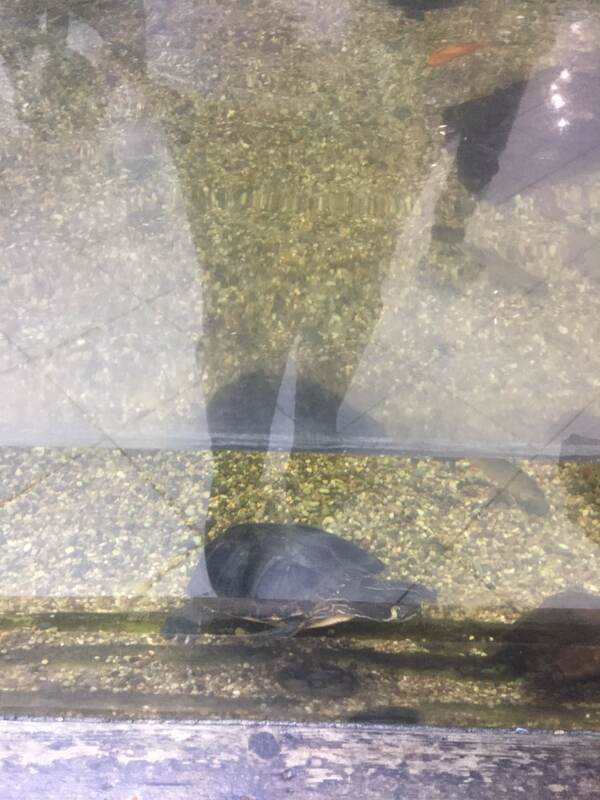
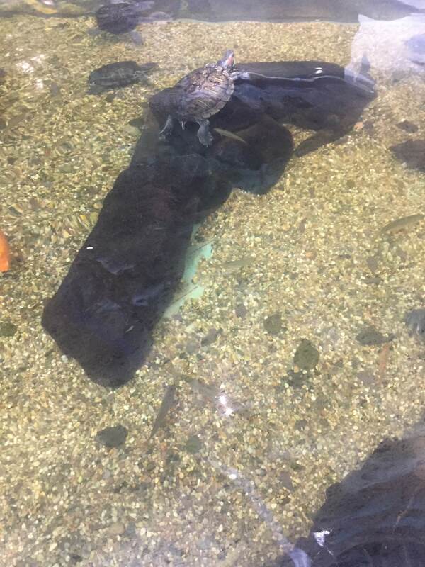
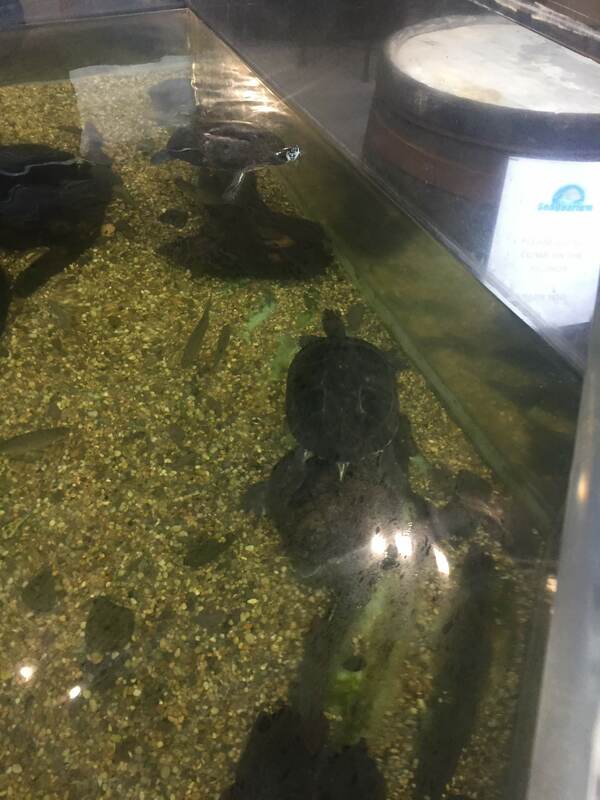
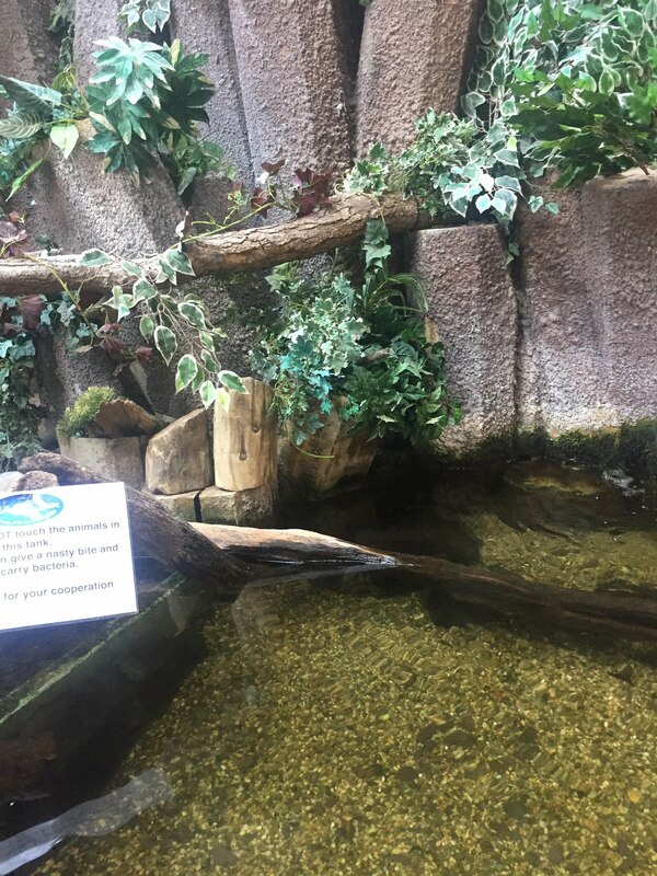
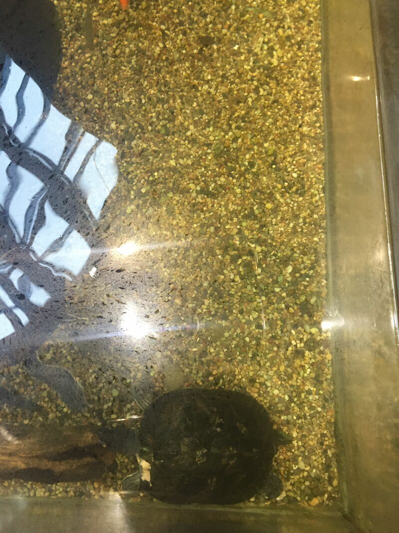
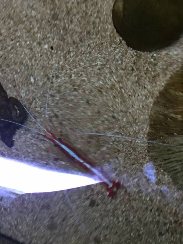
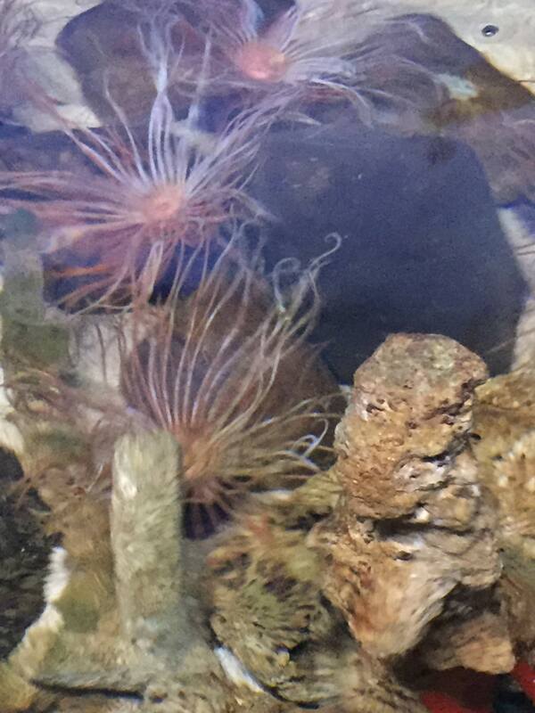
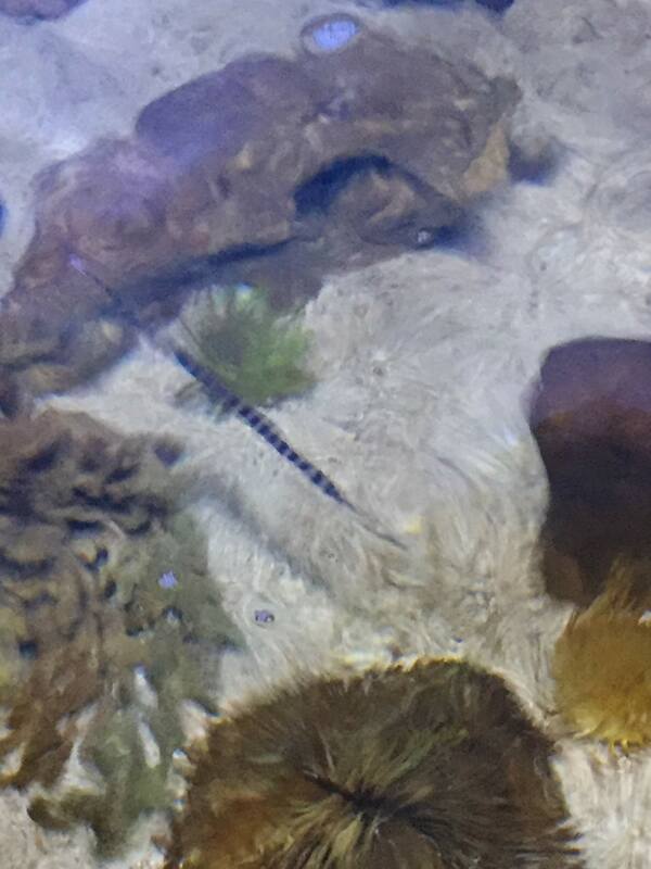
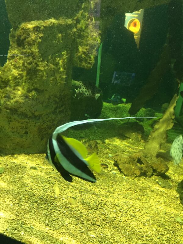
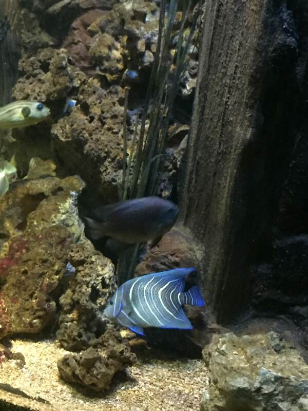
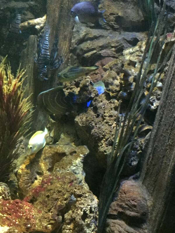
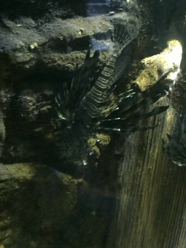
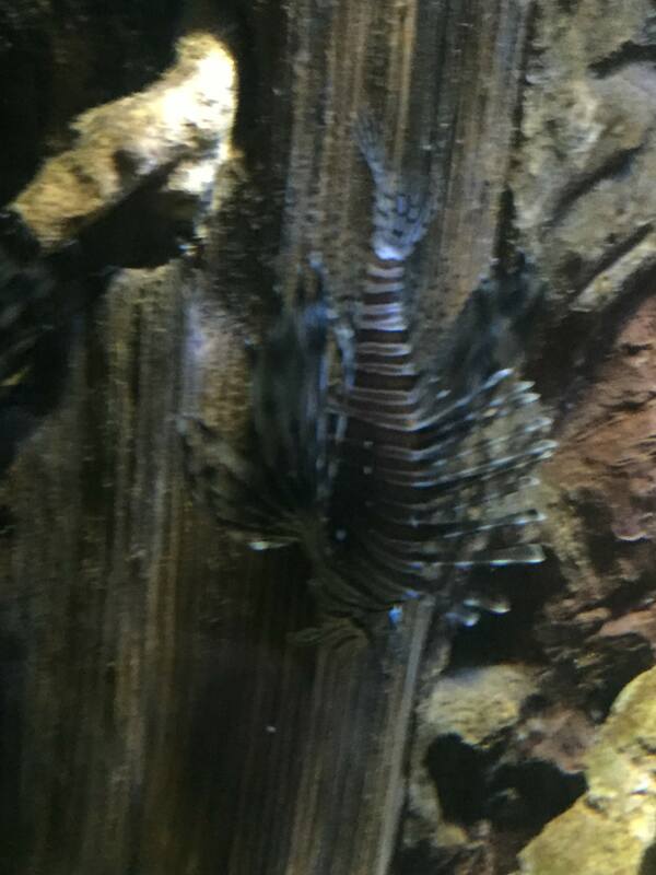
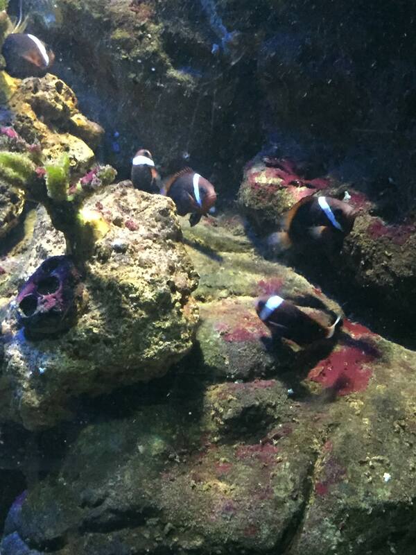
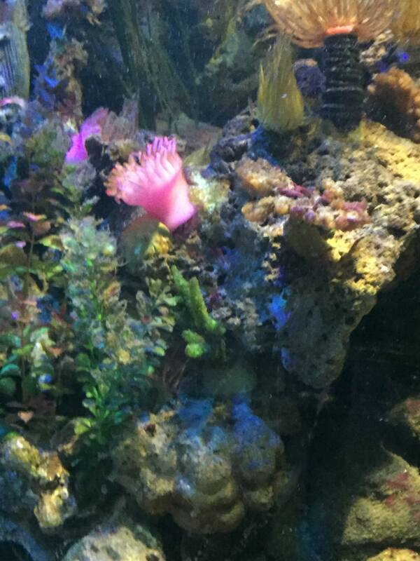
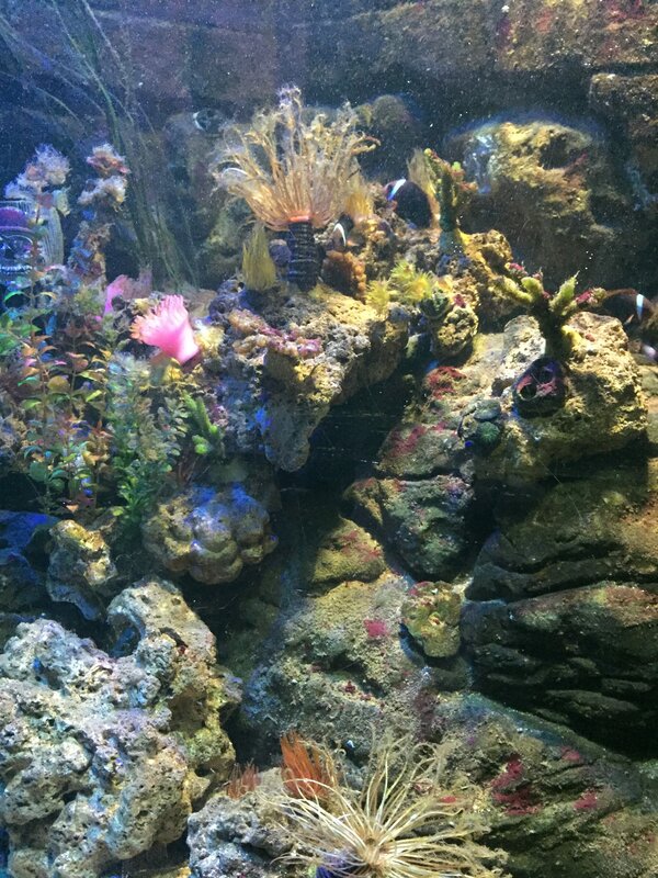
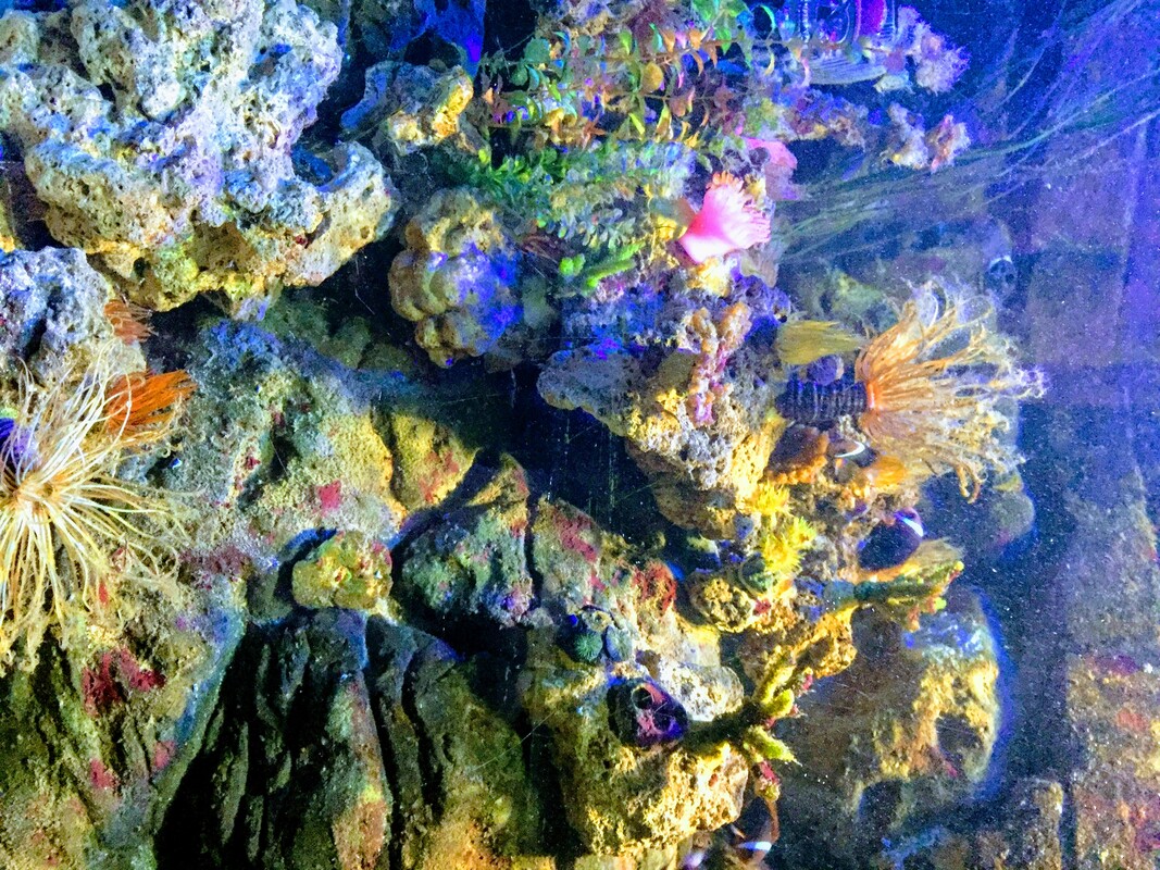
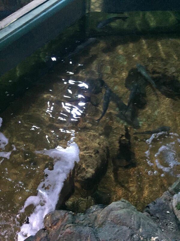
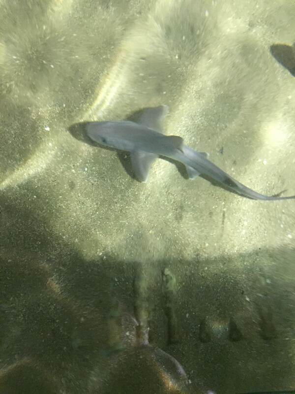
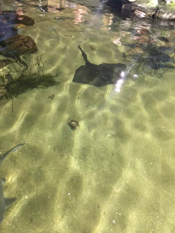
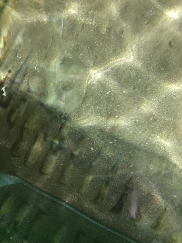
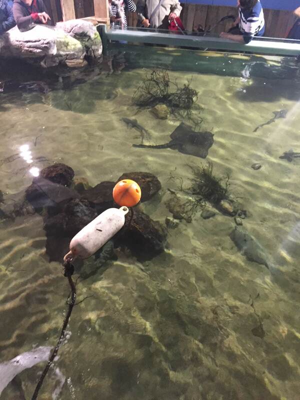
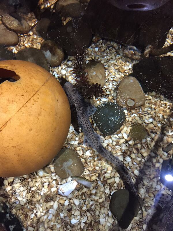
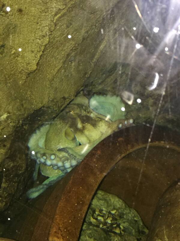
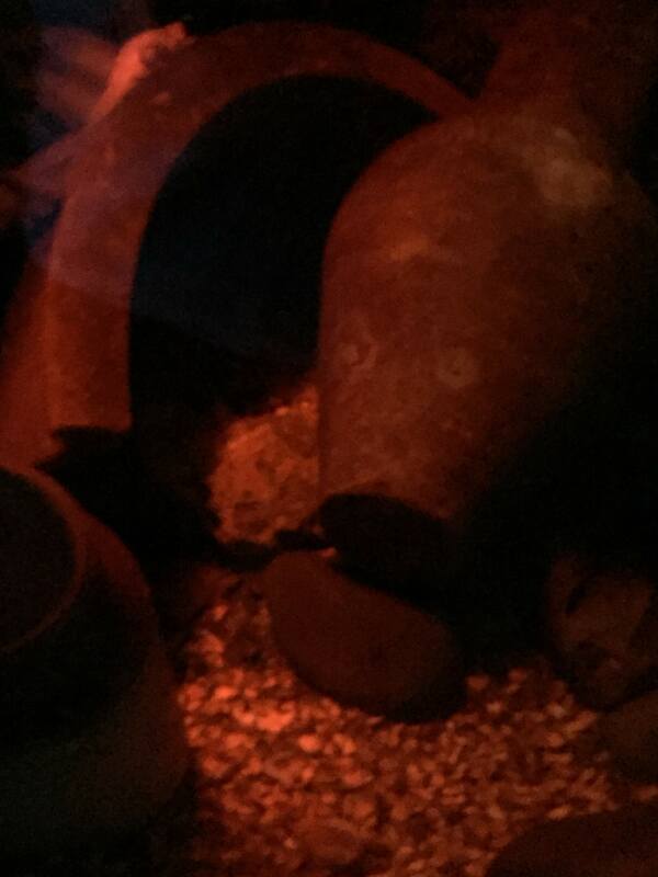
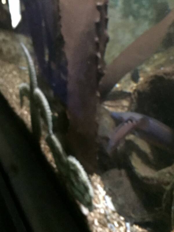
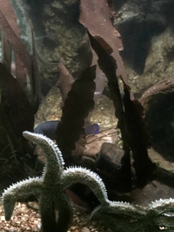
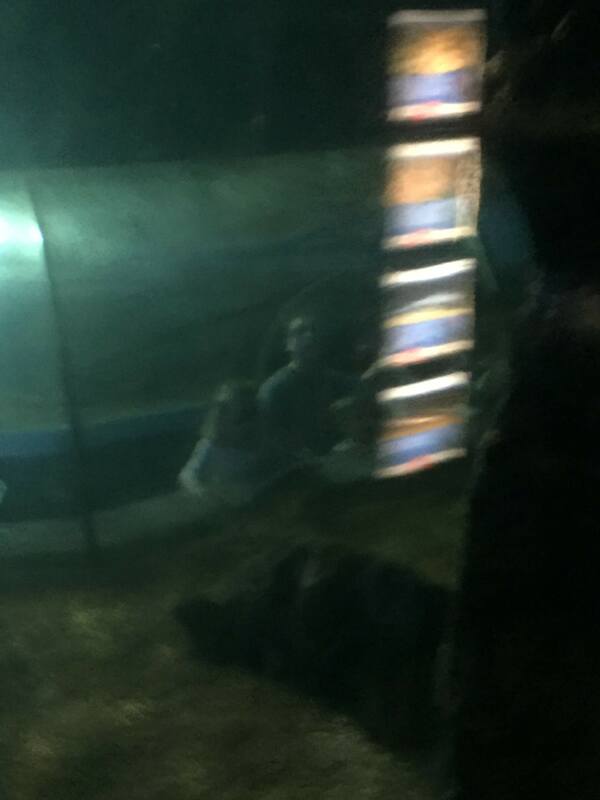
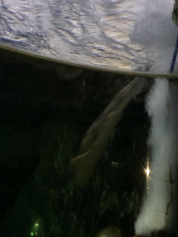
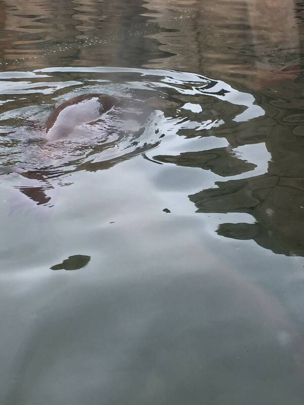
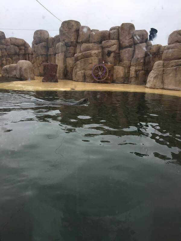
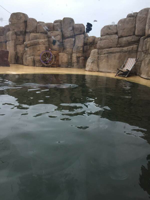
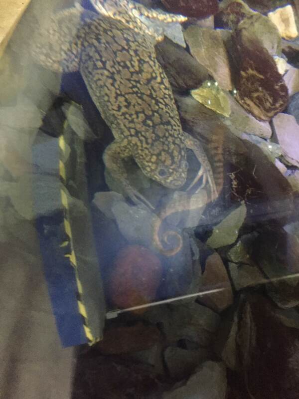
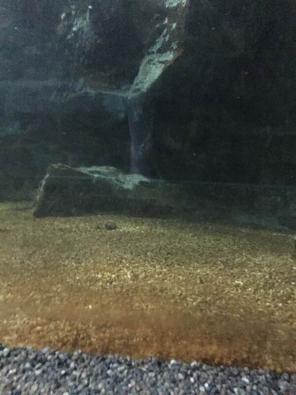
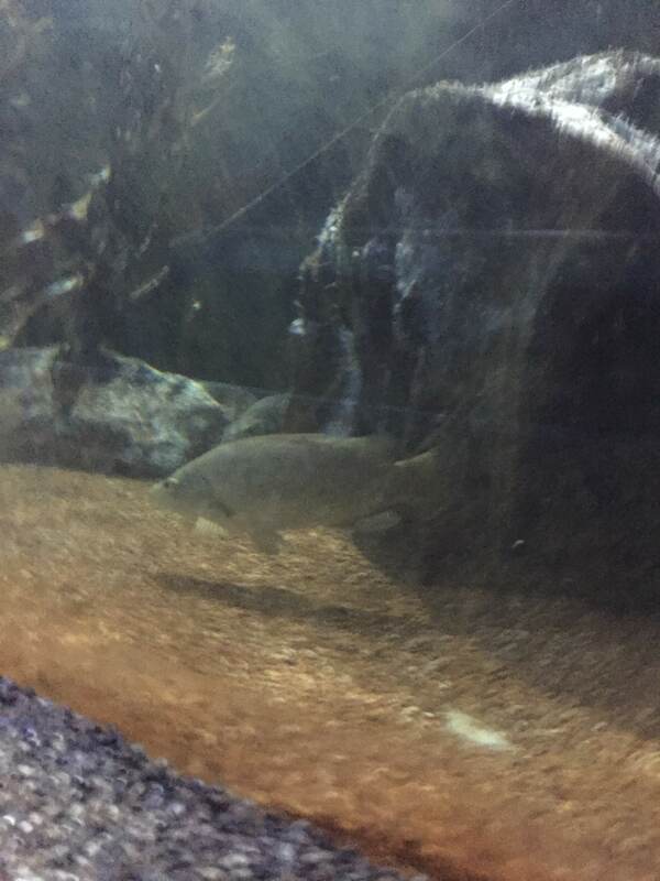
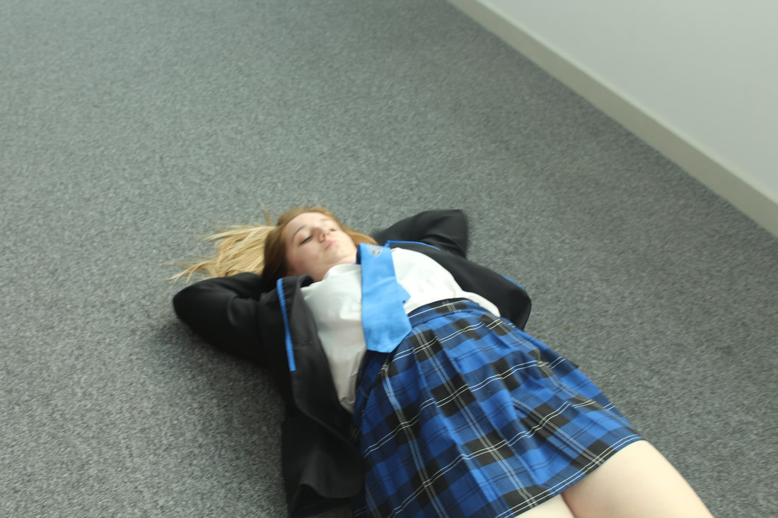
For this shoot I have decided to something totally different to what I have seen from my peers and other photographers. I have decided to use images from an aquarium that I visited in Rhyl and have my model like swimming in the tank. I also thought about trying to have my model in a space standing in one of the spaces on one of the images. In addition I thought about having my model pressed up against the glass on the tank. I think all of these ideas are different to what my peers have done and will make mine e stand out. My decision of which edit I will do will be based on how good my model images turn out.
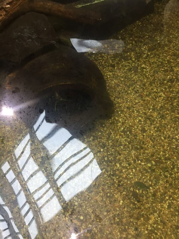
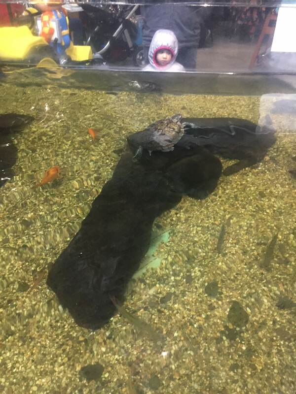
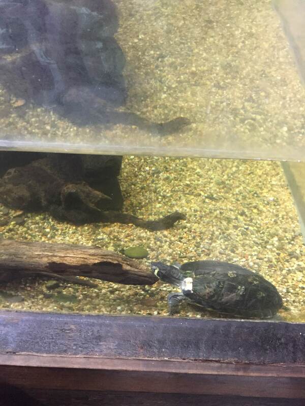
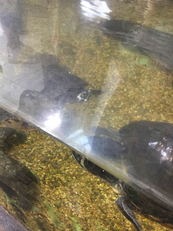
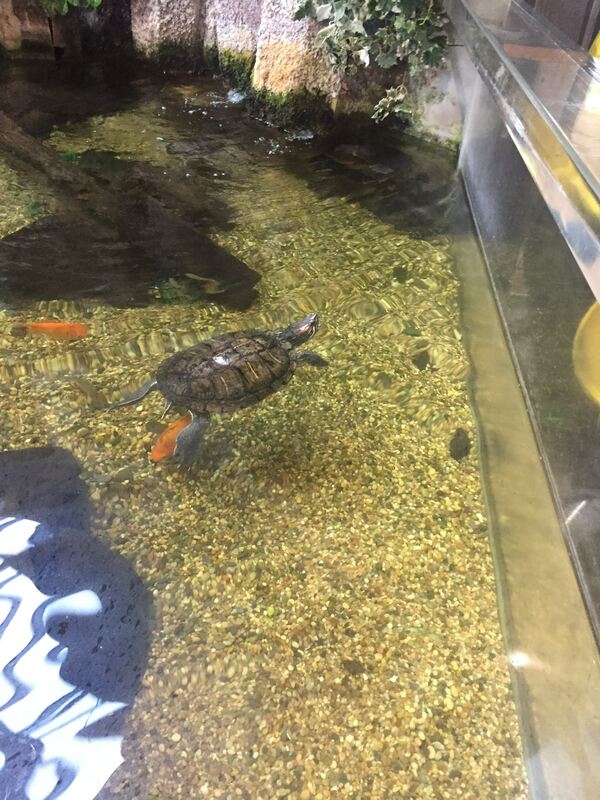
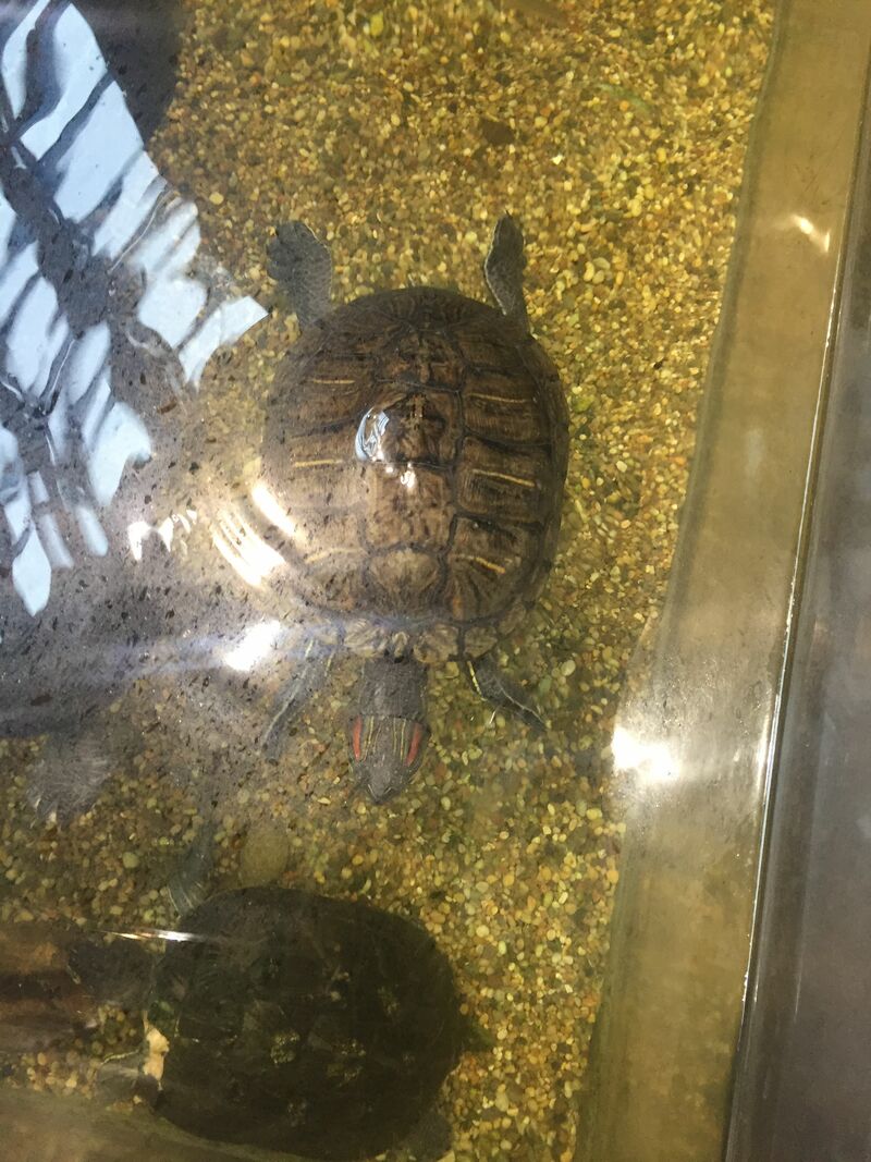
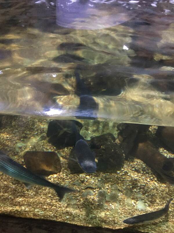
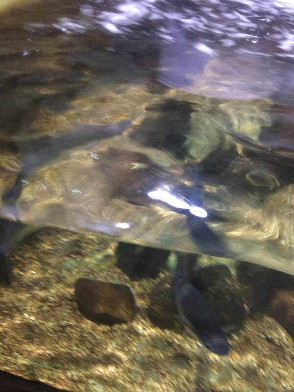
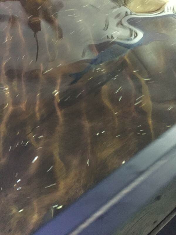
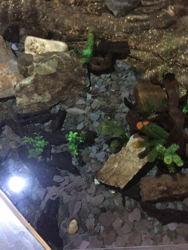
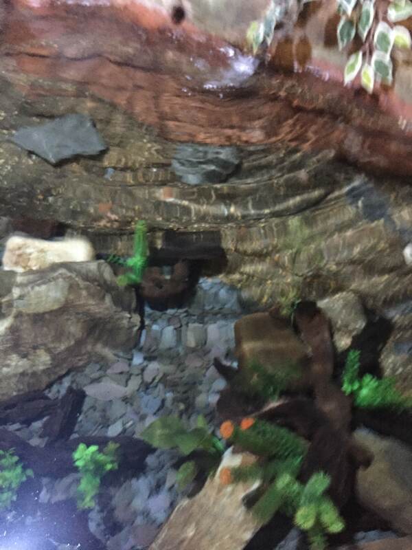
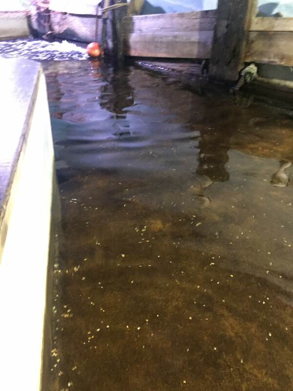
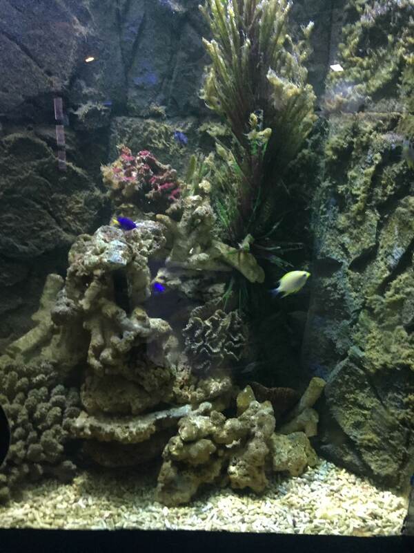
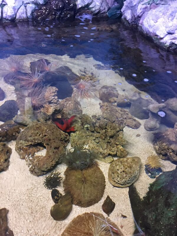
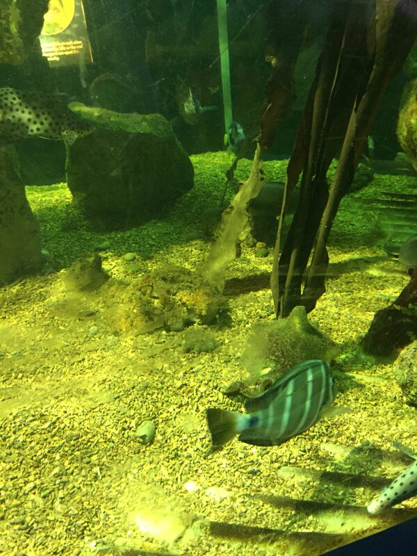
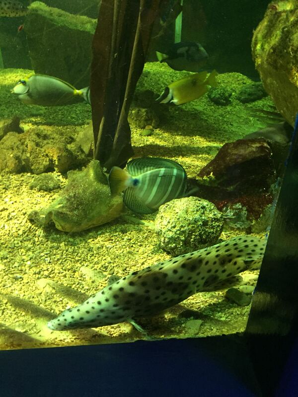
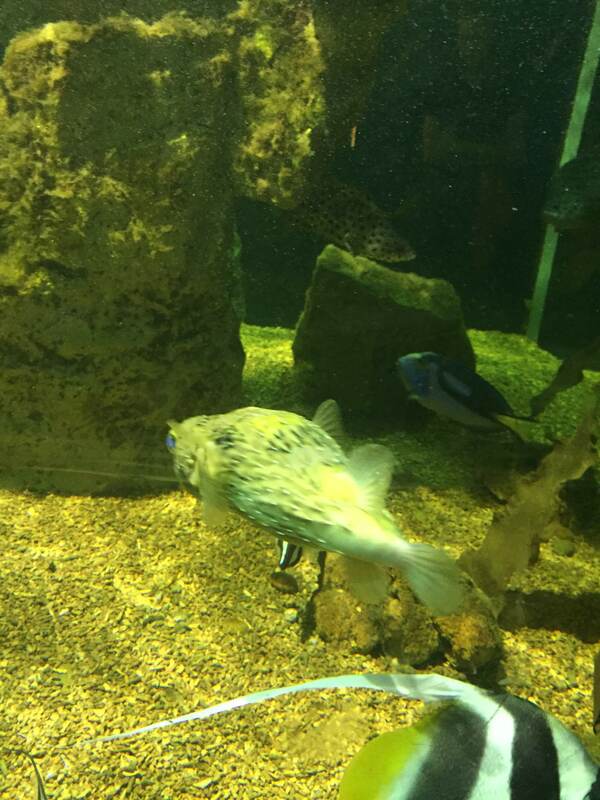
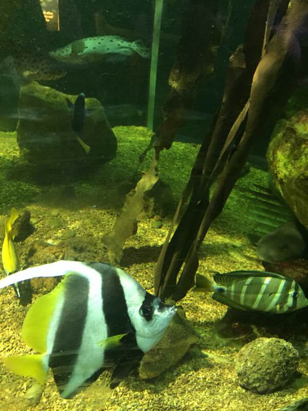
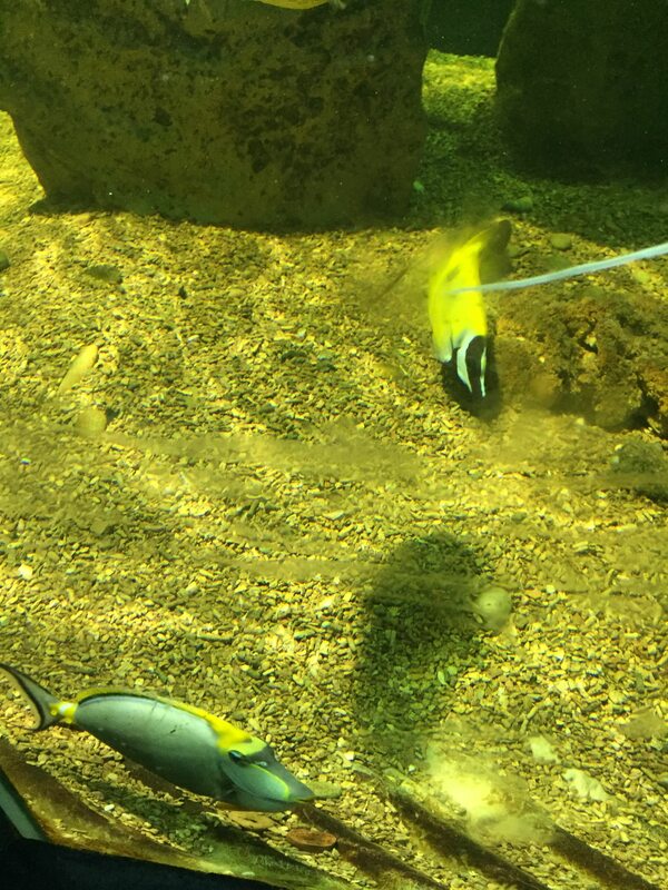
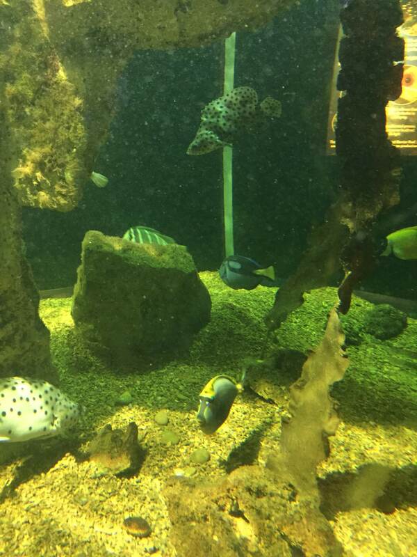
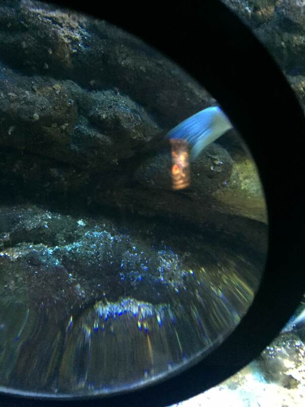
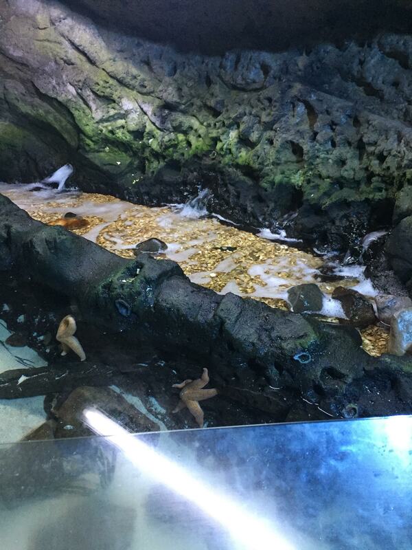
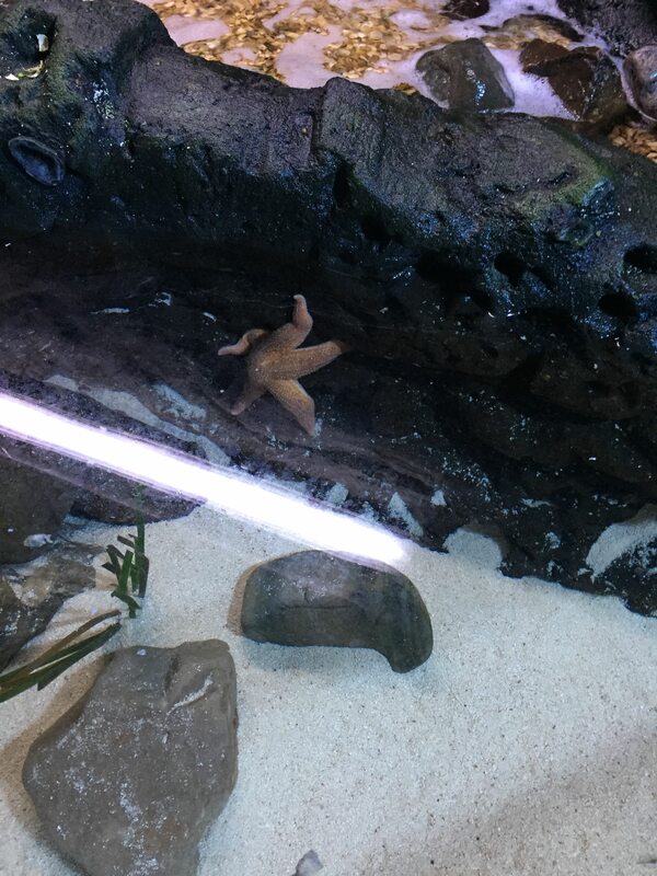
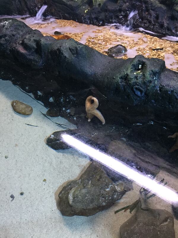
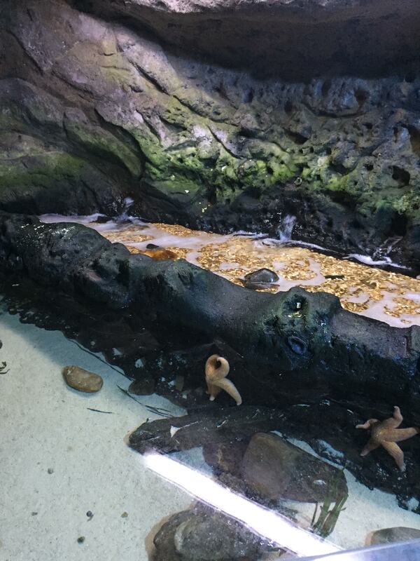
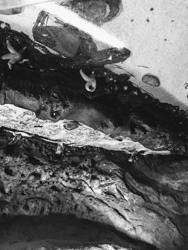
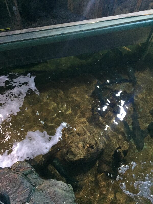
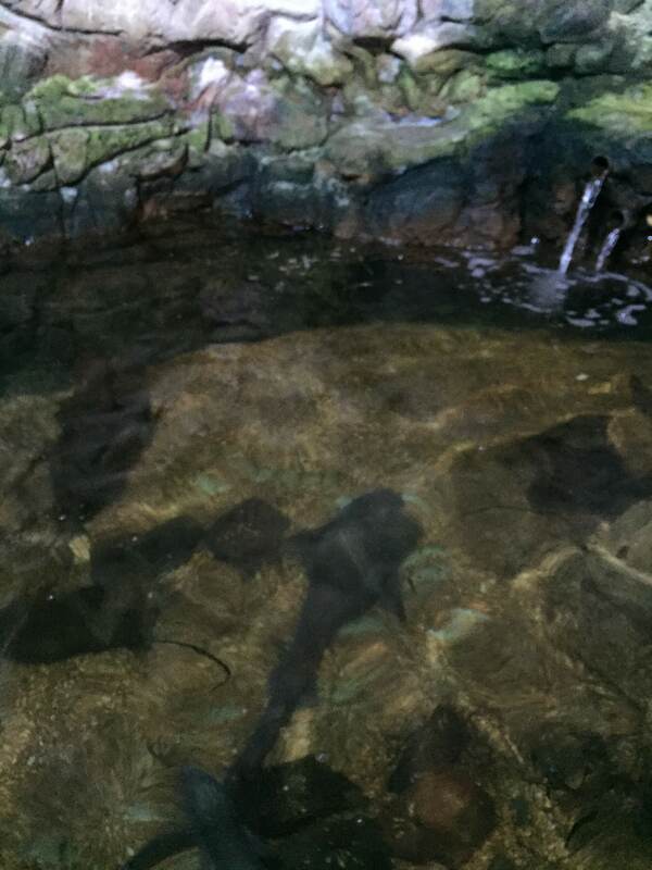
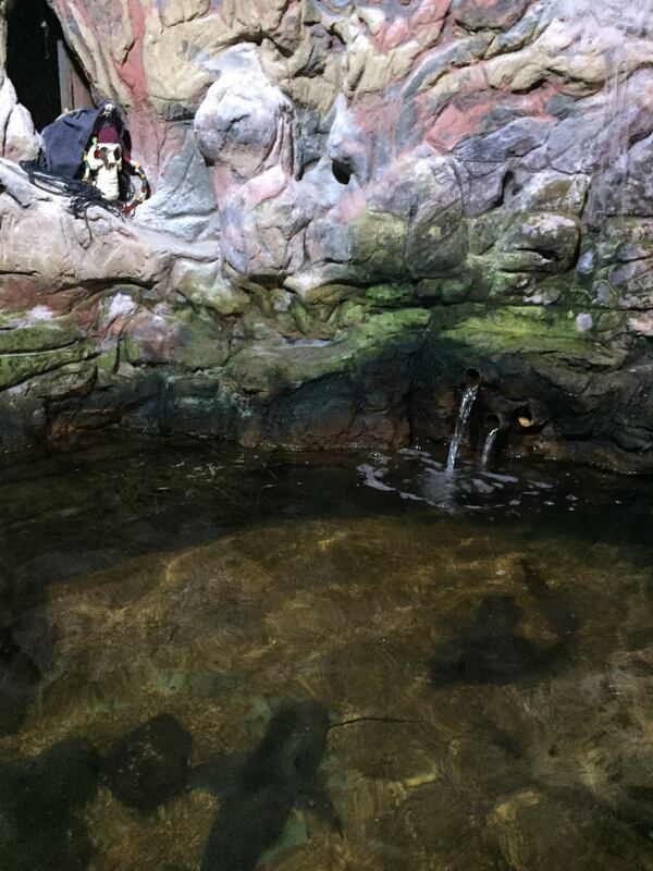
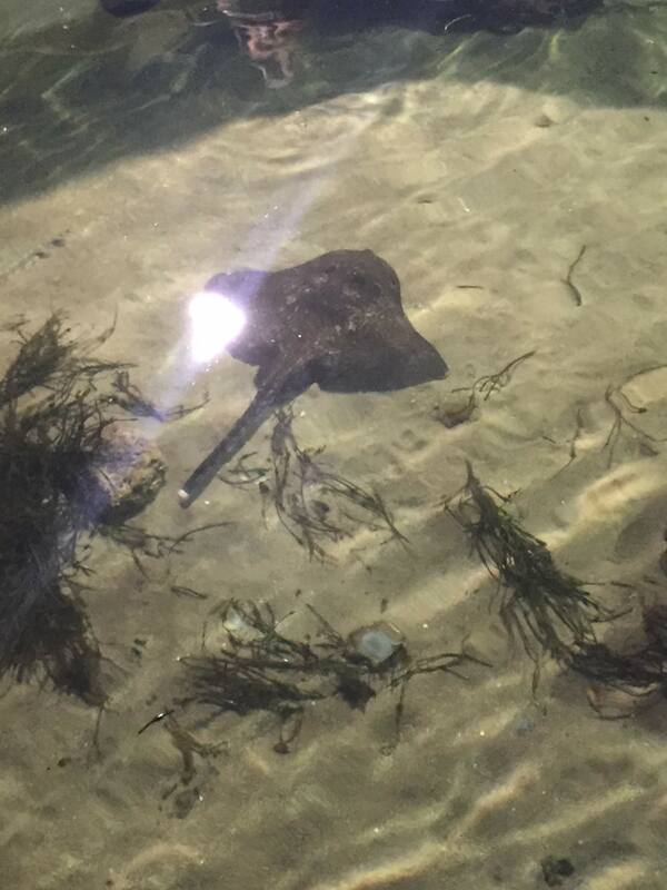
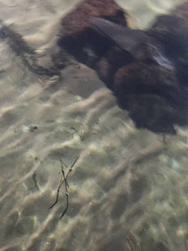
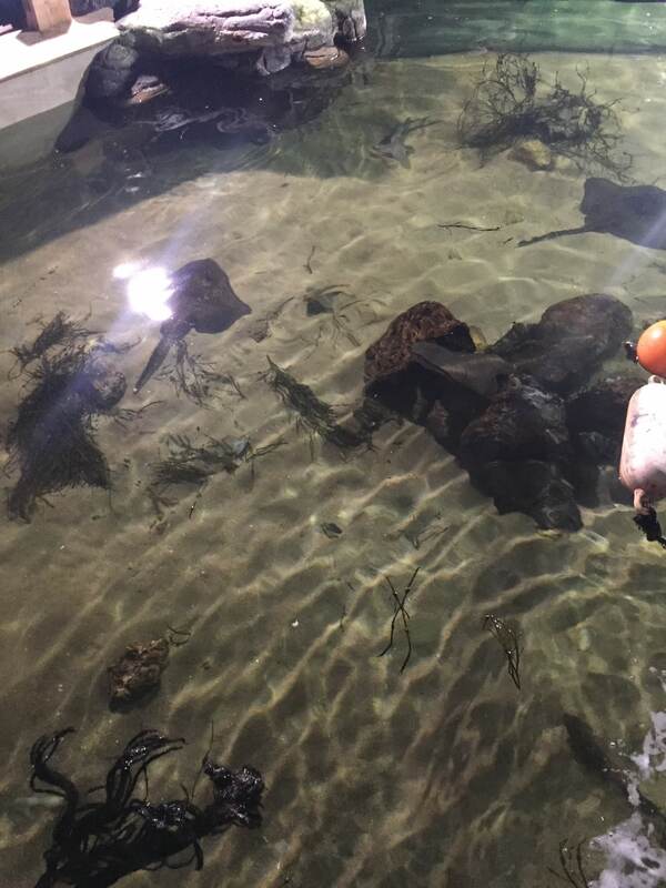
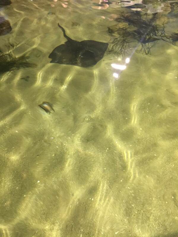
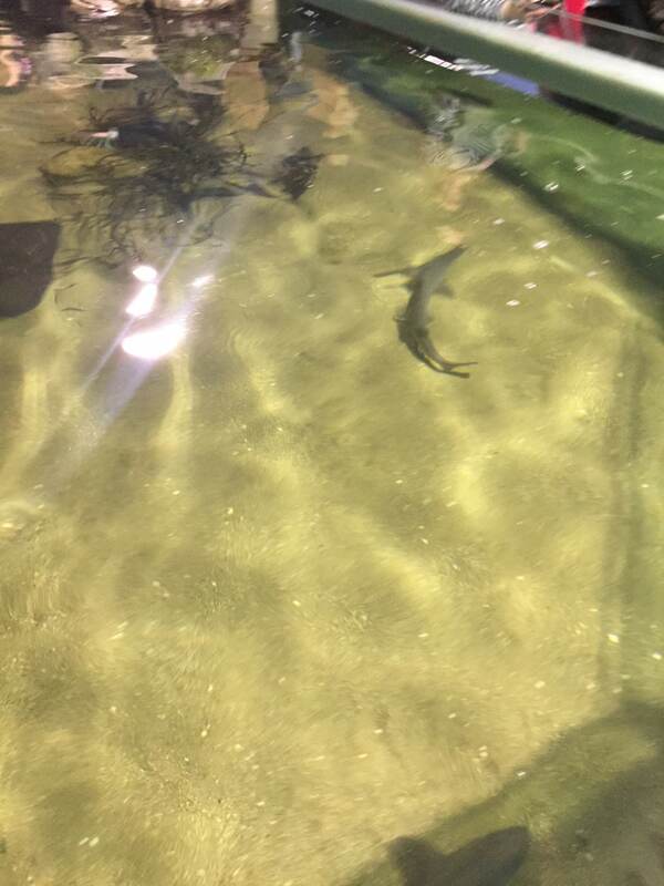
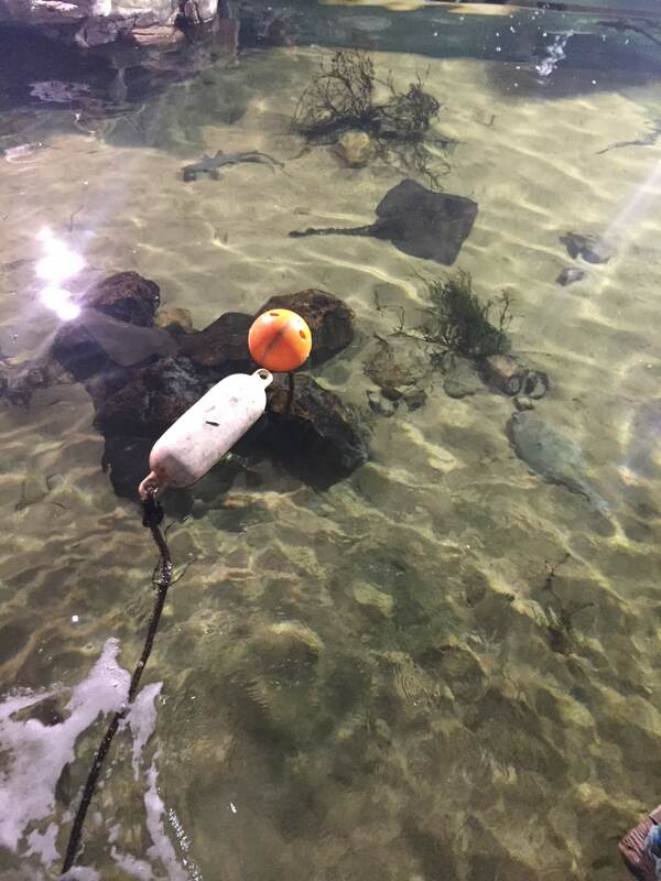
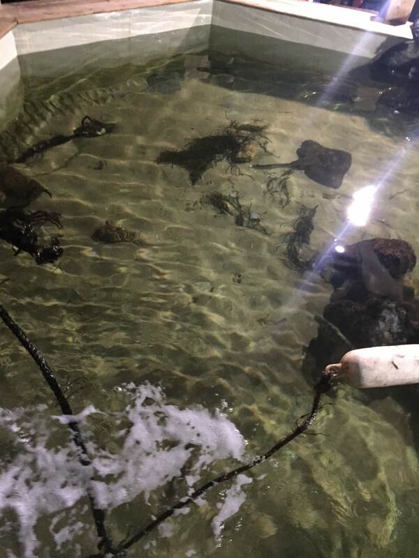
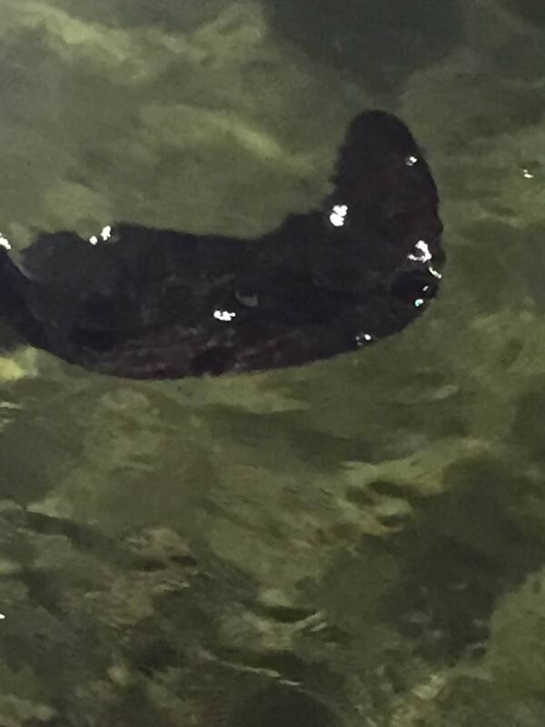
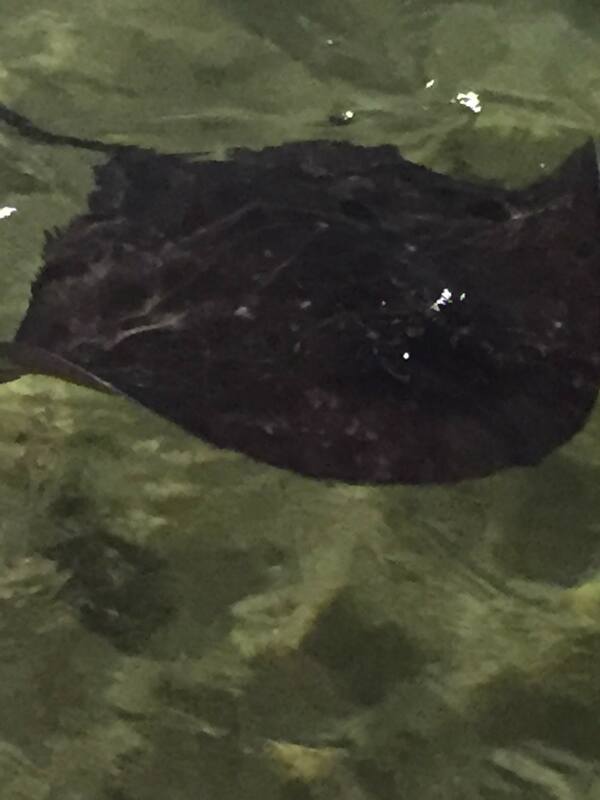
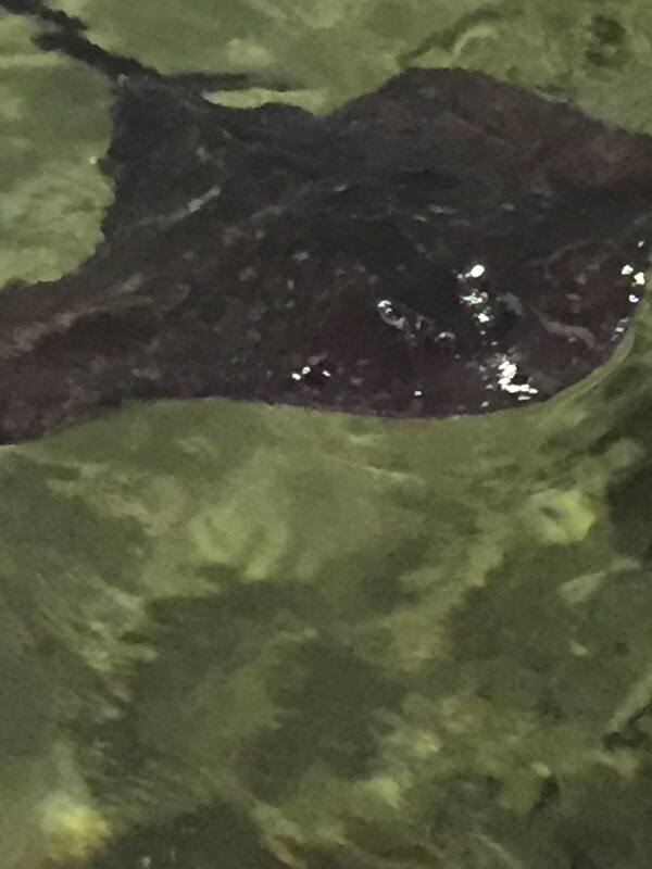
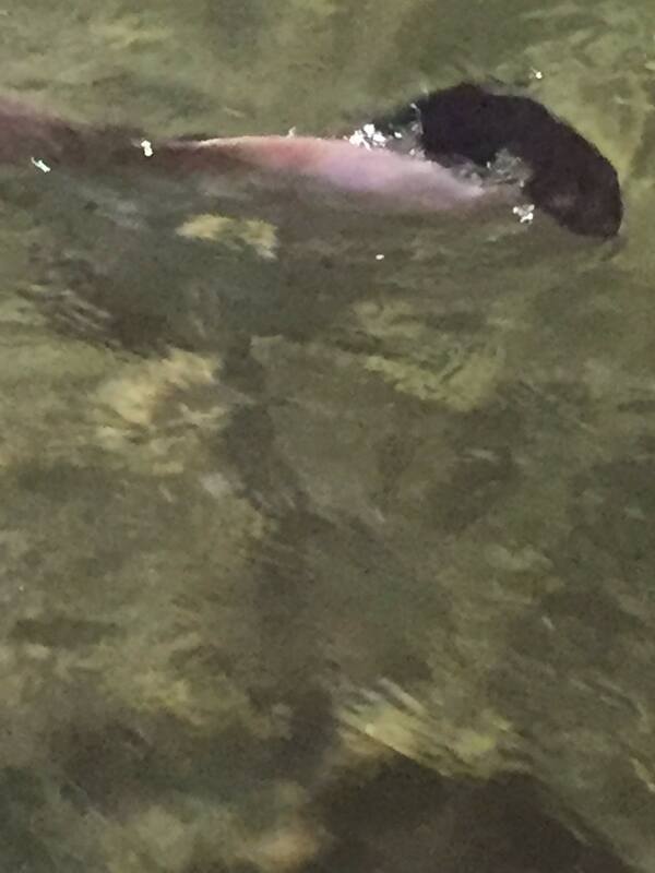
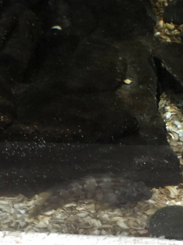
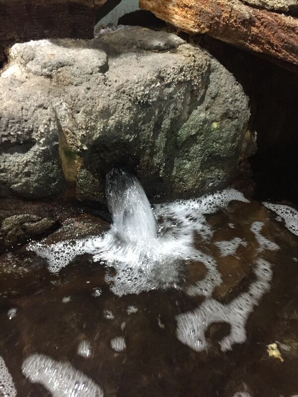
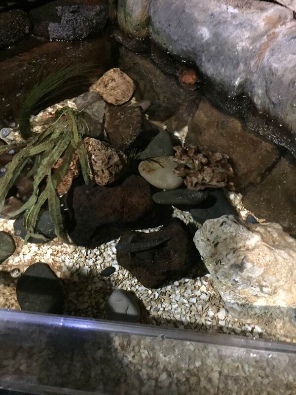
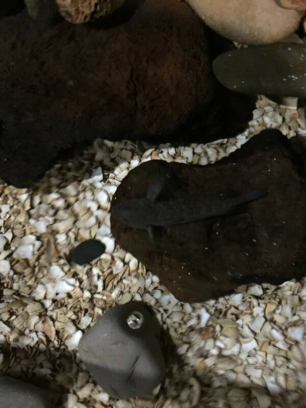
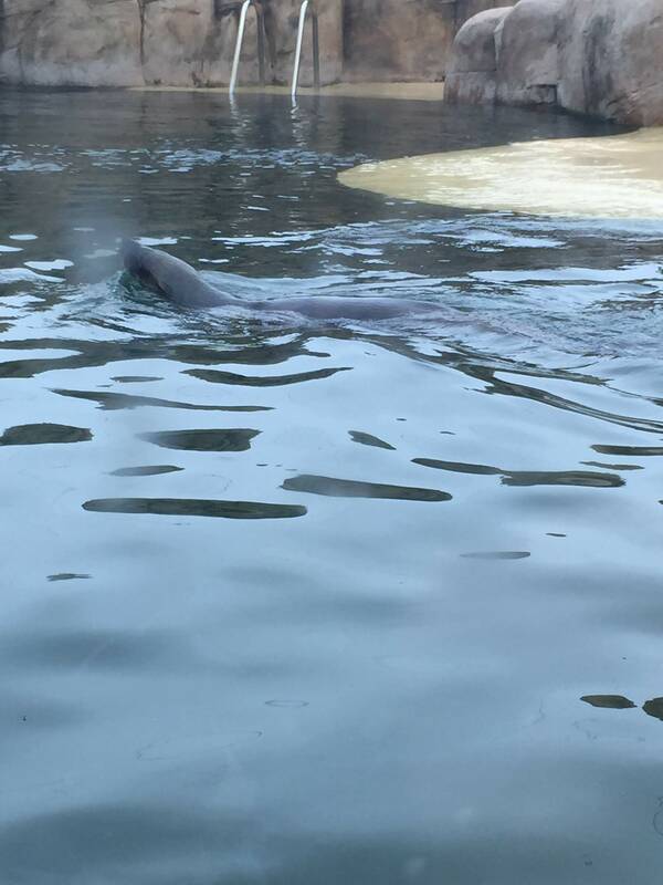
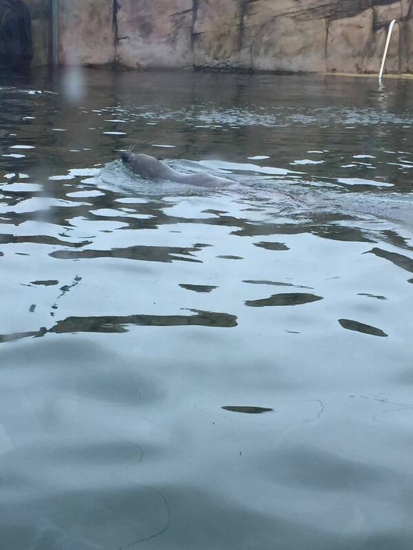
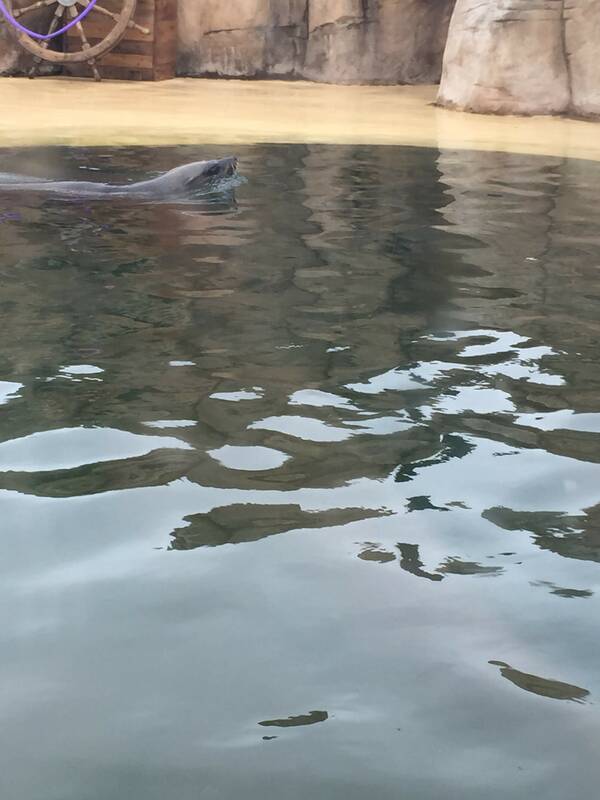
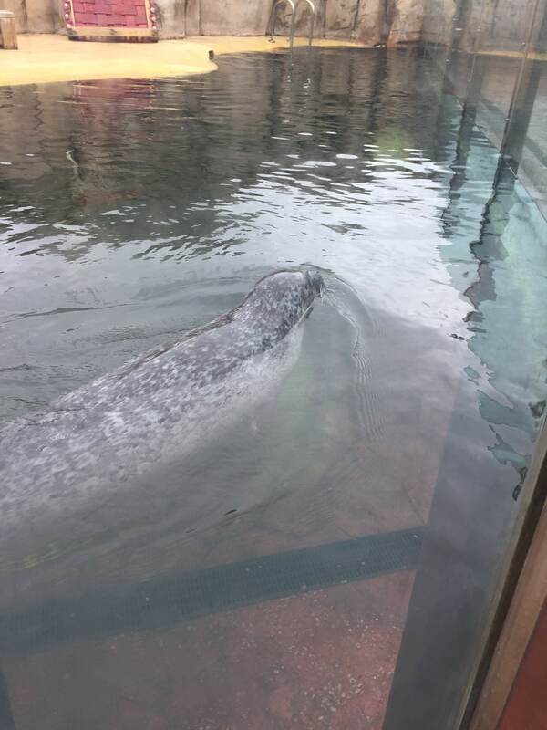
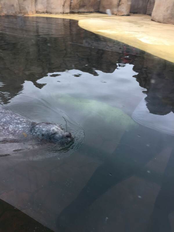
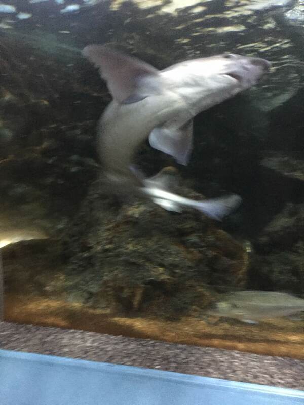
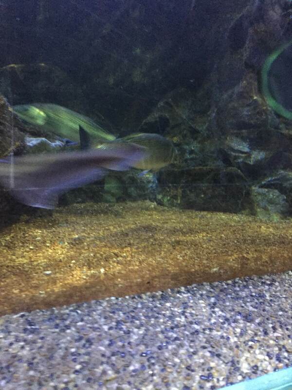
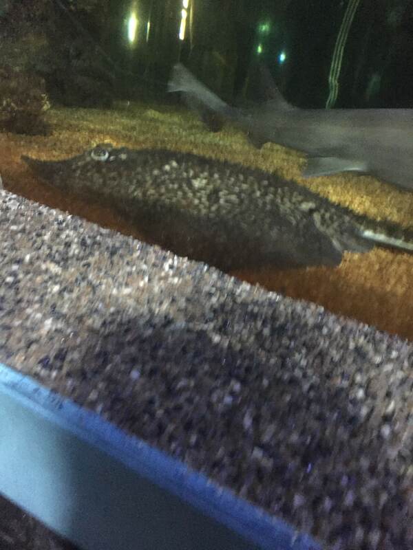
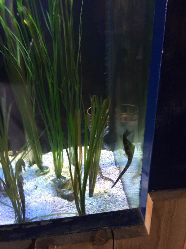
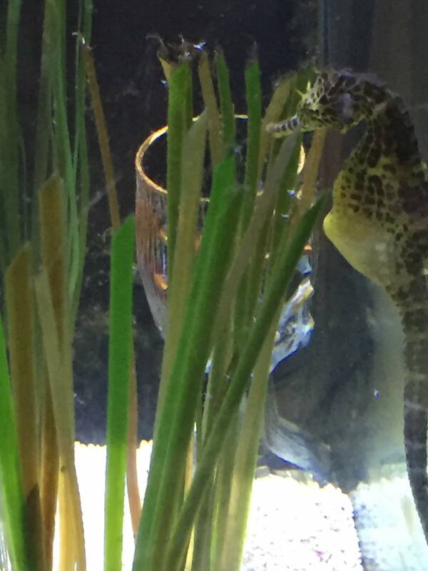
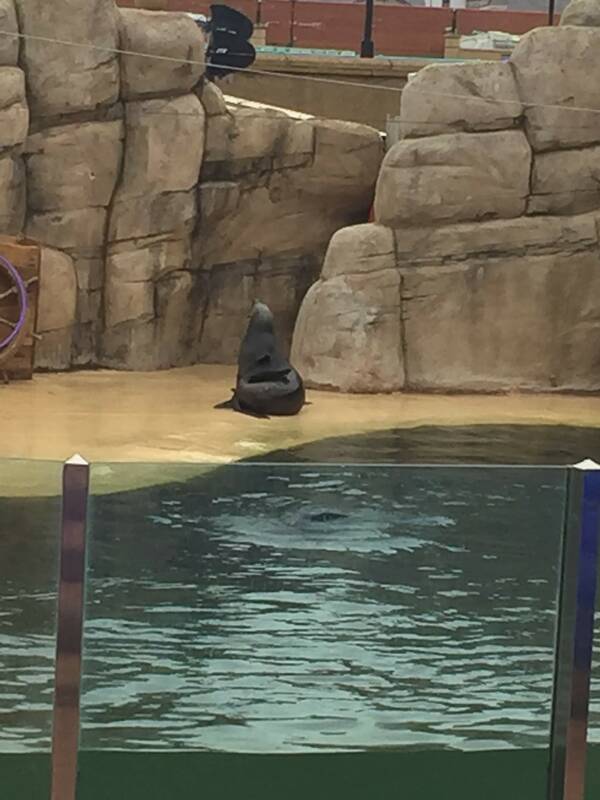
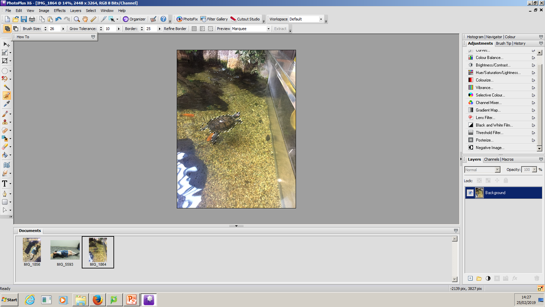
Aquarium Images


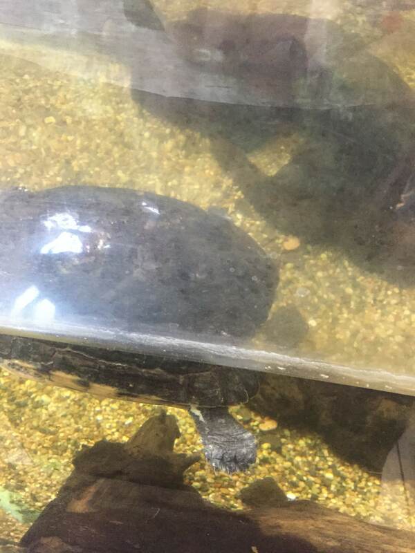
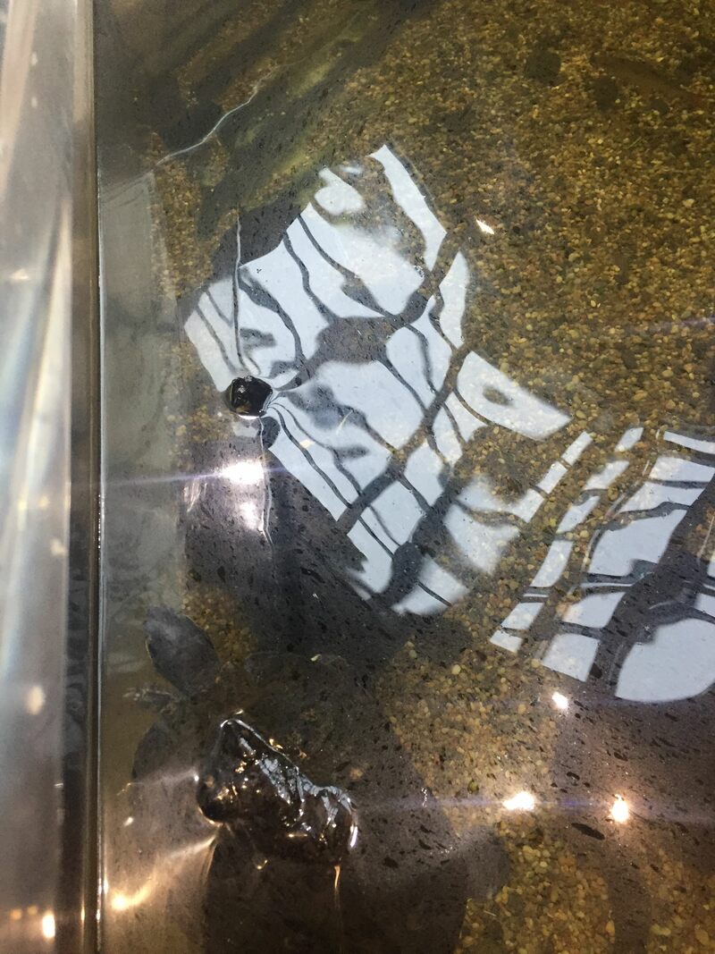
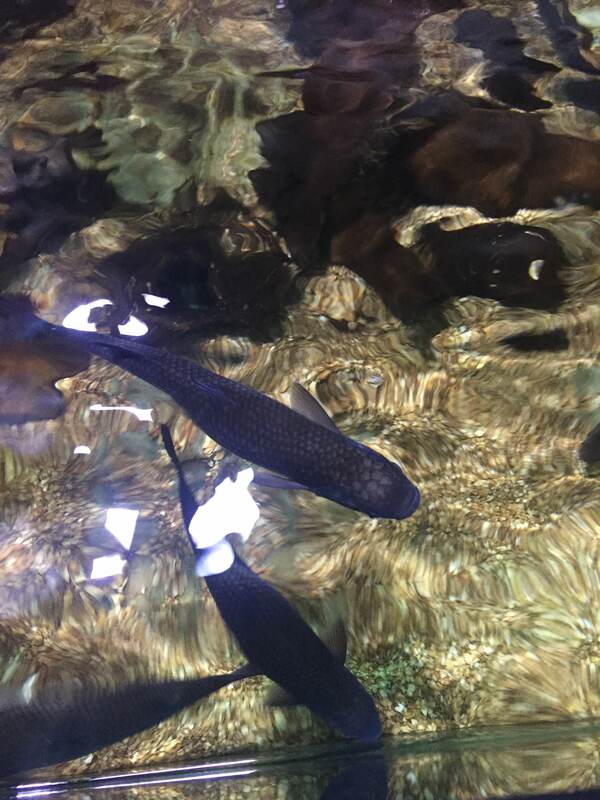

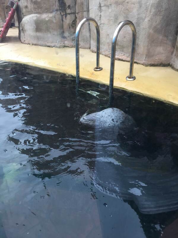
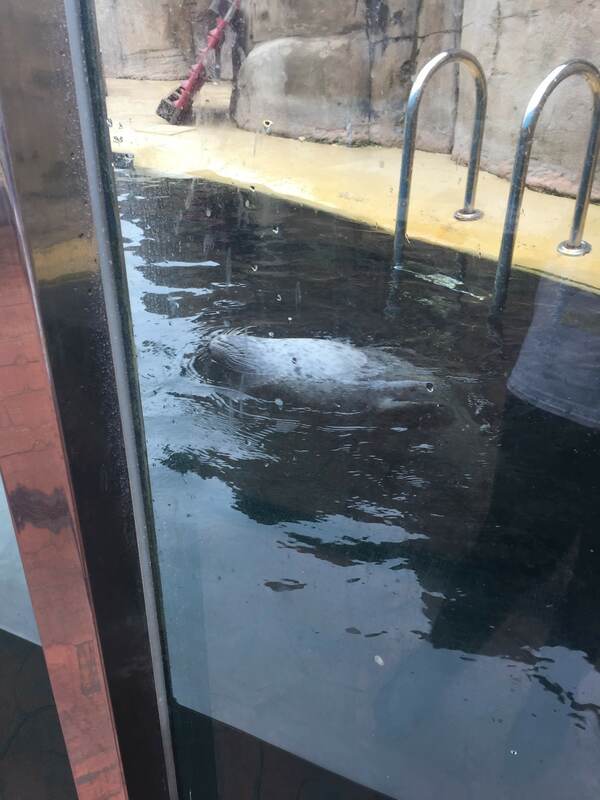
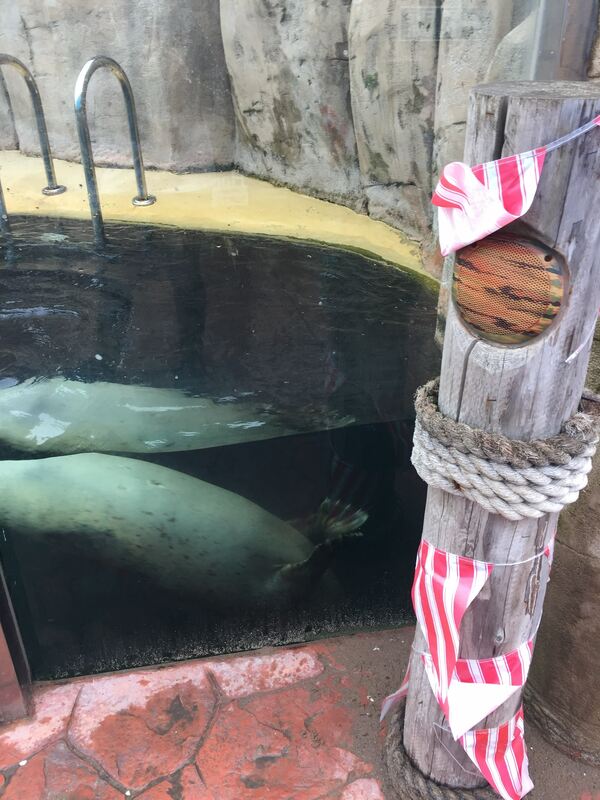
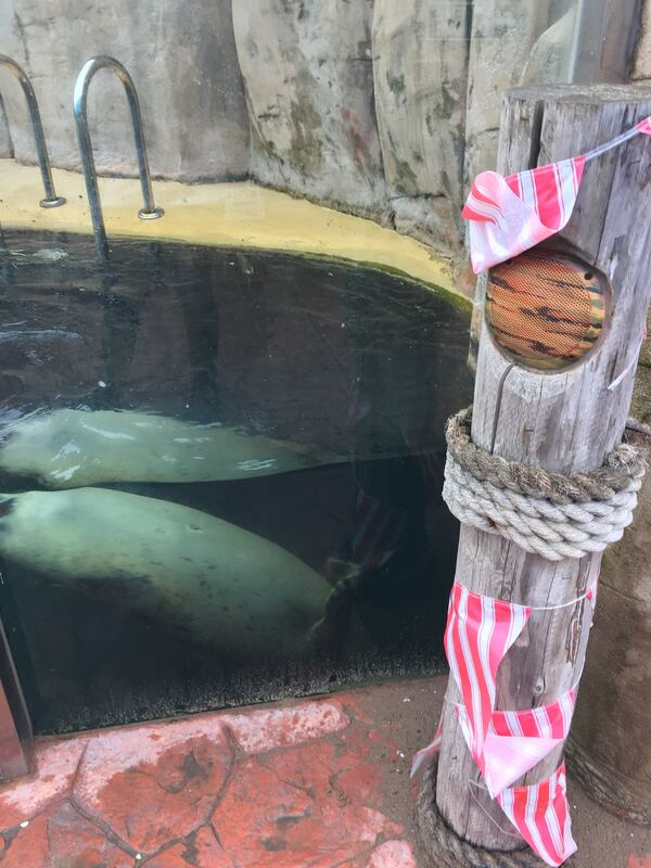

Model Images
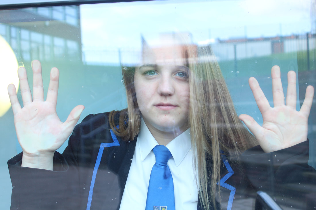


Worse Image

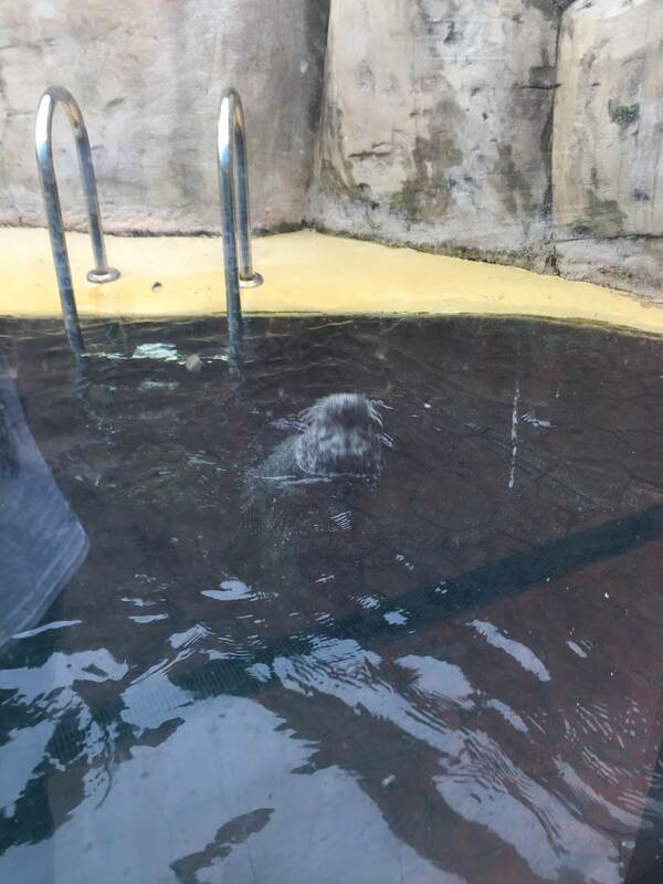
|
This is my worst image because through the window you can see the school which doesn't make it very appropriate for this shoot to look real. In addition I feel the nose isn't scrunched enough which doesn't make my image very good either.
|
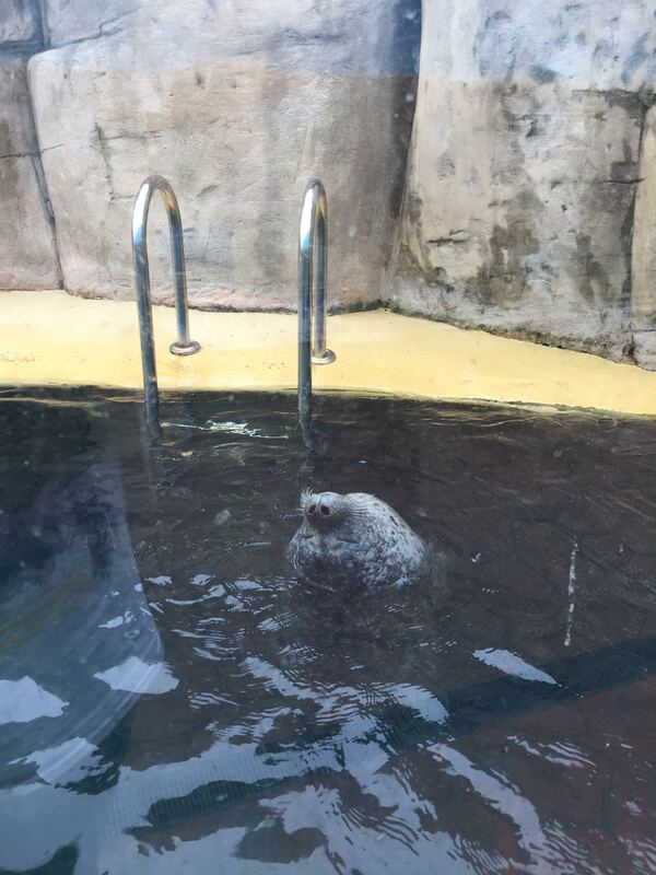
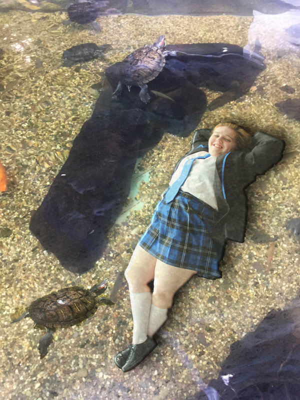
Best Image
This is my best image because I feel it will go best with the idea of having my model lying in the tank with a terrapin. Also I feel it will have the best look on the edit when it comes to it. Also I think the emotion shown on the face is the best for the image I want to have portrayed at the end of this shoot. In addition I think the exposure and depth of field are set really well and go with this image. However this image would be even better if you couldn't see another person beside my model but that is going to be cut out so it doesn't make much difference.
Editing Process
|
Firstly I used the smart selection tool to select my model. To make my selection smoother I used the smooth effect so it didn't look really rough around the edges of my model.
|
|
Then I copied and pasted my cut out on to my main layer (Ctrl+C) and (Ctrl+L). Then I used the deform tool to get my model to roughly the right size.
|
|
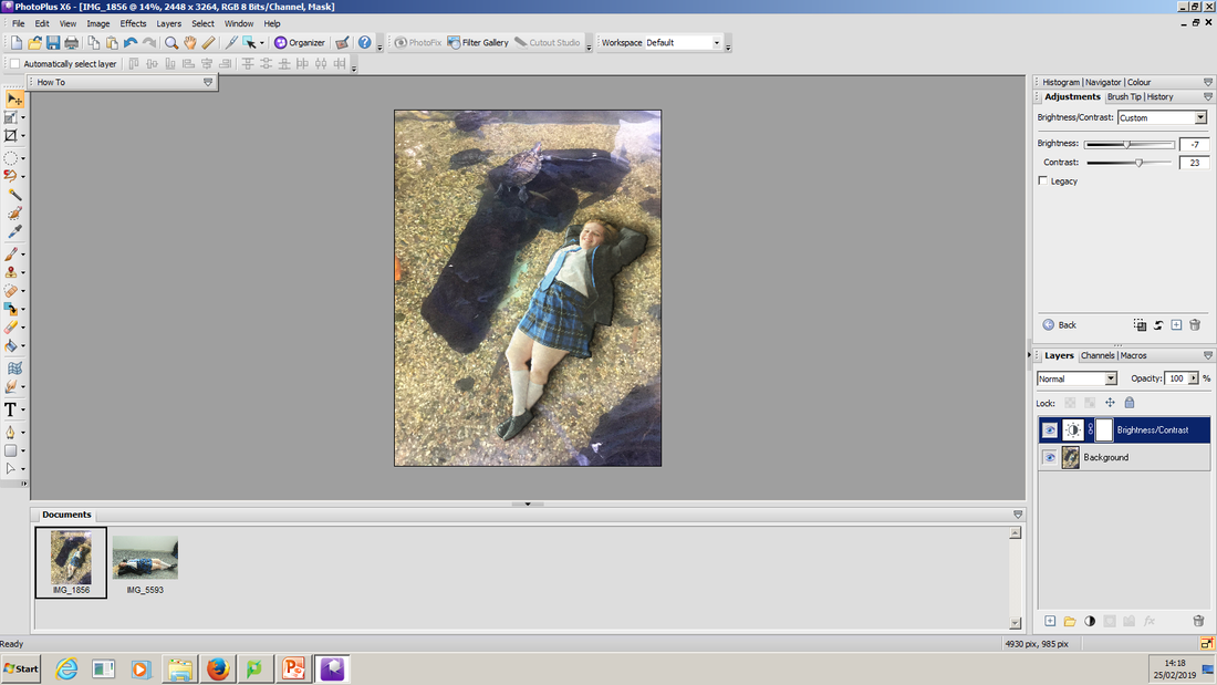
Here I have lowed the opacity of my model to 52% because the model's brightness was to high so it didn't go with the image and now it looks better and more real.
|
|
For this stage I dropped a shallow shadow on my model to make the contrast of the two images go with the edit I am creating.
|
|
Next I changed the brightness and contrast to make the model blend more with the image. I change the brightness to -7 and the contrast to 33.
|
|
I decided that my image looked a bit plain so I decided to use the smart selection tool to cut out another terrapin and add it to the original image.
|
|
To finish my image I copied and pasted the extra terrapin over to the main photo and I merged it with the background so that it looked like it was originally part of the image.
|
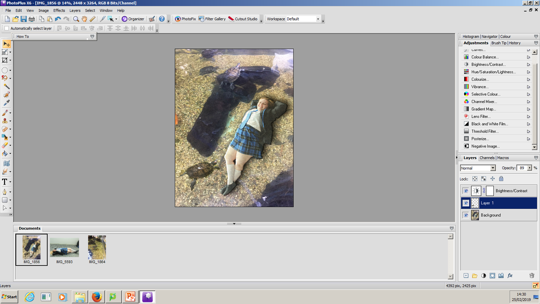
Final Edit

I like this image because it is a warming image but also because it includes some of my photos that I took outside of school on holiday with my family. In addition it shows like a 'under the sea' feeling which could link to the little mermaid which considers the theme of my project. This edit would be even better if some of the selection wasn't still there also if it looked like my model looked like she was going with the water a little more.
Shoot Analysis
Shoot 4
Plan
For this shoot I am planning on recreating my first shoot and instead of having my model trapped in the card I am going to change it and have a male and a female head in the card where the queens face is. I plan on removing the original face of the queen and trying to import a male face and female face as if it was originally how the card was meant to be.
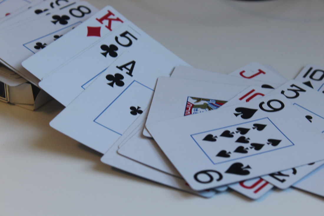
Card Images


Worst Image

|
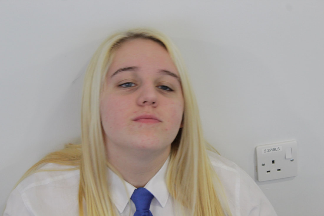
This is my worst image because the emotion conveyed on my models face isn't angry as I would have liked it to be. In addition the focus point isn't directly on the face which would make it really hard when I come to editing. Additionally for this shoot I think the eyes would be better open than shut so you can see the mood more clearly.
|
Best Image

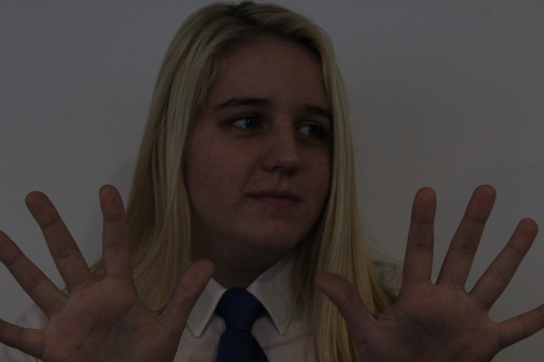
This is my best image because it shows the sass really well. Also i like how the focus is on the models face so it can easily be edited to make my final image. In addition I like how the depth of field is large so the image is conveyed to show the emotion very well. However I am not too sure if the exposure is too dark or not so I don't know if it will work as well but I like how when you look at the image you feel like the model is staring you in the face.
Editing Process
|
First I used the smart selection tool to select my model's face. Then I copied (Ctrl+C) and pasted (Ctrl+L) the face on to my card image. Next I used the deform tool to get my image to the correct size.
|
|
Next I copied the card image so that i had two layers of the same image. Then I placed the image of the face on top of the eyes of the background image. I lowed the opacity so i could line the face' eyes with the cards eyes this was so they looked level to make it believable. Next I used the blemish tool to pull my models face out a bit more.
|
|
Then like i did with my first model I selected the face using the smart selection tool. I used the smoot effect to smooth the edges so they didn't look rough.
|
|
Then I copied the (Ctrl+C) and pasted (Ctrl+L) the second face over to the background image. Again I used the deform tool to get my image to the right size. Also I changed the opacity to line the eyes with the cards eyes. I flipped the head round a bit to try and get it to fit with the image and blemished the face so it covered the whole face.
|
Final Edit
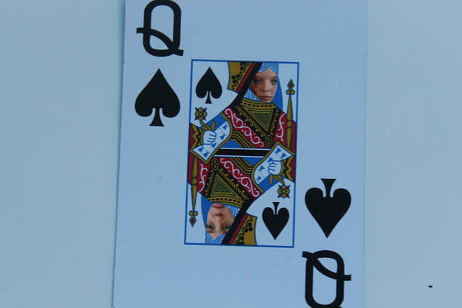
I like this edit because of how it finishes my weird and wonderful project by linking back to the first shoot I did. In addition the expressions on my models faces show a real conflict look which links to my theme of fairy tales as it could show the conflict between the queen of hearts and the white queen in Alice in Wonderland. This edit would be even better if the card was the queen of hearts but also if the faces were deformed a little more so that they were further up in the hair line.
Evaluation
I have quite enjoyed this project because it has helped me to edit and has improved my editing skills from my last project. In addition it has used a lot of imagination to come up with the ideas for my shoots. Sometimes it was hard to generate ideas for my shoots but as soon as I had the ideas it was easy to get started with the tasks. I think my shoots for this project would be better with a little more editing experience. Overall in my opinion this project has been a success and I hope the next one is a lot like this one.
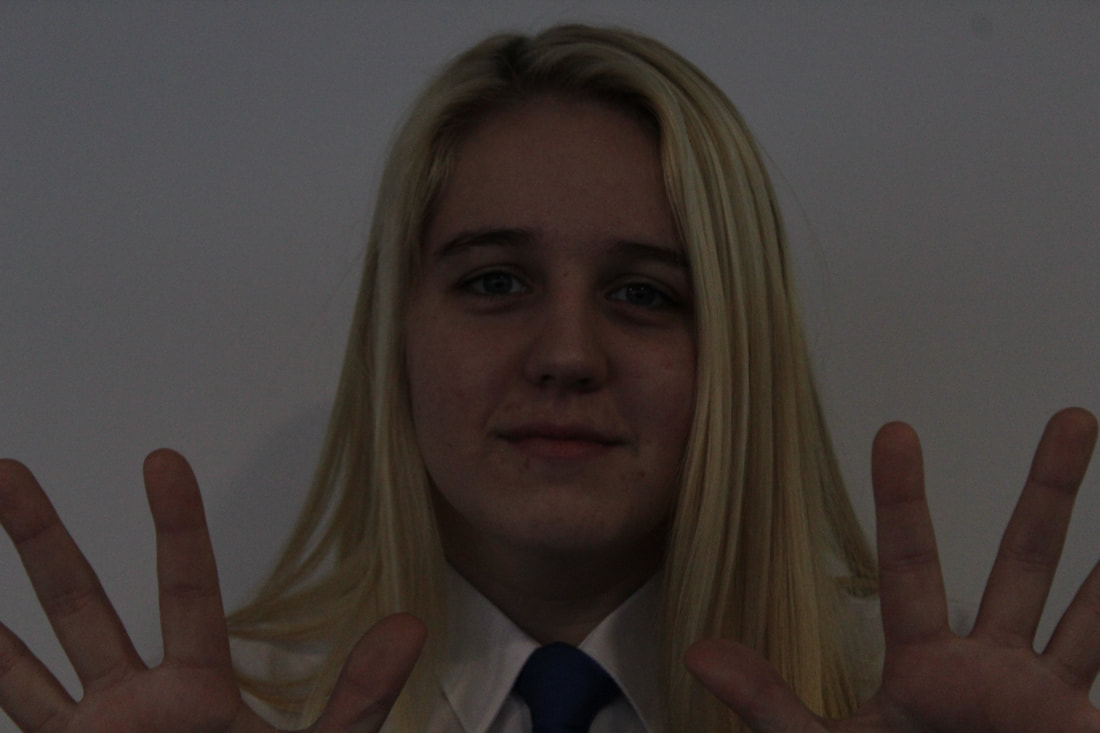
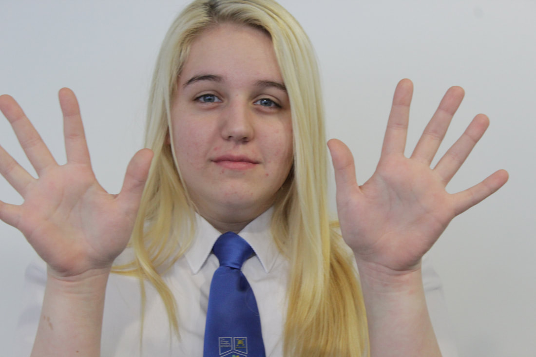
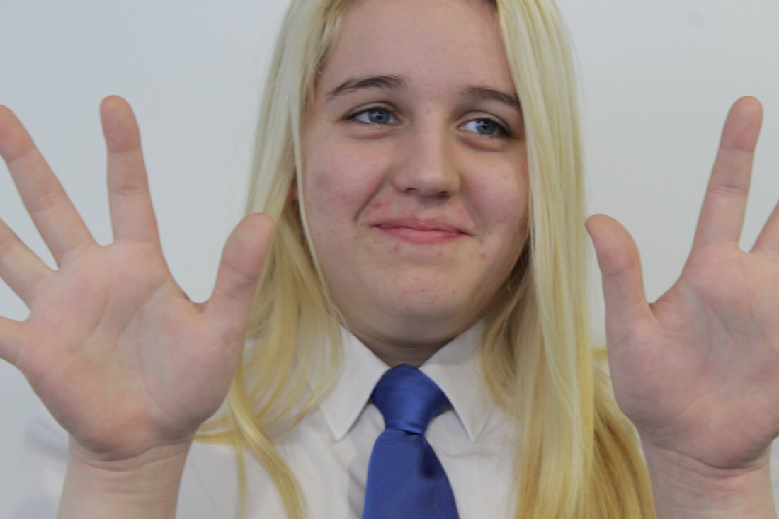
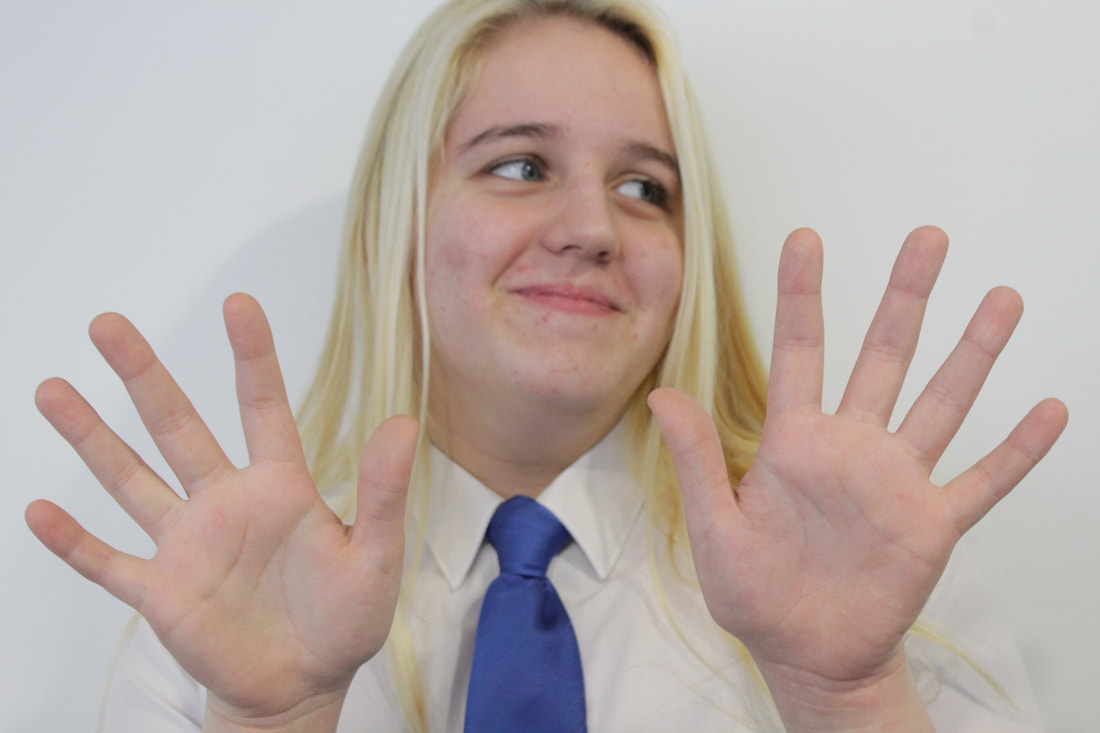
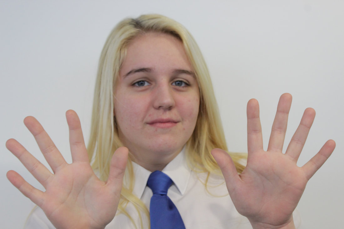
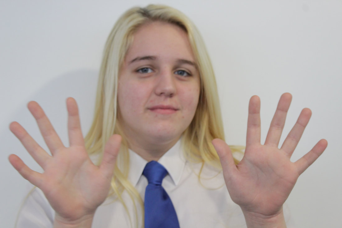
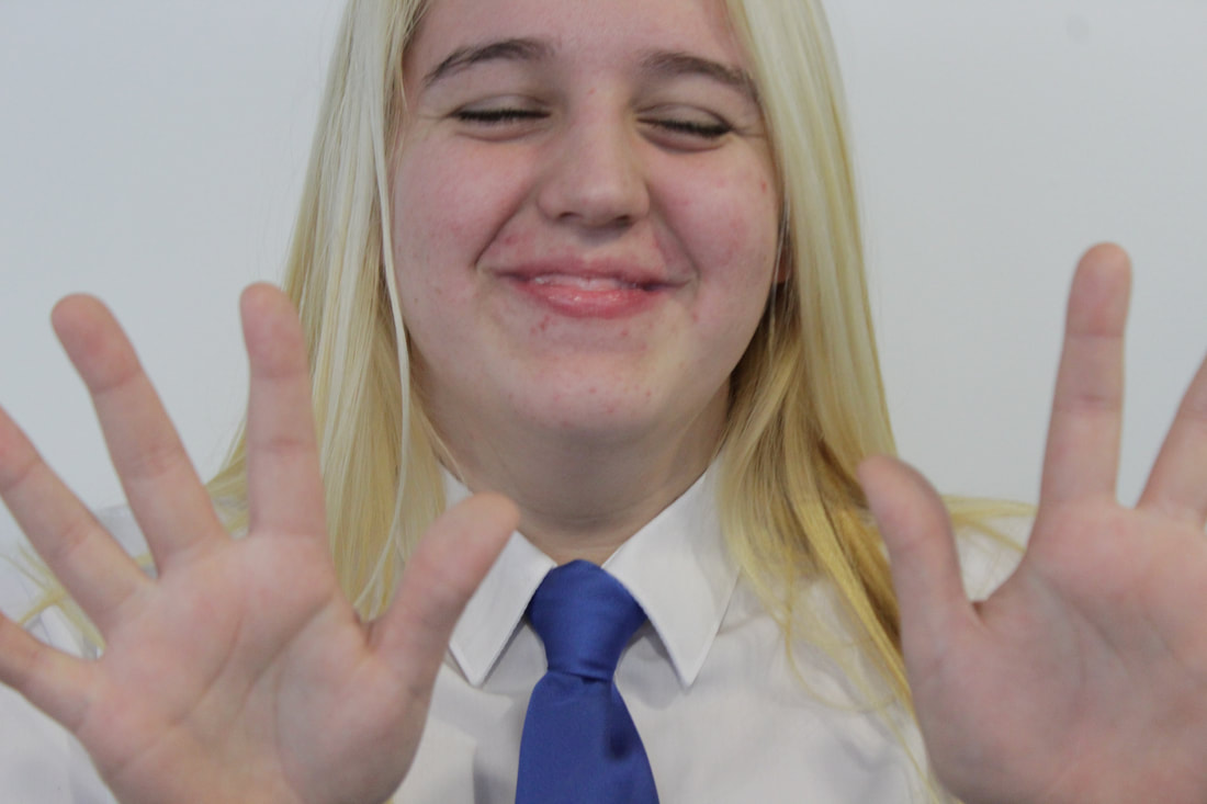
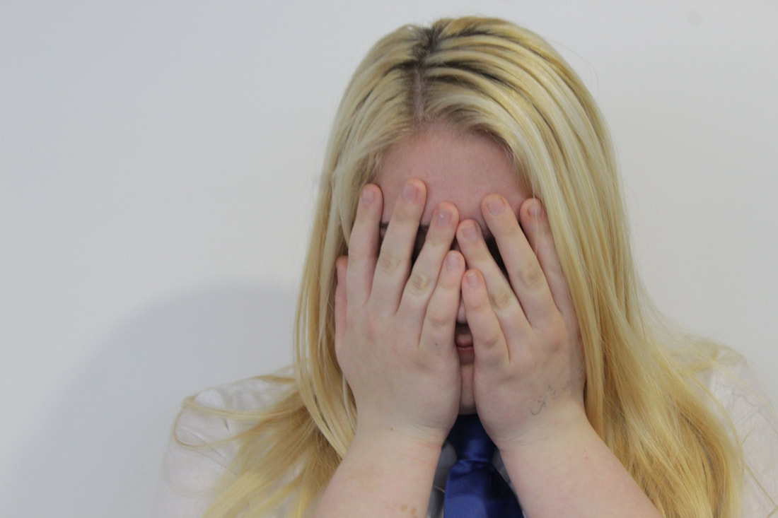
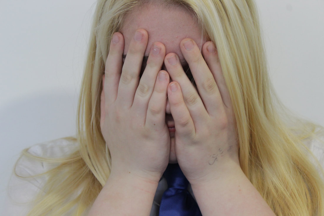
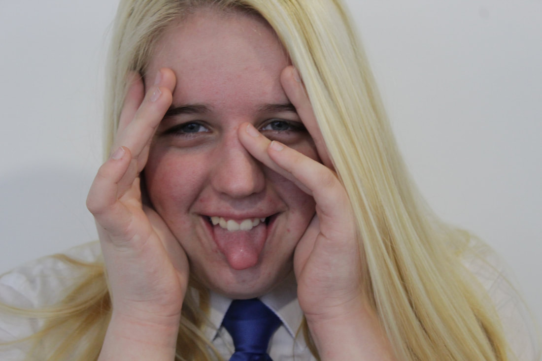
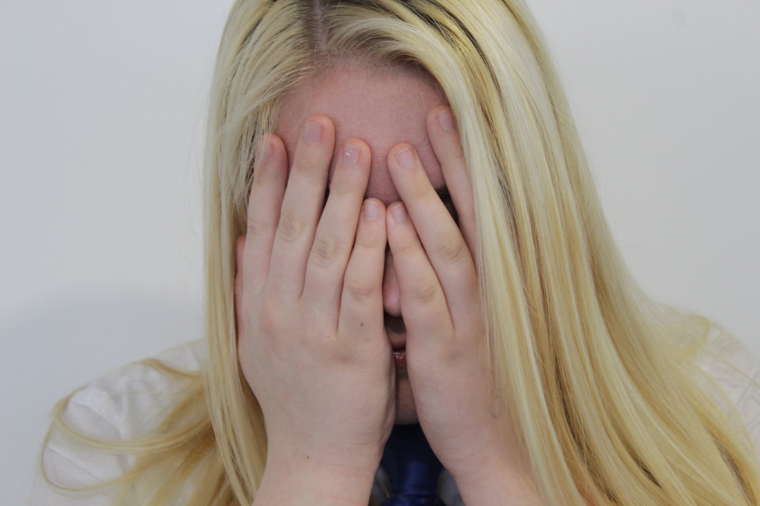
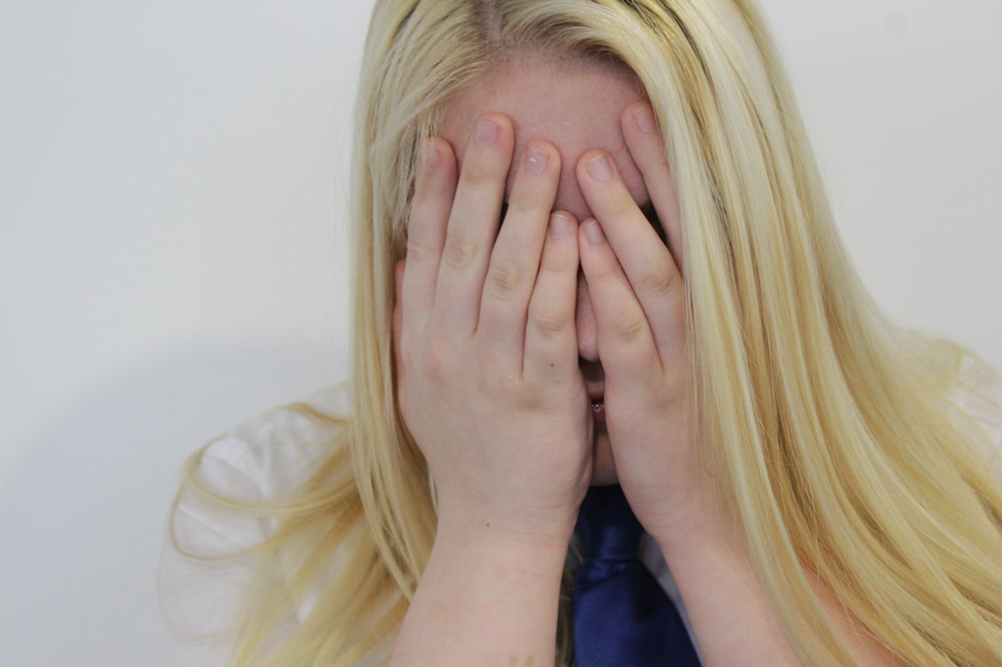
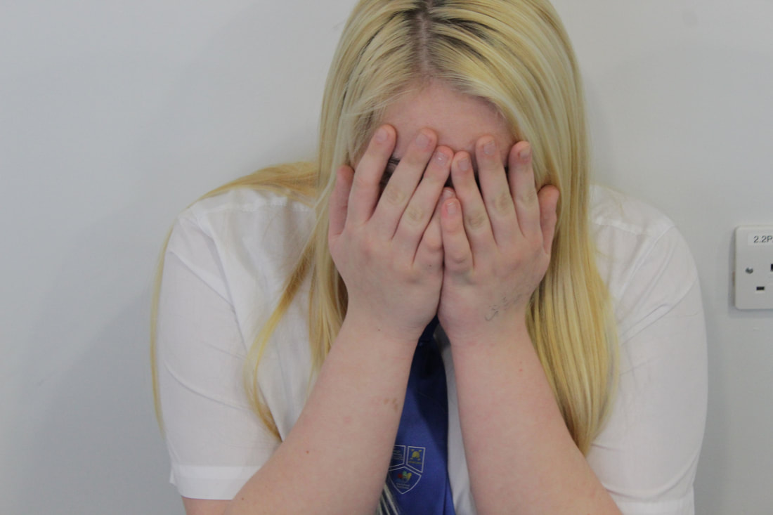
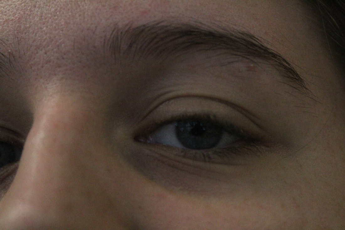
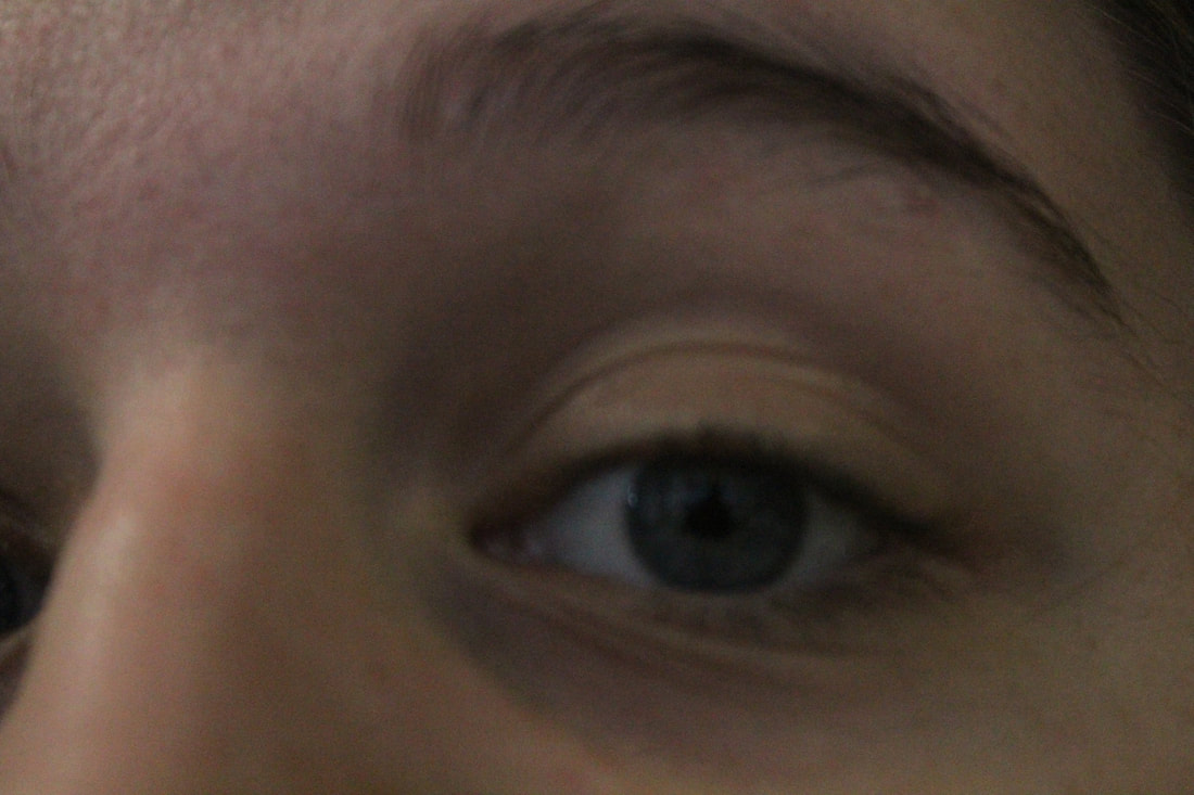
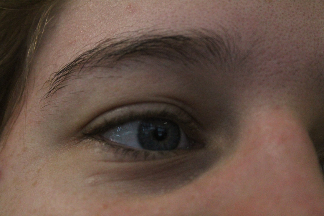
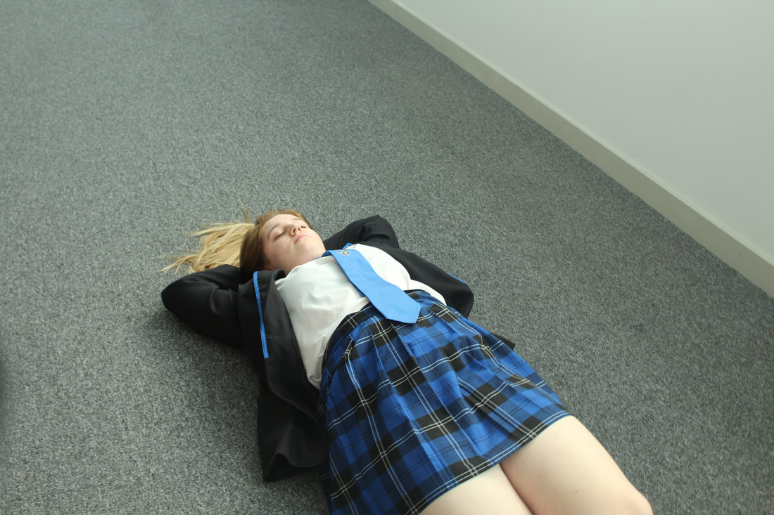
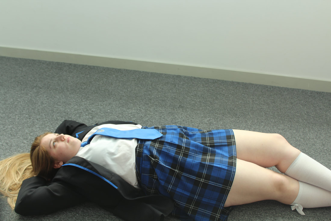
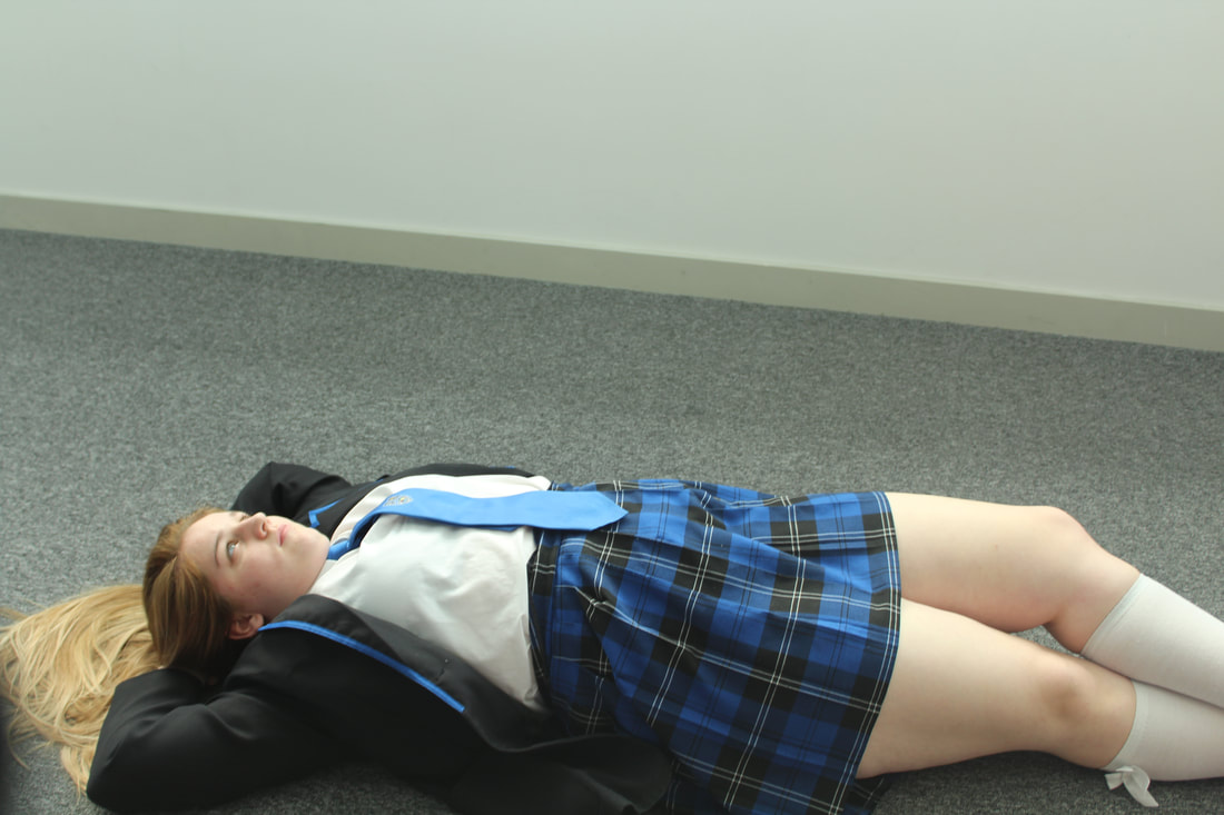
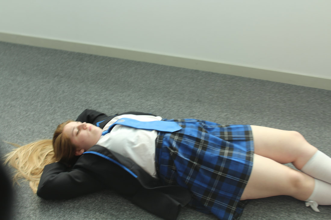
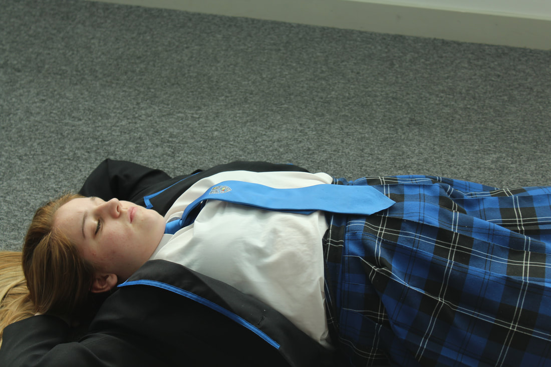
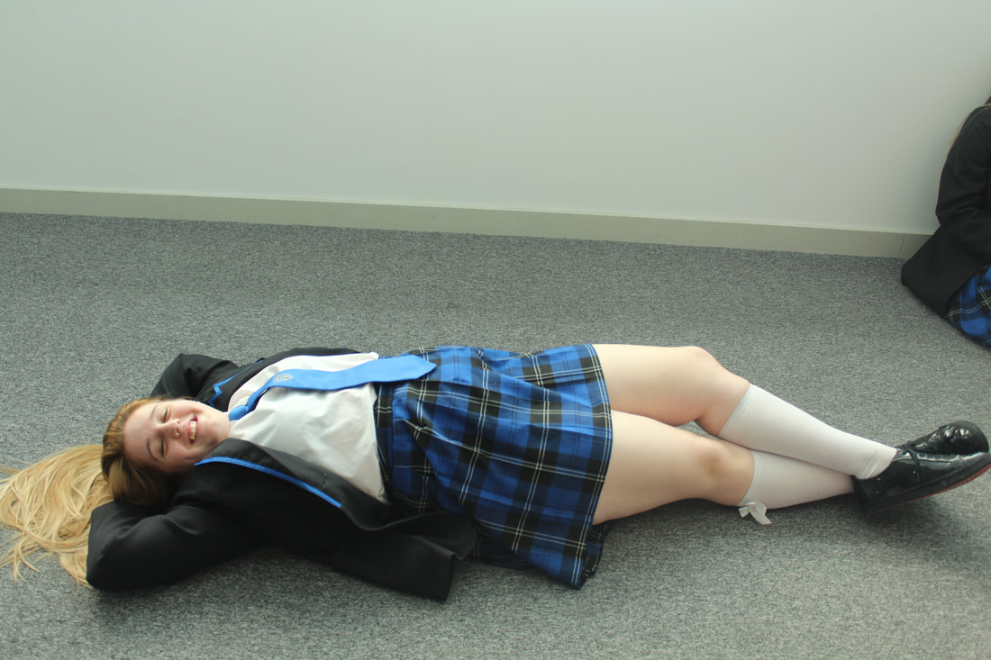
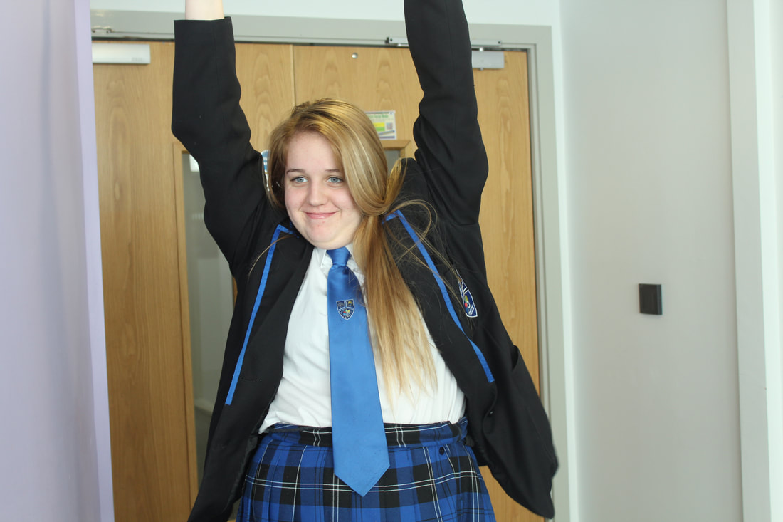
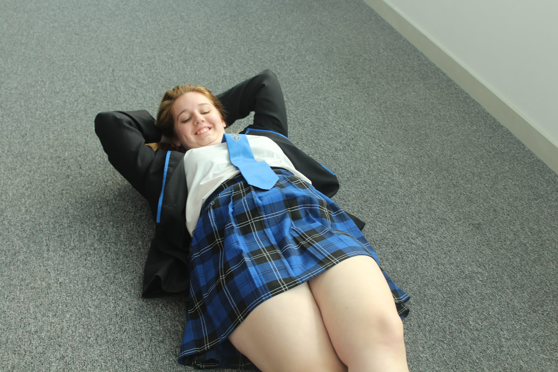
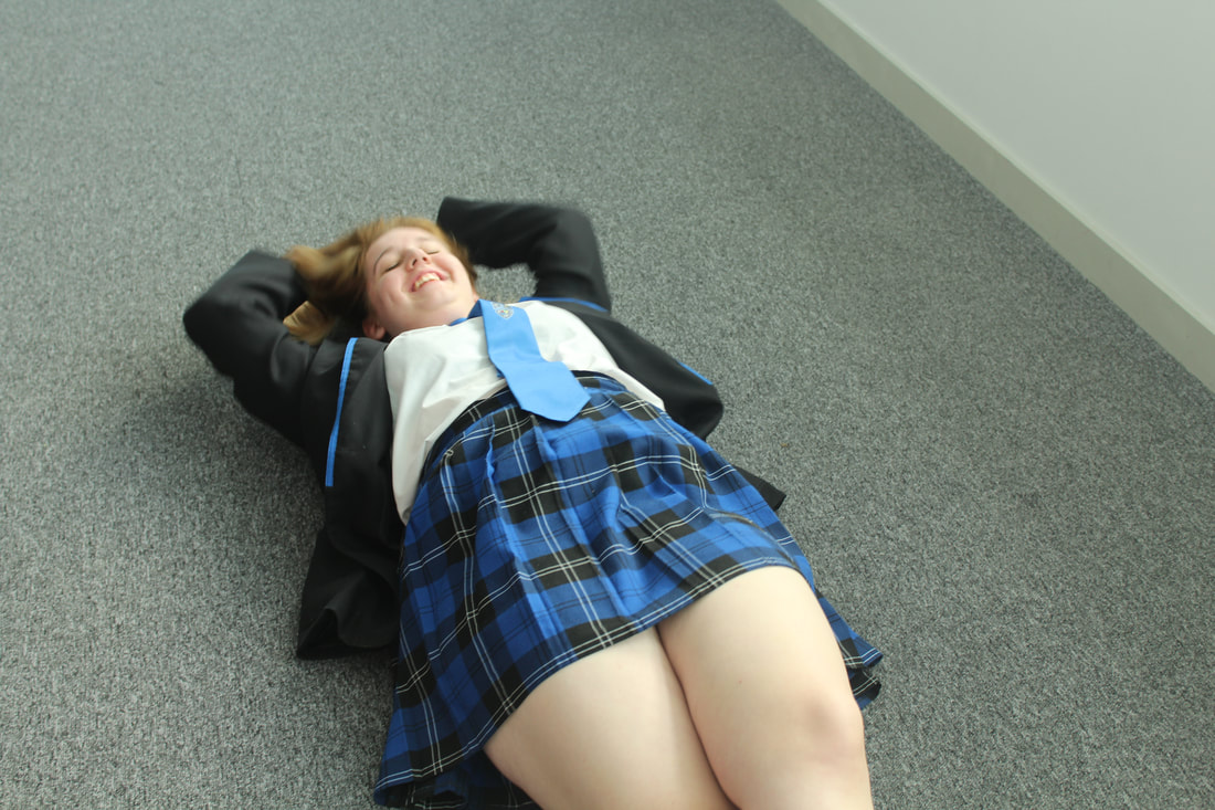
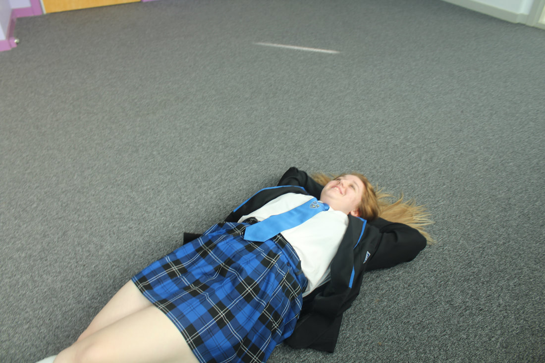
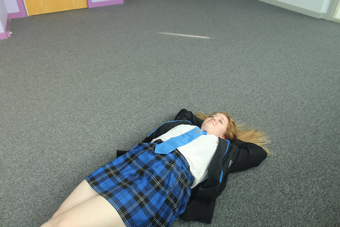
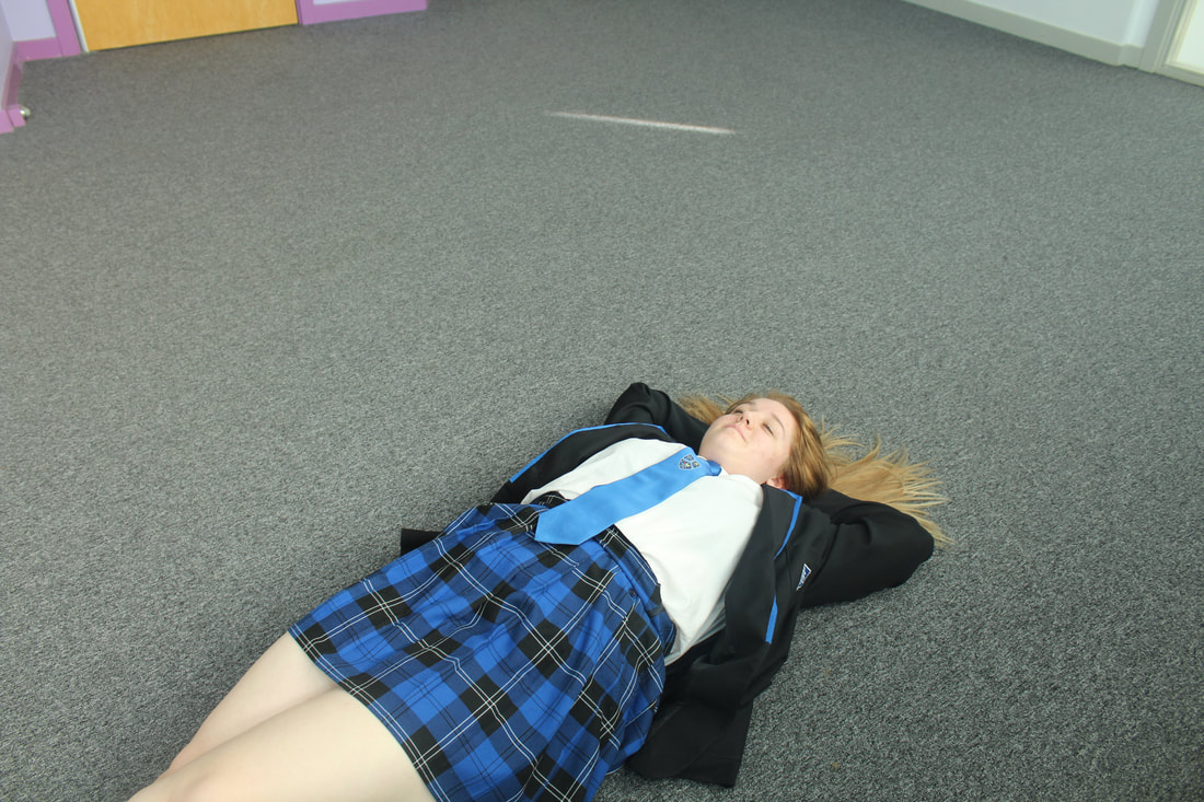
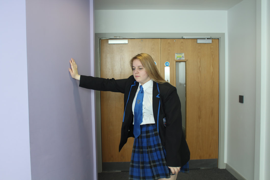
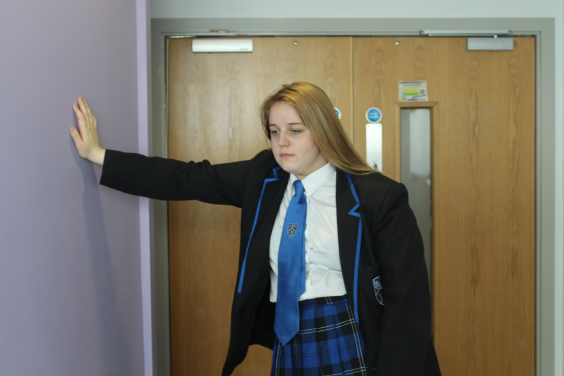
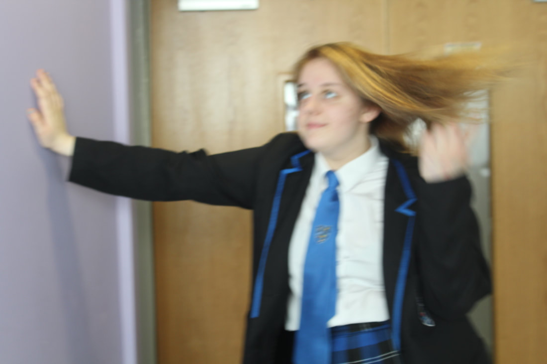
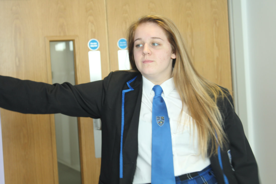
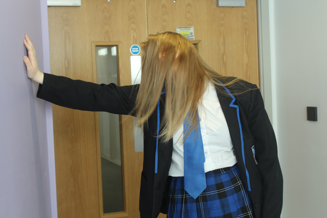
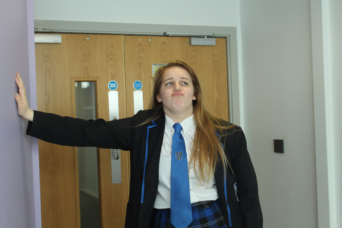
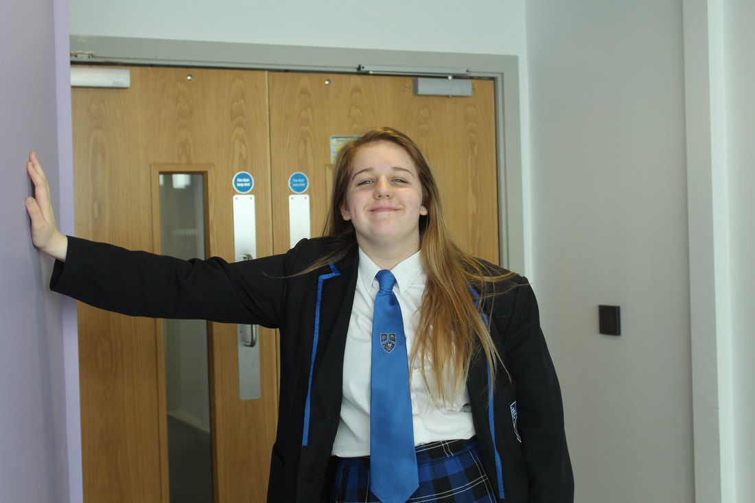
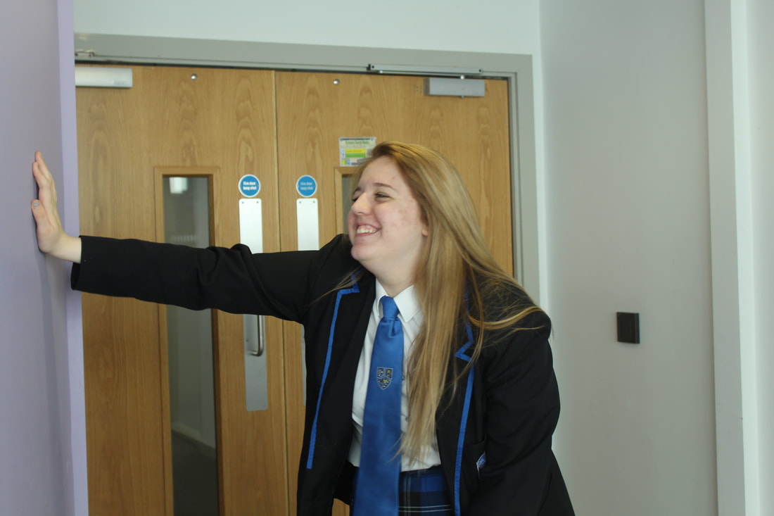
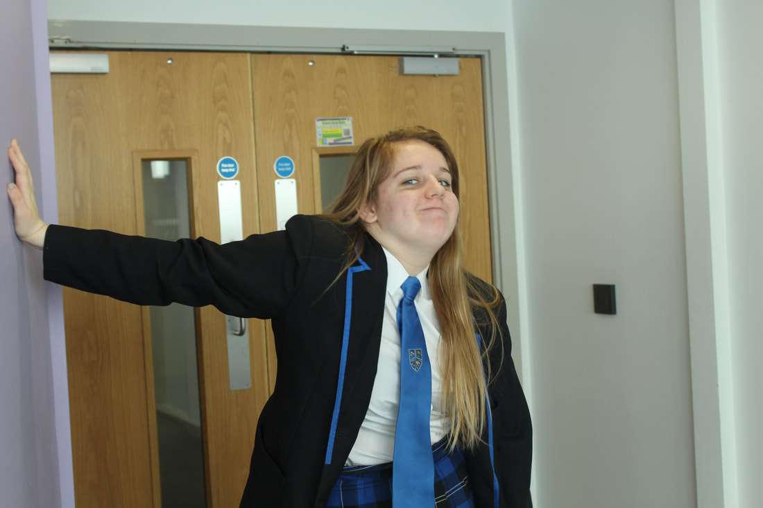
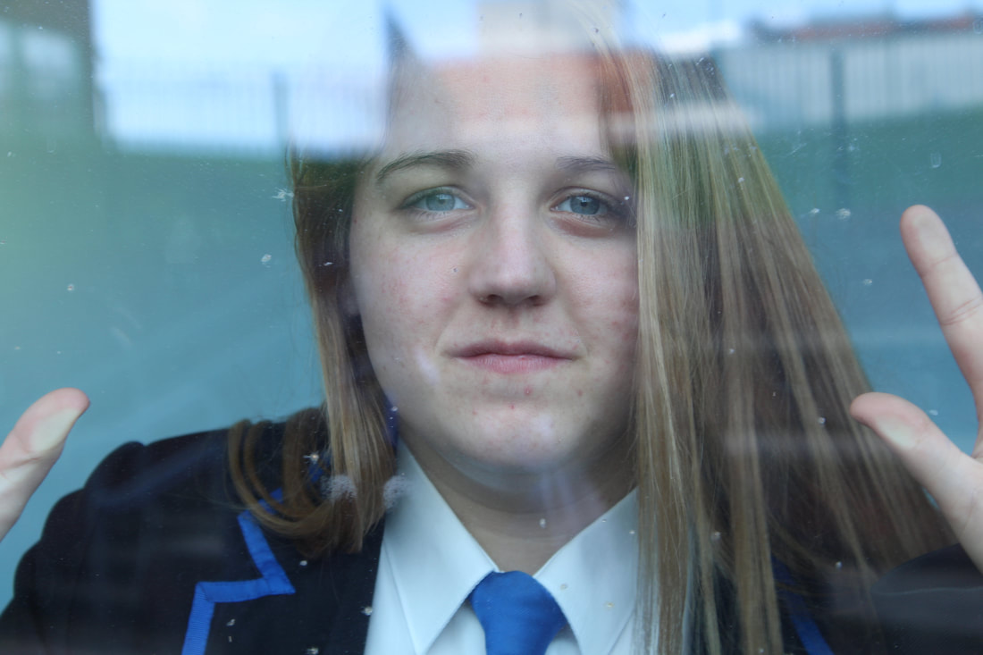
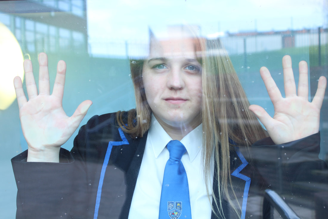
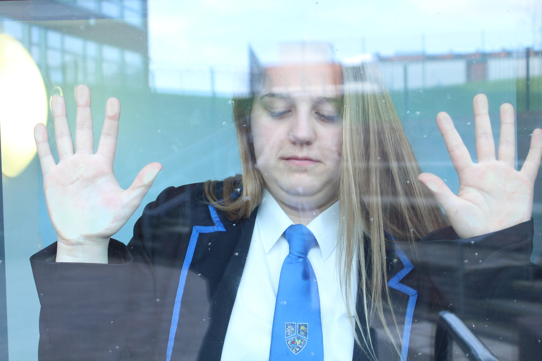
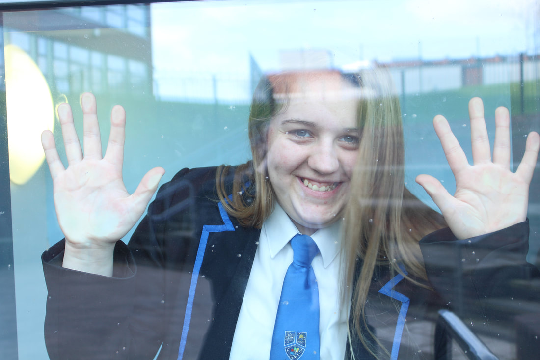
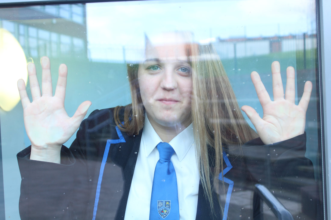
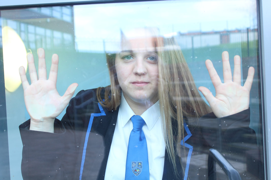
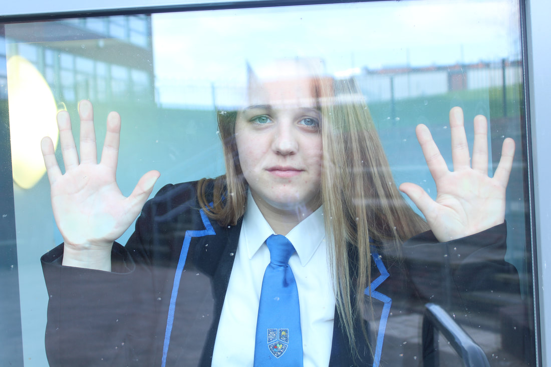
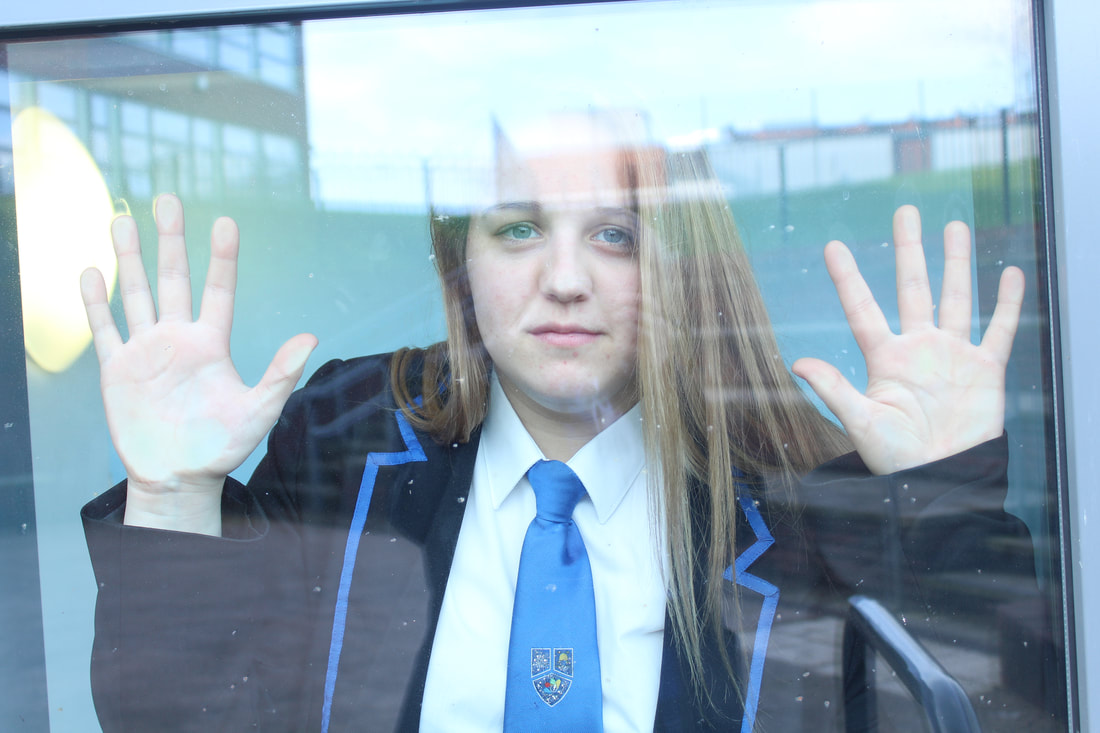
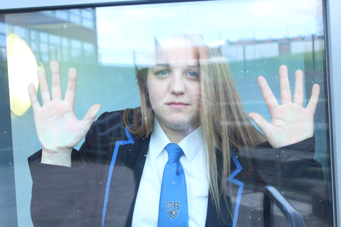
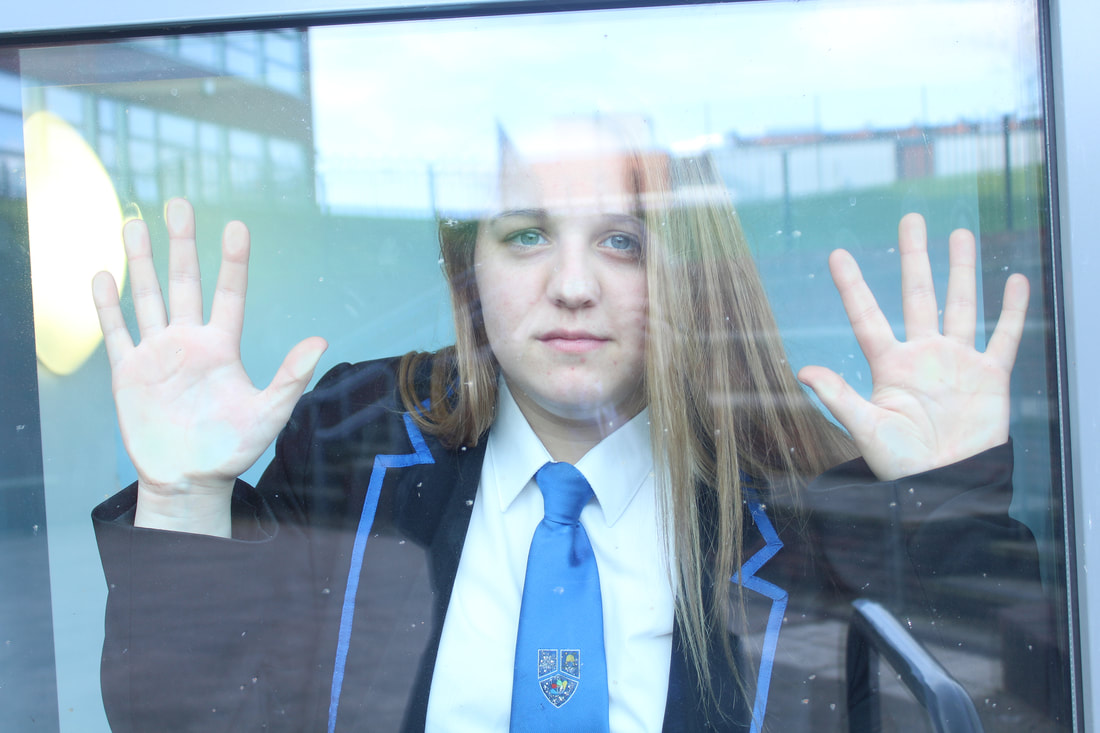
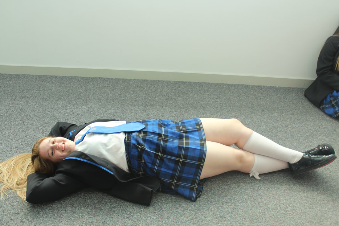
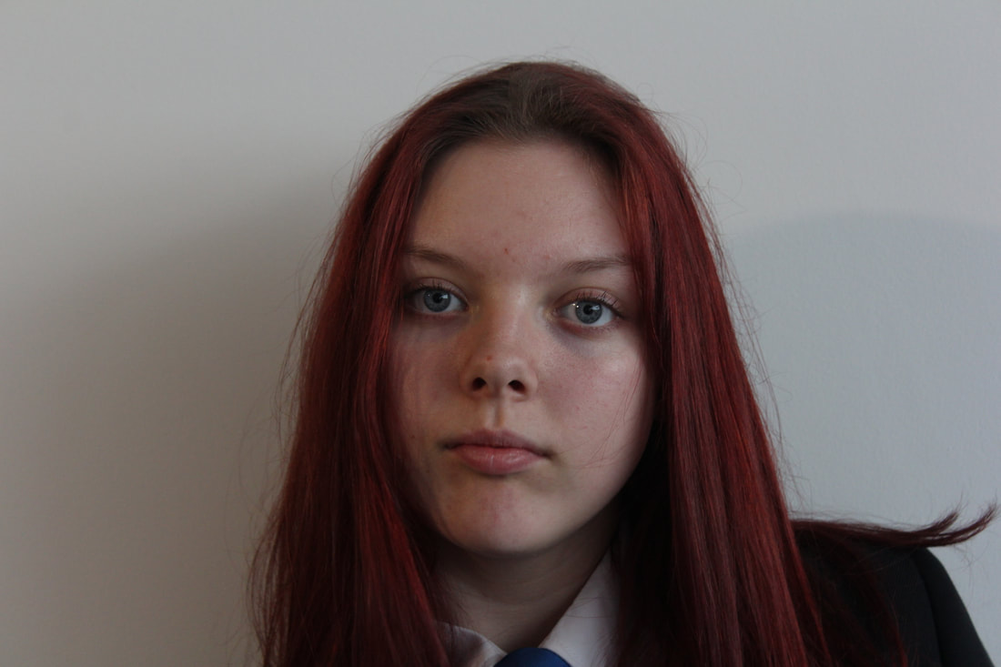
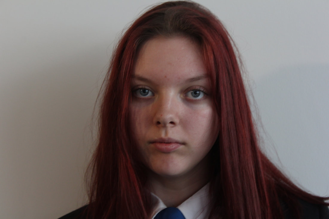
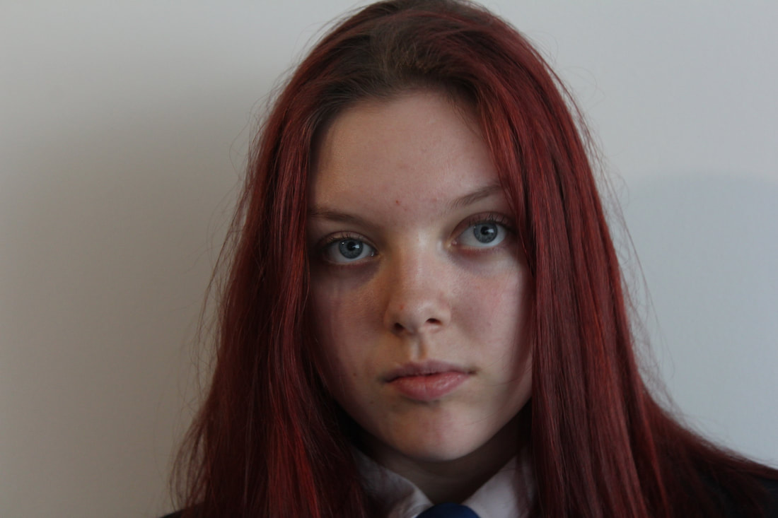
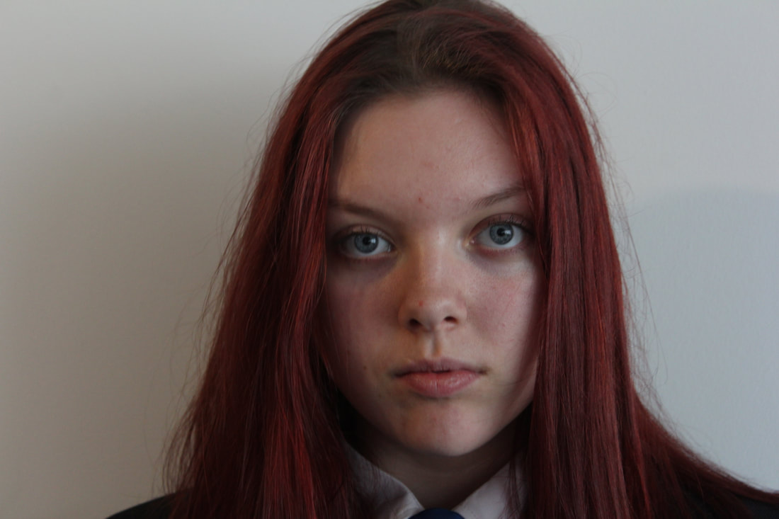
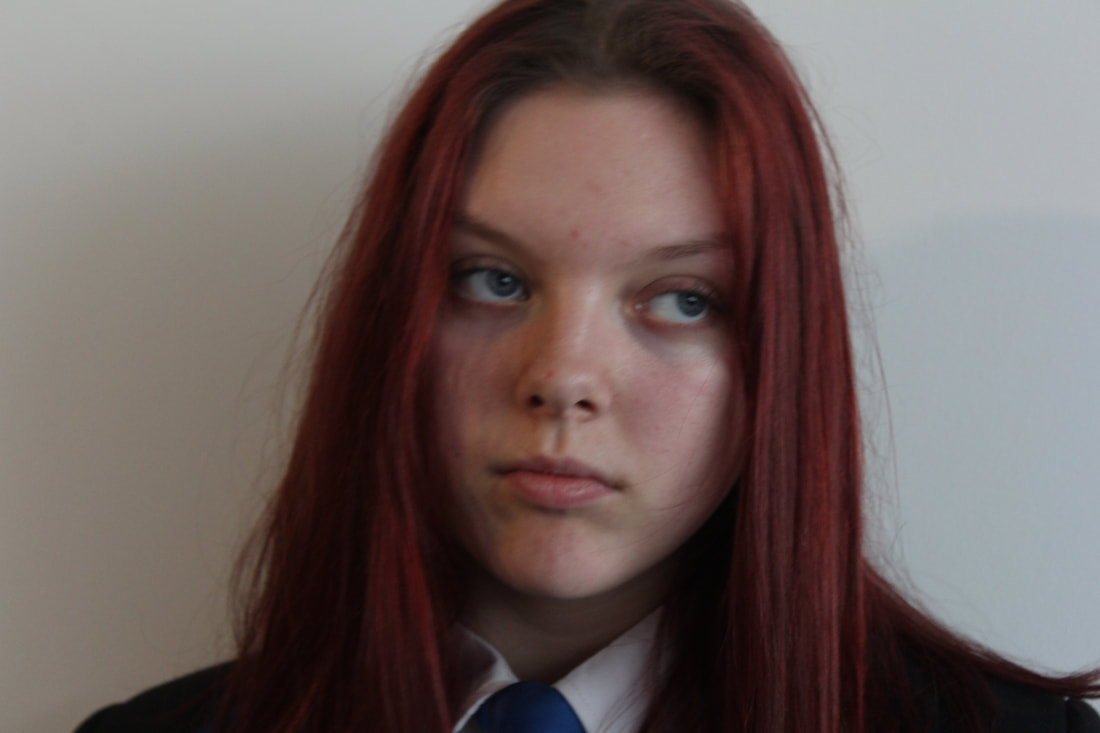
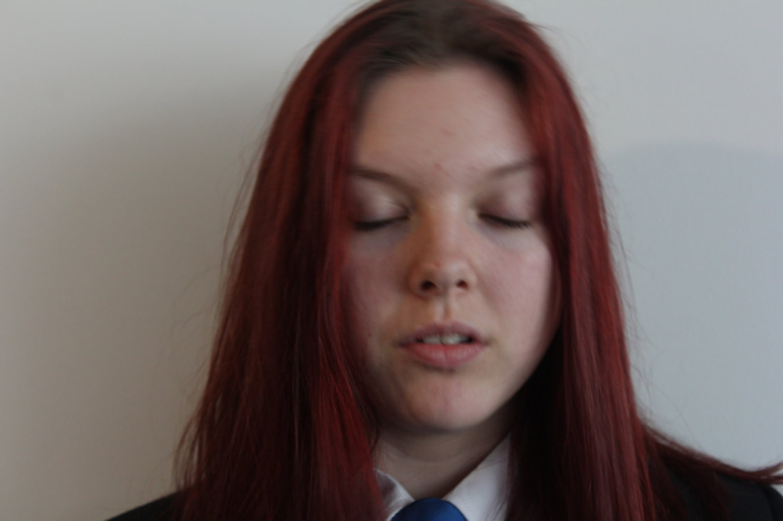
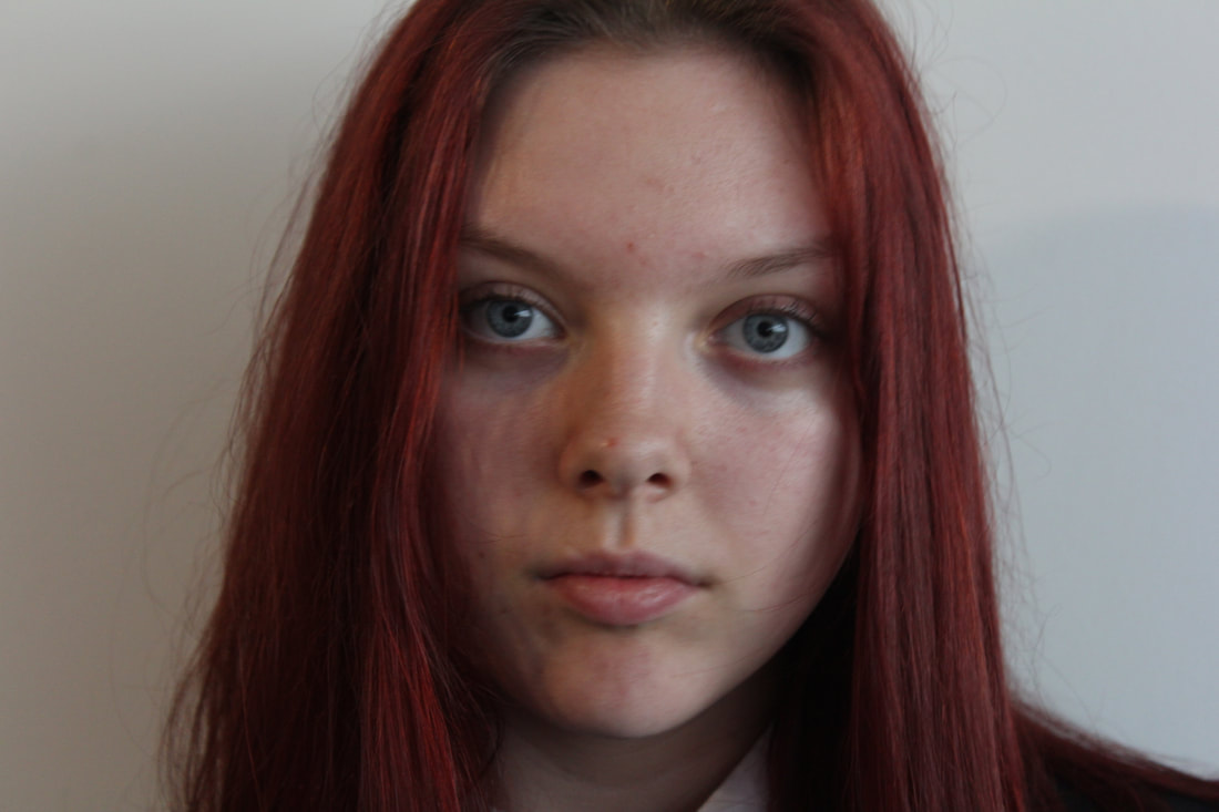
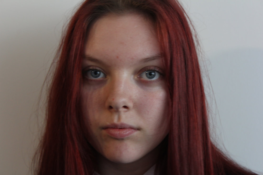
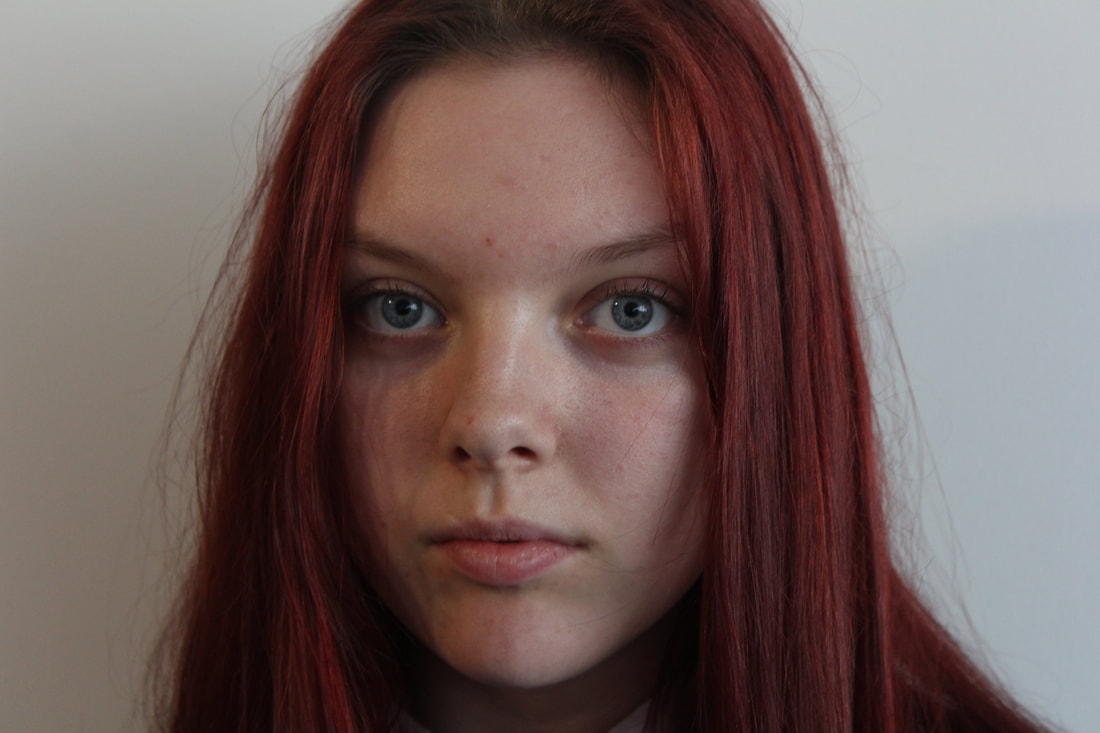
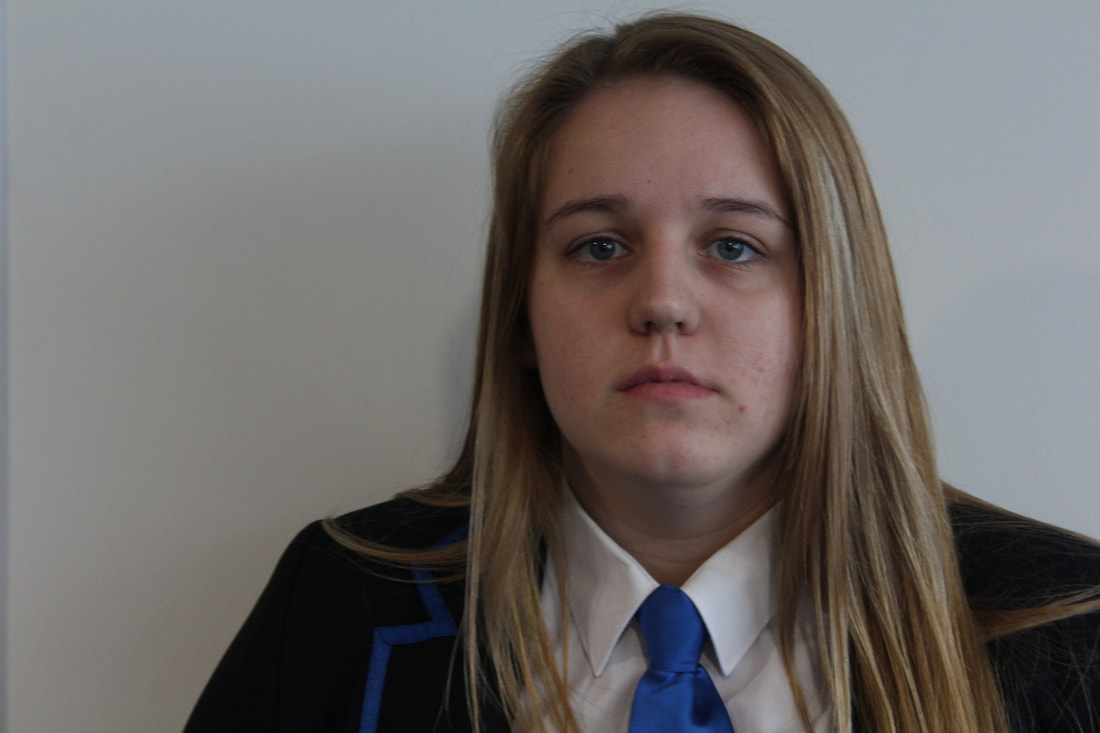
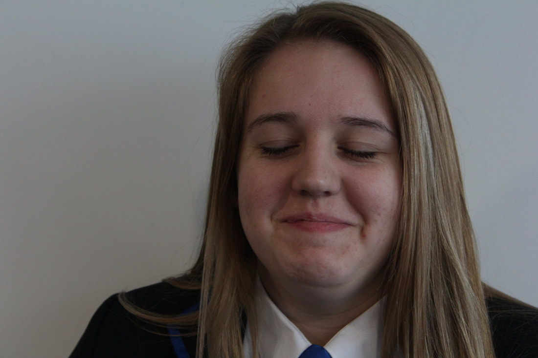
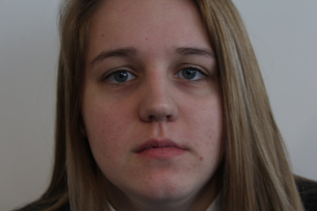
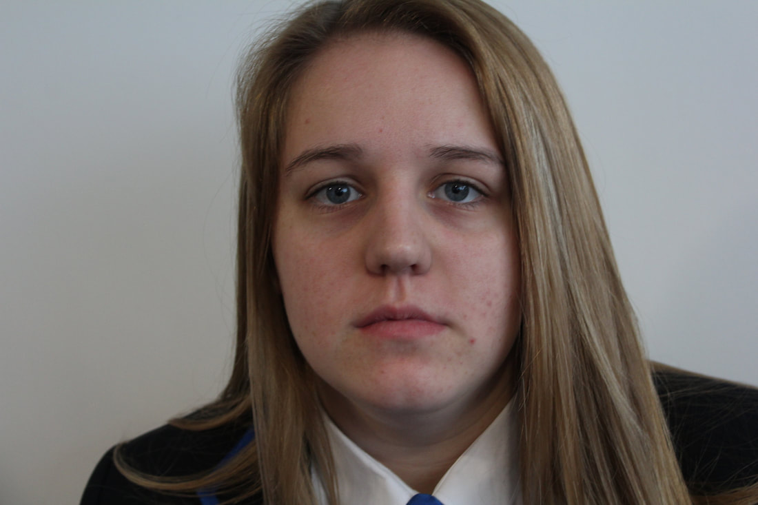
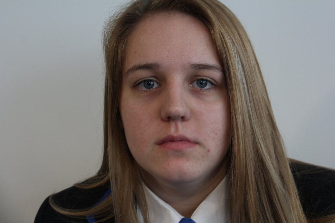
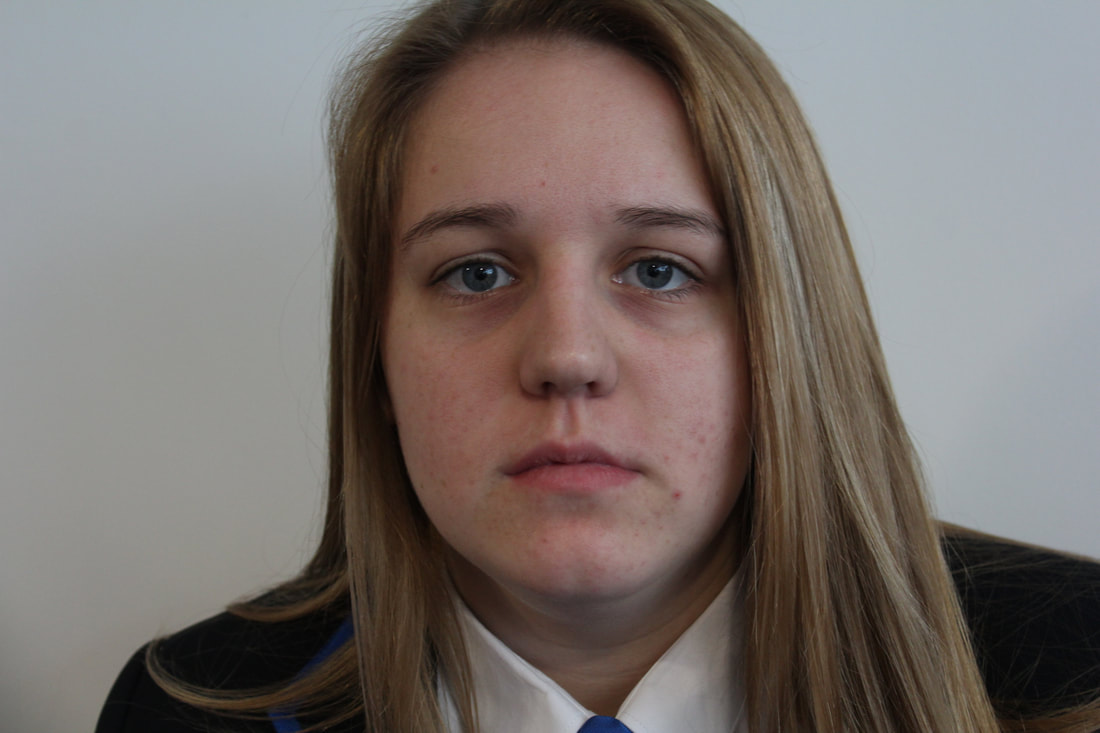
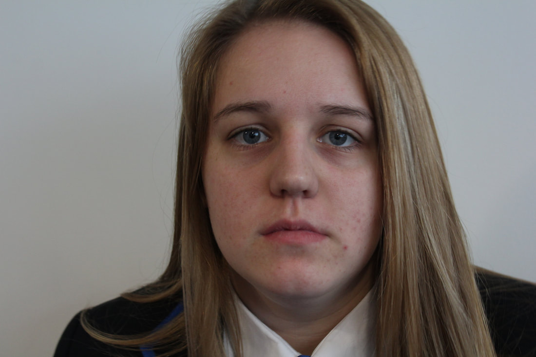
My Best Model Images


My Favorite Edit
This is my favorite edit because I have used images personal to me and I really like the mood the image gives off. Also I feel that this edit shows off my strong points in editing and also shows me myself as a photographer what my weakness are in the editing and can help me improve on what I need to.
