What is Portrait Photography?
Portrait photography is a photograph of someone's face to capture a certain feeling or emotion on a topic this can be done by using poses,lighting and backdrops.
Types of Portrait Photography
Candid
Posed
Formal
Environmental
Individual
Couple
Group
Sport
Surreal
Posed
Formal
Environmental
Individual
Couple
Group
Sport
Surreal
Examples
Put the mouse on the image to see the type of portrait photography.


Documentary photography- Use of portraits in everyday life
What is documentary photography?
Documentary photography is a form of photography which refers to historical or recent events that have been captured on camera. An example of documentary photography is the news or documentaries on the television. These pictures can be took of an a event as little a snapshot of something you have planted in your garden for a garden journal. Sometimes these pictures can be classed as art but sometimes they are just on recent or historical events.
When was documentary photography first introduced?
In the 1930s, the concept of a story told through a series of photography, a photographic essay, was born. In 1947, Magnum photography agency was founded by a group of like-minded photographers including Robert Capa and Henri-Cartier Bresson. A lot of photographs from World War II were produced by Magnum photographers.
It is this ability to work in series which separates documentary photography from photojournalism, often coupled with a moral stance on the part of the photographer who hopes to impart to the viewer a greater understanding of how his subjects live. This series of images, or photo essay, is more powerful in conveying the photographers than a single image by itself.
It is this ability to work in series which separates documentary photography from photojournalism, often coupled with a moral stance on the part of the photographer who hopes to impart to the viewer a greater understanding of how his subjects live. This series of images, or photo essay, is more powerful in conveying the photographers than a single image by itself.

This is the first ever photograph took to represent documentary photography. As you can see it is a picture of a women with an injured figure getting seen to.
Documentary photography portraits?


Portrait Photography Photographers
Bella Kotak

Bella Kotak is a portrait Photographer who is inspired by fairy tales, Nature and strong feminine characters. Her pictures show us the overlooked and reminds us that there is magic in the most ordinary places.
Bella Kotak is a fine art and fashion photographer based in picturesque England. It is said that photography changed her life. From this moment she was hooked with making images that translates thoughts of the imagination into something that is real.
Bella Kotak is a fine art and fashion photographer based in picturesque England. It is said that photography changed her life. From this moment she was hooked with making images that translates thoughts of the imagination into something that is real.
Her Work


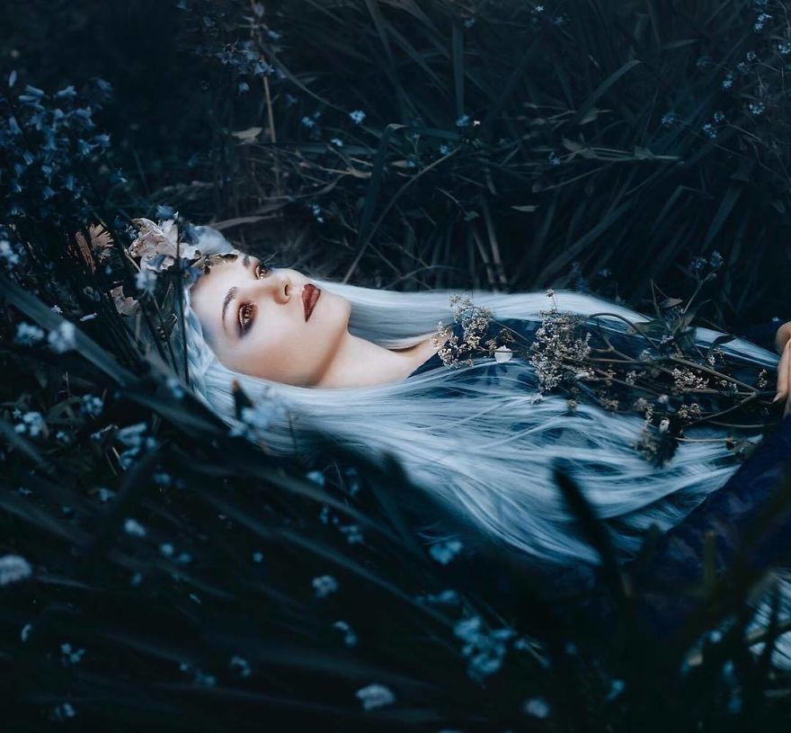
This image is a typical Bella Kotak style which is fairy tale/ environmental portraits. I like this image because it seems a little magical. I also like how Kotak has angled the image and used a small depth of field to show the model and some of the surroundings. I think it is a great image to show her work and find the emotion well presented.
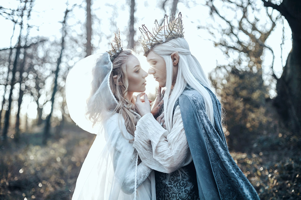
This portrait uses couples portrait style. I like this image as there is clear emotion through the image not only through the models acting but also through the sunlight shinning on the models. Kotak has used a medium depth of field so you can get the sense of love and happiness through the image. I like the way this image is presented as it is clear and you can see the theme through it.
Holly Rose

|
Holly Rose Stones is a fine art, surrealist and conceptual fashion photographer currently based in London/Kent. (and travels to Yorkshire a lot!). Her portrait imagery is simply sublime.
|
Examples of her work


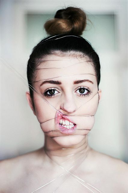
This is an example of a surreal piece of work Rose has created. I like the way the wire is around her face and the emotion it produces. The type of portrait is candid photography. Also I like the angle of the photo and how it is focused on the face because it creates a tenses effect.
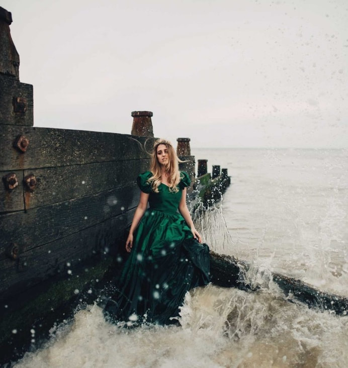
This is an enviromental shows good emotion and you can also see the background which means Rose has used a large depth of field. I also like the way the shoot has captured the waves coming up I feel this makes it more effective because it gives the image a little emotion as well as the face. I like how the focus is more on the environment than it is on the person which makes the image stronger.
Martin Neuhof
|
Martin Neuhof is a portrait photographer from Germany. He was born in 1984. His inspiration is people are and travel. This photographer travels a lot. He likes to discover new places. Be it in his hometown Leipzig, on tours of Germany or traveling around the world.
|
Examples of His Work


This image is an example of posed portrait photography. I like this image because I doesn't only show emotion through the face it also shows emotion through the gloom of the image. I also like the way he has focused on the eyes and not the whole face. The emotion through the image is very clear it is depression.
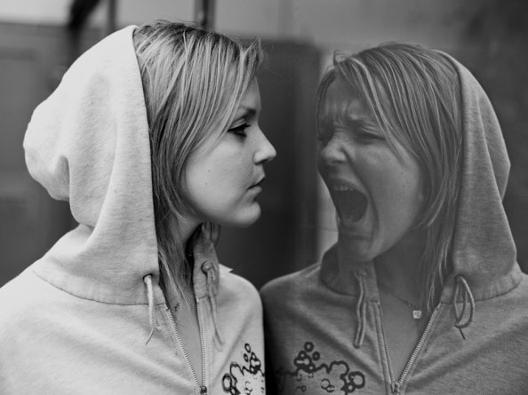
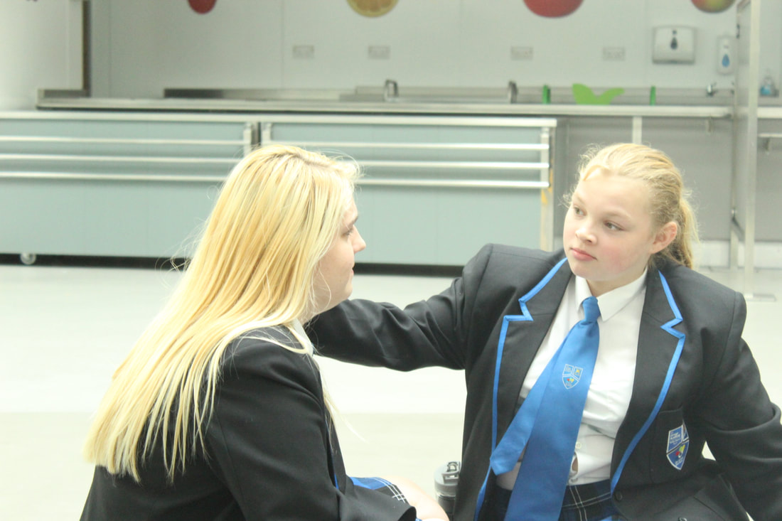
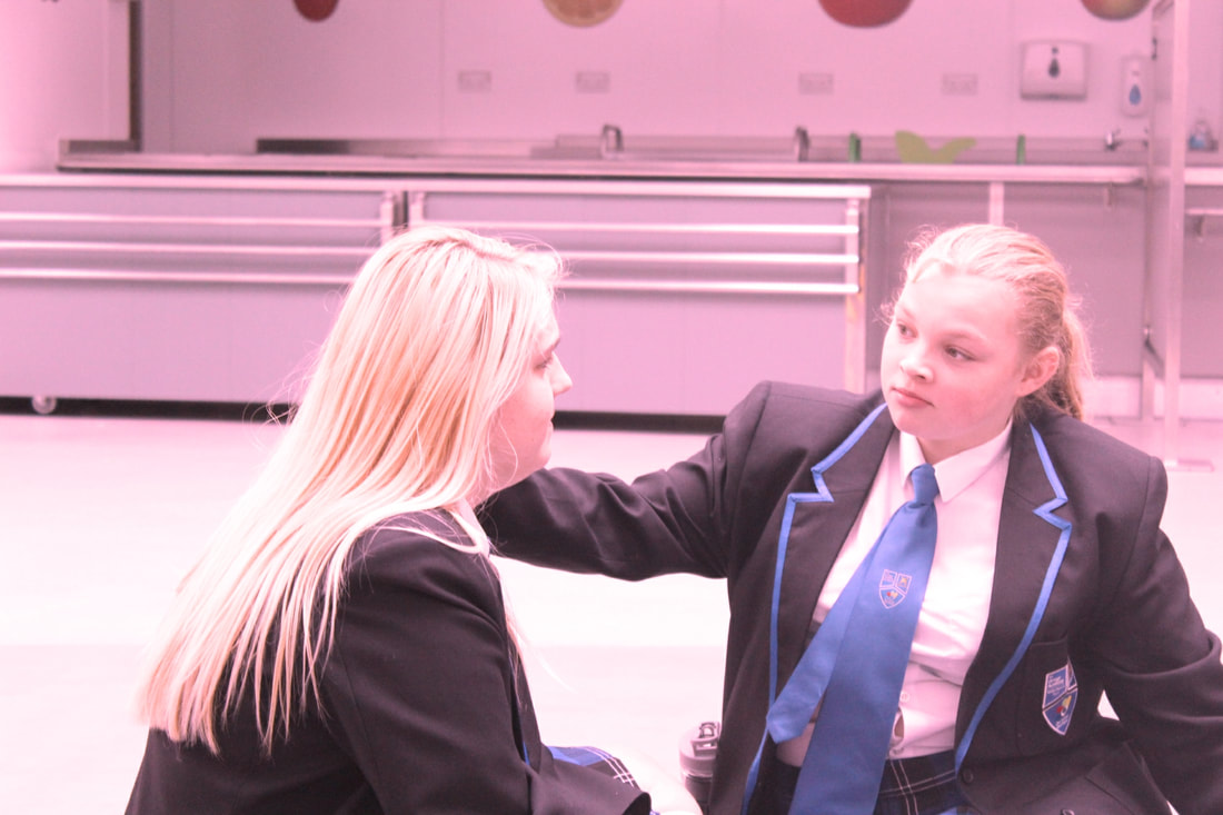
This image is an example of candid/posed portrait photography. I like how on one side of the image it is candid and the other side of the image its posed. This suggests that the person is suffering from a ort of mental health issue. I like the way the image is black and white and how the focus is on both of the types of portrait.
My Examples of different emotions


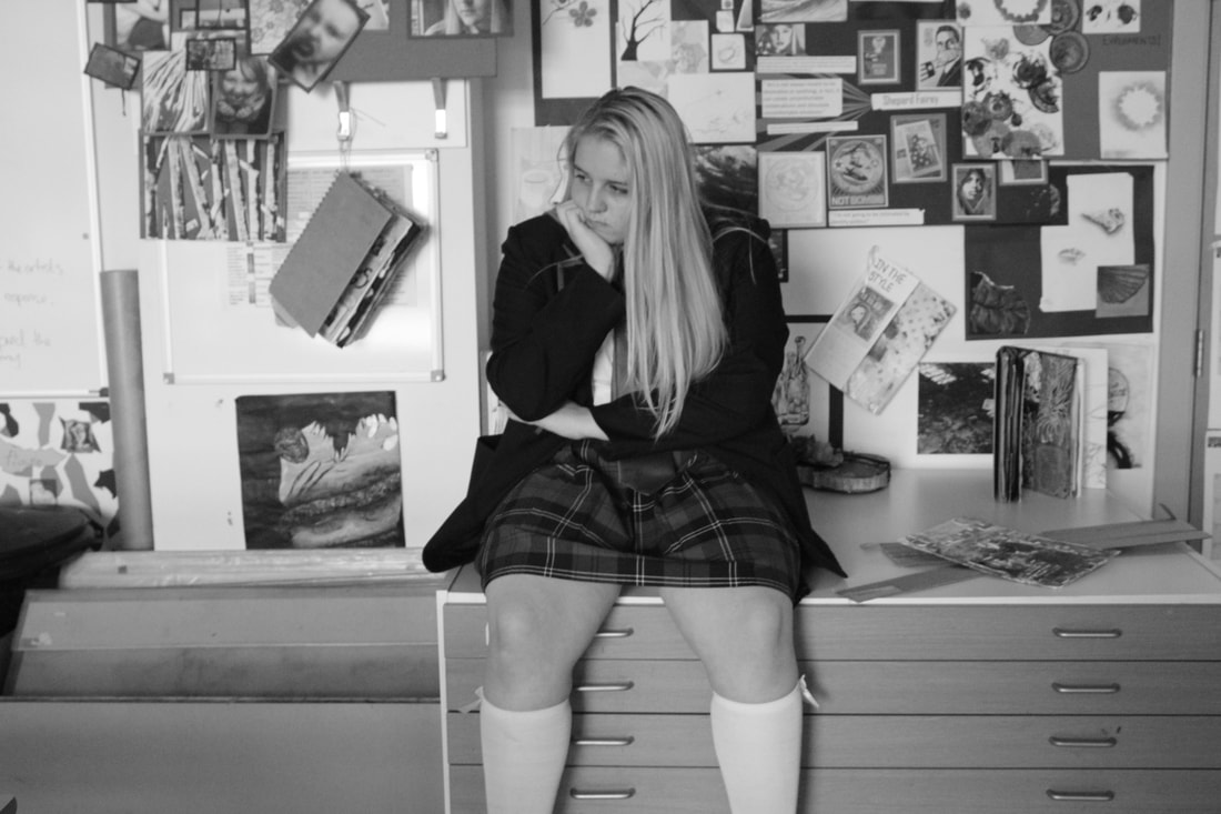
Worst Image
|
Best Image
I think this is the best image because it shows the emotion very well and it has the right focus and the right depth of field. I like how the angle of the image came out. I feel that the lighting could be a bit better and it could be a bit more like the emotion. If I edited this image the lighting is the thing I would change.
Edited Version
I have edited the image on photo plus. I tried to create a theme of love using the lens filter. I thought that the colour of a reddish pink would bring out the theme but it look a little to aggressive. So I decided that maybe a more pink colour would work and I think it does. The only thing is I feel it didn't work out how I imaged it so I might try and make it look a little better.
Shoot 1- Lighting with hands shoot


Worst Image
|
I think this image is my worst image because it is really under exposed and you cant see the emotion in the model's face . Also my model hasn't used her hands to show the emotion sol this isn't really part of the theme.
|
Best Image
This is my best image because it portrays the emotion through my models face very well. Also my model has used hands to show the emotion as well as showing it through her face. In addition i like the use of the large depth of field as it makes the image look more realistic.
Shoot Analysis
I feel this shoot went quite well as most of my images conveyed an emotion which is what the aim was for this shoot. I think some of my images don't convey emotion as best as the other ones do. I enjoyed showing emotion using hands because I feel like it shows emotion in a way i wouldn't usually of considered. Also I think the monochrome background helps show the emotion very well as it gives my images a dark, sad and depressive look.
Shoot 2- Emotion through the eyes


Worst Image
|
This is my worst image because it is quite blurred and a little over exposed. Also it doesn't really focus on the eyes it's more the main face. It would be better if it was less blurred and it was more focus on the eyes and maybe more emotion shown.
|
Best Image
This is my best image because it isn't blurred and there is more focus on the eyes. Also i feel the emotion is portrayed well and that is is a little clear of what the model is thinking in that moment in time. If i was too do this again i would probably choose a better emotion so it is clearer to the audience what the aim of the image is.
Shoot Analysis
I feel this shoot went really well as you can really see the emotion in my models face. Also I like the use of props to create the emotion as I feel it really adds detail to the image because it is a dark colour so it shows the neutral emotion in my models face. However some of the images in this shoot are out of focus so if i was to do this shoot again I would make sure the focus is on my models face. Also i would include more of a vary of emotion to show how different emotions can be shown through the eyes.
Personal Response
Examples


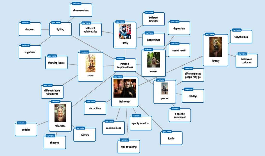
I have developed the popplet above with some different and similar ideas. I did this to give myself a better idea on how to approach this personal response. This is because i struggled to think of pictures to take. My top 3 off this popplet are: Reflections,Family and Halloween. This is because these ideas benefit each other so if i pick one off them i can also have another theme in the image.
I like the idea of reflections because you can take reflections from different objects to take the images in. A part of me feels this will make it more effective to my audience and also it will give me different ways to present my images.
I have picked family as a theme because with this theme it will be easy as my family are at home. In addition i feel that i could also use the theme to show different emotions and relationships and events that happen in my life.
Halloween seems like a good theme to me because it is coming up soon and i am taking my little cousins out trick or treating so i figured this would be a good image to get of them. In my opinion i fell that i can show different costumes and possibly come up with a shadowed image to create a scary effect. This is so it goes with my theme.
Overall i think the theme i will pick is Family because i feel it will be the best way to express my skills as a photographer and because it can link to other ideas i have to make my shoot a success so i can reach a grade 9. Also the theme links to my life and I want to show what I do on different days. In addition this can be done by capturing an image of a model or capturing a image of myself which makes this theme a flexible idea.
Some of My Portrait Images


My Worst Image
|
This is probably my worst image because it is quite blurred although while it is blurred it shows motion which I quite like because it shows the model is concentrating. However compared to the other images it is quite poor but in the future I might look at trying to do something with this image.
|
My Best Image
This is my best image because it portrays too different emotions. One of my models look happy and excited and the other one looks exhausted and tired. As you can image it was beautiful but it was also tiring. This is a candid portrait because my models didn't know I was taking the photo. However it does look like a posed photo which is quite cool because I feel it looks better that way.
Practise Edit
Original


I have dimmed the contrast and lighting of this image so that my model stands out more. This is because in the original the setting stands out more than the models face so you can't really tell the emotion where as now you can see the model better.
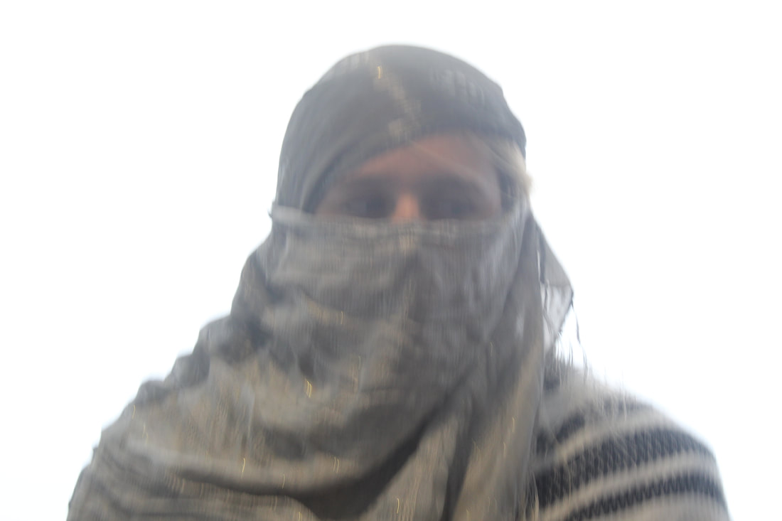
Shoot 3- Halloween


My Worst Image
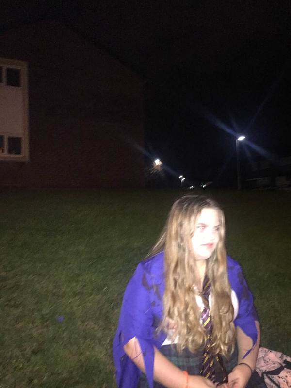
|
This is the worst image because the models face is slightly exposed. In addition it is kind of out of focus and the side of the face looks pretty bare. To improve this image I could focus it more and change the exposure so that the model stands out and the image looks better.
|
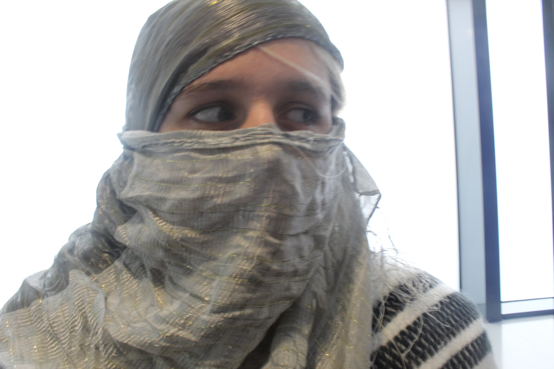
My Best Image
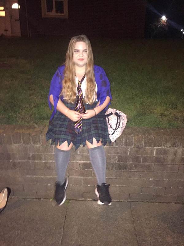
This is my best image because it focuses on the face and it blurs the setting behind my model. This is good because it means that my model stands out more. To make this image even better I am going edit it to make the image have a more of a spooky atmosphere so that the theme of family crossed with Halloween is portrayed better.
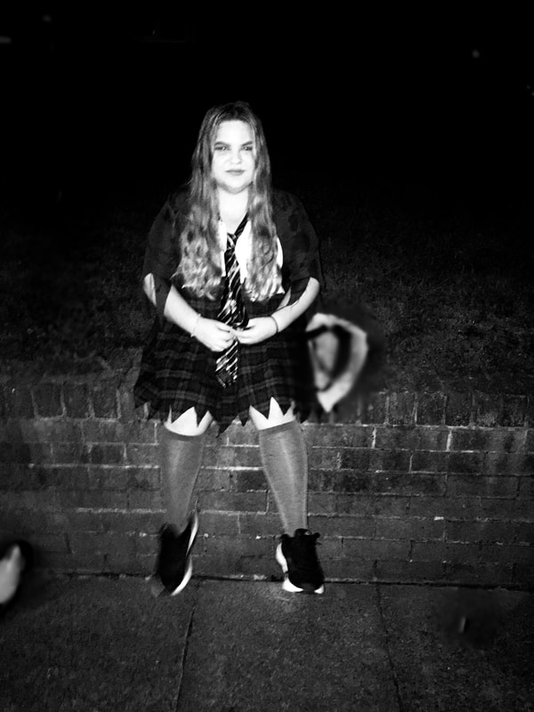
Edited pic
Shoot Analysis
I think this shoot went pretty well as it shows my friend as my personal response. I think the theme of Halloween was a good theme because the images were taken from around this time. In addition I think the depth of field is really good as it brings out the image i would like it to. However I think the exposure could be a bit more darker and i think that the emotion on my models face could be more scary than happy. If i did this shoot again I would improve all of this and maybe edit the image so there are several scary people.
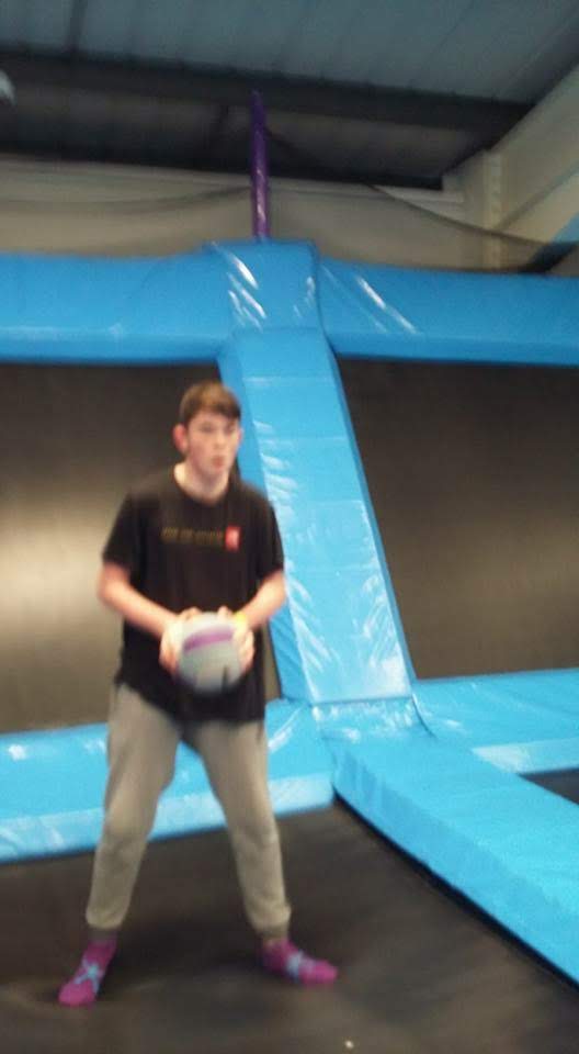
Shoot 4- My Best mate- Emotions


Worst Image
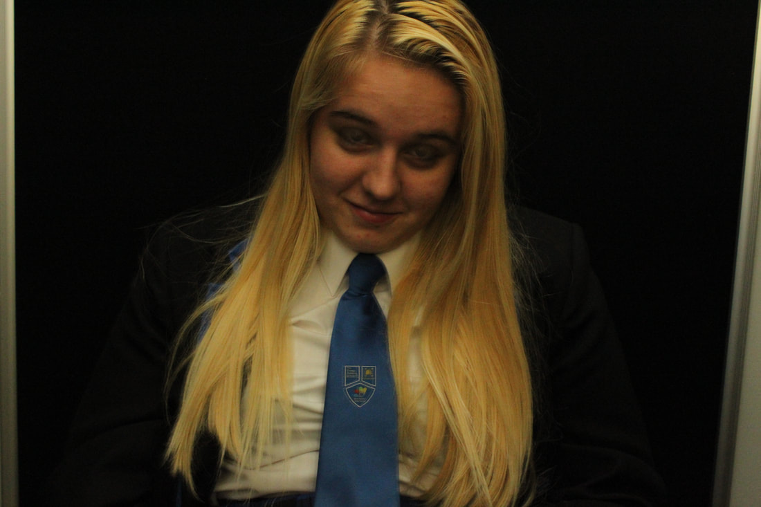
|
This is my worst image because my model doesn't really show any emotion and I think she looks drunk. I don't think this goes with this shoot. I feel this image is thew weakness of the shoot also i think the focus is not as good as it could be.
|
Best Image
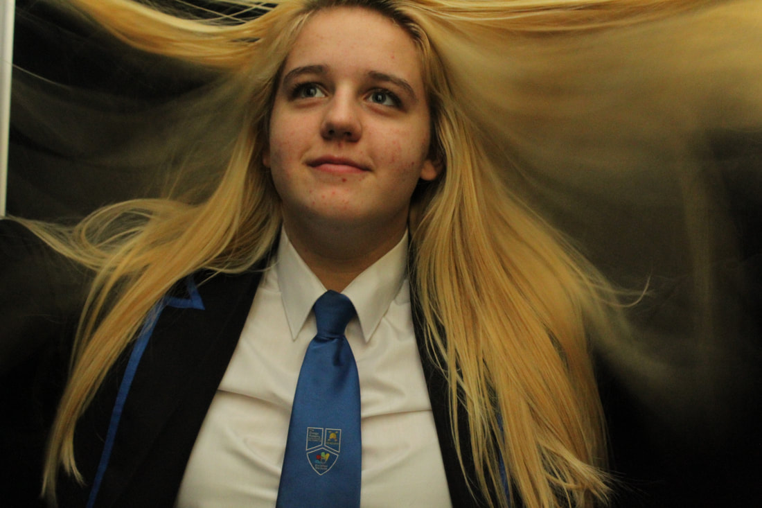
|
I think this is my best image because i feel it portrays an excited and happy emotion very well. I like how the hair is captured flipping as it gives the image a slow shutter speed which portrays the emotion more. I also like that the focus and how it is on my models face.
|
Shoot Analysis
I think this shoot went okay I feel like it needed a bit more detail to it. For example I feel it could of had some sort of story behind it rather than just emotions. However I like some of the emotions shown on my models face. Also I feel the black background makes this shoot better because it would be easy to edit into other landscape images to make this shoot more effective. This shoot would be better if it wasn't so plain because it doesn't really show my photography skills.
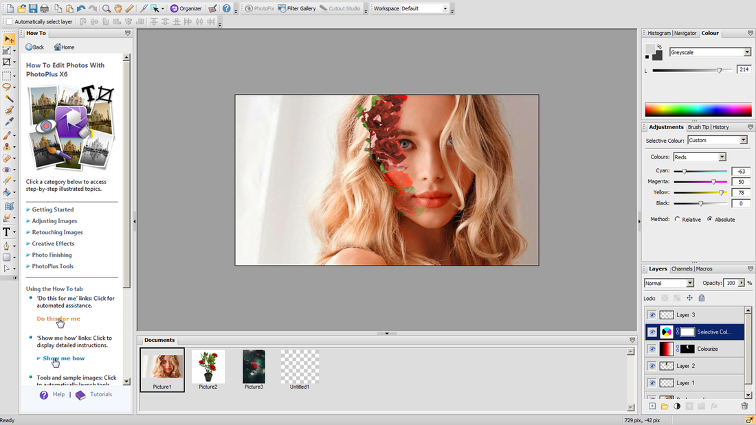
Editing Work
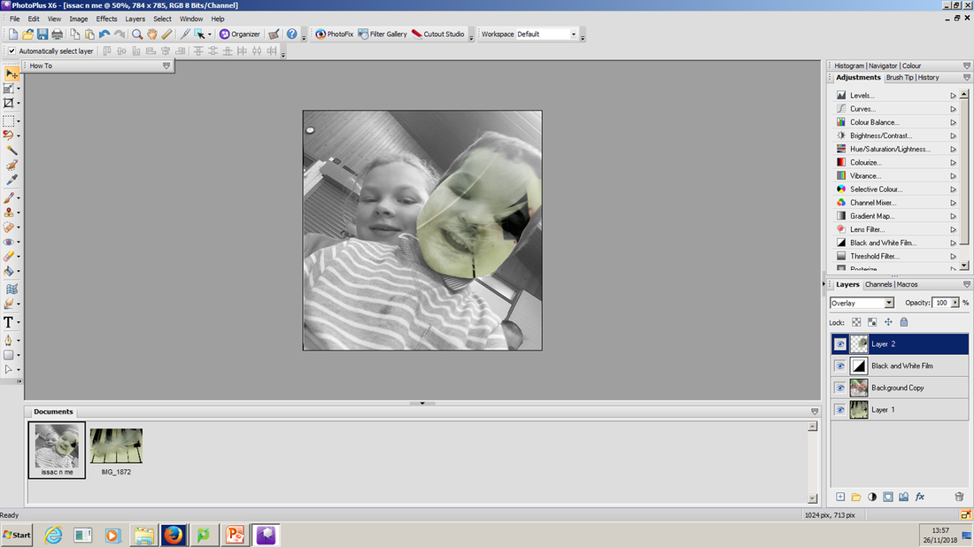
L.O. –Today we are learning how to use the tools on photo plus to understand how they alter the appearance of photographs


These images are the two images I used to create my finished result. I combined my two images to create the final image.
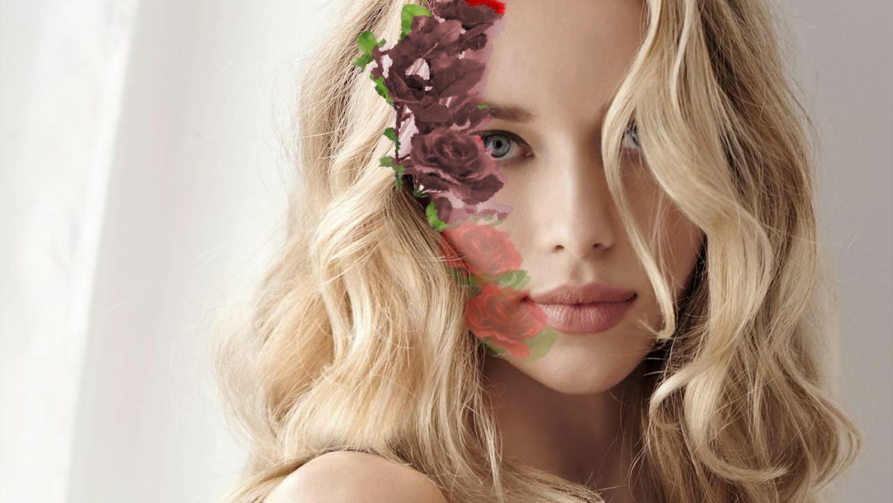
Finished Result
Erin Case
Erin Case has style! She might not be the typical photographer we would normally put in this category, but her works fascinated and inspired us so much…and she is using photos in her very own way! Erin is creating most of her collages from news paper cut outs, old magazine images, more or less anything she finds in old and new print media. Images found on the Internet and photographs serve as her material for her digital works. Erin’s collages take you to far, far away places, take you into space or trap you in an old fashioned TV… Clueing, sticking, composing, editing. And the same counts for your own. Erin’s works do not only express her own creativity but also make us think!
Examples of Her Work


These portraits have had their faces blanked out and have been changed for landscaped images. This is a very skilled work for editing and photography I have tried to do an Erin Case type of image with my own images.
My Erin Case based Image
I tried to do a Erin Case based portrait on photo plus I used 2 images that I took one is a image of a landscape the other is a couple portrait image. I only edited one face and it went ok it isn't the best but it was my first try. To remove the face I used the smart select tool and when the face was deleted it had the image behind it as I change the background into a layer and dragged the layer above the landscape layer. I tried to smooth the edges over by using the rubber tool and changing the opacity to 50% that didn't go as well as I planned but with some more practise I might be able to create an improved image from the one above.
Second try
I like the way my second image has come out very much. i decided to use one of my hands pictures to create an effective image and in my opinion i feel this worked really well.
Shoot 6- Erin Case Style
Plan

|
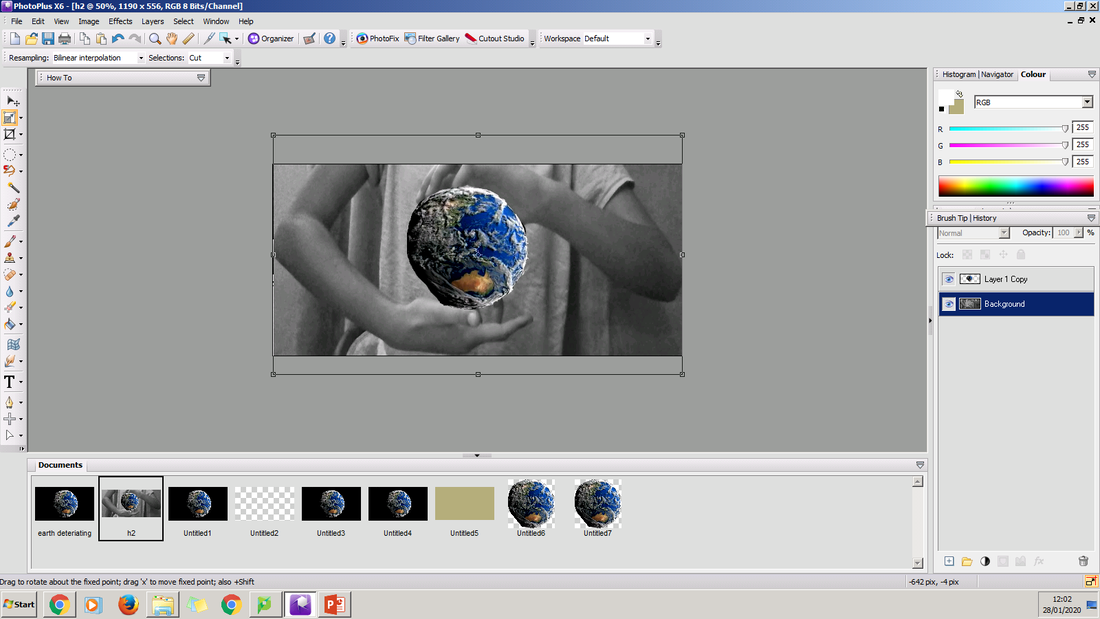
I have chosen this image as my inspiration for this shoot. I have chosen it because I like how the image compares humans to nature. In addition, I feel the colours match well together and for me this is what makes the image stand out. Also, I like how the image is slightly over exposed because this helps the image stands out really well. This image has a depressing feeling which is shown by the disorientation of the world. This makes the audience realise the impacts of humans to earth. I like how the background is just white because in my opinion adding more colour to the image would loose the effect is being shown. In addition, the hands being on hotspots show the message clearly. This image uses a small shutter speed which means the image can still portray clearly the effect humans have on nature and how we destroy it. The image uses a small aperture which is usually F stop 16. Using a small aperture for this image means that the whole image can be focused on so the message is easily conveyed to the audience. The lighting of the image is very clear which helps the audience see what is going on in the image. The main focus of thr image is on the hands which are surrounding the world. This shows how we should love the world instead of destroying it. Fianally, the image uses a small depth of field. This gives the image a sense of feeling trapped which shows how nature is trapped by us.
|
Practice Edit
The Editing Process
|
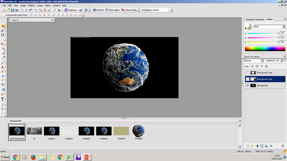
First, I picked two images off of the internet. One of a globe and the other of a hand gesture. With the globe image I used the select brush to select around the earth. Then i copied the earth using CTRL C and pasted it on the hands photo using CTRL L.
|
|
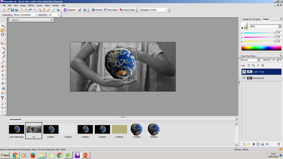
Once the picture of the earth was pasted onto the picture of the hands I used the deform tool to resize the earth. This was so that the earth didn't just look copied onto the image and it actually looked part of the image.
|
|
Then so I could further make the world fit in between the hands I used the deform tool on the main background image. In using the deform tool I have been able to create the final image that I wanted.
|
|
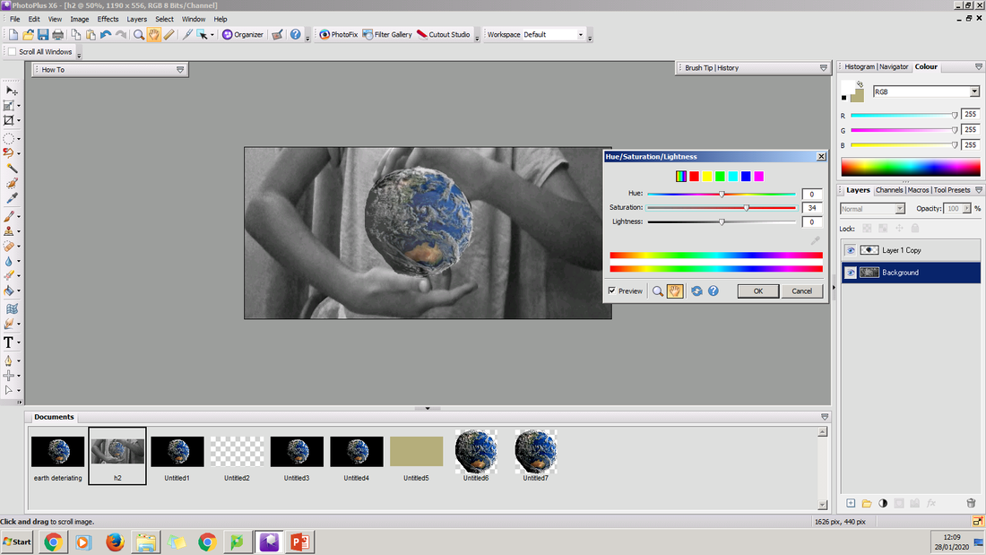
Then to make the image look more realistic I brought the contrast down. In bringing the contrast down it made the image look like it was meant to be apart of the image and not a sticker.
|
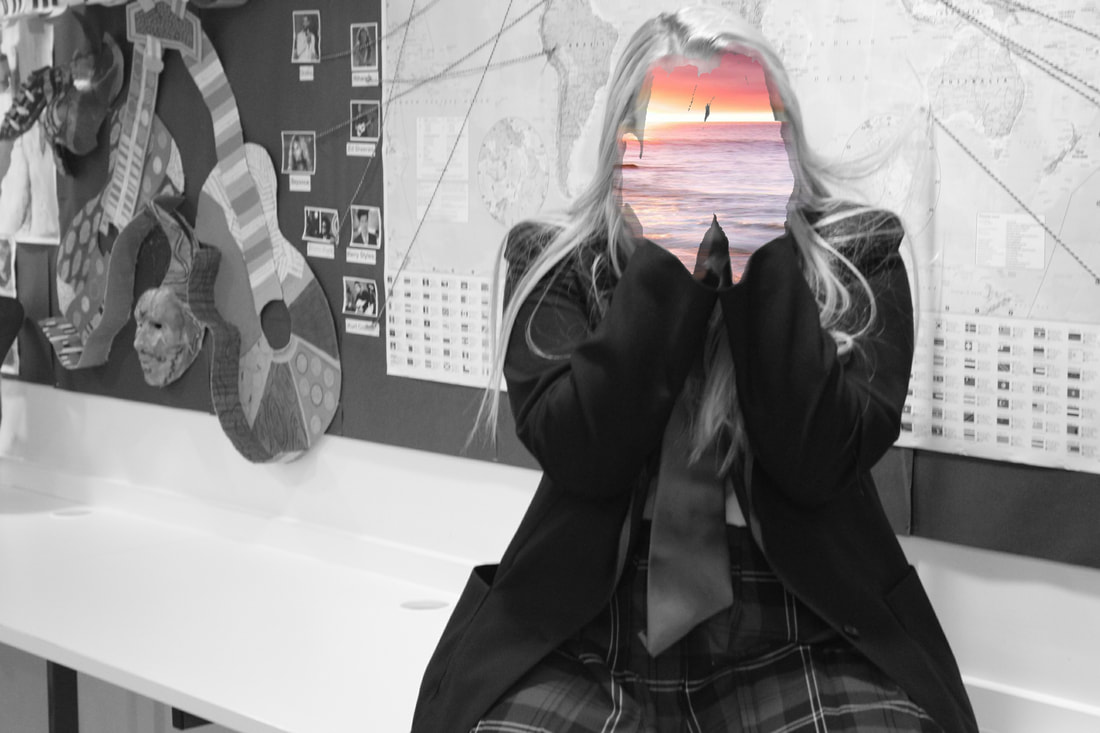
Final Edit
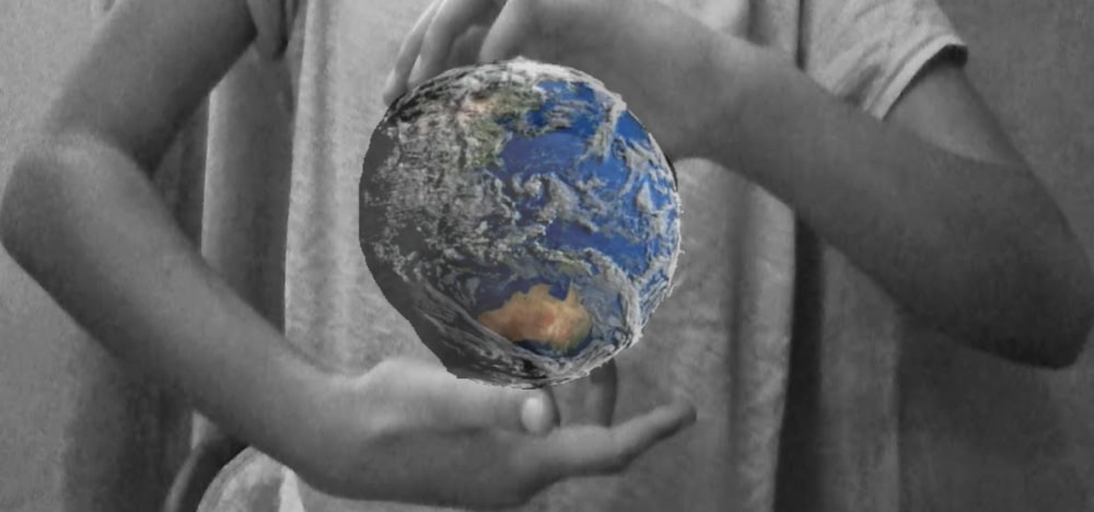
This is the final
My Shoot Plan
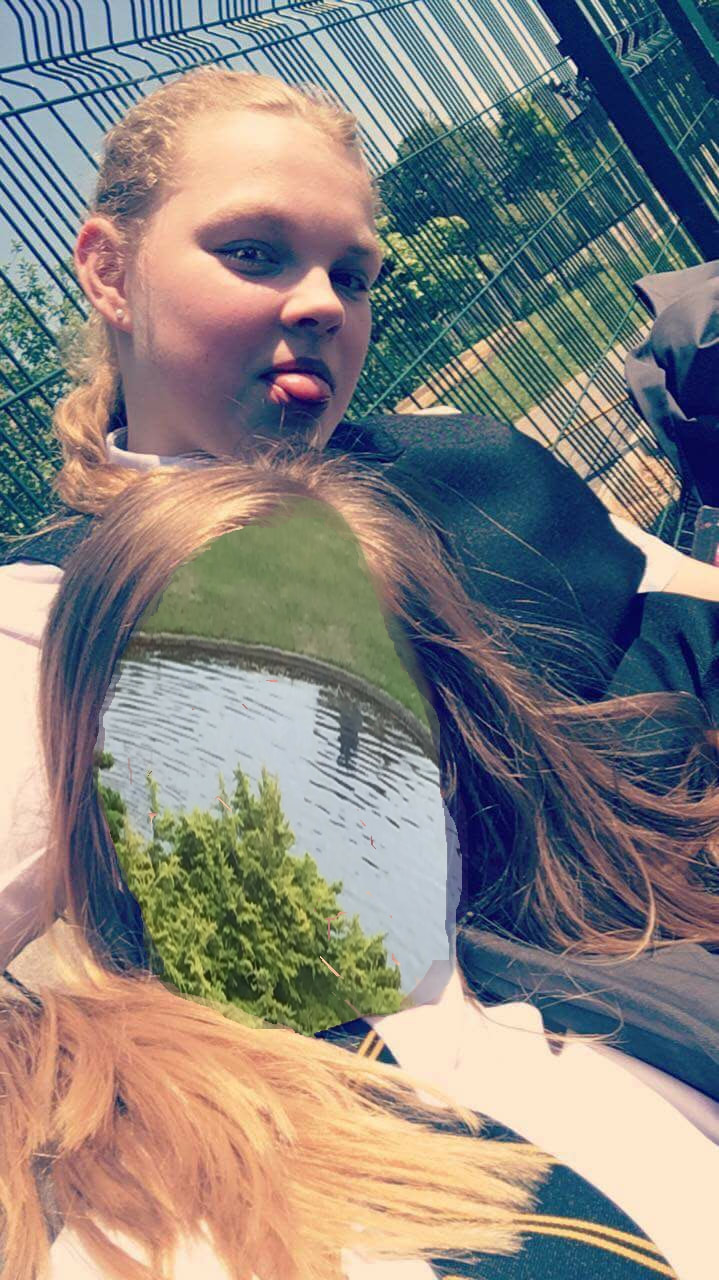
For this shoot I am planning to take pictures of someone's hands their face. This will represent how the earth is trapped from us. To make the face look like the world and to show how we are destroying it I am going to edit it in the style of Erin case. This will be done by removing the face by editing using the remove the background tool. By doing this I can get rid of the person's face but can also keep the shape. Then I am going to take images of a globe to show how the world is trapped in human hands. With these images I will import them on to photo plus and place them on the outline of the face.
While taking these images I will either use under exposure or an exposure of 0 depending on which I feel looks better. I am going to use a medium depth of field for the scene images but a small depth of field for the hands and face image as this will then give a feeling of being trapped like Erin Case's image does. The shutter speed will be a low shutter speed because I don't want any motion in the image and I want it to be still. My main focus will be on the hands of the image and how the hands are on the face. This is because I feel that this will clearly portray the theme of being trapped in my image.
While taking these images I will either use under exposure or an exposure of 0 depending on which I feel looks better. I am going to use a medium depth of field for the scene images but a small depth of field for the hands and face image as this will then give a feeling of being trapped like Erin Case's image does. The shutter speed will be a low shutter speed because I don't want any motion in the image and I want it to be still. My main focus will be on the hands of the image and how the hands are on the face. This is because I feel that this will clearly portray the theme of being trapped in my image.
The 4 Hand Positions I Plan To Try:
I have chose these hand positions because I think that they show the theme of being trapped really well. In addition I think these will be the best images to use for this shoot as they are all close together. Also they all look like they have a tight grip on them which is how I would like my image to look like.
Face Images


Worst Image
Best Image
Globe Images


Shoot 5/ part 1 -Making Objects Look Bigger


Shoot 5/ part 2 -Texture


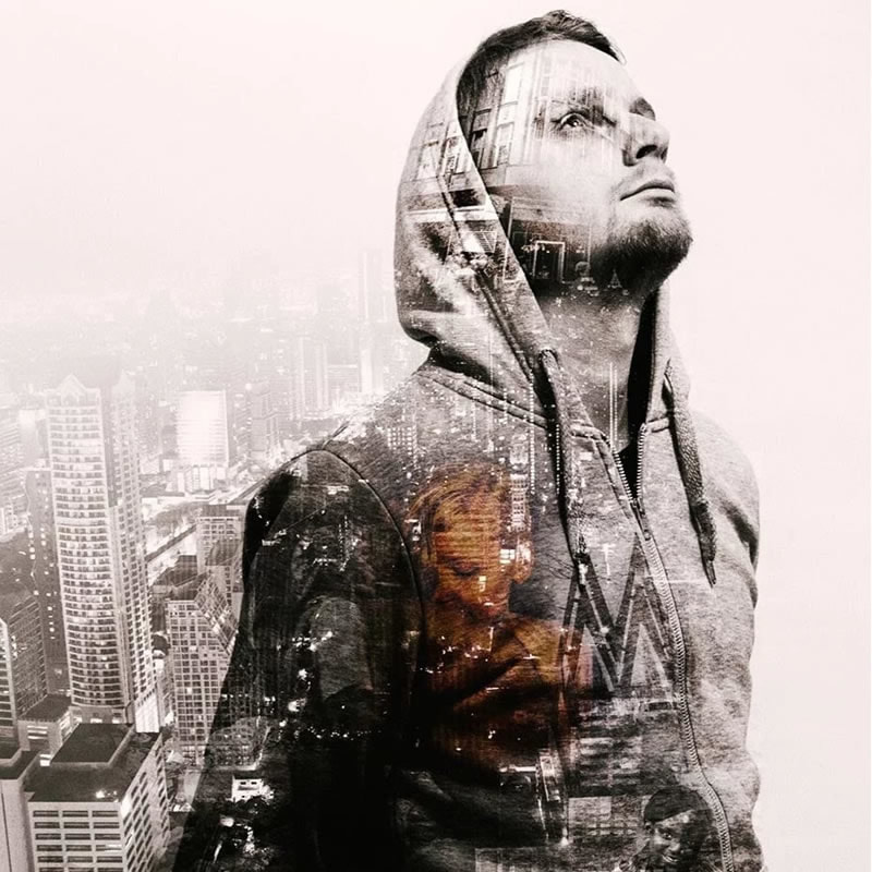
Antonio Mora
Antonio Mora takes multiple photos and mixes them to create a surreal art of the finest. This is known as double exposure. He is an experienced Spanish artist who has had an extensive career like a designer and art director. It ends to give his free rein to his inexhaustible fantasy, to his expressive needs.
He uses double exposure to create a portrait with things such as using landscapes or animal shots to create a majestic abstract photograph. His ongoing Dream Portraits transform two separate images by combining them into one. This re-configures their visual power.
He uses double exposure to create a portrait with things such as using landscapes or animal shots to create a majestic abstract photograph. His ongoing Dream Portraits transform two separate images by combining them into one. This re-configures their visual power.


Shoot 5/ part 3 -Double Exposure: Objects


These are the two images i used to get my final double exposure image.
This is a screenshot of the app i used to edit my portrait to give it a double exposure. The app i used is called photo plus and i used two images to create this image. I used a portrait image and i used a close up objects image to create this style. I took both of the images i used to add a personal touch.
This is the final result of my double exposure image using an object. I think this is the best edit i have done up to yet but it would be even better if I added a overlay to the other face in the image. Also I think I should mess around with the contrast and brightness so I might have a look at this in the future. Overall I am happy with the result of this image.
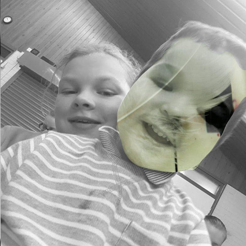
Shoot 5/ part 4 -Double Exposure: Texture


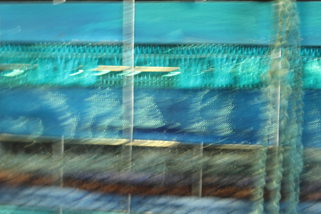
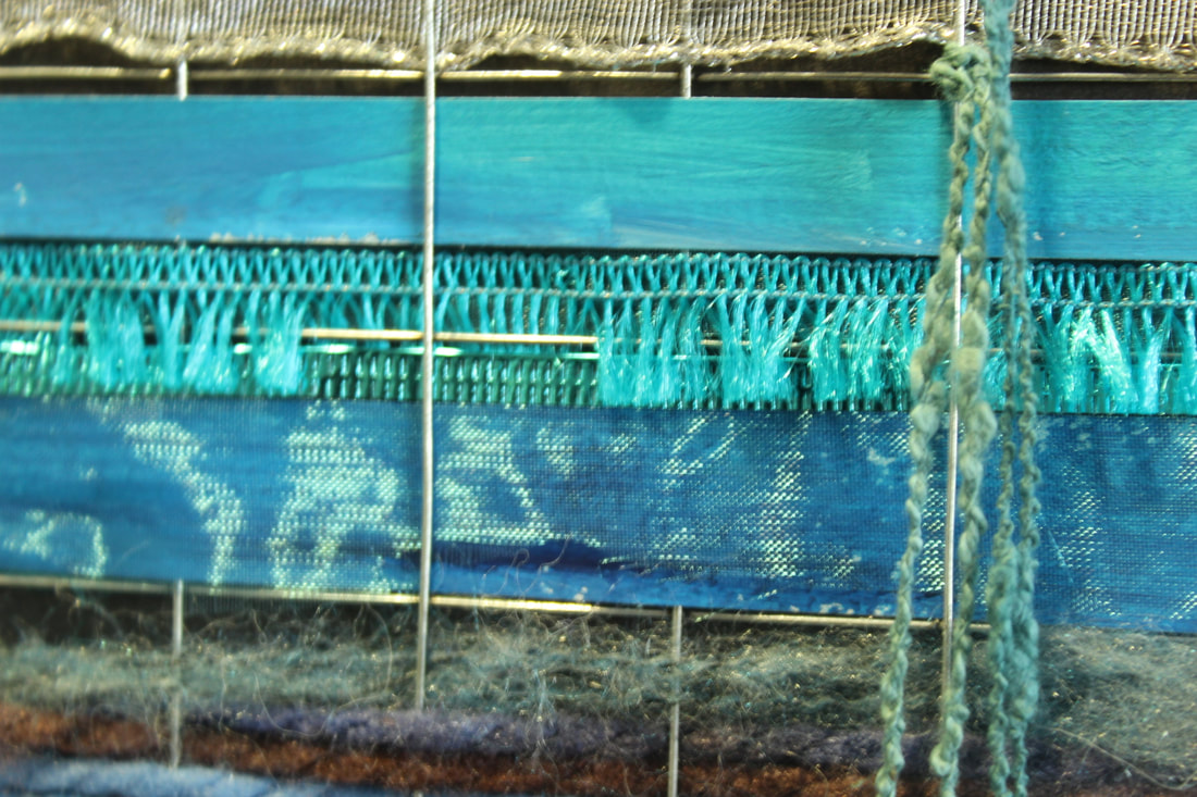
These are the two images I am going to use for my texture double exposure edit. I have chose these two images as in a way the backgrounds are different to each other. In addition the texture overlay will stand out as the background of the portrait image is grey colours and the texture is rainbow type.
My Edit

This is my second edit but instead of using an object I used a texture. Also i used both of the faces as i thought it would look better and I think it does look really good. I like how it has turned out because i feel like this is my best edit up to yet and i can see an improvement in each of my edits each week. To improve this i need to make the texture cover the face a bit more but other thatn that i really like this image.
How this image was created
I created this image using Photo Plus which is an editing app.
1. First I selected my portrait and opened it with photo plus
2. Then I selected my texture image and opened it on photo plus
3. Next I copied and pasted the texture image on to my portrait (Ctrl C) to copy and ( Ctrl L) to paste
4. Then I had to resize the texture image to make it fit on the portrait I used the deform tool for this
5. Then I clicked on the Portrait layer and used the smart selection tool to select the face
6. I selected the layer with the texture and copied the selected image
7. Then I pasted it and put it on the face to get my finished result
8. Next I repeated this process for the second face
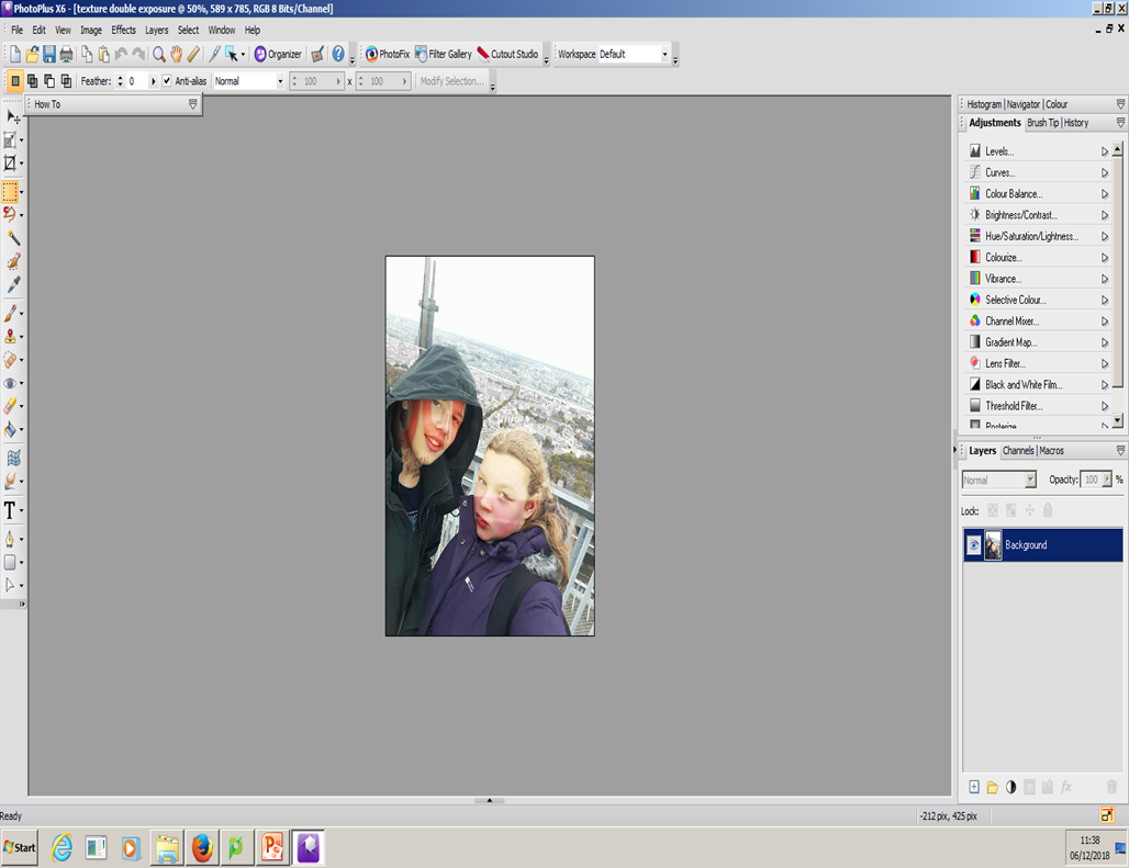
Christmas Challenge


These are the 3 images i used to create my final piece. The idea I went for was to create the front of a Christmas card and I fell it turned out well. I used the Christmas hat as a prop and put it on one of the models head. I used the snowy background to overlay my original image so it would look a little more festive.
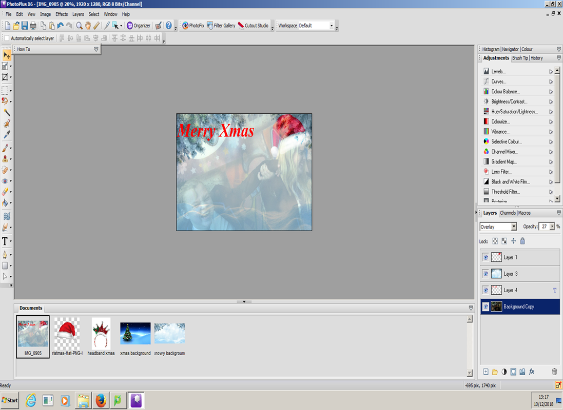
This is a screenshot of my finished piece and it shows the pictures I used and the ones I tried to see if they would look good as you can see some of the images didn't work. The screenshot also shows the layers it took and the possible tools i could of used.
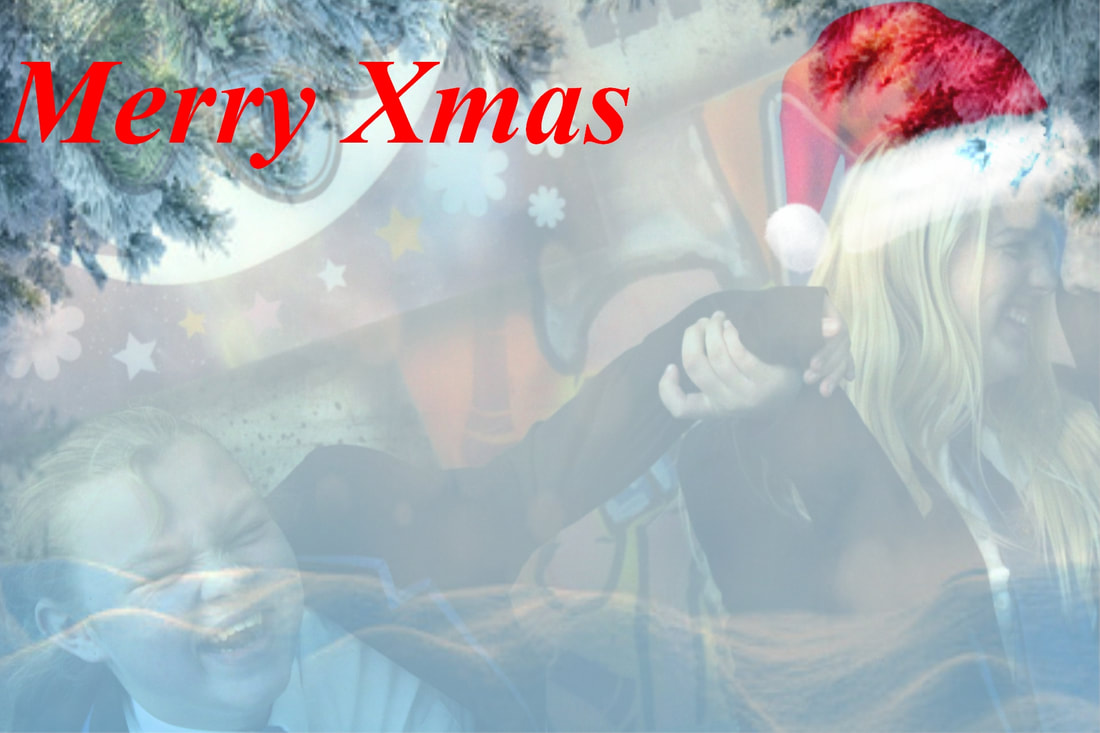
This is my final edit of my image you can see i have used overlay as you can still see the original image and the Christmas hat on one of my models. Also I think the emotion on my models faces shows a joy which also gives a festivity to the image. I have made this the front of a Christmas card as I have added a caption saying " Merry Xmas" at the top of the image. To improve this image I feel I could add some more detail.
How this image was created?
1) First I gathered my images together to convey my ideas
2) Then I select the Christmas hat image and used the selection tool to select the shape
3) I copied and pasted the Christmas hat on to my main image and carefully made it the right size and placed it on my models head
4) Next I copied and pasted my snowy background on to the original image
5) I resized my snowy background to fit the image
6) Then I used the overlay selection to make my image more festive I reduced the opacity of my original image to 27% and kept the opacity of the background image at 100%
7) Finally I added text to my image and I changed the colour to red to give it a traditional Christmas colour
Distorted Portraits
What are distorted portraits?
A distorted portrait is a transformation of an object and its surroundings that differs from what the object would look like normally, due to the relative scale of nearby and distant features.
Examples


Man Ray
|
Man Ray was a American visual artist who spent most of his career in Paris. Most of his images were either surreal or dada although his ties to each were informal.
Born: 27 August 1890 Died: 18 November 1976 Know for: Painting and photography |

|
Examples of his work


My favorite image of his
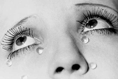
This is my favorite image because it stands out the most to me. In addition I like the the way the tears are shown on the face. Additionally i think the image conveys emotion very well and it is very appealing and gets a strong message across to its audience.
Evaluation
This project was relatively easy to do and to complete. What I liked the most about this project was that I got to have a personal response to my work. I really enjoyed using photos I took at home as I feel it really makes my work stand out from everyone elses. This project would be even better if I had more edits to show the improvement i have made. Overall in my opinion I believe this project was a success and I am very proud of it.
My Edits


My Favorite Edit
This is my favorite edit in this project because I feel that both the texture and background of this image go well together and really show the emotion of the image. In addition I feel this image really shows off my editing of double exposure and can help me improve my editing.
