What is mobile photography?
Mobile photography is taking images using a mobile phone. It is the most common way of taking photos in everyone's life. It is easy as you can take photos of people,places and many other amazing things. Everyday we all use mobile photography and don't even realize it.
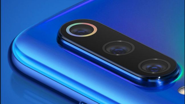
What are the best cameras in 2019
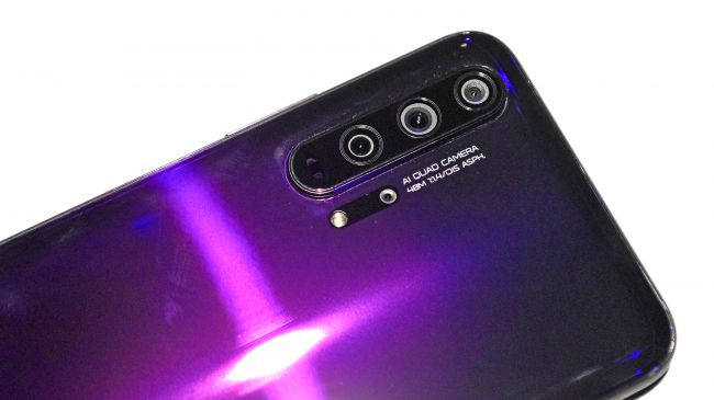
Huawei P30 Pro
|

|
Google Pixel 3
|

|
Honor 20 Pro
|
|
OnePlus 7 Pro
|

|
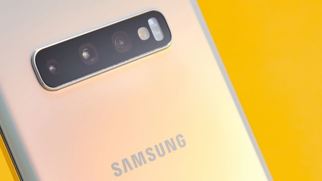
Samsung Galaxy S10 Plus
|
|
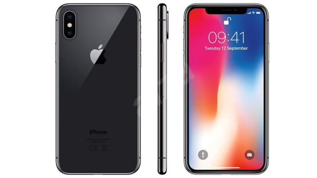
IPhone XS
|
|
Oppo Reno 10x Zoom
|

|
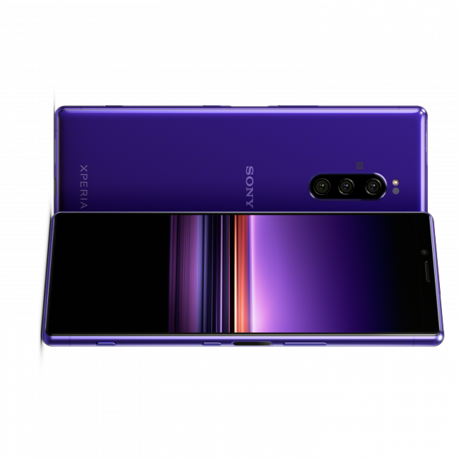
Sony Xperia 1
|
|
Google Pixel 3A
|

|
Xiaomi Mi9
|
|
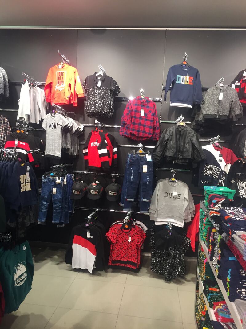
Mobile Photography editing apps for Apple and Android
VSCO
Cons: It forces users to make in app purchases. |

|
|
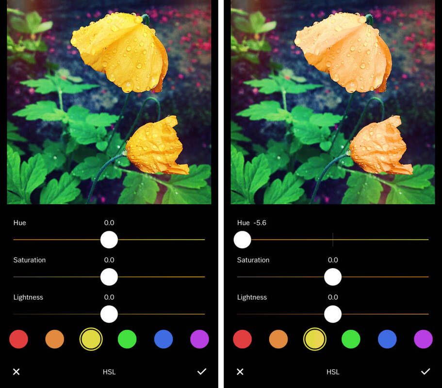
This is an example of a image that has been edited on the editing app VSCO. As you can see this person has changed the hue on the image which has made the flower look more orange rather than yellow. In my opinion I think this looks very effective and show the difference in the two images.
|
My Examples of editing
|
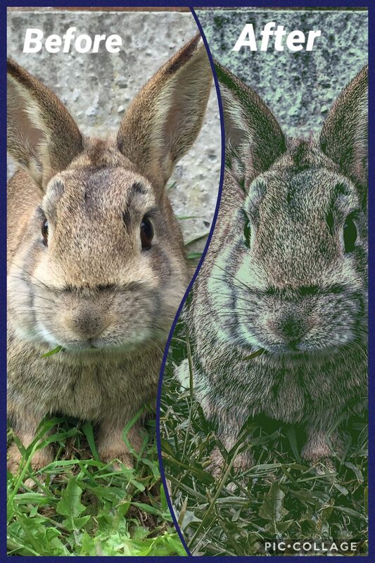
This is my edit on the VSCO as you can see I have used a picture of my rabbit. First I used the P5 filter to make the image a little darker. Then I moved the highlights up to +8.8 to make the image a little more effective. Next I increased the shadow up to 6.9 to make the rabbit stand out. After this I added a green tint to show the grass out more and so the main focus of my edit was on the rabbit. To finish the image off I changed the clarity to about 80% to give it an even better effect.
Personally I found editing on VSCO quite easy but the only thing is that to use the free version you can't access some of the filters and tools for free. However, you do get a few tools that you can use to edit. |
Screenshots of my steps


Adobe Lightroom
|
Features: Powerful advanced adjustments and corrections
One-tap presets for quick editing Support share photos to Instagram, Facebook, Twitter, Flick Save photos on Adobe Creative Cloud so that you can access them on other devices through cloud. Pros: Impressive controls with effective synchronization. Cons:This best editing app is quite complicated, can create a mess for beginners |
|

|
This is an example of an image edited on adobe lightroom. As you can see the colour of the sky has changed from light blue to a slightly darker blue. This is because the tint tool has been used. Also this person has increased the exposure of the image to +20 so the image is clearer to its audience.
|
My examples of editing
|
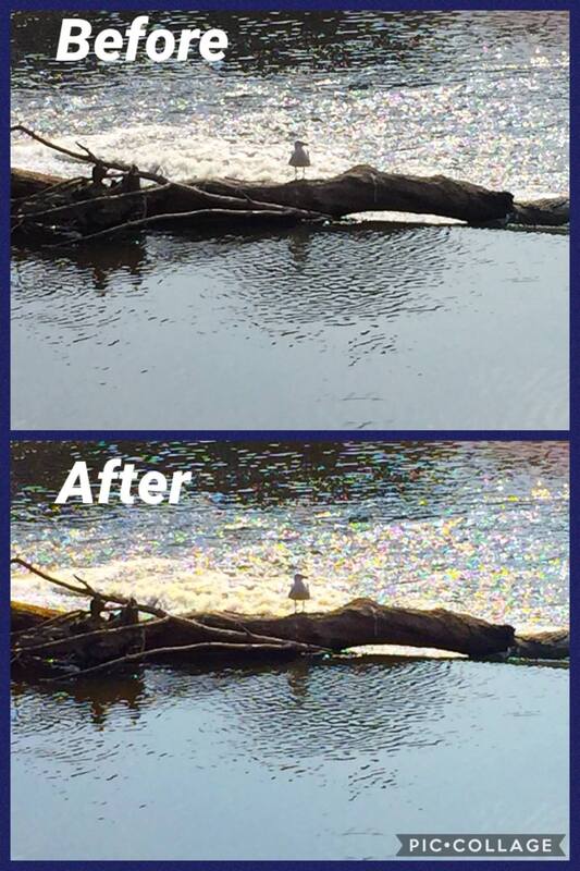
This is my edit using Adobe Light room and for this edit I have decided to use a piece of driftwood with a seagull on it. First I changed the contrast to -11 to darken the image. Next I added some shadow to really show the seagull. Then I added a blue tint to make the water stand out. Finally I sharpened the image up to 75% to make the image stand out.
Personally I found this app a little difficult to use and I feel that beginners will feel the same. Also I think this is more of an app to change your lighting and not to do other complex stuff like double exposure. |
Screenshots of my editing process


Google Snapseed
|
Features:Powerful while easy-to-use
Cons: Beginners find its interface little difficult. |
|
|
This is an example of an image that has been edited on google snapseed. As shown this person has used a different filter to make the image look brighter. To me this shows a warm seen which gives a calming effect. This also shows the beauty of the landscape.
|
My examples of editing
|
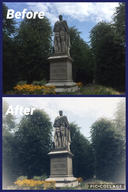
This is the edit I did on Google Snapseed. I have used an image of a statue from when I went to Chester. First to edit this image I used the bright filter which gave the image a little light to show a religious theme. Then to make this edit better I used the sharpening tool and i put it up to +42. This helped make the religious theme more obvious and I feel that it shows the statue to be as generous as Richard second of Marquis was.
I found Google Snapseed quite easy to use and I think the results come out pretty good. In addition I feel it offers quite a lot but could maybe offer a few more tools for people to use so that the edits look more effective. |
Screenshots of my Editing Process


Prisma
|
Features:
|
|
|
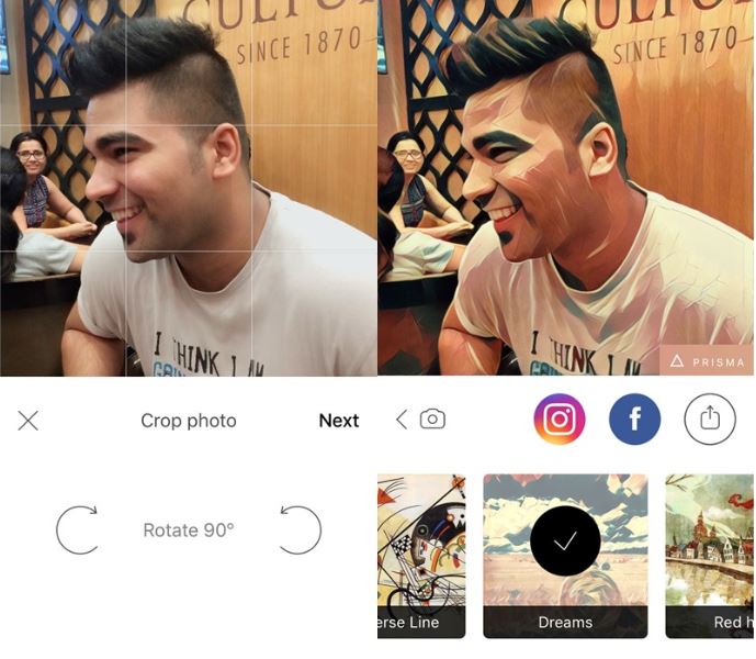
This is an image that has been edited on Prisma. As you can see Prisma is a very artistic app which uses abstract art. So if you want your images to look more artistic Prisma would be the right app. This person has used the dreams style which makes the image look really effective.
|
My examples of editing
|
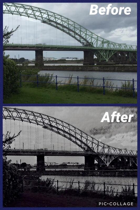
This is the edit I have done on Prisma. As you can see I have used a picture of the old Silver Jubilee Bridge. My first step in this editing process was to choose a filter. The filter I chose to use was the Daryl Feril filter. I think this filter looks cool as it makes the bridge look more sinister and dark. To further show this theme I turned the exposure down to -73 which helped give the image a darker look. Then I put the contrast up to 16 to help the darkness blend in with the image. In addition I turned the brightness up to 5 so that it helped blend in with the theme. To further do this i put the saturation down to -31 which helps with the images contrast. Next I sharpened the image to 35 so that the bridge stands out of the image more to give this spooky look. Also I added shadows and put it on -7 just to add to the theme.
I found it quite easy to get around the app and I feel like it is and effective way to produce an edit, especially for themes like horror or more abstract type themes. However, I feel like it doesn't fit all types of themes as it gives more of an abstract look than anything else. |
Screenshots of my Editing Process


Kamil Konrad Kawczynski
|
Kamil Konrad Kawczynski is a photographer who takes pictures on his mobile. To him photography is a mission, he takes photographs through workshops and training. He has won awards like mobile photography awards and Android photography. Photographing with a smartphone gives him satisfaction. He is happy to share his passion with others and he hopes to make other people enthusiastic about mobile photography.
|
His Work


Analysing his work
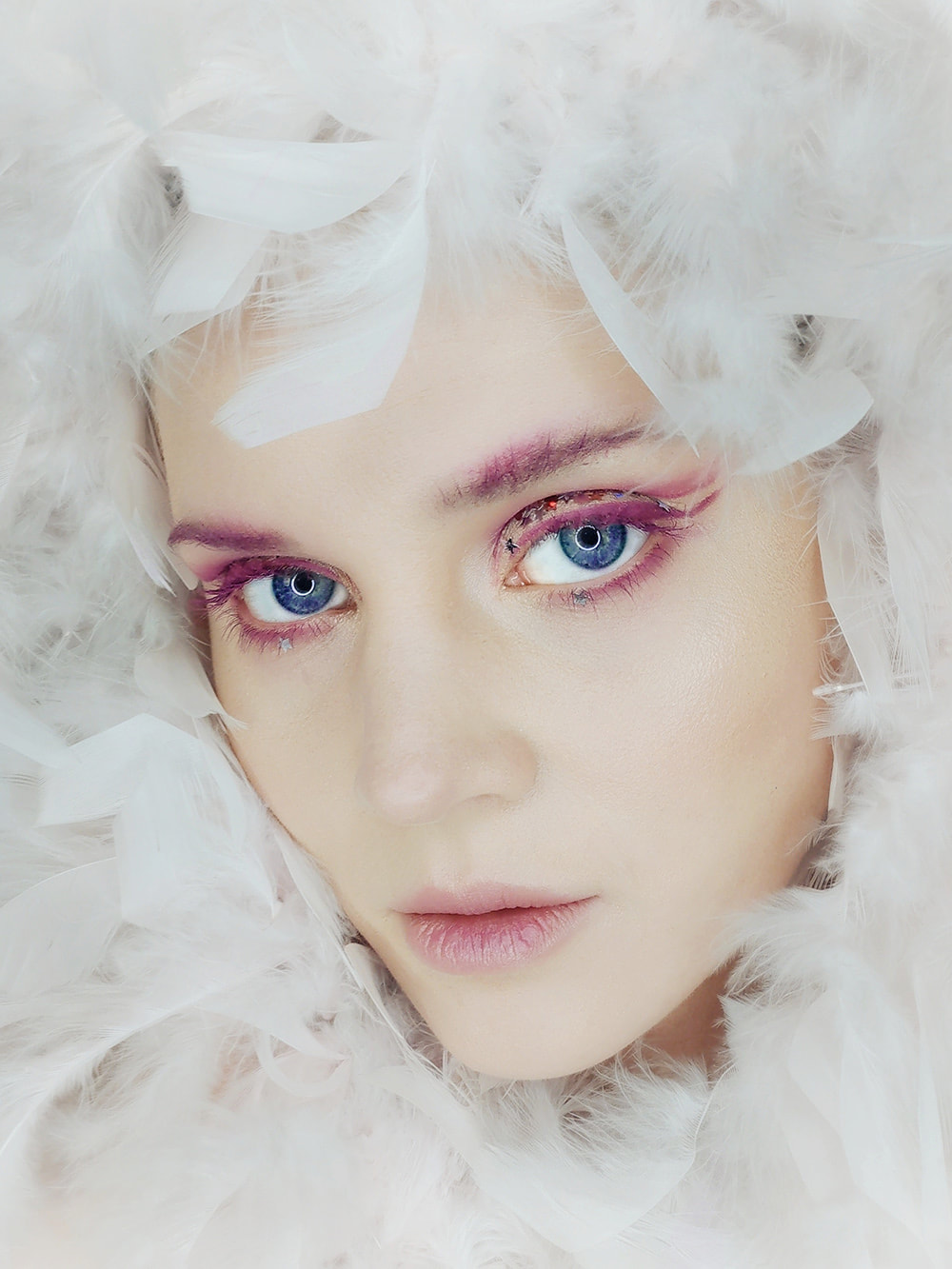
This image is very effective because the audiences focus will be on the face of the image and this is really effective because it gives it a innocent look. This is further implied by the use of the white feathers as white has the connotations of innocence. Also I like the use of a neutral exposure as it really gives the image a bright look. In addition I like how the image uses a large depth of field so it just focuses on the neutral look of the face.
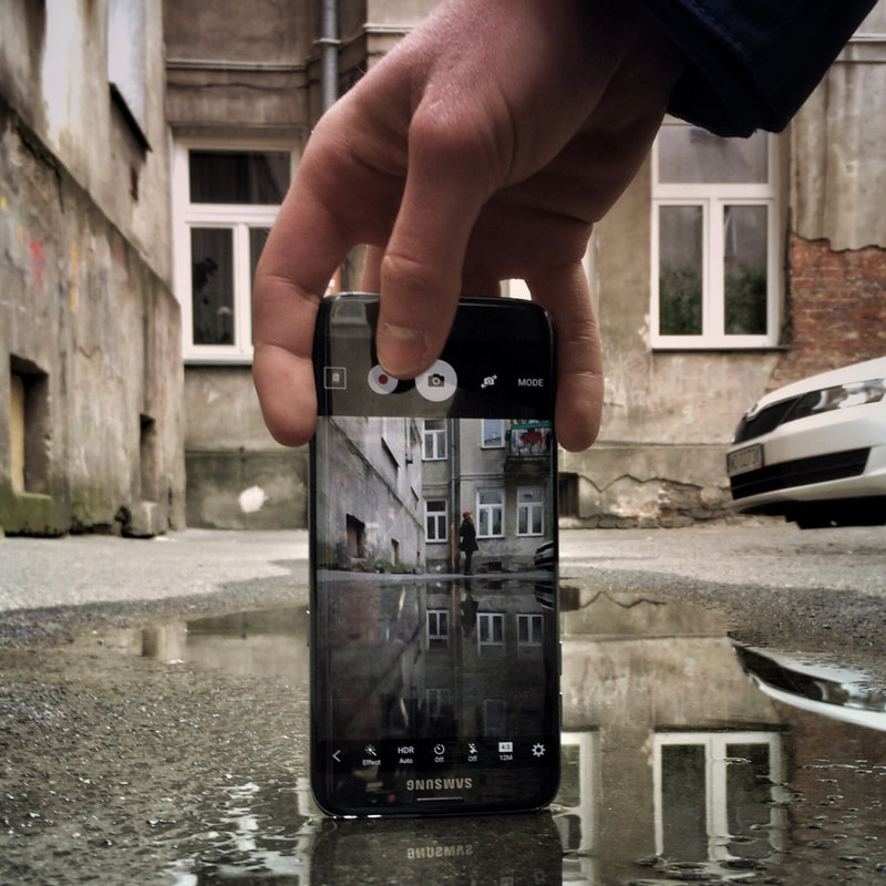
This image is effective because of the use of the upside down mobile phone. This shows how crazy life is and i feel that the use of the rainy impact helps show this. I like how the image has used a large depth of field to get a background in which has largely impacted on this image to make it what it is. I also think that a neutral exposure helps create the look of this image.
Oliver Lang
|
Oliver Lang is photographer who takes pictures with his mobile phone. He uses emphasis on Instagram and finds his images from social media. Lang lives in London but is originally from Sydney Australia.
|
Examples of his work


Analysing his work
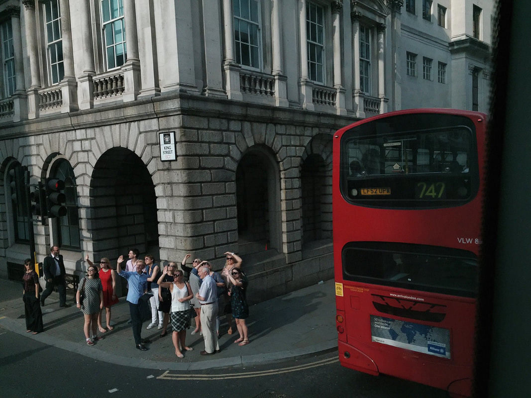
This image is from Lang's street collection and i think this image is great as it captures a real but planned street moment in London. I like how he has the building in the background and that you can see the bus. I think if it was more of a casual look then it would look more effective but other than that this image is a really good image. In addition I like how it is slightly birds eye view but not completely as it gives it an effective touch and you can see the monuments behind it.
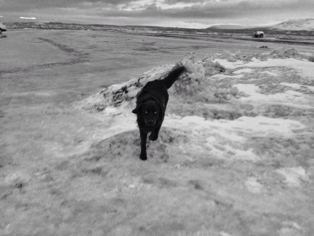
This image is also from Lang's street collection an I feel it looks unplanned which is great as it gives it a casual look. I like how the waves catch up with the dog because it looks like he is running away from the waves. I also like how it looks like the dog is staring at you through the image which gives a deathly look to the image. This is further shown by how grey the image in to show this dark look.
The Three Themes I Have Chosen
I have thought about my themes long and hard and I have decided the themes I am going to do are:
- Landscapes
- A pop of colour
- Animals
A Pop of Colour
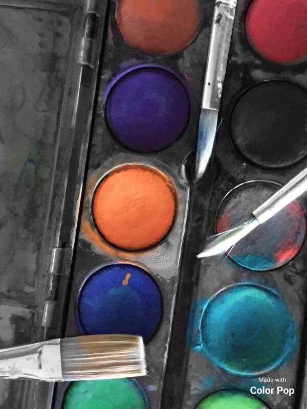
Shoot 1

|
For my first shoot on this interest I am going to get some paints and show different colours by putting brushes on the pallettes to show a little bit of artwork. This is a simple shoot to start my theme off and it will develop this theme with other ideas and hopefully give me a good first theme.
|


Worst Image

|
This is my worst image because it doesn't show the paint palette as I would like it to. Also I don't like the paper underneath with the squiggles on because I don't think it looks effective. I like the idea of the paint brushes on the palette but I would possibly change the the position they are in. This is so the image has some more detail to it.
|
Best Image

|
This is my best image because I like the way I have focused on the colours and how you can see the three bottoms of the brushes. This is because I feel it gives the image extra detail and shows a little less colour to the image to show the theme a pop of colour. To edit this I think I am going to make the main image black and white and to show the colour I will erase the black and white from the colours.
|
My editing process
|
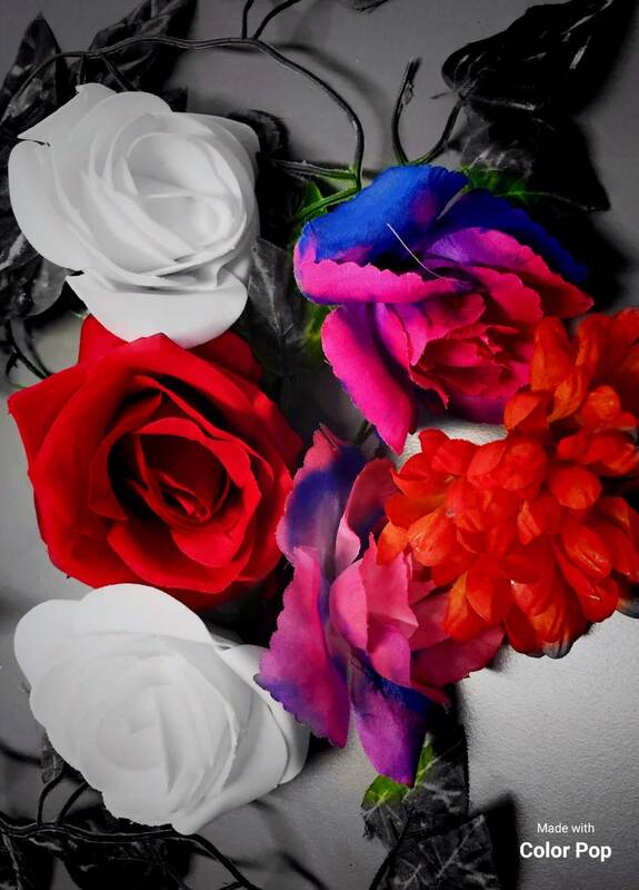
I have not made any major changes to this image because I felt the image looked good how it was. All I have done is change used an app called Color Pop and I selected the color pop tool which changed my image to black and white. Then I used a medium sized brush to colour in the paints so that the colour stands out from the rest of the image. I think this has made the colours more obvious than the other image did which makes the theme shown more clearly.
|
The Screenshots from my process
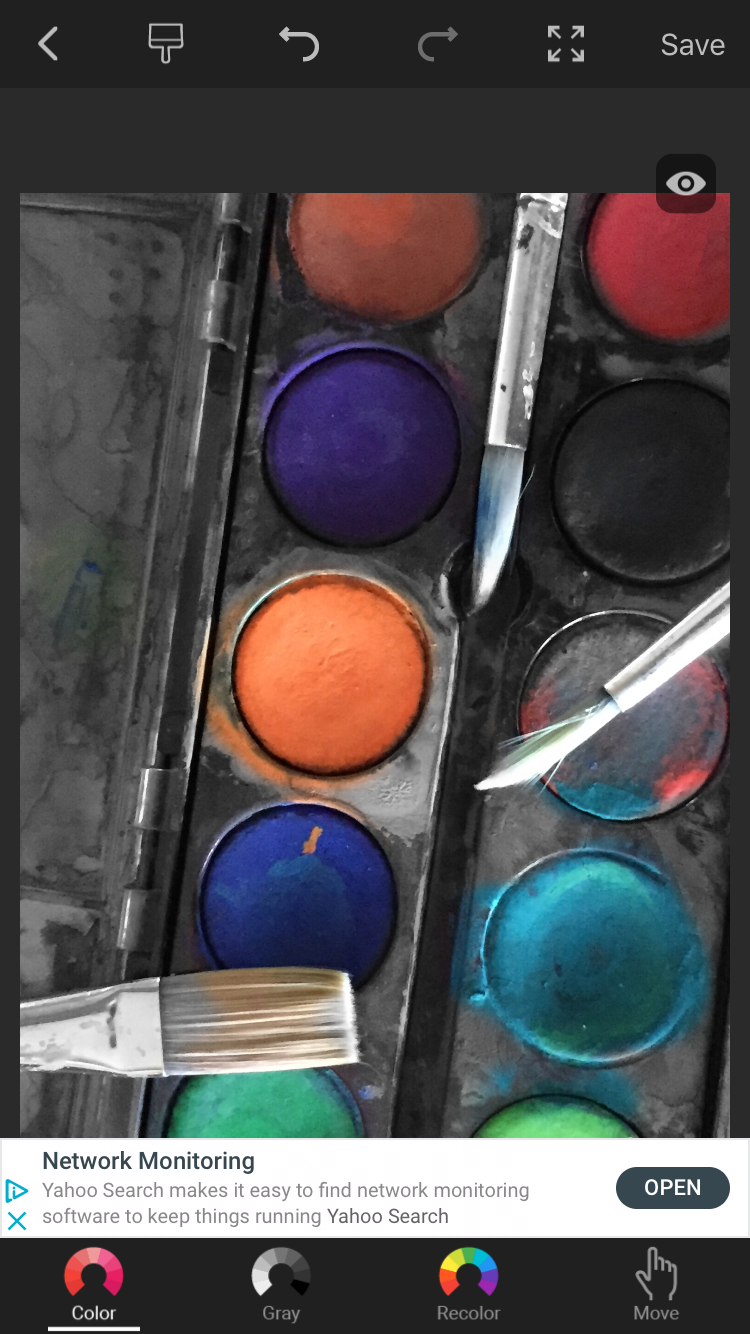
This is a screenshot of my editing process and it shows the different modes you can use on the colour pop feature. First when you press this feature it turn your whole image grey and then you rub the paint brush across the bit that you would like to colour.
|
This is the app that I used to edit this image. It has 3 different features which are: color pop, edit and collage. For my edit I used the color pop feature so that the colours will stand out more than they did in the original which shows the theme more.
I found this app really easy to use and very effective in the work it creates. I tried some of the other features and then decided the colour pop on it's own look better than additional features. |
Shoot 2

|
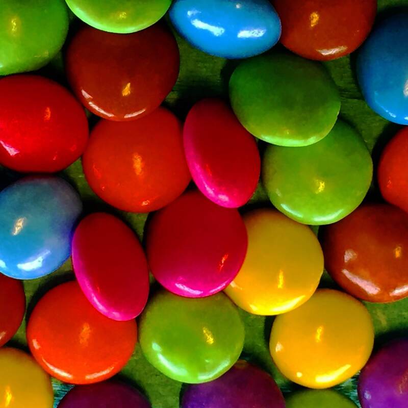
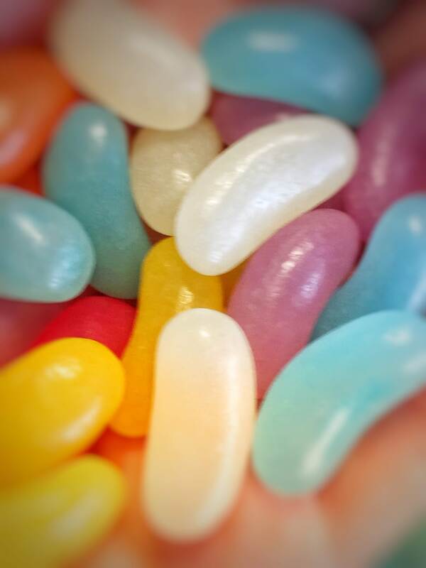
For this shoot I am planning on bringing some sweets in. Using these sweets I will get someone to slowly tip them out of the pack to show some colour with in using sweets. I might use a bowl to tip them into or I might tip them on the table. I am going to try both of these ideas to see which one looks better for this shoot. This will create a rainbow type image so that it can show different colous to show this theme.
|


Editing Process
|
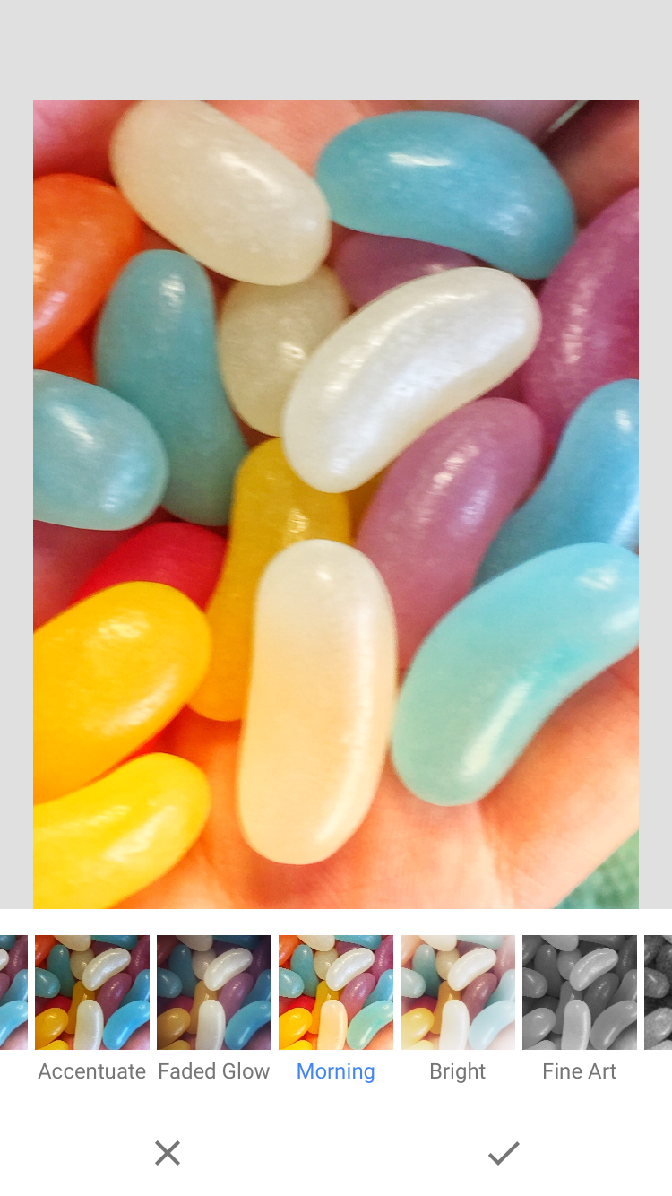
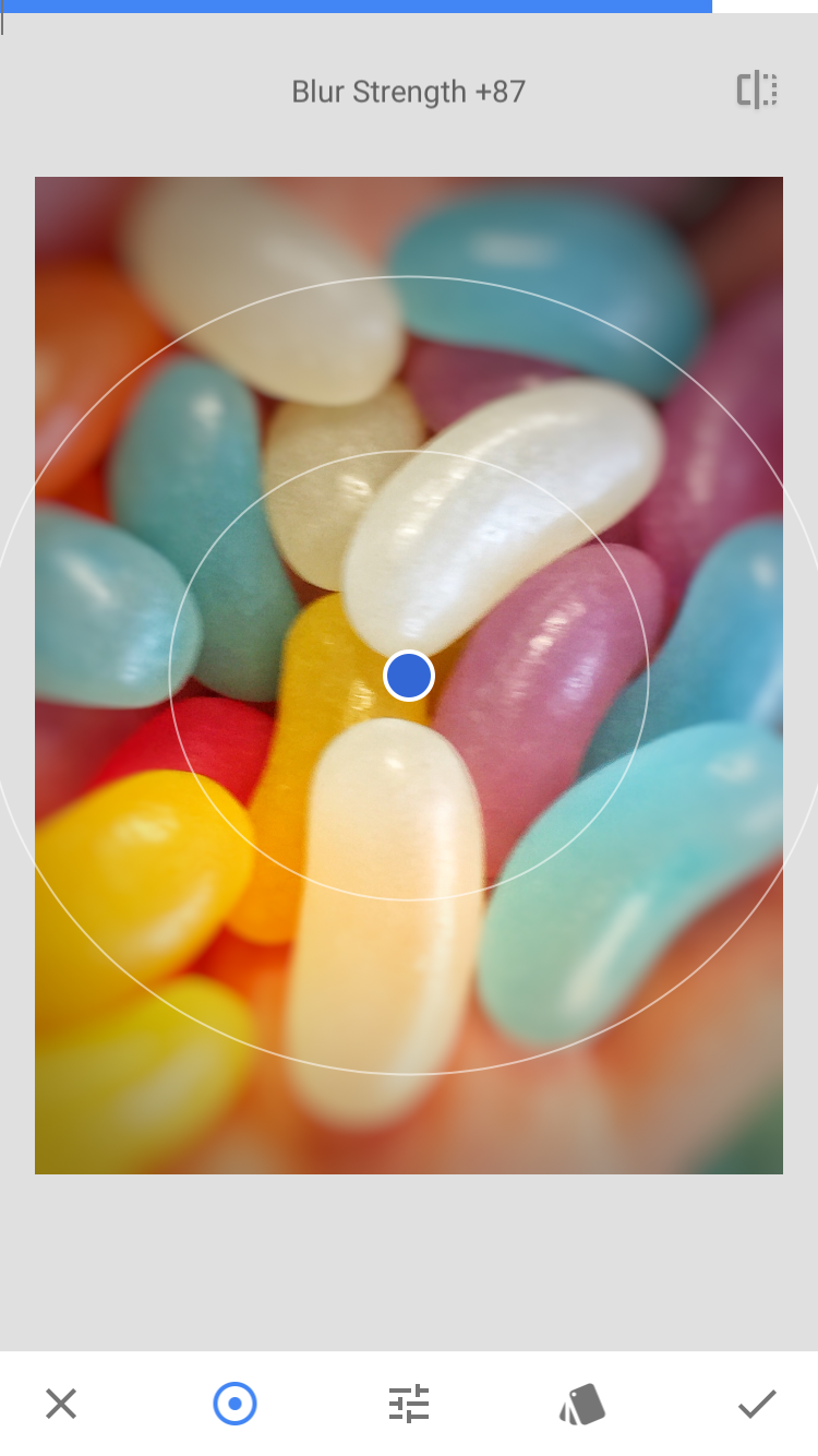
This is my edited version I think that it looks better than the original image because the colours stand out more. First I adjusted the colour to the top of the bar and the black and white also to the top of the bar. This gave me a slightly more boldness of colour for the image. Next I changed the highlight bar to the left. Also I repeated it with the shadow tool which gave my image some shadows underneath to make the smarties stand out from the rest of the image. Then I used the square tool to square the image so that it looks more effective as the smarties are all close together which shows all the different colours more clearly.
|
   These are the screenshots of my process. The first image shows the adjustment of the colour. The second image shows the highlights and shadows level. Finally the third image shows the changing of the shape of the image.
|

I did my editing on an app called MOLDIV and I found that this app had some really good tools like you can double expose on the app. This app is really good because it consist of a variety of tools that you can edit an image with. Also there are multiple modes like collage and magazine for different types of editing.
|
Shoot 3
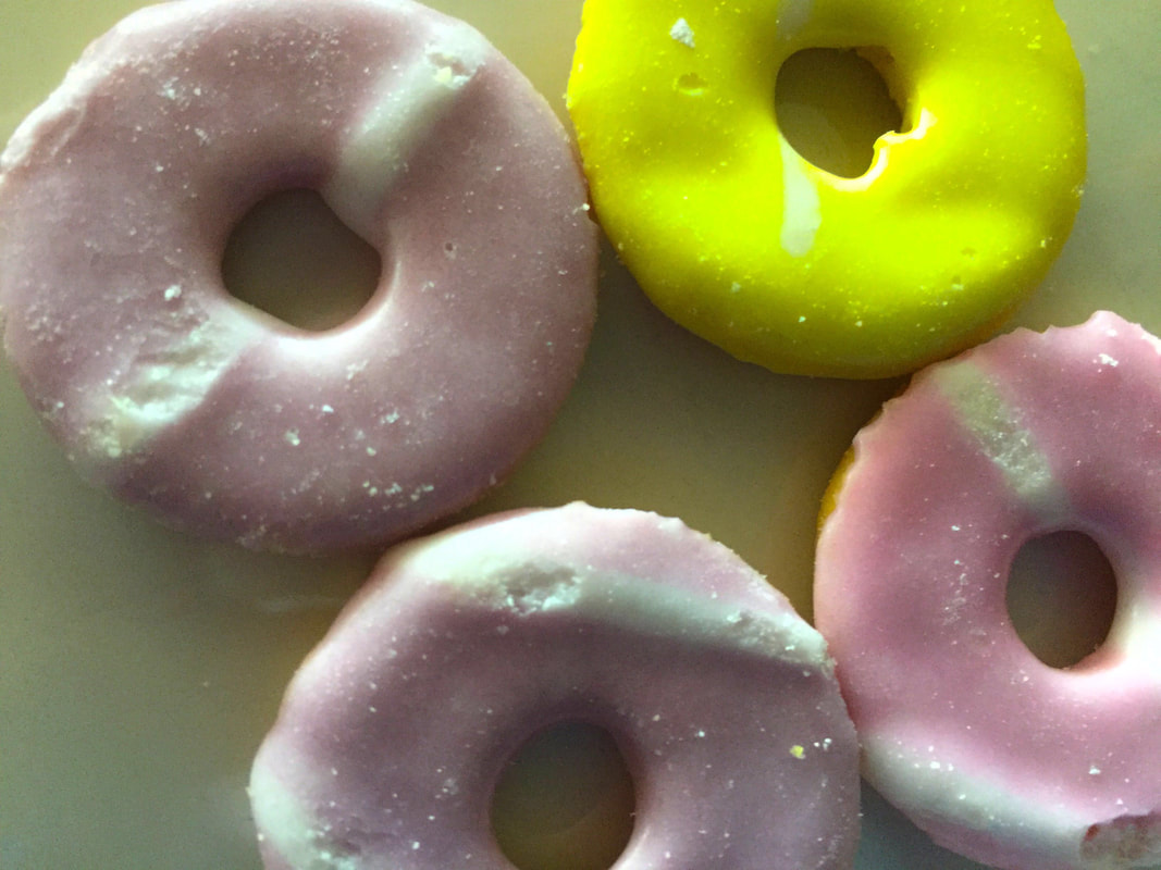
For this shoot I am going to use party rings to show a pop of colour. I will do this with 3 different colours of party rings and I will also use different shapes to make my image more effective. I will break some of the party rings up to show different shapes along with different colours


Worst Image

|
Best Image

My editing process
|
Screenshots of the Process
   |
|
Shoot 4


Editing Process
|
    |

|
Shoot 5


Editing Process
|
|

|
Shoot 6


Editing Process
|
    |
|
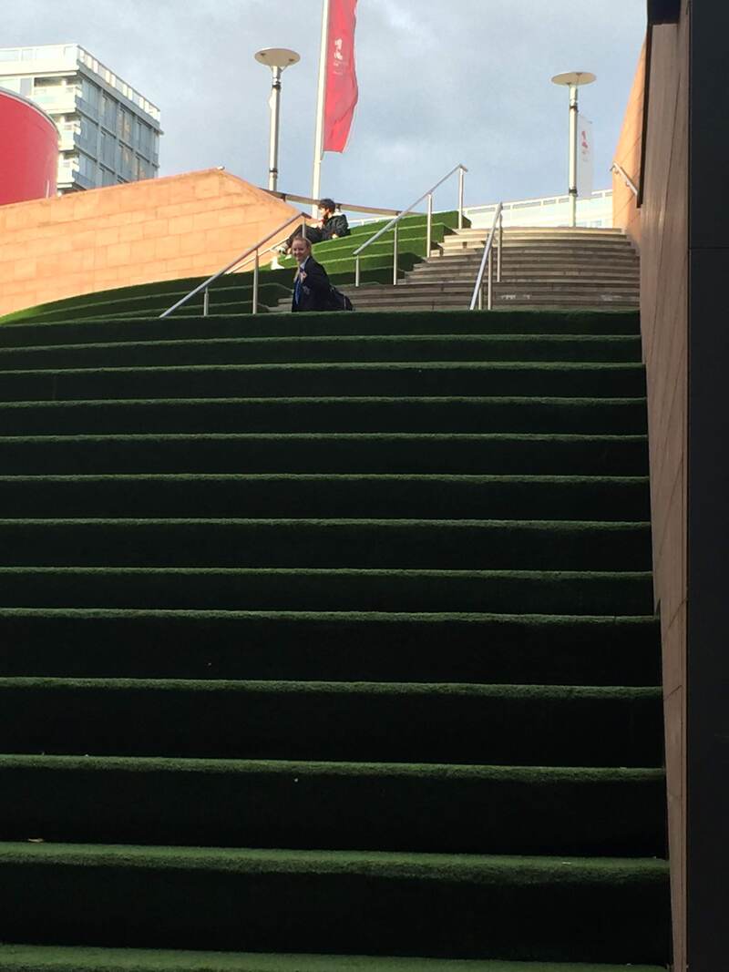
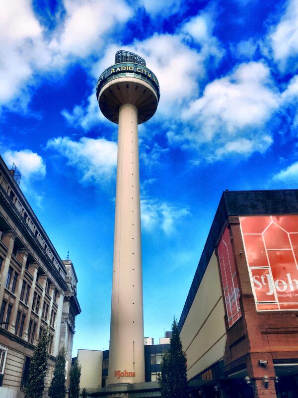
Our Trip To Liverpool
We went to Liverpool on a trip and took pictures based on 5 topics these were:
- Buildings and Detail
- A Pop of Colour
- Hustle and Bustle
- Transport
- Reflections


Buildings and detail edit
Worst Image

|
Best Image

|
The Editing Process
|
  |
|
A Pop of Colour
Worst Image

|
Best Image

|
Hustle and Bustle
Worst Image

|
Best Image

|
Transport
Worst Image

|
Best Image

|
